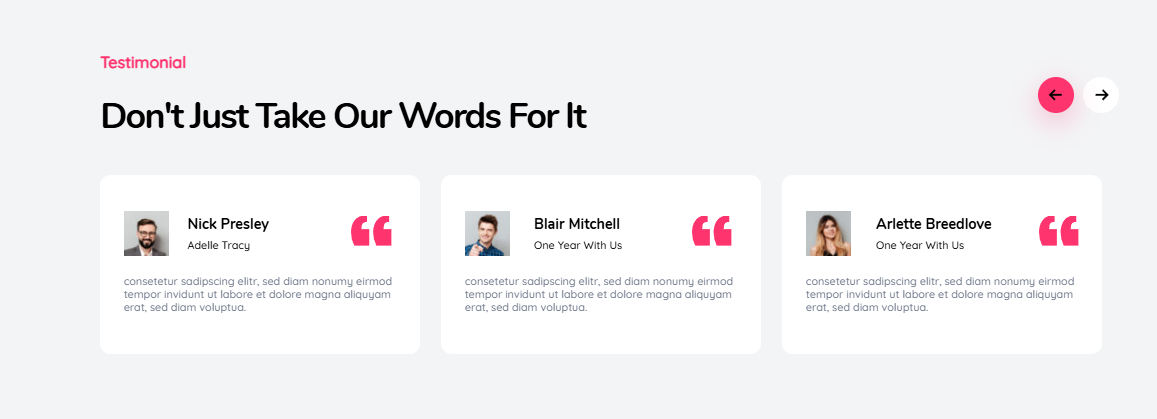
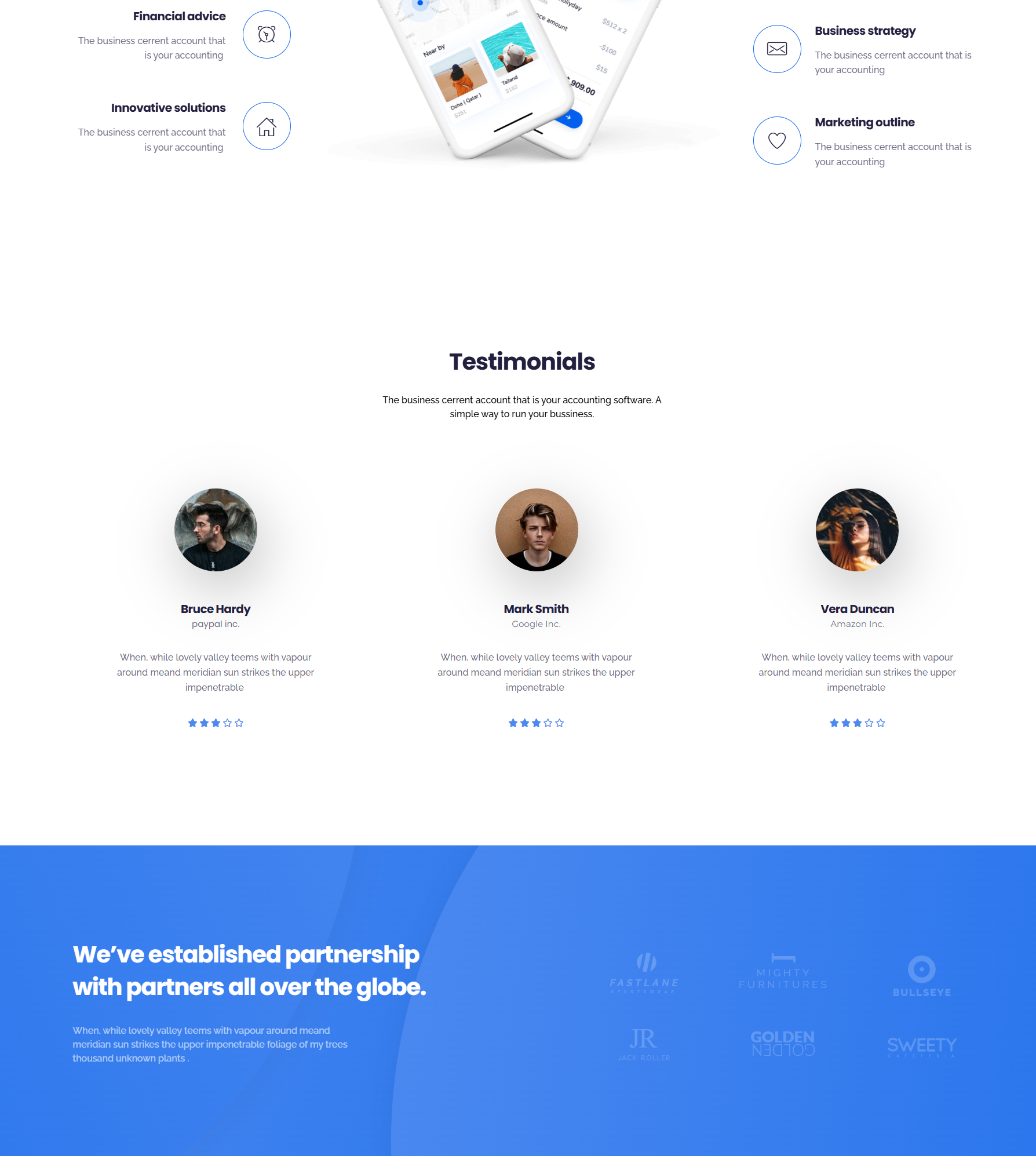
Testimonials are one of the most familiar trust signals on the web, yet their impact depends heavily on where they appear. Even strong testimonials can lose effectiveness if they’re hidden, poorly timed, or disconnected from user intent.
That’s why questions like where to place testimonials on a website come up so often. It’s not just about having positive feedback, but about showing it at the right moment, when visitors are actually paying attention and looking for reassurance.
This article explores how thoughtful testimonial placement on website pages can strengthen credibility, reduce hesitation, and support user decision-making across a website. Rather than focusing on tools or tactics to sell, the goal here is to explain why placement matters and how testimonials can be used responsibly and effectively.
Why Testimonial Placement Matters
Testimonials work because they provide social proof. They show that real people have interacted with a product or service and found value in it. However, users don’t consume websites in a linear way. They scan pages, skim sections, and jump between areas based on what they’re trying to achieve.
Placement matters because testimonials are most effective when they appear at moments of uncertainty, reinforce claims already being made, answer unspoken objections, and feel relevant to the surrounding content.
When testimonials are placed randomly or grouped into a single isolated page, they often fail to influence decisions. Strategic placement ensures testimonials support the user journey rather than interrupt it.
For a more detailed overview of how testimonials function and why they build credibility, this guide on testimonials on websites provides useful foundational context.
Homepage Testimonial Placement
The homepage is often a visitor’s first interaction with a brand. At this stage, users are usually asking basic questions such as whether the website is credible, whether others trust the brand, and whether they’re in the right place.
Testimonials on the homepage should focus on reassurance rather than detail. Their purpose is to support first impressions, not explain every feature or outcome.
Effective homepage placements commonly include testimonials positioned just below the hero section, where they reinforce the main value proposition, or mid-page sections that support claims related to reliability, results, or customer satisfaction. Testimonials can also work well near transition points, encouraging users to continue exploring the site.
Best practices for homepage testimonials include keeping them concise, focusing on trust and outcomes, avoiding excessive specificity, and prioritizing clarity over quantity. The homepage is about confidence, not depth.
Landing Pages and Product Pages
Landing pages and product pages are designed for decision-making. Users often arrive with clear intent, such as evaluating an offer or considering a specific solution. In these contexts, testimonials play a more direct role in reducing hesitation.
On landing pages, testimonials can reinforce a single promise, validate claims, and provide reassurance immediately before a call to action. They are commonly placed below key benefit sections or near signup and pricing areas.
On product pages, testimonials are most effective when they reference real usage and practical outcomes. Instead of grouping all testimonials at the bottom of the page, placing them alongside relevant features or explanations helps users connect claims with real experiences.
In both cases, relevance matters more than volume. A small number of well-matched testimonials is often more persuasive than a long list of generic quotes.
Visual vs. Text Testimonials
Testimonial format plays an important role in placement decisions. Text and visual testimonials serve different purposes and should be positioned accordingly.
Text testimonials are flexible and easy to scan. They work well when supporting written claims, appearing within informational sections, or reinforcing specific points on a page. They are especially effective in blog content, feature explanations, and comparison sections. Short paragraphs and clear attribution improve both readability and credibility.
Visual testimonials, such as those with photos or videos, tend to draw more attention and require more space. Because of this, placement becomes even more important. Visual testimonials are best used when emotional connection matters or when a testimonial tells a clear story.
They are typically most effective in dedicated sections on landing pages or between major content blocks where they don’t compete with dense text. Overusing visual testimonials can overwhelm users, so they should be placed intentionally and sparingly.
Common Testimonial Placement Mistakes
Many websites weaken the impact of testimonials through avoidable placement mistakes. One common issue is hiding testimonials on a single page that users may never visit. Another is placing testimonials too late in the journey, after users have already made up their minds.
Using testimonials that are irrelevant to the page’s audience or purpose can also reduce trust. Similarly, overloading one section with too many testimonials can dilute their impact and make them feel repetitive.
Testimonials should not interrupt critical content or break the flow of important explanations. When they feel intrusive rather than supportive, they lose credibility.
Matching Testimonials to User Intent
Effective testimonial placement starts with understanding user intent. Different pages serve different goals, and testimonials should align with those goals.
On educational pages, testimonials should reinforce credibility without pushing decisions. For the comparison pages, testimonials that mention alternatives or differentiation are often more helpful. And for conversion-focused pages, reassurance and outcome-focused testimonials tend to be most effective.
When testimonials reflect what users are already thinking or questioning, they feel helpful rather than promotional.
Key Takeaways
There is no single universal rule for testimonial placement. When people talk about finding the best places for testimonials on websites, they’re usually looking for guidance rather than a fixed formula. The most effective placements are guided by user behavior and intent rather than rigid templates.
Testimonials should be placed where users feel uncertainty, matched carefully to the purpose of each page, and used selectively rather than excessively. Isolating testimonials from decision points or overloading sections can reduce their effectiveness.
When treated as supportive content rather than decorative elements, testimonials quietly reinforce trust by sharing real experiences at the moments when users need reassurance most.
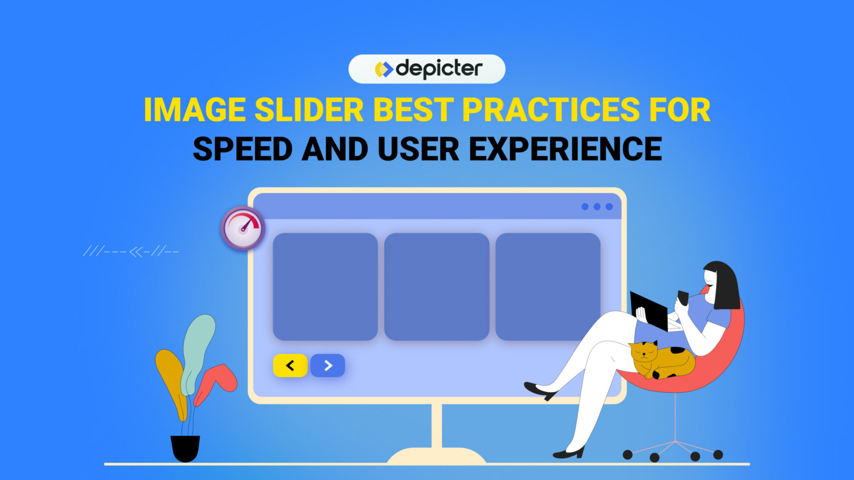
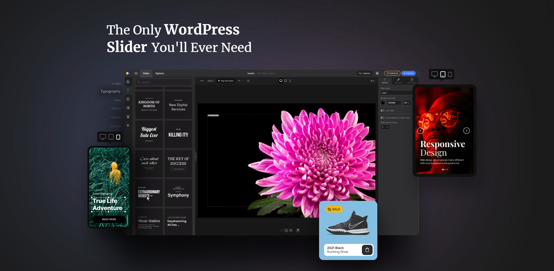
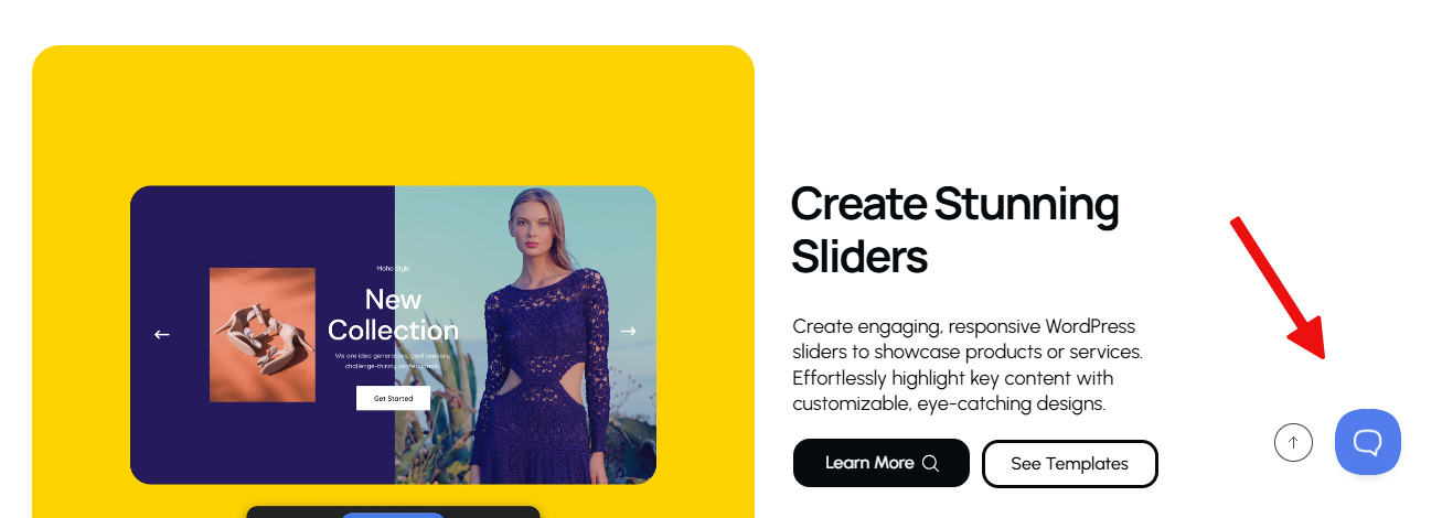
Image sliders have become a familiar element in modern web design. From homepage hero sections to product showcases and portfolios, they offer a visually engaging way to present multiple pieces of content within a limited space. Despite their popularity, sliders are also one of the most debated UI components due to concerns around performance, accessibility, and user engagement, which is why following image slider best practice is essential for achieving a balance between visual appeal and usability.
Understanding the fundamentals of What is an Image Slider helps designers and site owners make informed decisions about when and how sliders should be used effectively.
The truth lies somewhere in between. Image sliders are neither inherently good nor bad. When implemented with intention and technical care, they can enhance storytelling and visual appeal.
When implemented poorly, they can harm usability, slow down pages, and frustrate users. Understanding best practices is essential for making sliders work effectively rather than against your website’s goals.
Why Image Sliders Remain Popular
Image sliders continue to be widely used because they solve a common design challenge: how to present multiple highlights without overwhelming the layout. They allow designers to rotate content, emphasize visuals, and introduce motion to otherwise static pages.
Common reasons websites use sliders include:
Showcasing multiple products or services
Highlighting featured blog posts or announcements
Creating visual storytelling sequences
Adding movement to hero sections
However, popularity alone does not guarantee effectiveness. Over time, UX research has raised valid concerns about how users interact with sliders, especially when they are overloaded or poorly optimized. The key takeaway is not to abandon sliders entirely, but to use them correctly.
Common Image Slider Mistakes
Many issues associated with sliders stem from predictable implementation mistakes. Avoiding these pitfalls significantly improves usability and performance.
Too Many Slides
One of the most common errors is including too many slides. Users rarely view more than the first one or two slides, especially on homepages. Excessive slides dilute attention and reduce content recall.
Best practice: Limit sliders to 3–5 slides maximum.
Autoplay Without Controls
Autoplay sliders that lack pause, navigation arrows, or swipe controls can feel intrusive. Users should never feel forced to consume moving content.
Best practice: Always provide clear controls and the ability to pause or navigate manually.
Heavy or Unoptimized Images
Large image files dramatically increase load time, especially on mobile networks. This negatively impacts both user experience and SEO.
Best practice: Optimize images for size, format, and resolution before uploading.
Poor Text Readability
Text placed directly on images often suffers from low contrast or cluttered backgrounds, making it hard to read.
Best practice: Use overlays, contrast-aware colors, and readable font sizes.
Using Sliders for Critical Content
Sliders are not ideal for conveying essential information such as core value propositions or legal notices. Content hidden behind slides risks being missed entirely.
Best practice: Reserve sliders for supporting or exploratory content, not critical messaging.
Performance and Speed Best Practices
Image slider performance is one of the strongest arguments against sliders but it doesn’t have to be. With modern techniques, sliders can be lightweight and fast.
Optimize Image Sizes
Always serve appropriately sized images. Avoid uploading full-resolution photos when smaller dimensions are sufficient.
Use modern formats like WebP when possible
Compress images without noticeable quality loss
Serve different sizes for different screen resolutions
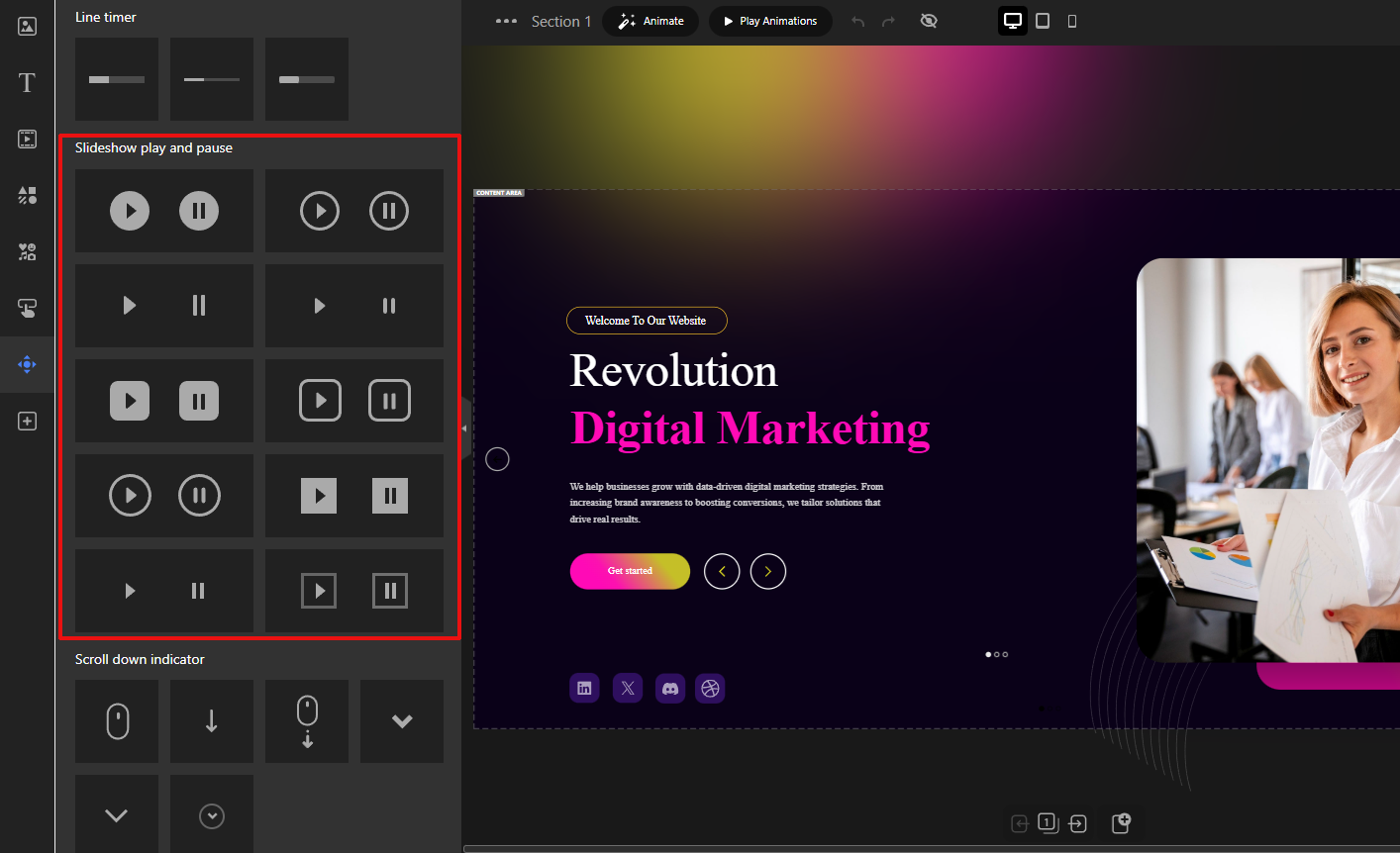
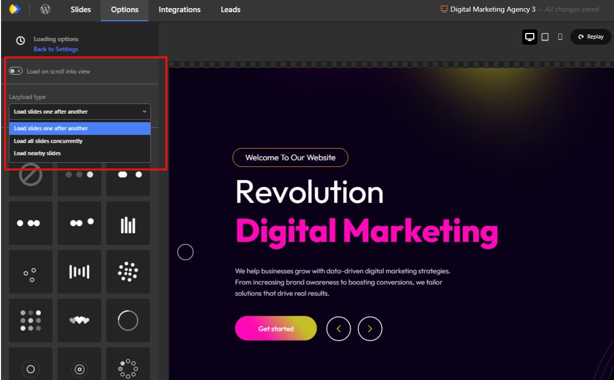
Use Lazy Loading
Lazy loading ensures images load only when they are needed, rather than all at once. Modern image sliders typically include this capability as a built-in feature and also provide additional loading-related options, such as deferred asset loading and optimized rendering behavior, to help improve overall page performance.
Load the first slide immediately
Defer loading off-screen slides
Reduce initial page weight
Avoid Excessive Animations
Complex transitions and layered animations require more processing power and JavaScript execution.
Prefer simple fades or slides
Avoid stacked animation effects
Keep transitions subtle and purposeful
Mobile User Experience Considerations
Mobile users often make up the majority of website traffic, making image slider usability for mobile users essential.
Swipe-Friendly Navigation
Sliders should feel natural on touch devices.
Support horizontal swipe gestures
Ensure smooth, responsive movement
Avoid reliance on hover interactions
Touch-Friendly Controls
Navigation elements must be large enough to tap comfortably.
Use adequately sized arrows and buttons
Avoid tiny pagination dots
Leave sufficient spacing between controls
Readable Text on Small Screens
What works on desktop often fails on mobile.
Increase font sizes for mobile breakpoints
Shorten text content
Ensure adequate line spacing
Avoid Precision-Based UI Elements
Small arrows or dots demand precise tapping, which frustrates users.
Favor clear buttons
Reduce visual clutter
Keep interaction simple
Accessibility Best Practices for Image Sliders
Accessibility is frequently overlooked in slider design, yet motion and interaction can pose real barriers for some users.
Keyboard Navigation
Users relying on keyboards must be able to navigate sliders.
Support tab navigation
Allow arrow key interaction
Ensure focus indicators are visible
Pause or Stop Autoplay
Motion can be distracting or harmful to some users.
Provide a visible pause control
Respect reduced-motion preferences
Avoid mandatory autoplay
ARIA Roles (High Level)
Assistive technologies rely on semantic structure.
Use appropriate ARIA roles for sliders
Label navigation controls clearly
Ensure screen readers can interpret slide changes
Avoid Motion Overload
Too much movement can overwhelm users.
Limit animation frequency
Avoid rapid transitions
Keep motion predictable
When to Use (and When Not to Use) Image Sliders
Intentional usage is what separates effective sliders from ineffective ones.
When Image Sliders Make Sense
Visual storytelling and galleries
Showcasing multiple related items
Highlighting featured but non-critical content
Portfolios, inspiration sections, and campaigns
When to Avoid Image Sliders
When a single message is most important
For time-sensitive or critical information
When content must be immediately visible
On pages where performance is the top priority
Sliders should support the message, not compete with it.
Intentional Design Is What Makes Sliders Work
The debate around sliders often misses the core issue: design intent. Sliders fail not because they exist, but because they are frequently overloaded, under-optimized, or misused.
A well-designed image slider loads quickly, respects user control, works seamlessly on mobile, remains accessible to all users, and enhances rather than hides content.
Final Thought
Image sliders are not a shortcut to better design but they can be effective when used with care. By focusing on performance, accessibility, and intentional usage, you can avoid common pitfalls and create a smoother, more engaging user experience that respects both users and devices.
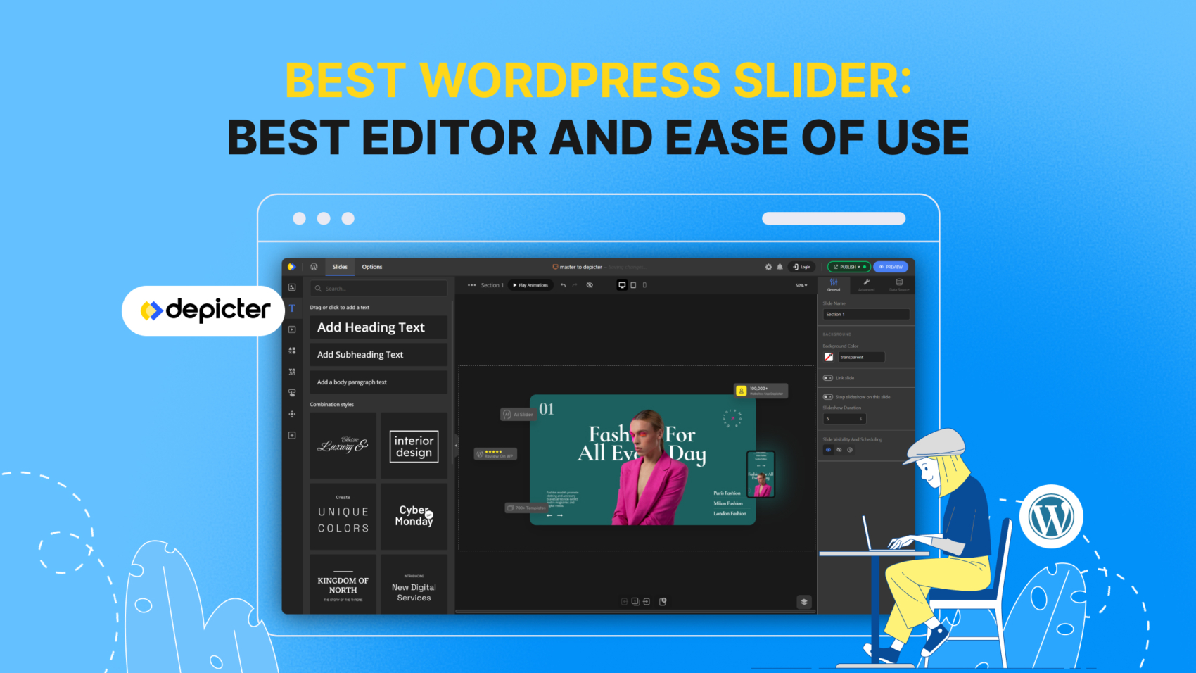
When building sliders in WordPress, ease of use is just as important as having powerful design features. Many plugins offer advanced tools, but overwhelm users with complicated interfaces. Depicter solves this by combining a clean, modern UI with a true drag-and-drop experience. It allows beginners to design sliders without code while giving professionals the flexibility to create complex layouts and animations quickly. The result: faster workflows, less frustration, and professional results every time.
There’s a simple test you can try yourself. Import a template from a different slider plugin, then try moving some elements around, resizing them, and changing their content. You’ll quickly notice the difference. Below, we’ve explained some of these features in detail.
In this guide, I will show why Depicter stands out as the best WordPress slider plugin. Instead of just providing a list of features, I offer detailed explanations and direct comparisons with other popular slider plugins. By breaking down both the strengths and weaknesses, you’ll clearly see how Depicter makes designing sliders faster, easier, and more professional.
Feature
Depicter
Slider Revolution
Smart Slider 3
Description
True Drag-and-Drop
Yes
Partial
Partial
Depicter allows free placement of any element, not restricted to grids. Others limit positioning.
Alignment & Auto Snapping
Yes
Partial
Partial
Depicter provides smart alignment guides and snapping for pixel-perfect layouts.
Not Restricted to Grid System
Yes
Partial
Partial
Depicter frees you from strict row/column layouts; great for creative designs.
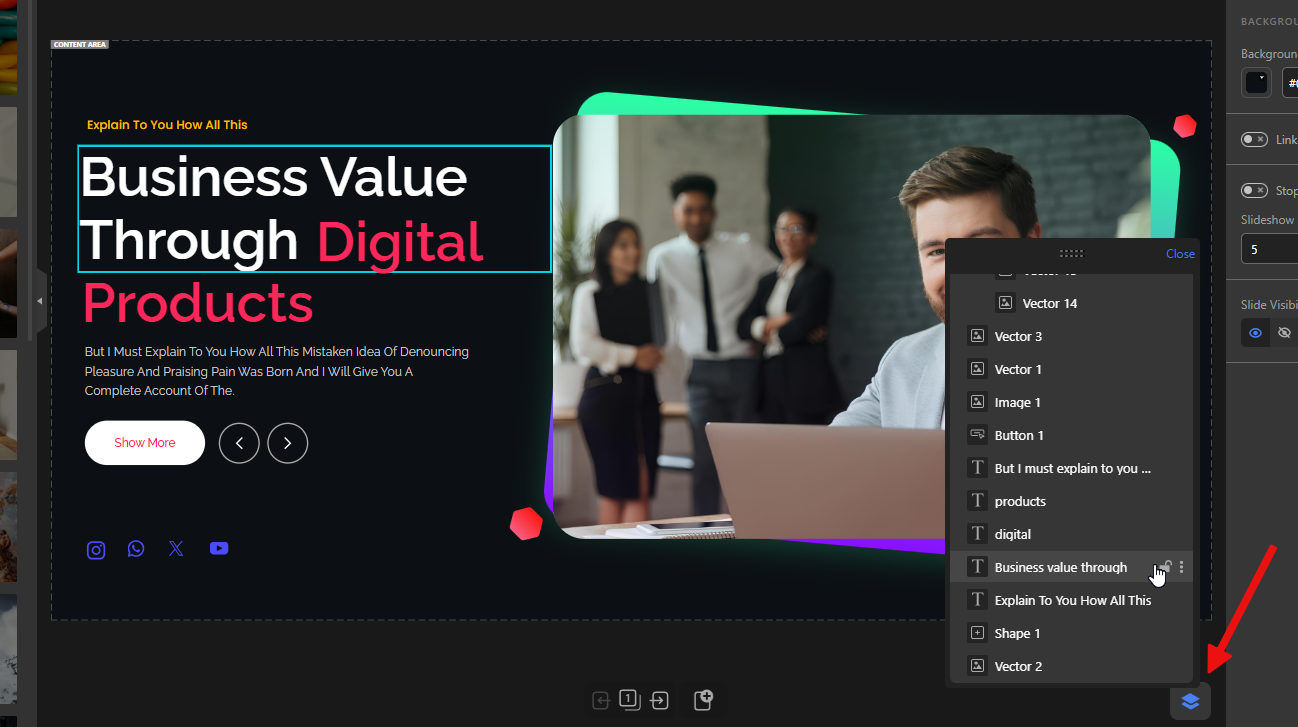
Layers Panel
Yes
Yes
Yes
Depicter’s floating panel makes navigating, selecting, and moving layers easier.
Lock Elements
Yes
Partial
No
Full locking in Depicter prevents accidental moves; others have weaker lock functions.
Selecting Overlapping Elements
Yes
No
No
Depicter allows direct selection of overlapping items on the canvas.
Contextual Options Panel
Yes
Partial
Partial
Depicter shows clear, element-specific options.
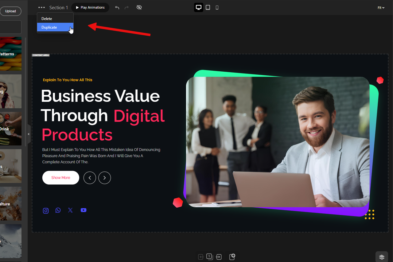
Duplicate Slides
Yes
Yes
Yes
All support duplication, but Depicter makes it one-click and keeps consistent structure.
Depicter offers these controls clearly and intuitively; others bury them in menus.
Replace Images via Drag & Drop
Yes
No
No
Depicter lets you drag new images directly over old ones for instant replacement.
Set Image as Background via Drag & Drop
Yes
No
No
Unique to Depicter: drop an image onto canvas edges to set as background.
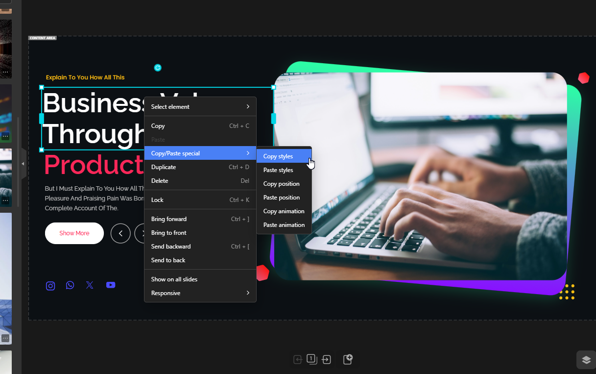
Copy & Paste Styles
Yes
Yes
No
Depicter saves time by allowing style-only copy/paste across elements.
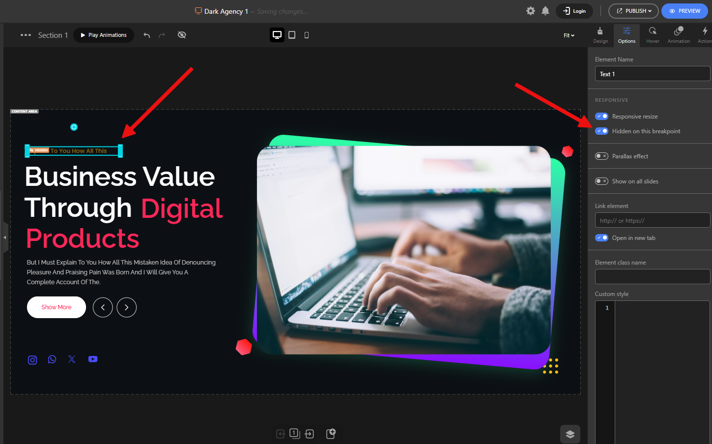
Hide Elements in Responsive Modes
Yes
Yes
Yes
Depicter lets you hide elements per device mode without deleting them.
Live Editing & Preview
Yes
Partial
Yes
Depicter provides instant preview with animation replay inside editor.
Auto Save Before Publish
Yes
No
No
Depicter auto-saves drafts but changes only go live when published.
Undo/Redo + Hotkeys
Yes
Yes
Yes
Depicter fully supports standard hotkeys (e.g., CTRL+Z) for smooth workflow.
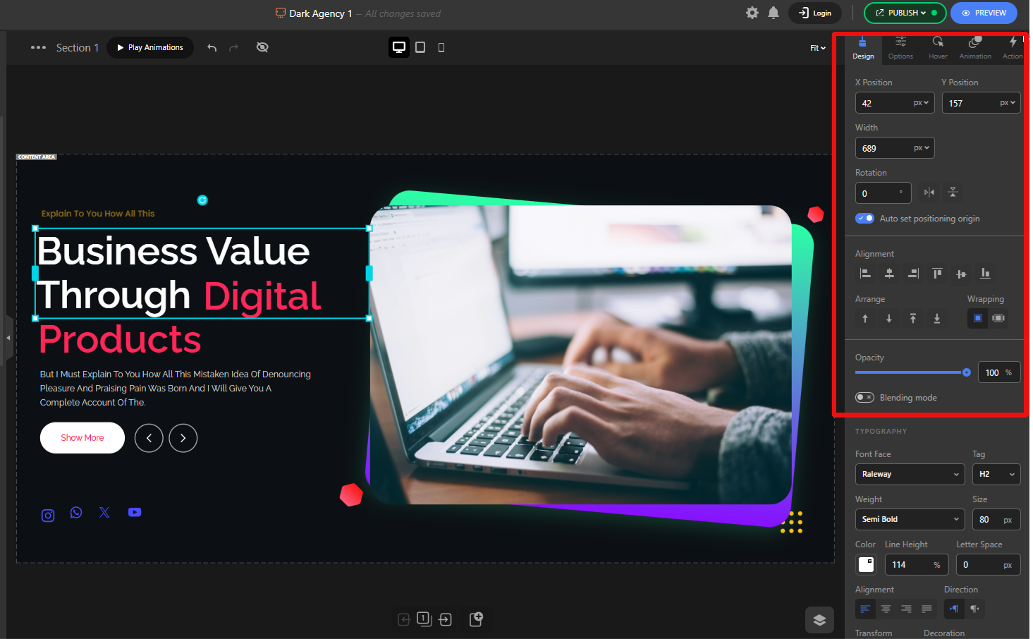
Resize & Rotate Elements Easily
Yes
Partial
Partial
Depicter allows intuitive resizing and rotation directly on canvas.
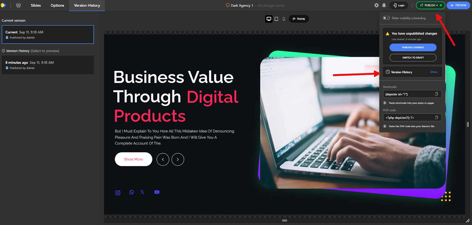
Version History
Yes
No
No
Depicter offers version rollback with live previews.
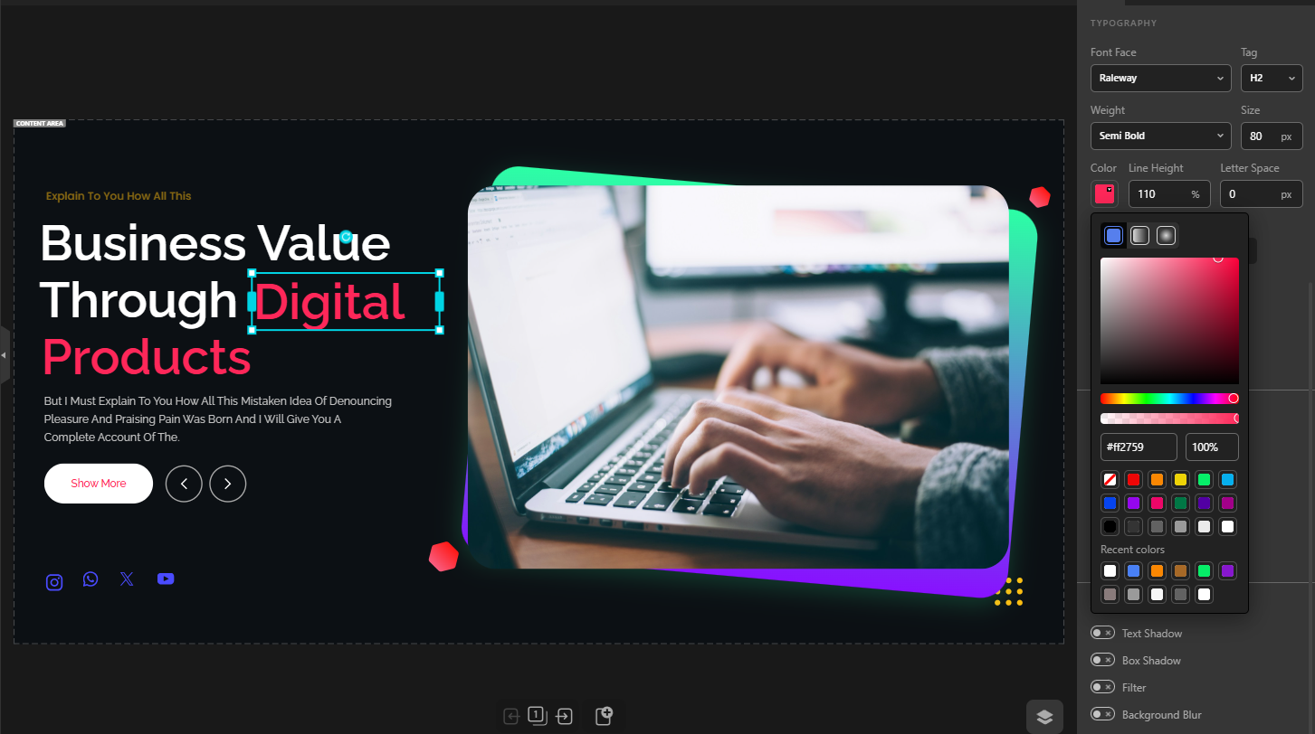
Advanced Typography (gradients, Google fonts, custom fonts, shadows, etc.)
Yes
Partial
Partial
Depicter gives complete typography control without coding.
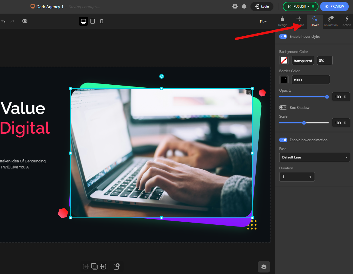
Hover Effects + Element Animations
Yes
Yes
Yes
Depicter lets you add hover effects and customized animations per element.
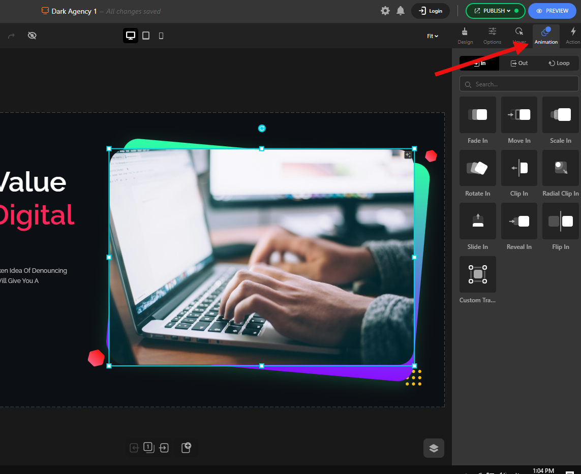
Categorized Animation Options
Yes
Partial
Partial
Depicter organizes animations by category for easier use.
Fully Categorized Options Panel
Yes
Partial
Partial
Depicter’s panel is clean and structured.
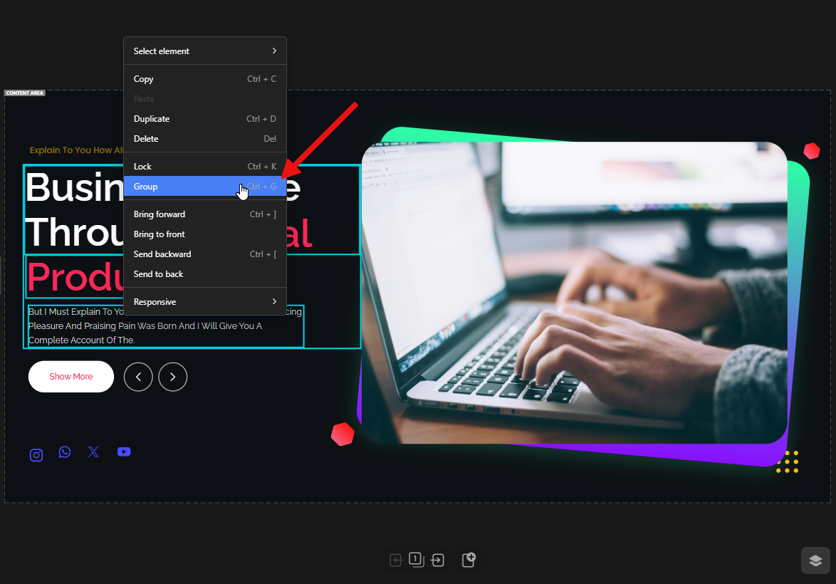
Grouping Elements
Yes
Partial
No
Depicter allows grouping for easier move/resize.
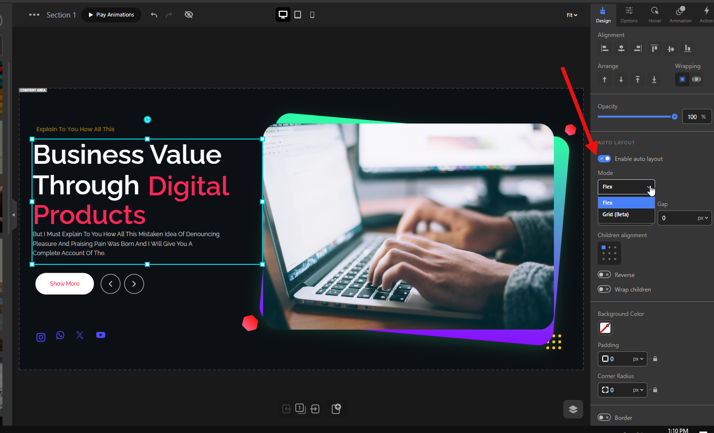
Auto Layout (Grid/Flex inside Groups)
Yes
No
No
Exclusive to Depicter: auto layout for grouped elements using Grid or Flex.
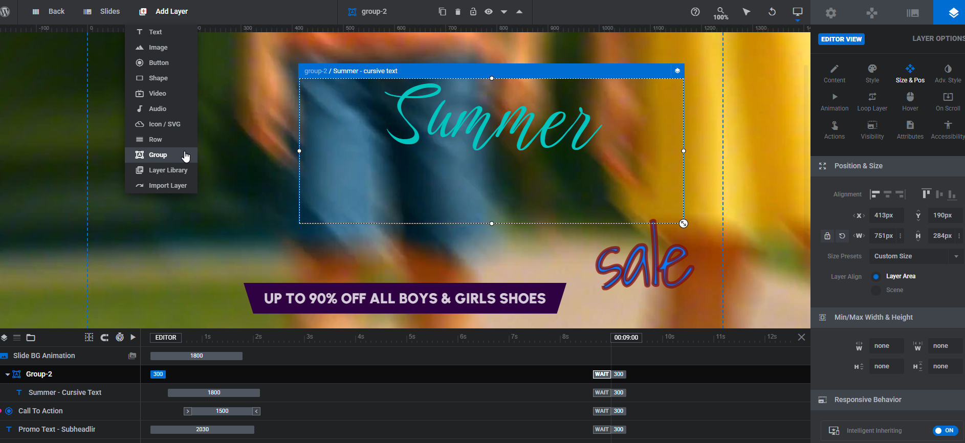
True Drag-and-Drop
Place any element anywhere – You’re not restricted to a rigid row-and-column grid. You can drag elements freely across the canvas.
Auto snapping & alignment guides – Helps align items perfectly without guessing, making layouts look professional with less effort.
💡 Why it matters: Instead of struggling with fixed grids, you get total design freedom while still maintaining neat, balanced layouts.
Other slider plugins:
Slider Revolution:
It has drag-and-drop, but it feels limited. For example, you can’t always freely move grouped elements or elements inside rows. Editing imported sliders quickly becomes frustrating because changing positions breaks layouts. Like Depicter, it also has snapping guides, but with more limited functionality. For example, if you want to align a layer based on other layers, it doesn’t accurately show the edges, and unlike Depicter, it doesn’t display the spacing either.
Smart Slider 3:
This plugin is fully based on a row-and-column system. To move elements freely, you have to manually change their position settings. This creates a confusing and complicated workflow. Also, apart from two guide lines that show the center of the slide, there are no other snapping guides.
Layers Panel
Manage all your elements in one organized list.
Quickly select, reorder, or hide layers without hunting around the canvas.
💡 Why it matters: Keeps projects organized, especially when working with complex sliders containing many elements.
Other slider plugins:
Slider Revolution:
It has a layers panel, but it’s not as intuitive. It always sits at the bottom of the editor, unlike Depicter’s floating panel, which you can move around freely.
Smart Slider 3:
Like Slider Revolution, it has a timeline that also works as the layers panel, and it’s always fixed at the bottom of the screen.
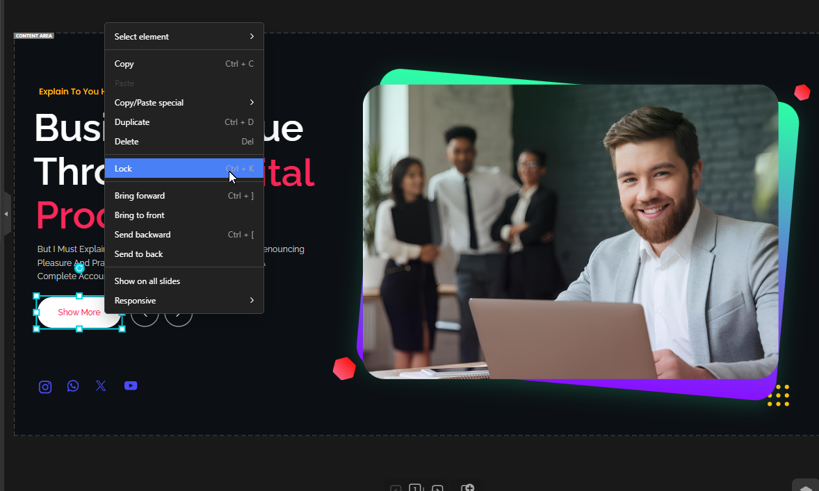
Lock Elements
Lock items in place so they don’t accidentally move while you’re designing.
💡 Why it matters: Saves time and avoids frustration during detailed adjustments.
Other slider plugins:
Slider Revolution:
It has this feature, but once a layer is locked, clicking it becomes difficult. If the locked layer is in a group, moving the group still moves the locked layer, which defeats the purpose. Depicter avoids these headaches.
Smart Slider 3:
This plugin does not have this feature.
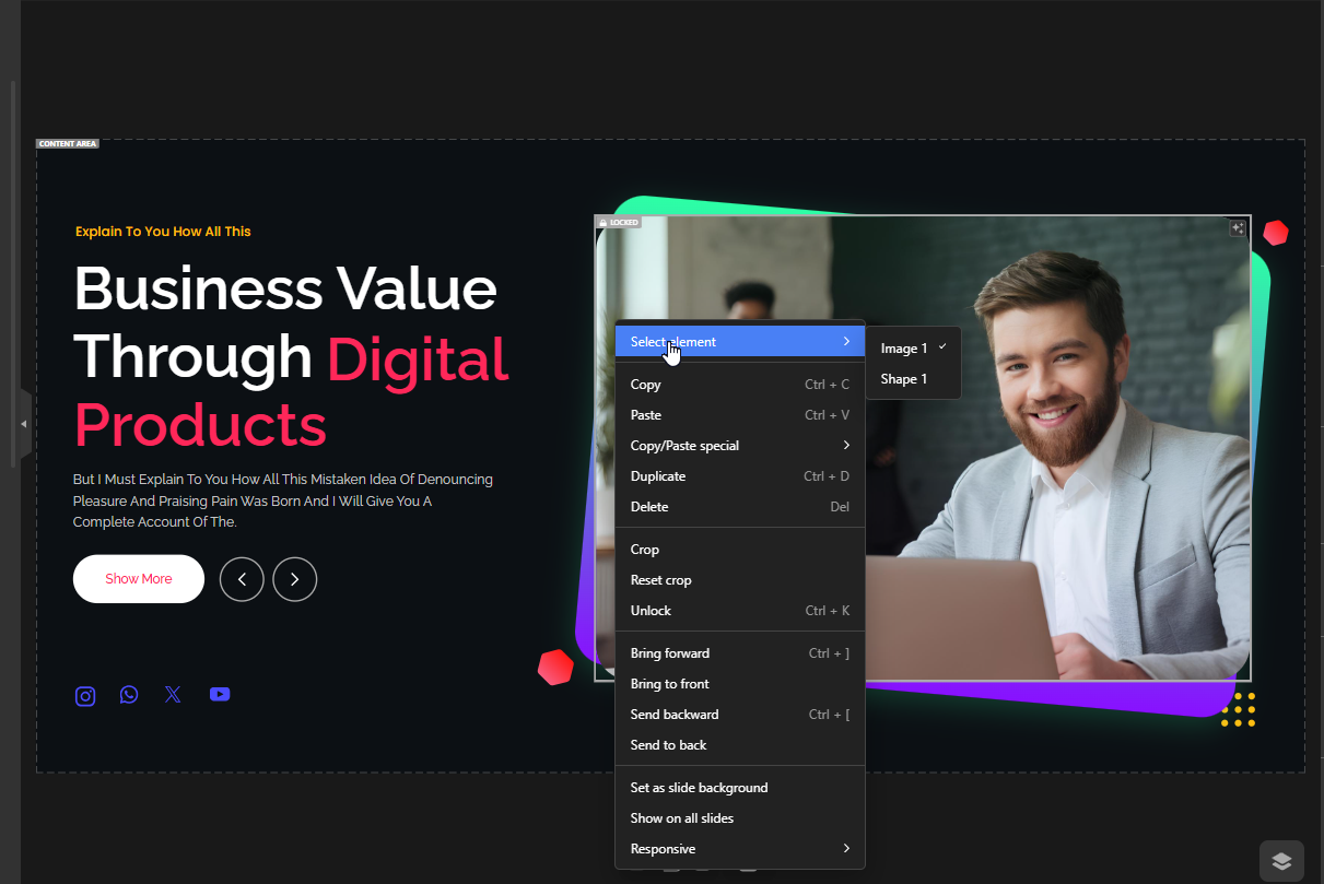
Selecting Overlapping Elements
Easily select elements even when multiple layers overlap.
💡 Why it matters: Makes editing smoother on complex or crowded designs, where you’d otherwise waste time searching for the right element.
Other slider plugins: Slider Revolution: Doesn’t have this in the right-click menu. You must go to the layers panel and manually find the item you want.
Smart Slider 3:
This plugin does not have this feature.
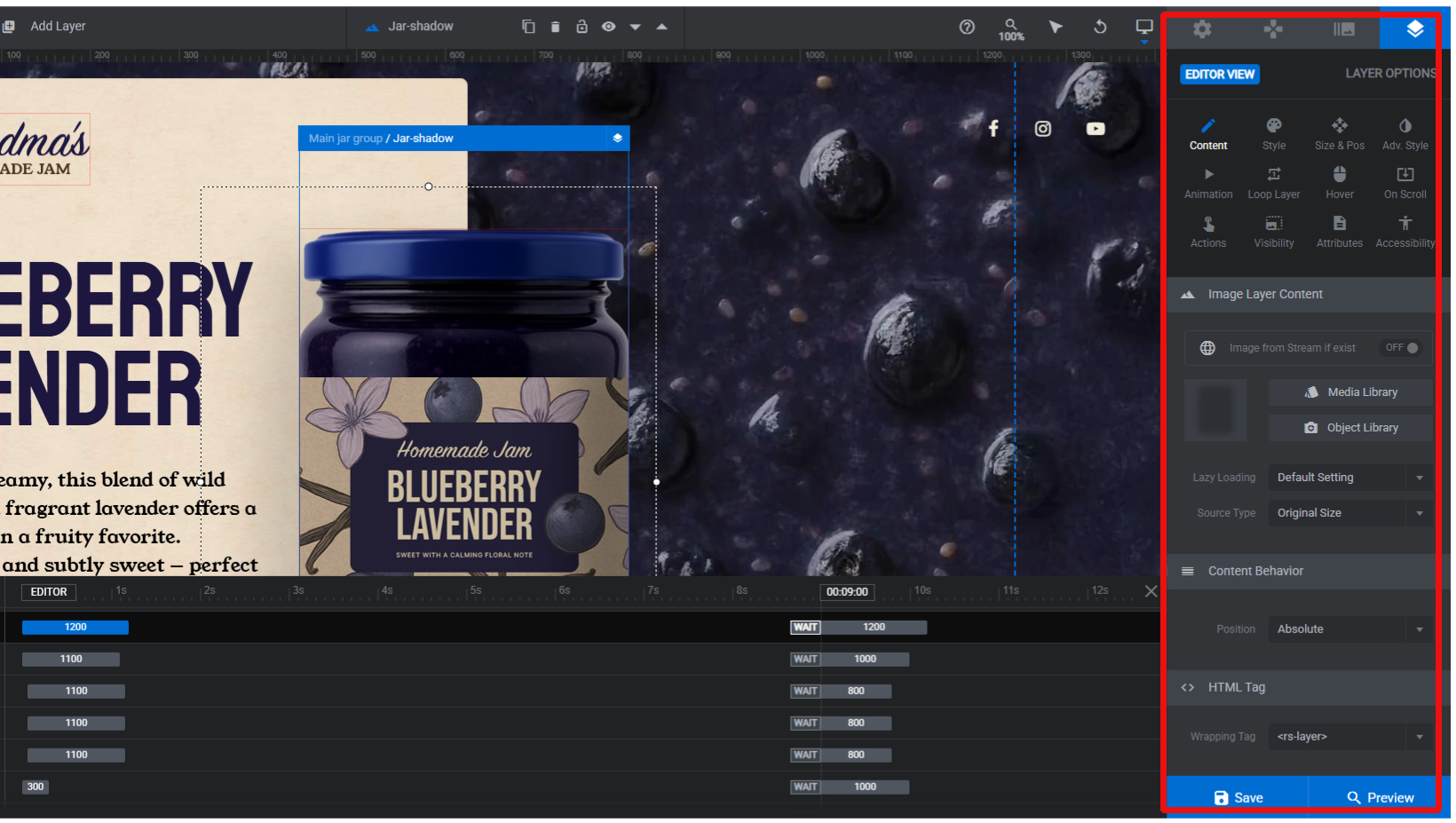
Contextual Options Panel
Each element has its own specific options in the right-hand panel (e.g., set an image as the slide background).
General controls + element-specific settings in one place.
💡 Why it matters: Streamlines your workflow—no need to dig through menus or write code.
Other slider plugins:
Slider Revolution:
Like Depicter, it shows options for each selected layer, but visually it’s cluttered — options feel crammed together, which makes the editor tiring and confusing for beginners.
Smart Slider 3:
It has a floating menu that sits on the right side of the screen by default, with a very simple UI and not so many features.
Duplicate Slides
Duplicate any slide with a single click.
Great for keeping a consistent structure across multiple slides.
💡 Why it matters: Perfect for building uniform sliders quickly, like product carousels or testimonials.
Other slider plugins:
Slider Revolution:
Works similarly and performs fine, though the UI is not as user-friendly.
Smart Slider 3:
Works similarly and performs the duplicate process.
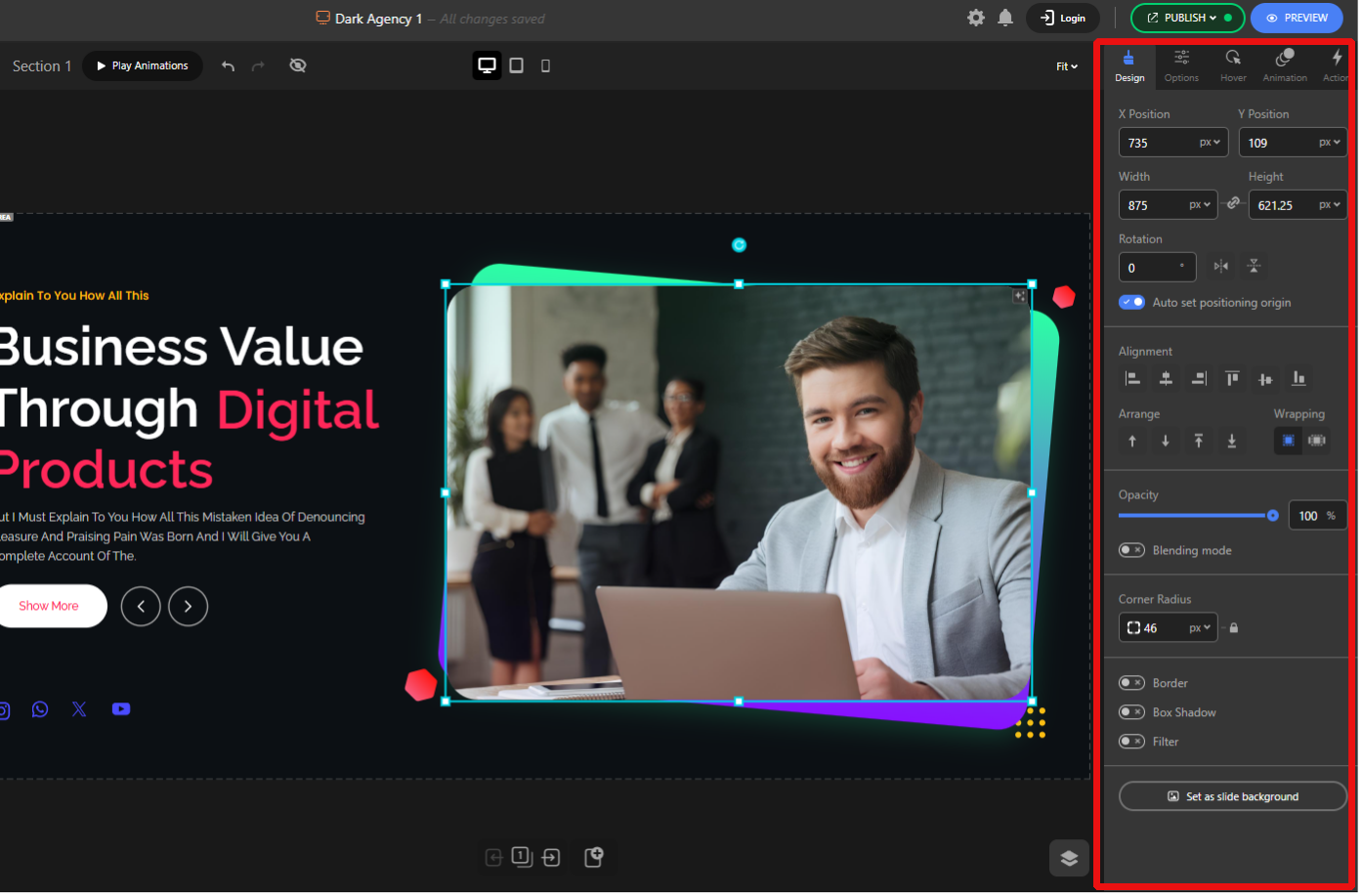
Intuitive Basic Controls
Built-in tools for positioning, flipping, rotating, aligning, arranging, adjusting opacity, and blend modes.
💡 Why it matters: These common actions are available right where you need them, so you don’t lose time searching.
Other slider plugins:
Slider Revolution:
Provides the necessary options, but the UI is more complex, and all options feel crowded, which makes it less beginner-friendly and more confusing.
Smart Slider 3:
It includes the basic options, but the arrangement is a bit messy and doesn’t prioritize the important ones. For example, to change the position, you have to go through less important options before finding the right setting.
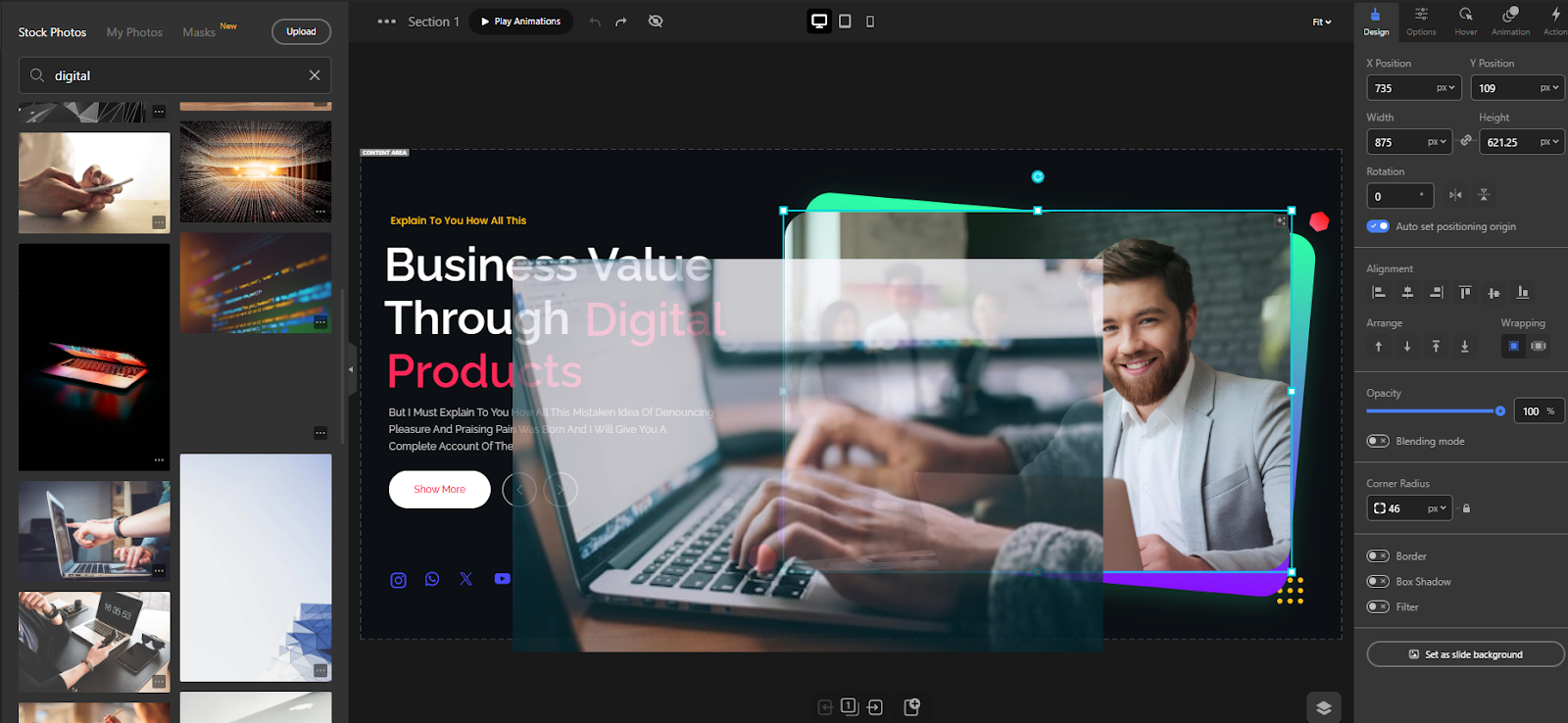
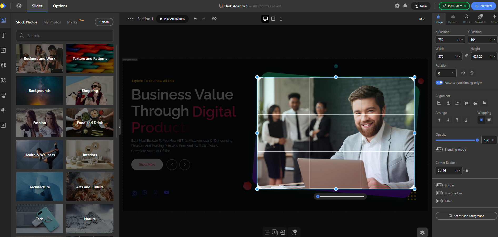
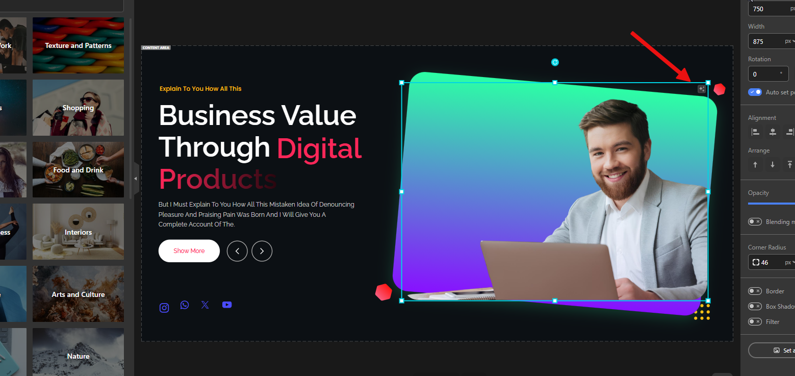
Easy Image Replacement
Drag a new image from the assets panel and drop it on an existing image to replace it instantly.
Set an image as the slider background by simply dragging it to the slider corner.
💡 Why it matters: Replacing visuals becomes a one-step action, making content updates incredibly fast.
Other slider plugins:
Slider Revolution:
Because it lacks an integrated assets panel, you must open the content tab and the media library to replace images. It also doesn’t support the same drag-to-set-background convenience.
Smart Slider 3:
Because it lacks an integrated assets panel, you must open the content tab and the media library to replace images. It also doesn’t support the same drag-to-set-background convenience, and the overall appearance feels even more basic.
Easy Text Replacement
Double-click any text layer — including buttons or any layer with text — to edit inline directly on the canvas.
💡 Why it matters: Inline editing removes context-switching and speeds up content updates dramatically.
Other slider plugins:
Slider Revolution:
Doesn’t support inline editing. You need to select the layer and replace text through the content tab.
Smart Slider 3:
Inline editing isn’t available. To change text, you have to select the layer and update it from the content tab.
Copy & Paste Styles
Copy the style of one element and apply it to another with a single click.
💡 Why it matters: Saves huge amounts of time when creating consistent designs.
Other slider plugins:
Slider Revolution:
Has copy-paste style functionality similar to Depicter.
Smart Slider 3:
This plugin does not have this feature.
Responsive Controls
Hide specific elements only on certain device views (desktop, tablet, mobile).
💡 Why it matters: It lets you design device-optimized sliders without deleting elements.
Other slider plugins:
Slider Revolution:
Also supports hiding layers per responsive mode, like Depicter.
Smart Slider 3:
It also lets you hide layers for specific responsive views.
Live Editing & Preview
See every change instantly in the editor.
Preview animations inside the editor with a Replay button—no need to go to the front-end.
💡 Why it matters: Immediate feedback means faster design iterations and fewer mistakes.
Other slider plugins:
Slider Revolution:
It has live preview features, but they’re weaker. For example, you may not see unsaved changes in preview until you press Save. It also lacks an inline Replay feature to preview slide animations directly.
Smart Slider 3:
It offers live preview features, but they’re limited. There’s no inline replay option to preview slide animations directly.
Auto Save & Publishing
All changes are saved automatically, but they only go live after you publish.
💡 Why it matters: Prevents losing progress while giving you control over what’s published.
Other slider plugins:
Slider Revolution:
Does not auto-save; you must manually press Save to preserve changes.
Smart Slider 3:
Does not auto-save; you must manually press Save to preserve changes.
Undo & Redo
Go back or forward with undo/redo buttons or keyboard shortcuts like CTRL+Z.
💡 Why it matters: Gives you creative freedom to experiment without worrying about mistakes.
Other slider plugins:
Slider Revolution:
Supports undo/redo via buttons and hotkeys as well.
Smart Slider 3:
It supports undo and redo, both through buttons and keyboard shortcuts.
Resize & Rotate
Adjust element size and angle directly on the canvas.
💡 Why it matters: Quick, intuitive adjustments keep the design process smooth.
Other slider plugins:
Slider Revolution:
It also offers resizing, but with fewer details than Depicter — for example, it lacks a dedicated rotate handle. And when you resize a text layer, the font size doesn’t adjust automatically, so you have to change it manually.
Smart Slider 3:
Just like Slider Revolution, resizing is available but less refined — no rotate handle, and text layers don’t auto-adjust font size.
Version History
Access past versions of your published slider.
Restore any version with a live preview.
💡 Why it matters: Safe experimentation—you can always roll back if needed.
Other slider plugins:
Slider Revolution:
Doesn’t offer switching between published versions or restoring a previously published snapshot. It only provides undo for changes during the current editing session.
Smart Slider 3:
This plugin does not have this feature.
Advanced Typography & Styling
Full typography control with color picker, gradient types, Google Fonts, or custom theme fonts.
Add borders, shadows, filters, and more.
💡 Why it matters: Professional-grade design options without needing extra tools like Photoshop.
Other slider plugins:
Slider Revolution:
Has strong typography features, but options are scattered across different tabs, which makes them harder to find. Some details are less refined than Depicter — e.g., Depicter can inherit theme fonts or apply multiple gradient modes in ways Slider Revolution doesn’t.
Smart Slider 3:
It has far fewer options, with a very basic color picker and no Gradient. Layout settings are messy and hard to work with. The experience feels nothing like “Advanced”.
Hover Effects & Animations
Apply hover effects or entry animations to individual elements.
Choose from categorized animation presets with customizable settings.
💡 Why it matters: Adds interactivity and motion that captures user attention.
Other slider plugins: Slider Revolution:
Offers a large set of advanced animations and fine-grained controls, but lacks helpful guidance. Depicter groups and labels animations to help you choose; Slider Revolution often only shows names and requires previewing to understand the result. Depicter also lets you preview the animation inline without opening the preview panel.
Smart Slider 3:
The categorization and presentation of animations are acceptable, but the options are limited and it doesn’t provide a large number of animations.
Organized Options Panel
Everything is grouped into categories with toggle switches and sliders.
No need for manual code or CSS tweaks.
💡 Why it matters: Makes advanced features approachable for all skill levels.
Other slider plugins: Slider Revolution:
Its right-hand panel tends to be cluttered and less organized. Many options live in the same place, making it harder to find the right controls or expect logical submenus — overall, it reduces ease of use.
Smart Slider 3: The general slider settings are located outside the editor, in the dashboard.
Grouping & Auto Layout
Select multiple elements and group them.
Move or resize them together.
Enable Auto Layout to arrange them with Grid or Flex properties.
💡 Why it matters: Keeps grouped elements aligned and consistent, especially useful for designing complex sections like product grids or galleries.
Other slider plugins: Slider Revolution:
Adding, editing, and managing groups is not easy with Slider Revolution. You must add a group layer and then drag layers into the group in the timeline, whereas in Depicter, you can select multiple elements and right-click to group them.
In Slider Revolution, a small moving element may cause it to leave the group, and groups don’t offer the same enhanced behaviors that Depicter provides, like the Auto Layout feature.
These workflow frictions become very annoying on larger projects.
Smart Slider 3:
This plugin does not have the grouping feature at all.
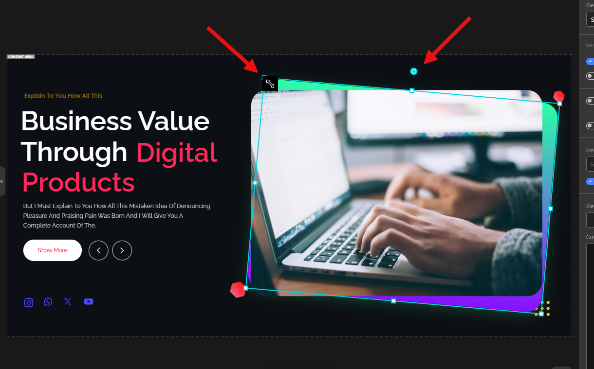
Easy Crop Mode
Double-click an image to enter crop mode and crop it directly inside the editor.
💡 Why it matters: Saves time and avoids switching to external tools — you can get the exact framing you need without leaving the slider editor.
Other slider plugins: Slider Revolution:
Does not include an integrated crop feature. You must prepare and crop images beforehand.
Smart Slider 3:
This plugin does not have a cropping feature.
Auto Background Remover
Remove image backgrounds with one click using AI for clean, professional visuals.
💡 Why it matters: Simplifies creating polished designs and hero sections without separate image-editing tools.
Other slider plugins:
Slider Revolution:
No equivalent built-in background removal feature.
Smart Slider 3:
This plugin does not have this feature.
Conclusion
When it comes to building sliders in WordPress, ease of use and a smooth editing experience make all the difference. While Slider Revolution offers deep functionality and Smart Slider 3 provides a balanced middle ground, both come with limitations in usability, flexibility, or modern UI design.
Depicter, on the other hand, strikes the perfect balance: it’s truly no-code, visually intuitive, lightweight, and packed with smart tools that speed up the design process. From true drag-and-drop freedom and responsive editing to version history, advanced typography, and grouped auto layouts, every detail is designed to save time and make creativity effortless.
The result? Depicter makes slider building not just faster—but also more enjoyable. For beginners, it removes the learning curve; for professionals, it delivers creative freedom without the clutter. That’s why Depicter is the best choice for ease of use in WordPress sliders.
FAQs – Best WordPress Slider for Ease of Use
Q1: What makes Depicter’s drag-and-drop builder better than other WordPress slider plugins? Depicter offers a true drag-and-drop experience, letting you place elements anywhere on the canvas with smart alignment guides and auto-snapping. Unlike other plugins that restrict layouts to rigid grids, Depicter gives you total creative freedom without complexity.
Q2: Is Depicter the best WordPress slider for beginners? Yes. Depicter is designed as a no-code slider builder with an intuitive interface. Beginners can create professional-looking sliders in minutes without coding or technical knowledge.
Q3: Can I undo or revert changes in Depicter if I make a mistake? Yes. Depicter includes undo/redo hotkeys, auto-saving, and version history. You can easily roll back to a previous design version whenever you need.
Q4: How does Depicter compare to Slider Revolution and Smart Slider 3 in ease of use? Slider Revolution is powerful but comes with a steep learning curve. Smart Slider 3 is easier, but its interface feels outdated. Depicter strikes the balance—it’s modern, lightweight, and the most user-friendly WordPress slider plugin.
Q5: Can I use Depicter with page builders like Elementor or Gutenberg? Definitely. Depicter works seamlessly with Elementor, Gutenberg, Divi, WPBakery, and other popular WordPress page builders. This makes integration into your existing workflow effortless.
Q6: Is Depicter free, and what’s included in the free version? Yes. Depicter has a free version that includes all essential features and templates to build stunning sliders at no cost. The Pro plan unlocks advanced design tools, more templates, and deeper customization starting at an affordable price.
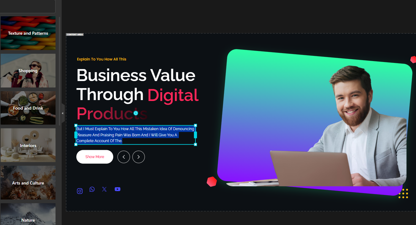
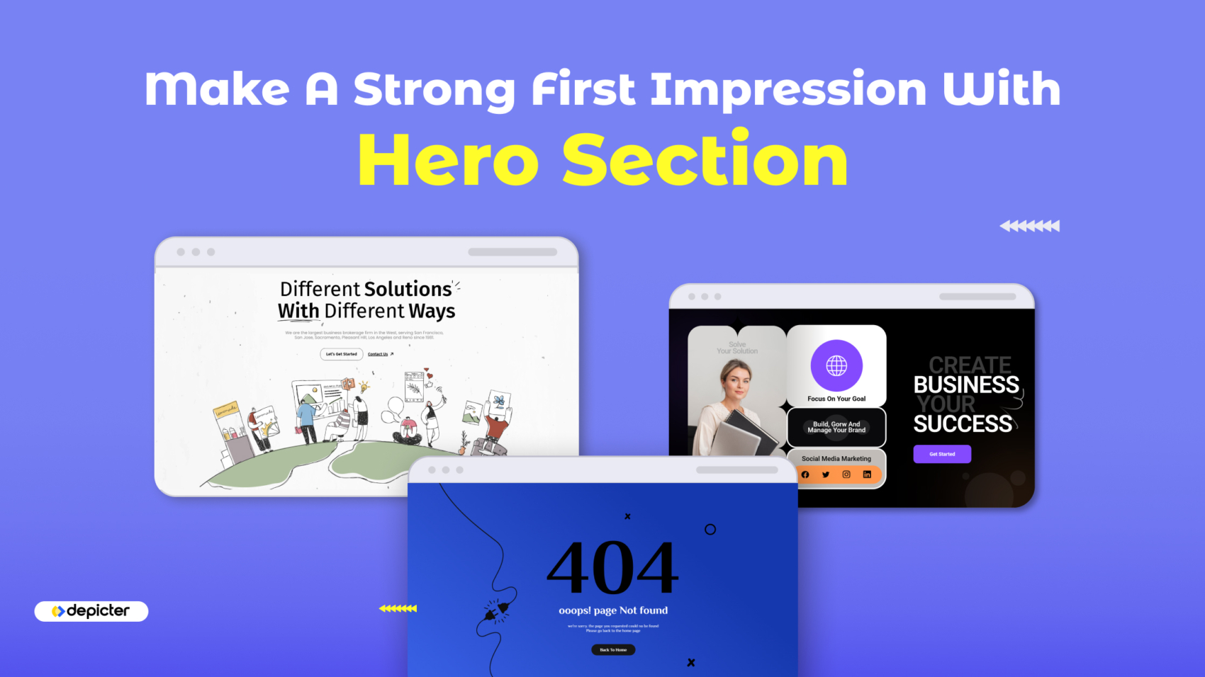
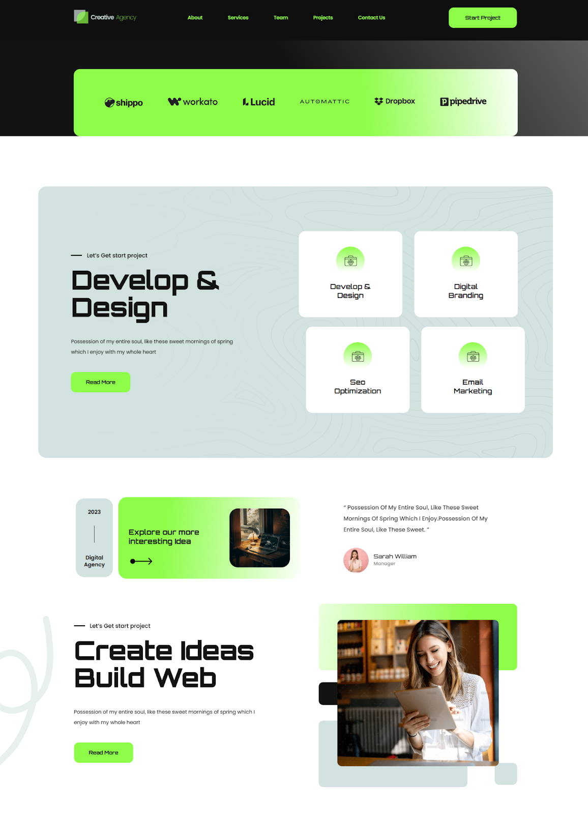
Making a strong first impression is everything. That’s where the hero section comes in. A large, visually striking area at the top of your page designed to grab attention, instantly communicate your brand, and encourage visitors to take action.
Whether you run a blog, an online portfolio, or an ecommerce site, having an image slider might be essentials in some part of your pages but a well-designed hero section can elevate your site’s appeal and guide users right where you want them next, whether that’s reading an article, subscribing to your newsletter, or checking out a product.
Plus, with the right tools, you don’t need to be a designer or coder to do it. In fact, by using Depicter, you can craft a polished, results-driven hero section in minutes, helping you boost engagement, improve conversions, and make your site look like a pro built it—without the typical marketing fluff or complicated setup.
What Is a Hero Section and Why Does It Matter
Let’s provide a good answer to the question, “What is the hero section of a website?”.
It is the large, eye-catching area at the top of a webpage. Often the first thing visitors see. It usually includes a strong headline, a background image or video, a short message, and a clear call-to-action like a button or link. What makes it so important is that it sets the stage for the rest of your site. In just a few seconds, it helps users understand who you are, what you offer, and what they should do next.
The website hero section is useful for many reasons. If you’re running a blog, it can highlight your latest or most popular post. For businesses, it can showcase a product, a special offer, or a company mission. If you’re building a portfolio, it can give a quick snapshot of your work or skills.
And for e-commerce sites, it’s a great way to promote sales or new arrivals. A strong hero section keeps visitors engaged, makes your message clear, and encourages them to explore further, which can lead to more clicks, more signups, and even more sales.
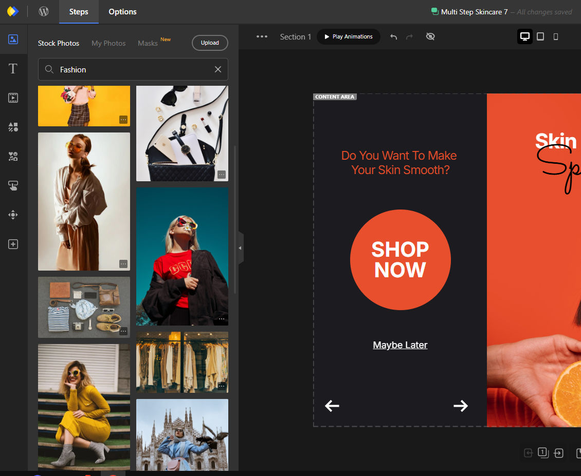
How to Create a Hero Section in WordPress with Depicter
What is Depicter?
Depicter is a powerful all-in-one tool for building website slider, popups, notification bars, and more — and it makes creating a WordPress hero section simple, even if you don’t write code. With its flexible features, you can catch your visitors’ attention, highlight key messages, or lead users through your content in a clear, visual way.
It supports dynamic content, works great on all screen sizes, and includes smooth animations and a wide range of templates. Depicter helps you build standout visuals without needing a handful of different plugins.
Before you start, make sure that the Depicter plugin is installed on your site.
Just head to the Plugins section in your WordPress dashboard and search for “Depicter” — it’s quick and easy to add.
Check out our full guide and video tutorial on how to install Depicter if you need help doing that.
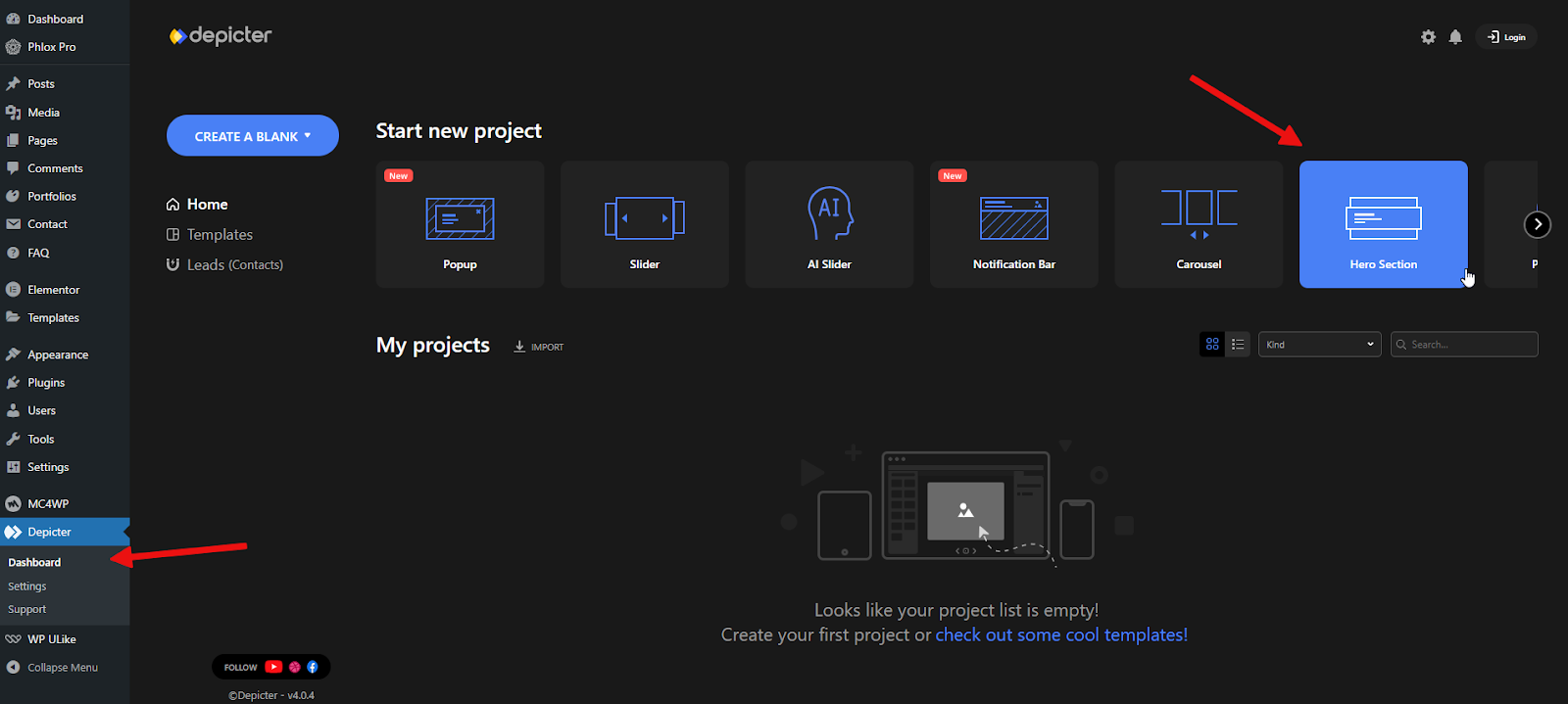
Here we have a website where, as you can see, the first thing a visitor sees doesn’t really make an impression. It lacks visual impact and doesn’t offer any real value to the site owner. Let’s change that to a hero section website together.
Importing a Template
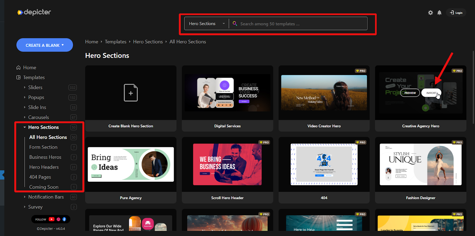
Once you’ve installed Depicter, open the dashboard and head to the Hero Section area to get started.
To save time, we’ll start with a pre-designed template. It’s the fastest way to build your layout without building everything from the ground up.
With Depicter’s wide range of templates and hero section examples, you can put together a clean, professional hero section in just a few clicks.
Use the menu on the left to explore different categories, or simply type in a keyword in the search bar to quickly find a design that fits your needs.
Once you find a template you like, click Import to get started.
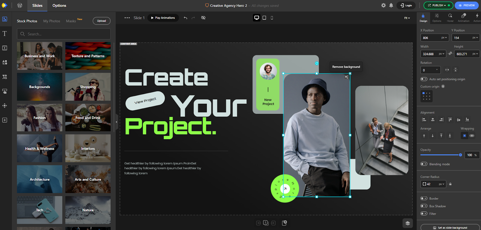
The template will load in a few seconds, and you’ll be taken directly to the Depicter editor.
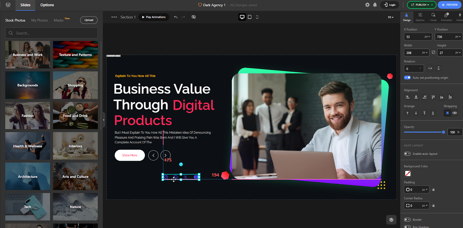
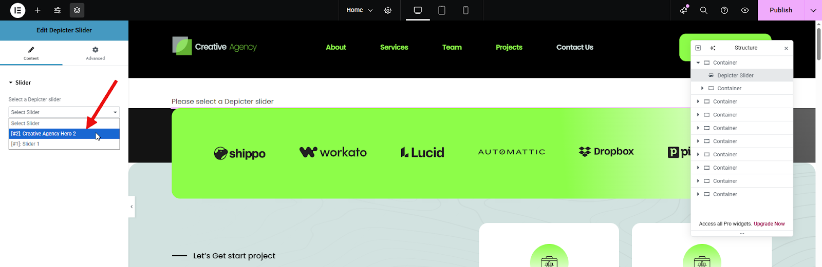
From there, you can customize everything — just click on any element, and its settings will show up on the right-hand side for easy adjustments.
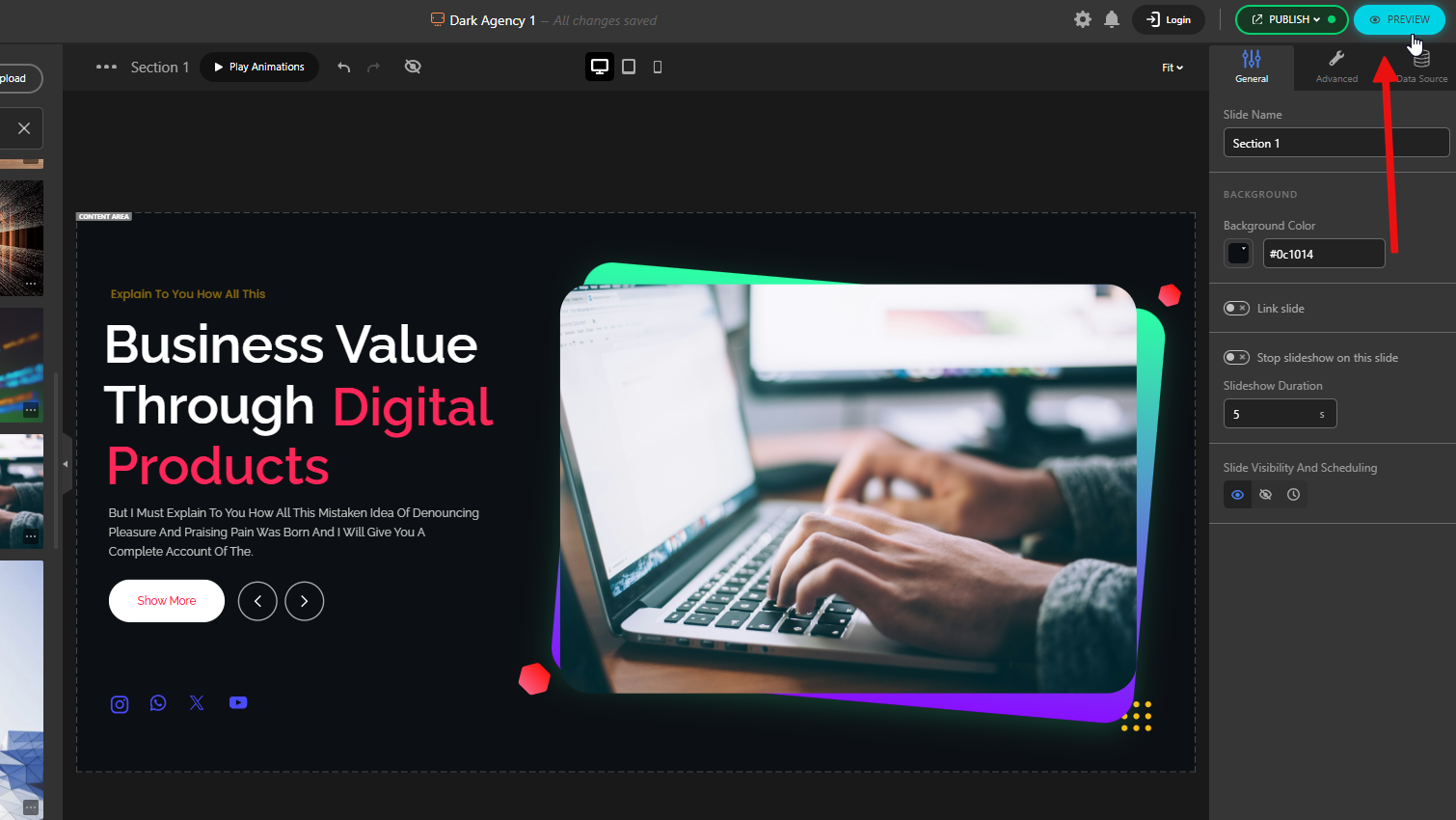
Alright, once we’ve made our changes, we click the Publish button and move on to adding our new Hero Section to the website.
Add Your Hero Section to Your Page
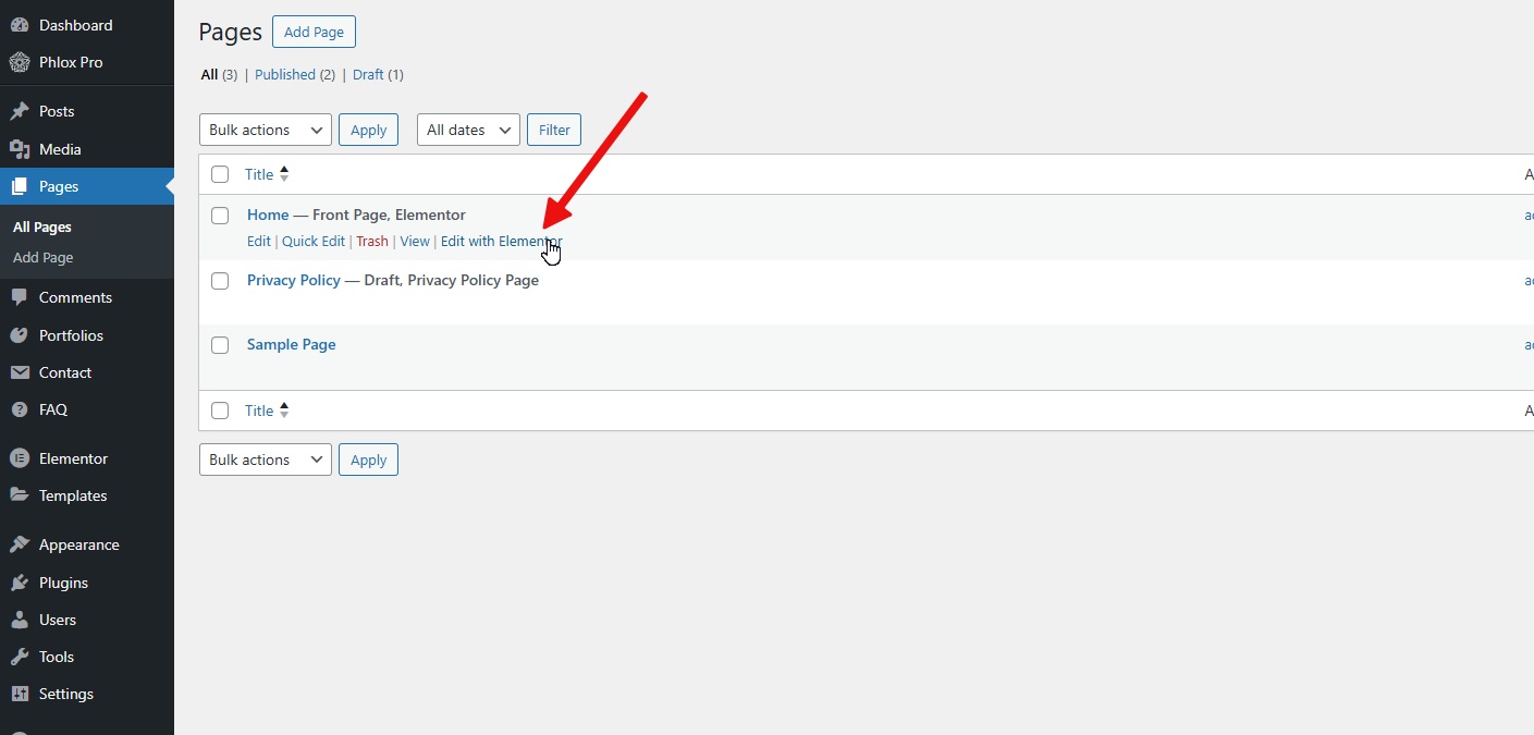
Since our page was built with Elementor, we’ll click Edit with Elementor to open the editor.
Basically, what we’re doing here is adding an Elementor Hero Section to our site.
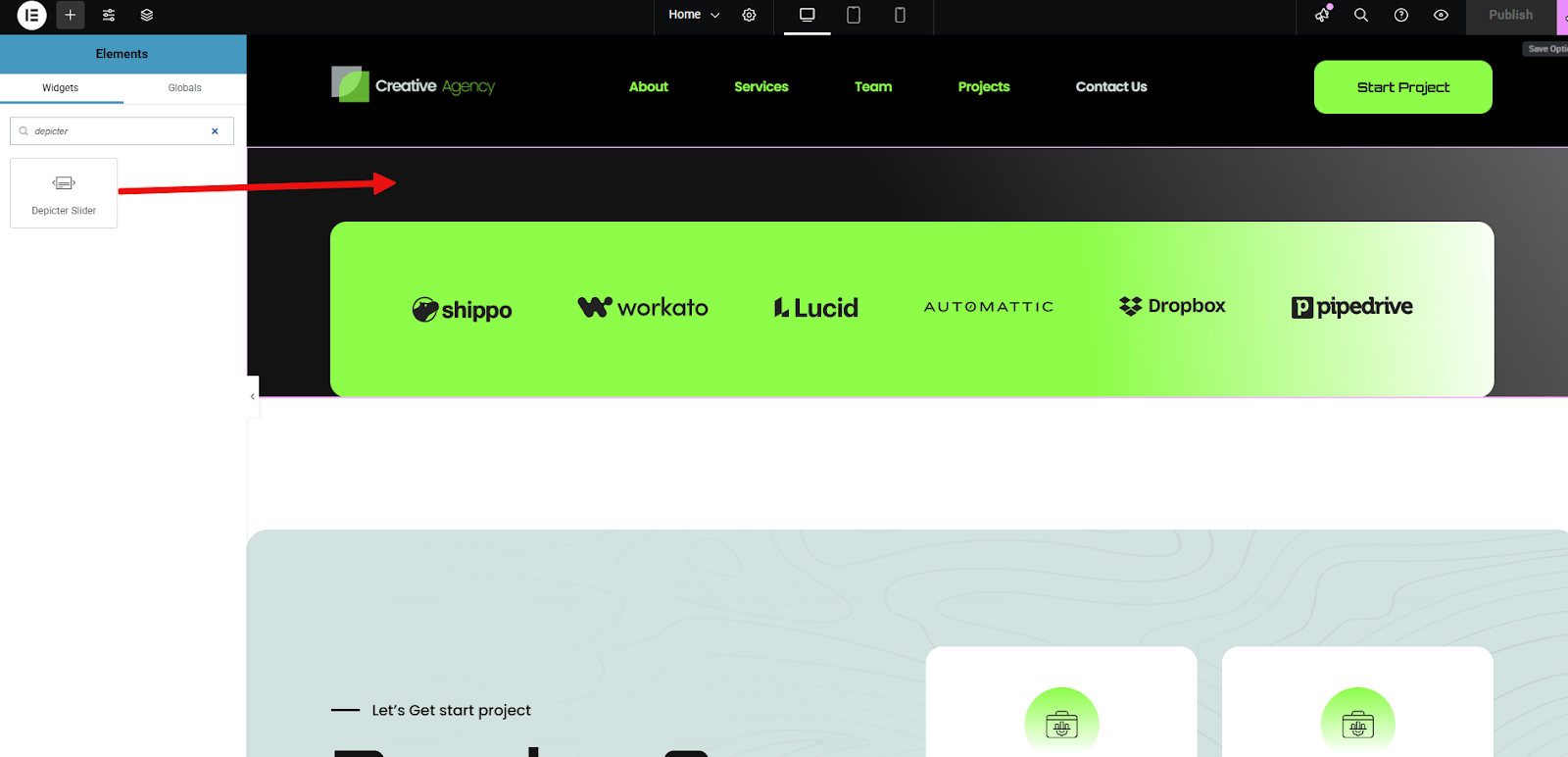
Once you’re inside the Elementor editor, use the search bar on the left panel to look for “Depicter.”
You’ll see the Depicter widget designed specifically for Elementor — just drag it into the section where you want your Hero Section to appear.
In the next step, select Hero Section from the list that appears.
It will then be displayed right on your page.
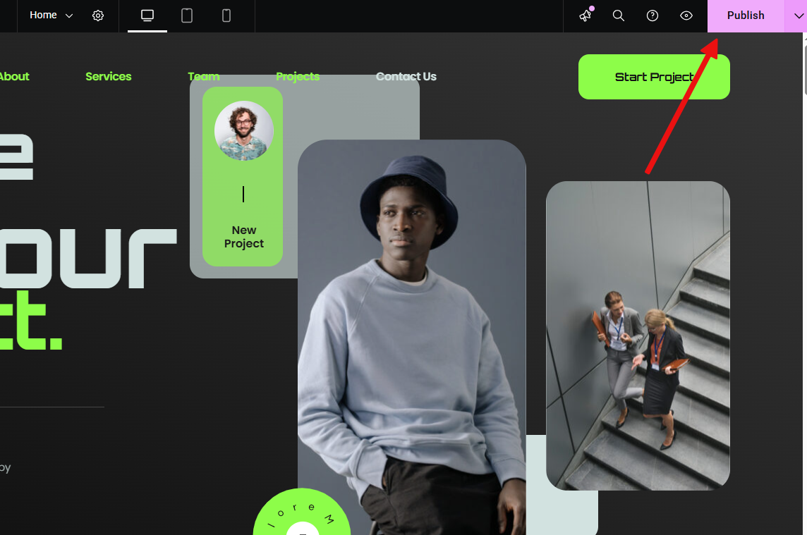
That’s it! Just click Publish to save everything on your page.
As you can see, this is the final result. A smartly designed visual with eye-catching elements that make a strong first impression and help capture your visitors’ attention in those crucial first few seconds.
Conclusion
It isn’t just a nice design touch — it’s a crucial part of how visitors experience your site. It gives them something clear to focus on, sets the tone for what’s ahead, and guides them toward the next step. Whether you’re highlighting a blog post, a product, a service, or your personal story, the hero section helps you say it loud and clear, right from the start.
Thanks to Depicter, creating a website hero section doesn’t require design skills or technical know-how. With a few clicks, you can build a sharp, professional Hero Section that fits your site perfectly — helping you stand out and make a better first impression.
FAQs
Do I need to know how to code to use Depicter?
No. Depicter is fully visual and drag-and-drop. You can create and customize everything without touching a single line of code.
Are there free templates available?
Absolutely. Depicter includes a range of free, professionally designed templates, including ones specifically for Hero Sections.
Will the Hero Section be mobile-friendly?
Yes. All templates in Depicter are fully responsive and adjust automatically to different screen sizes.
What else can Depicter do?
In addition to Hero Sections, Depicter can help you build sliders, popups, notification bars, and more — all in one tool.
Congratulations on choosing the best Popup Builder and Slider plugin! You’re now part of a growing community of over 100,000 happy and satisfied users.
Depicter is built by Averta. We’ve been part of the WordPress community for more than a decade.
Our team is also behind Phlox (50K+ customers on ThemeForest) and Master Slider (30K+ on CodeCanyon, 80K+ active installs on WordPress.org). That same expertise powers Depicter, and we continue our mission to elevate WordPress experiences.
We’re about to begin an exciting journey together starting tomorrow! But before we dive in, I’ve listed a few helpful places below that you’ll want to get familiar with. Throughout this journey, you’ll learn how to create eye-catching content for your website and pick up valuable marketing tips to help grow your business.
Don’t worry, everything will be simple and easy to follow, and we’ll be with you every step of the way. You’re never alone in this.
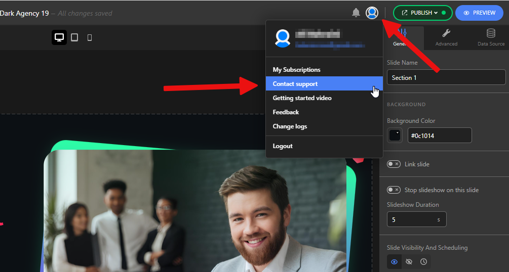
If you ever have questions or need support, just reach out using the links below.
Depicter Members Area
This is our recommended first stop. It’s a free support portal inside your account where you can manage your subscriptions and get quick help.
We’re available around 14 hours a day to chat with you live. Just head over to depicter.com and look for the chat button in the bottom right corner.
Whether you need quick guidance, have a technical question, or just want to share feedback, we’re here and happy to help. Don’t hesitate to reach out anytime during your journey.
Help Inside the Product
Need help while working inside Depicter? Just click on the highlighted areas to contact our support team directly.
We’ve built support right into your workflow to make sure you never lose momentum.
WordPress.org Support Forum
You can also post your questions on our community forum here:
Our team regularly checks the forum, and you’ll also find answers from other experienced Depicter users. It’s a great place to ask questions, share ideas, or browse existing topics for quick solutions.
Subscribe to Our YouTube Channel
Don’t forget to subscribe to our YouTube channel. We release 1–2 new tutorials every week to help you get the most out of Depicter.
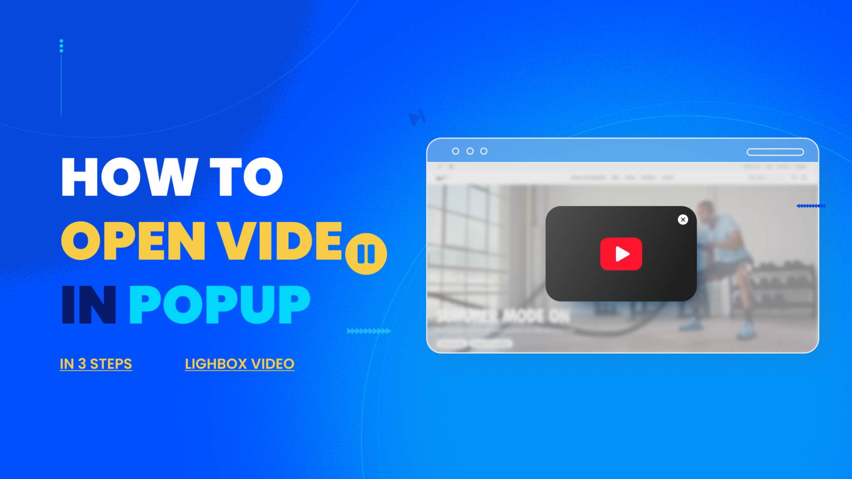
Video popups are a powerful way to grab attention, increase engagement, and drive action, right when it matters most. As studies show, people now spend nearly half their online time watching videos, and the majority prefer learning about products through short, engaging clips.
If you want your visitors to actually watch your videos and take action, putting them in a popup video is one of the smartest moves you can make—it keeps their focus, eliminates distractions, and delivers your message exactly when they’re most likely to engage.
This not only makes the experience smoother but also boosts time on site, click-through rates, and conversions. Simply put, if you want your message to be seen and remembered, a well-timed video popup is one of the most effective tools you can use.
Let’s learn how to create a video popup with everyone’s favorite Free Popup Builder, the Depicter.
This video walks you through the entire process of creating a video popup with Depicter, but if you prefer step-by-step written instructions, just keep reading.
Step 1: Install Depicter Free
Before getting started, make sure you have the Depicter plugin installed. You can easily find and install it by searching “Depicter” in the Plugins section of your WordPress dashboard. For a step-by-step guide with a video tutorial, check our guidelines here.
Step 2: Prepare Your Call to Action Element
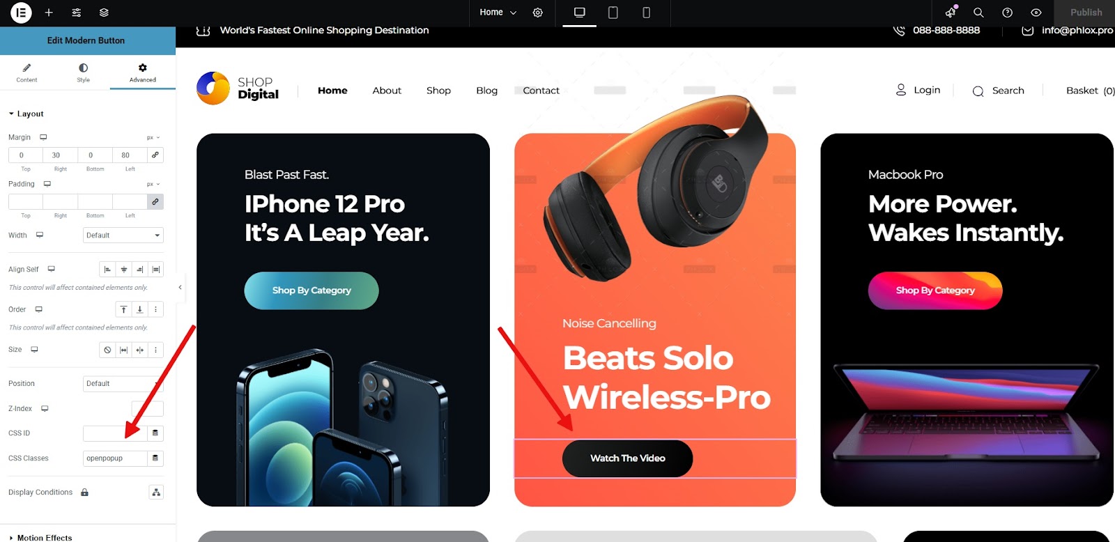
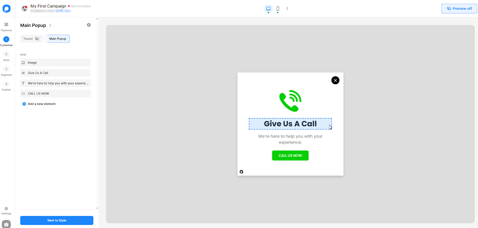
Our setup is simple. On the homepage of our website, we place a button. When users click this button, our video popup should open.
To make this happen, we simply assign a CSS selector—either an ID or a class—to the button.
Since the page was built using Elementor, we are creating an Elementor video popup (though the process is the same with any Page Builder). After opening the Elementor editor, open the Advanced tab, and enter a custom class name, let’s say “openpopup” in the CSS Classes field.
That’s all there is to it! We save the changes, and the button is now ready to trigger the popup.
Step 3: Create Your Video Popup with Depicter
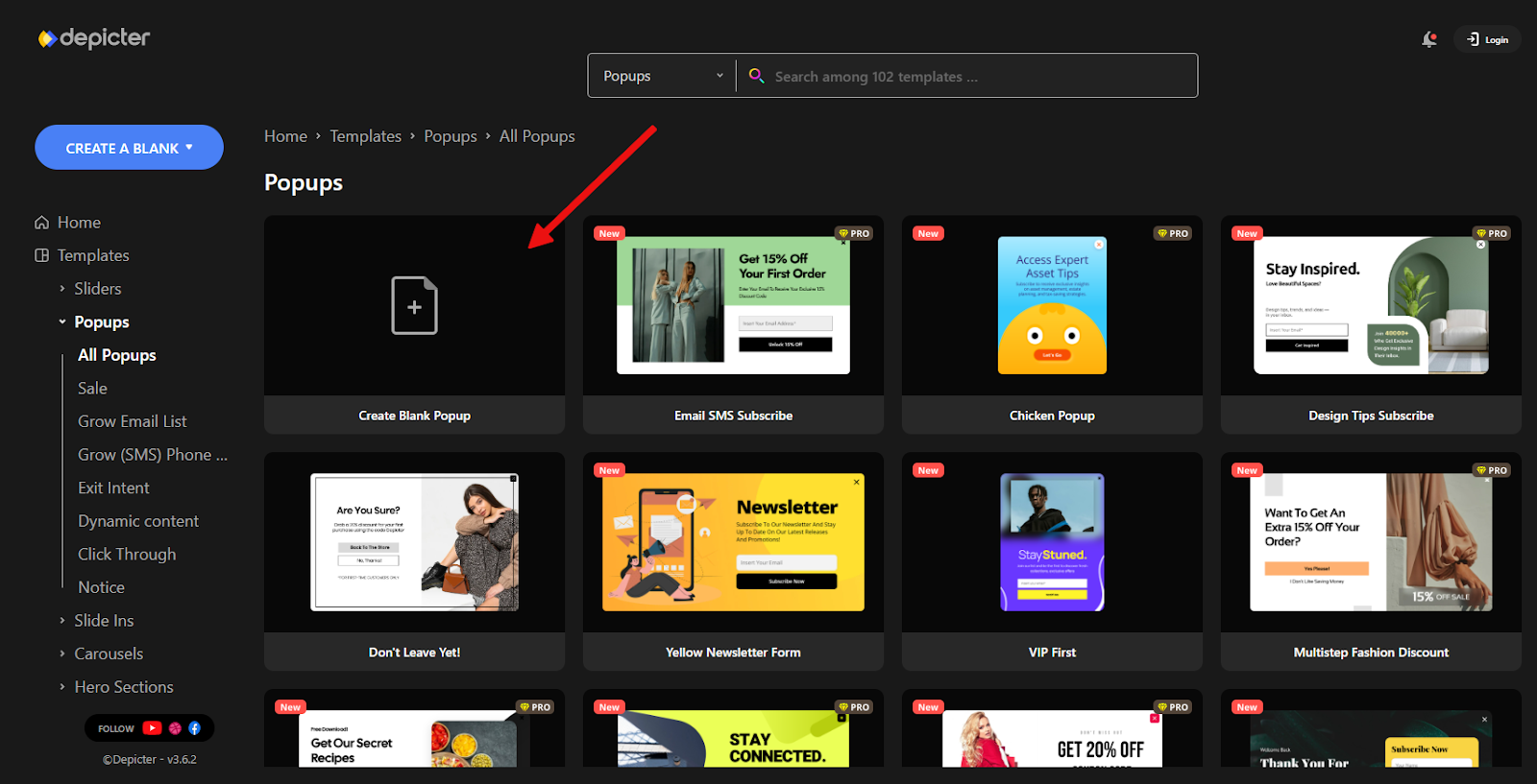
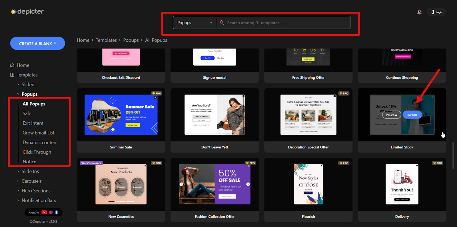
After opening the Depicter dashboard, go to the Popup section.
Although Depicter offers over 600 ready-to-use templates that make the process quick and easy, in this case, we want to build a simple popup from scratch. So, click on Create Blank Popup.
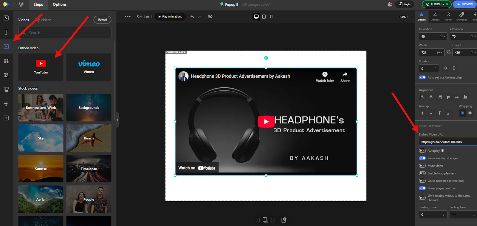
Once inside the Depicter editor, click on the Videos tab in the left panel and add the YouTube element.
Note that for embedded videos, we can also use Vimeo, or even upload our own video directly to the website. For this tutorial, we’re using a YouTube video.
After adding the video element, paste the video URL into the Embed Video URL field in the right-hand panel.
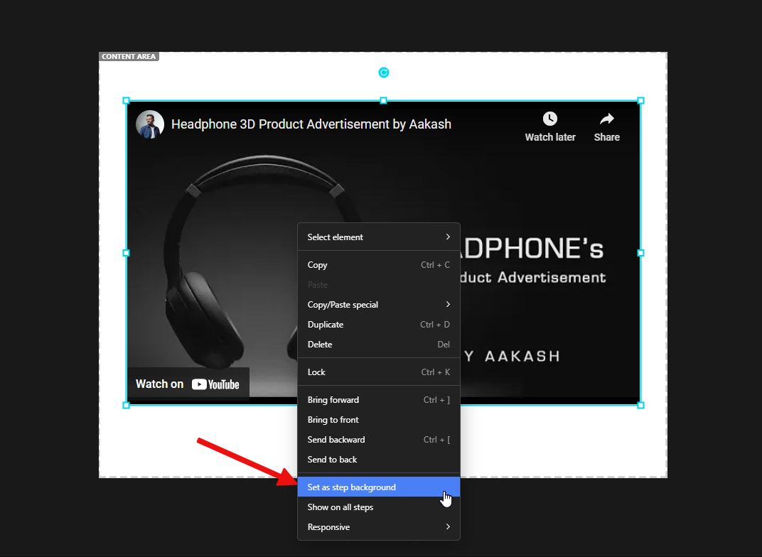
Next, to make a full-screen popup video player, we right-click on the video and select Set as step background.
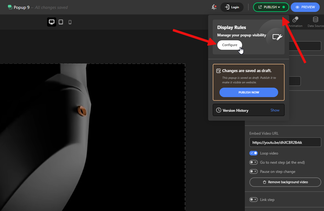
Now, let’s set up the Display Rules so that the popup opens when the user clicks a button with the CSS class we defined earlier.
To do this, we click on Publish, then select Configure under the Display Rules section.
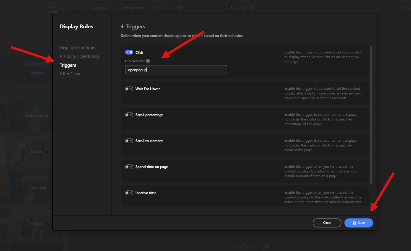
In the Triggers tab, activate the Click option and enter the same CSS class we used earlier, starting with a dot (.) to indicate it’s a class selector.
In the CSS, a class selector is a name preceded by a full stop (“.”) and an ID selector is a name preceded by a hash character (“#”)
Finally, save the changes, and we’re done!
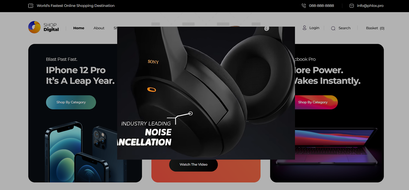
Now, when a user clicks the button on our page, the video popup opens and the video starts playing.
That’s it! This quick tutorial showed you how to create a video popup in just a few easy steps.
If you’d like to get even more out of the Depicter WordPress Popup Builder, make sure to check out the posts below for more simple, powerful tutorials like this one.
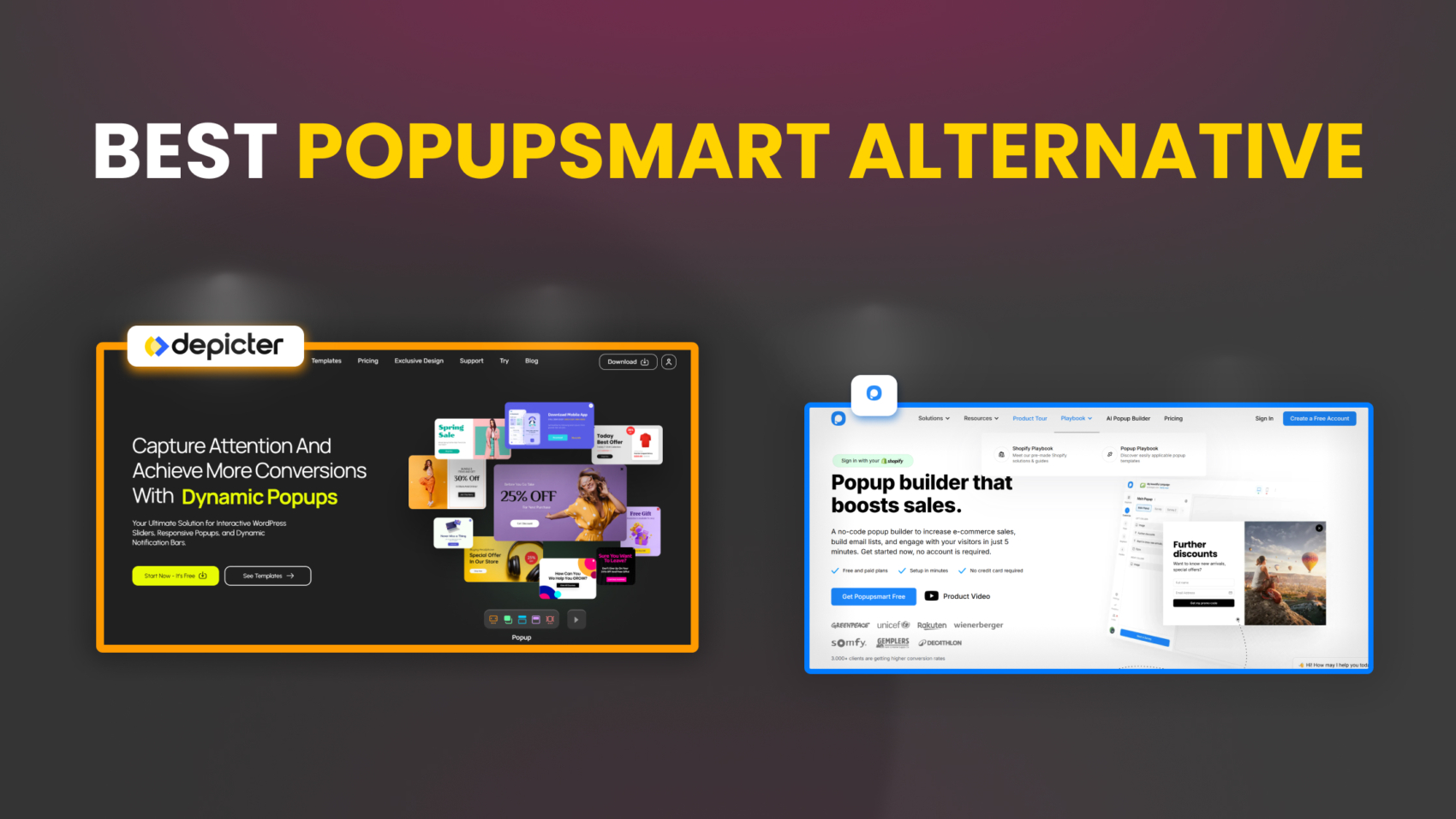
When it comes to creating high-converting, visually appealing popups, the tool you choose plays a critical role in both your workflow and your results. While Popupsmart has established itself as a user-friendly popup builder, it’s not without limitations, particularly when it comes to flexibility, customization, and cost. That’s why many users find themselves exploring Popupsmart alternatives that offer more advanced capabilities and better overall value.
For users seeking more creative control, a richer feature set, and better value, Depicter Popup Builder emerges as a compelling alternative. In this article, we’ll take a closer look at the key differences between the two, comparing them across various areas, and examining why Depicter leads the pack among Popupsmart popup builder alternatives.
The Editor
In the Editor section, we compare two user-friendly editors — one offering greater flexibility and advanced features, and the other focusing on simplicity.
Popupsmart uses a basic editor based on a row-and-column structure. You can rearrange elements through a drag-and-drop system to some extent. Standard options for editing content and styling are available when you select each element, providing a simple and straightforward workflow overall.
However, if you try to make a specific change to a template, like adding a new element to a particular spot in the popup, the rigid layout structure can quickly become frustrating. You’ll often find yourself stuck in a loop of excessive, ineffective clicks just to move an element where you want it.
In contrast, Depicter offers a fully visual drag-and-drop editor. With its modern and advanced features, it delivers an experience that is both intuitive and professional when editing visual elements.
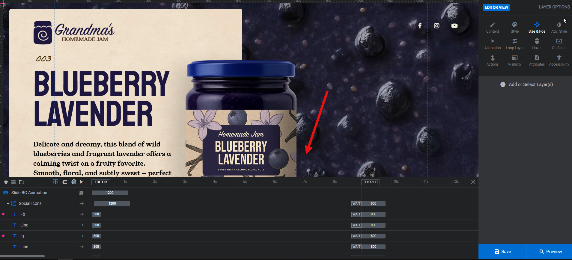
You can freely move elements anywhere on the canvas, resize them, align them with each other or the content area — all while snapping guides assist you automatically. You can move multiple elements together, group them, rotate them, and much more. In fact, the capabilities of the Depicter editor are so extensive that they deserve a dedicated article of their own.
Variety of Elements
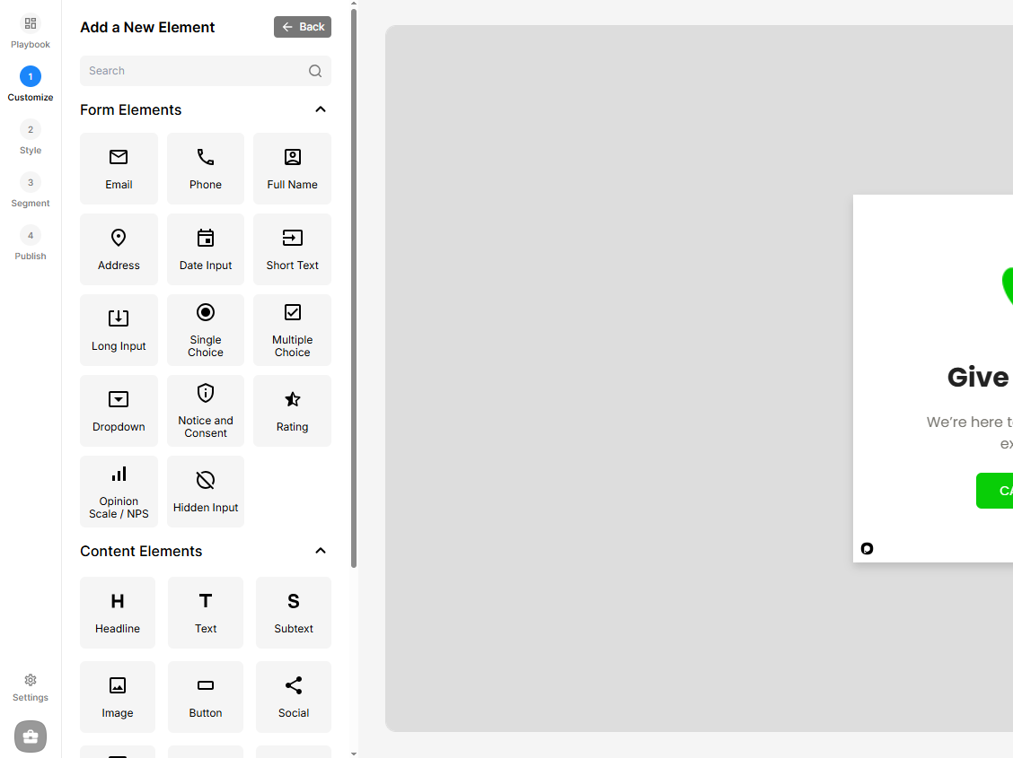
As the variety of available elements increases, designers gain more creative freedom to craft purposeful and engaging user experiences. These elements can include icons, buttons, animations, diverse typography, and a wide range of color schemes. When options are limited, designs often become repetitive, reducing the overall effectiveness of the messages displayed in the popup.
Looking at Popupsmart, elements are divided into two main categories: Form Elements and Content Elements. These mostly consist of input fields for forms, as well as basic components like text, image, and video, along with a few additional elements. In our Popupsmart review, we found that while the platform offers a clean and intuitive interface, the variety of available design elements is somewhat limited compared to more advanced tools, potentially restricting highly customized experiences for users seeking more flexibility.
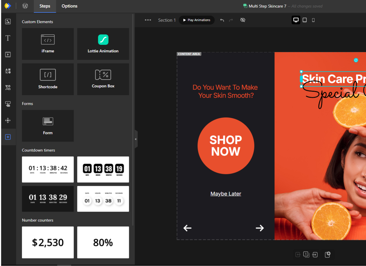
On the other hand, Depicter takes it a step further. In addition to offering standard elements like text, image, and video, as well as a full set of form fields specifically designed for lead capture, it also provides a collection of specialized elements, including:
Masks
Stories Progress Bars
Slideshow Play/Pause Controls
Scroll Down Indicators
Lottie Animations
Shortcodes
Coupon Boxes
Number Timers
Before/After Comparison Modules
Each of these elements opens up new creative possibilities for the final output in Depicter. Just imagine, for example, the potential of using the Shortcode element to embed and display content from other plugins directly within your Depicter design — the flexibility this unlocks is remarkable.
Templates
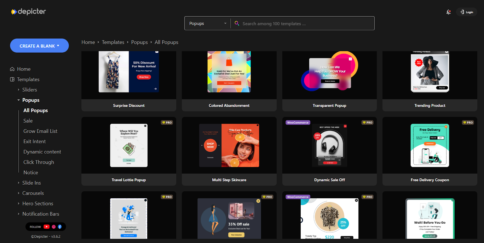
In terms of template offerings, Depicter holds a clear advantage over Popupsmart, both in quantity and design versatility. Popupsmart provides around 500 templates, covering common use cases with a straightforward approach. Depicter, on the other hand, offers a growing library of over 600 templates, including free popup templates, designed with greater visual polish and a broader range of styles and industries in mind.
Notably, Depicter expands its library with 10+ new templates every week, ensuring that users have continuous access to fresh and up-to-date design options. This consistent growth, combined with the professional quality and diversity of its templates, makes Depicter a more scalable and future-ready solution for users seeking both creative flexibility and visual impact.
Visual Effects
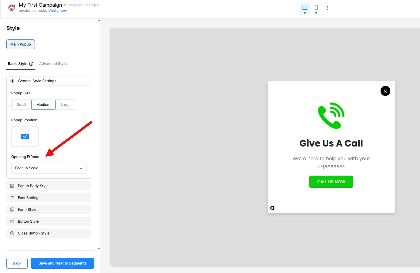
When it comes to making a strong visual impact, animations and effects play a crucial role in capturing user attention. These visual enhancements — whether applied to individual elements, popup transitions, or interactive sections — significantly influence how engaging the final experience is. In this area, Popupsmart offers only a basic “Opening Effect” option, with no further support for advanced visual dynamics.
Depicter, in contrast, provides one of the most comprehensive collections of animations available. Users can apply detailed animation settings to each element individually, and take advantage of popular effects like Parallax, Ken Burns, Marquee, and a wide range of transitions and navigation effects for different parts of the popup.
This level of visual control allows for highly dynamic, eye-catching popups that not only stand out but also encourage user interaction.
Such visual richness not only elevates the aesthetic appeal of the popup, but also helps guide user attention toward key messages and call-to-action areas. In fast-scrolling environments where attention spans are short, this can make a measurable difference in performance.
Responsiveness
Responsive design is no longer optional — it’s essential. With users accessing content from a wide range of devices, from desktops to tablets and smartphones, ensuring a seamless and optimized experience across all screen sizes is critical to maintaining engagement and usability. A well-executed responsive layout not only improves user satisfaction but also directly impacts conversion rates and overall performance.
In this area, Popupsmart offers only limited functionality. It supports just two responsive modes — desktop and mobile — and simply auto-resizes the content to fit smaller screens, with no real control over layout or design customization per device.
Depicter, however, takes responsive design to the next level with a set of dedicated features that provide exceptional flexibility. You can create fully customized layouts for three distinct modes: Desktop, Tablet, and Mobile. For each screen size, you can adjust typography, swap images, change backgrounds, show or hide specific elements, and even rearrange their order to best suit the viewing context.
This allows you to deliver truly tailored and optimized designs for every device your audience may be using — a level of control that ensures both visual consistency and user experience remain top-notch across the board.
Dynamic Content
One of Depicter’s standout capabilities is its support for dynamic popups, allowing content to be pulled directly from your website in real time. For example, you can automatically display your best-selling products or items from a specific category inside a popup, without needing to update the design manually each time. This is especially powerful for e-commerce sites, where showcasing live product data such as prices, stock levels, or new arrivals can significantly boost engagement and conversions.
And it’s not limited to products — Depicter supports any post type defined on your site, from regular blog posts to custom post types built with tools like ACF (Advanced Custom Fields). Whether you want to highlight a new blog article, feature testimonials, or display dynamic event listings, Depicter gives you full control to create personalized, data-driven popups.
In contrast, Popupsmart WordPress lacks this level of dynamic content integration, offering only static elements with no native support for real-time data. This makes Depicter a far more flexible and scalable solution for websites that need to stay fresh, relevant, and personalized.
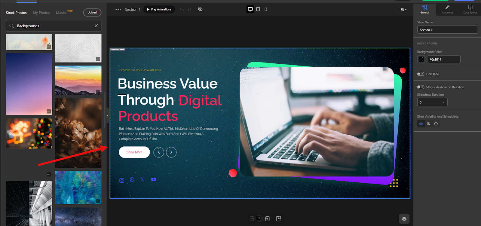
The Assets panel
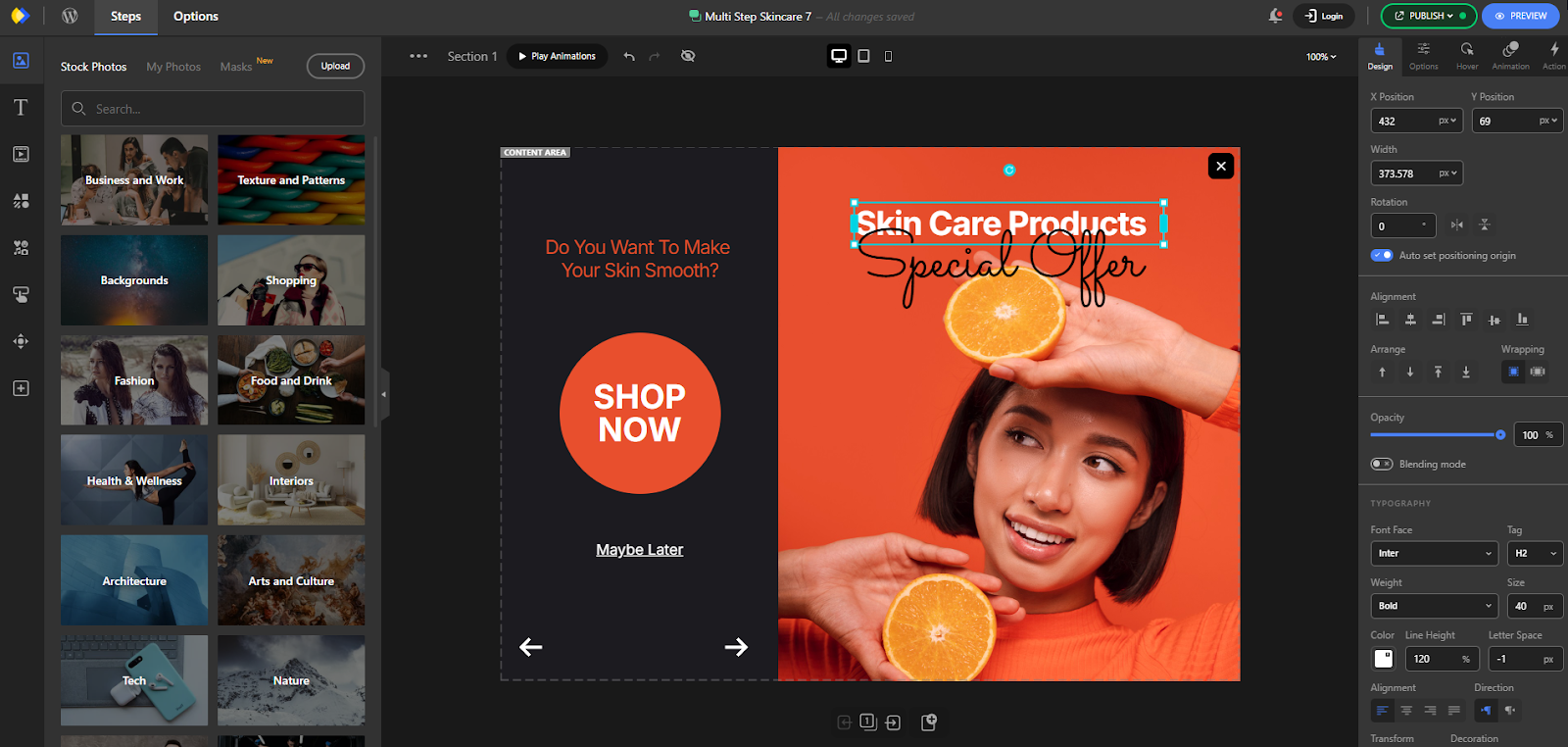
Another valuable feature that sets Depicter apart is its built-in Asset Panel, which provides users with direct access to a vast library of stock images and videos — all ready to use within their popups. This integrated resource eliminates the need to search for visual assets on external websites or worry about licensing and file compatibility. Having high-quality media at your fingertips streamlines the design process and allows users to focus on creativity rather than logistics.
Whether you’re building a product showcase, an announcement banner, or a lead capture popup, the ability to instantly browse and insert relevant visuals saves time and enhances the overall quality of your designs. It also ensures visual consistency, since everything is accessible from within the same platform.
Popupsmart, by contrast, does not offer a built-in media library, which means users must manually upload all images and videos — a process that can slow down production and limit creative flexibility. For anyone looking to produce professional-looking, media-rich popups quickly and efficiently, Depicter’s Asset Panel is a game-changing advantage.
Price
When evaluating popup builders, pricing is often a key factor, especially for small businesses, startups, or individual creators working within a limited budget. In this regard, Depicter offers a far more accessible solution, with its premium plan starting at just $39, compared to Popupsmart’s entry-level plan priced at $390. This significant price gap — a key point in Popupsmart pricing — makes Depicter an appealing option for users who want professional-grade features without committing to a high upfront cost.
Despite its affordability, Depicter doesn’t compromise on capabilities, offering advanced design tools, dynamic content support, responsive editing, and a growing library of templates and assets.
Conclusion
While Popupsmart may be a solid choice for simple use cases, it quickly shows its limitations for users who need more creative freedom, design flexibility, and advanced functionality. Depicter Popup Builder clearly stands out as a more modern and powerful popup builder, offering a professional-grade editor, dynamic content integration, visually stunning effects, a richer template library, and a responsive design system that adapts to every screen.
Add to that its built-in stock asset panel and an unbeatable price point — starting at just $39 compared to Popupsmart’s $390 — and it becomes clear why Depicter is the best among today’s Popupsmart alternatives. Whether you’re a designer, marketer, or business owner, Depicter empowers you to build popups that not only look great but also perform.
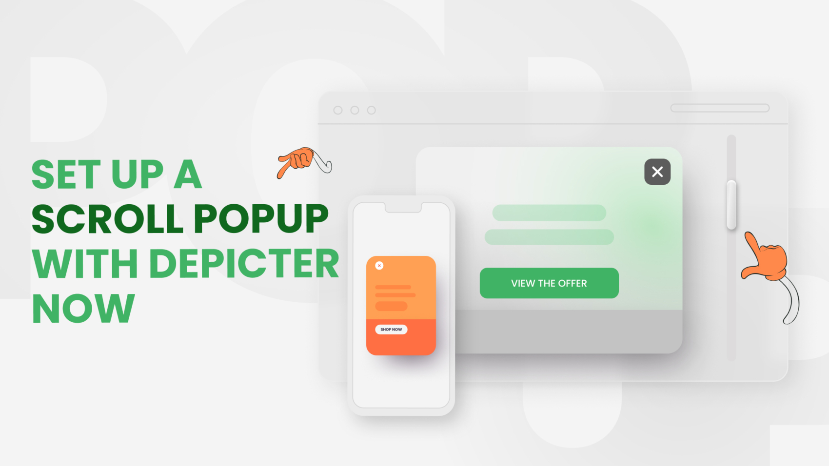
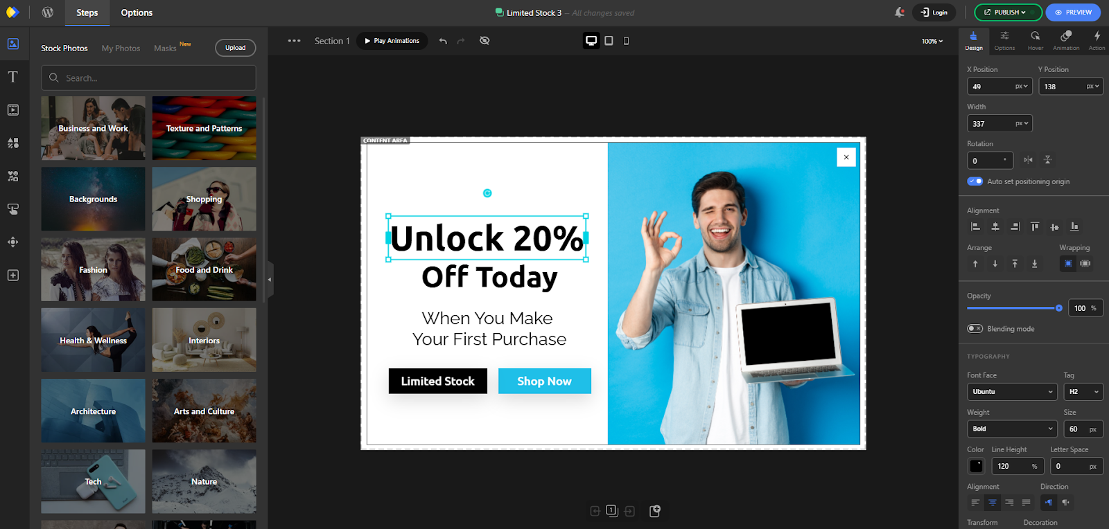
A Scroll popup is a powerful tool for delivering the best content at the best time to your website visitors without being intrusive. Unlike standard popups that appear immediately when someone lands on a page, scroll popups are designed to show up only after a user has scrolled to a specific point. This allows you to target users who are already engaged, making them more receptive to your message.
You should use a scroll popup when visitors have shown genuine interest by scrolling through your content, especially on long pages like blog posts or product descriptions. This is the moment when they are more likely to take action, such as signing up for your newsletter or exploring a special offer. Aligning your popup with the user’s engagement level to not only improve the experience but also increase conversions.
Step 1: Install Depicter Free
Before we start, just double-check that you’ve installed the Depicter plugin. It’s super easy — just search “Depicter” in the Plugins menu in your WordPress dashboard. Want a full walkthrough with video? Take a look at our guide here.
Step 2: Import a Template
To start building your popup, head to the dashboard and click on the “Popup” tab in the top navigation menu. Depicter makes the process fast and seamless by offering a wide selection of professionally designed templates, including many free options to choose from.
Find your perfect template by typing keywords into the search bar or exploring the categories listed on the left. When you see one you want, just click “Import.”
Your popup will be ready in seconds, taking you directly to the Depicter editor. There, you can customize every detail.
To explore all the tools and learn to build a popup from scratch, check out this video:
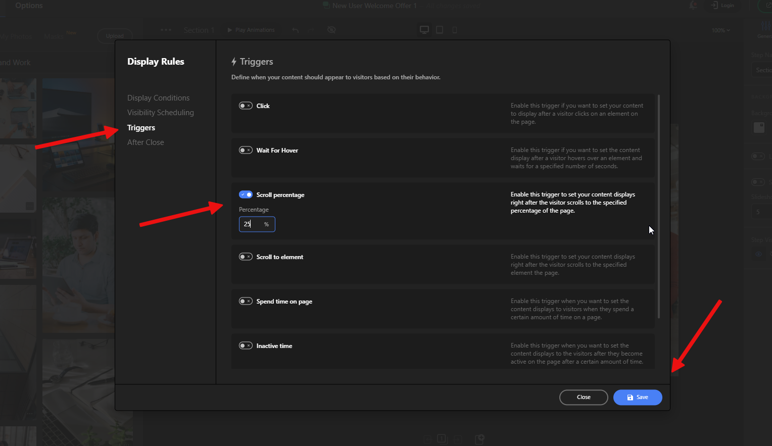
Step 3: Activate Scroll Trigger
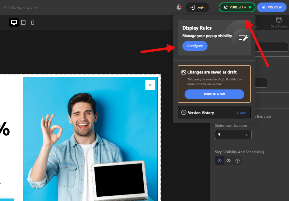
The last step to ensure your popup appears at a chosen scroll percentage is enabling the Scroll option in the Display Rules. You’ll find this setting by clicking Publish and then Configure within the Display Rules section.
Now, navigate to the Triggers section and enable the Scroll percentage option. Define the percentage at which you want the popup to appear, save your adjustments, and that’s it!
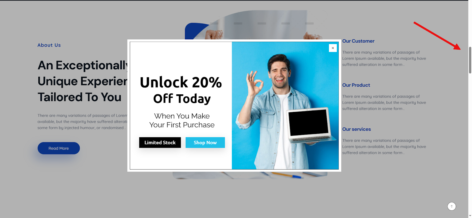
Now, whenever a visitor scrolls down your website to the specified percentage, the popup will be shown to them.
Be sure to explore additional tips to maximize the impact of your popups with Depicter:
If you’re not using exit-intent popups yet, you’re missing a valuable opportunity to retain visitors who are moments away from leaving your site. Exit-intent technology allows you to make a final, well-timed offer — whether it’s a discount, exclusive content, or a simple feedback request — that can turn lost traffic into leads or customers. It’s an easy, non-intrusive way to increase conversions, reduce bounce rates, and gain insights into visitor behavior, all without disrupting the user experience.
Let’s start setting up exit-intent popups in just three easy steps with Depicter Popup Builder!
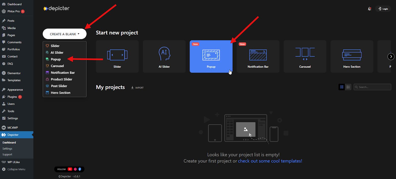
Step 1: Install Depicter Free
To get started properly, ensure that the Depicter plugin is already installed. You can install it by going to Plugins → Add New and searching for “Depicter”. For detailed instructions and a video tutorial, see our guide here.
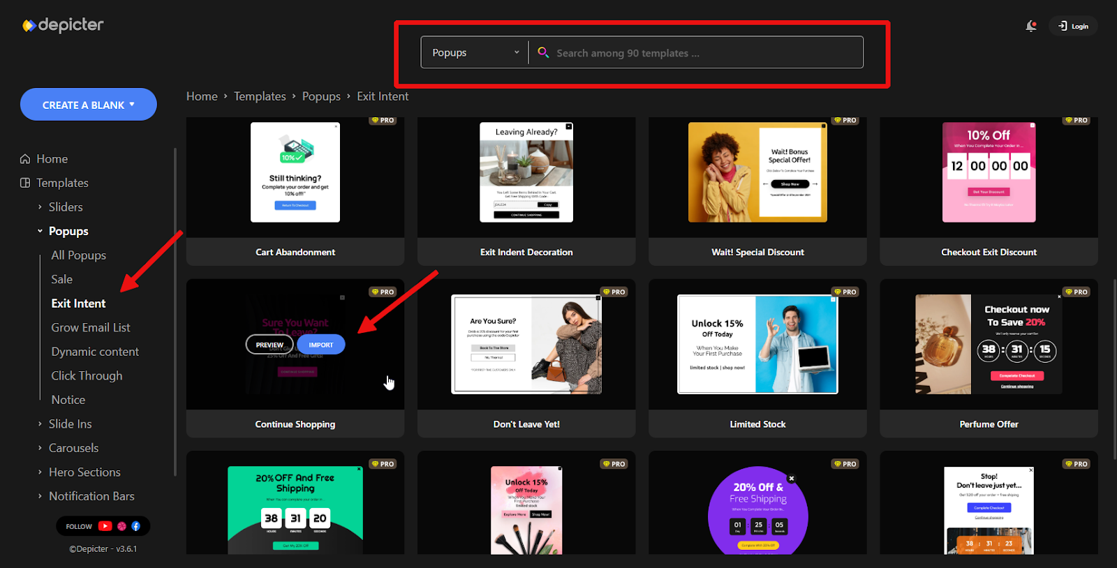
Step 2: Import a Template
Depicter provides a wide range of professionally designed templates, including many free popup templates, to make the creation process fast and hassle-free. Once you’re in the dashboard, simply head to the top navigation bar and click on the “Popup” section to begin building your design.
You can use the preset categories on the left side or search through the ready-made templates using keywords. Once you find a template you like, hover over it and click Preview to see how it looks. If it fits your needs, click the Import button to load it into your project.
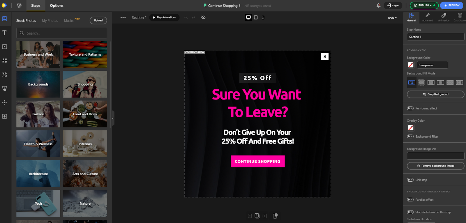
After a short moment, the import will be complete and you’ll be taken to the Depicter editor. Here, you can customize every detail of how your popup looks and functions using the powerful features Depicter offers.
For a step-by-step walkthrough, watch the video below.
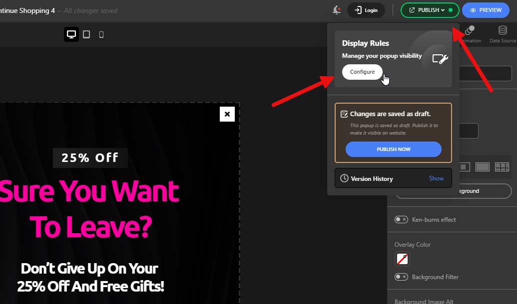
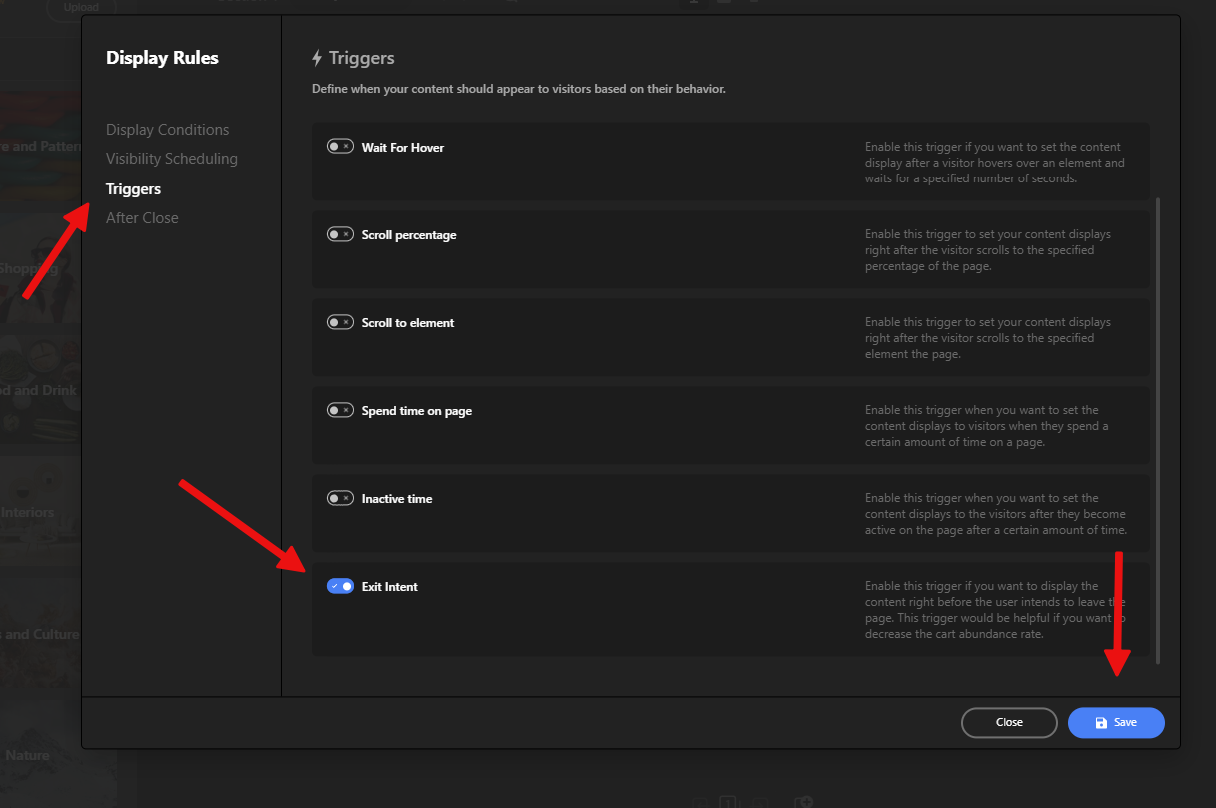
Step 3: Activate Exit-intent
Once that’s done, all that’s left is to enable the Exit-Intent option under Display Rules, so your popup appears right when a visitor attempts to leave the page. To do this, click the Publish button, then hit Configure in the Display Rules section to open the settings panel.
Next, go to the Triggers section, enable Exit-Intent, save your changes, and you’re done!
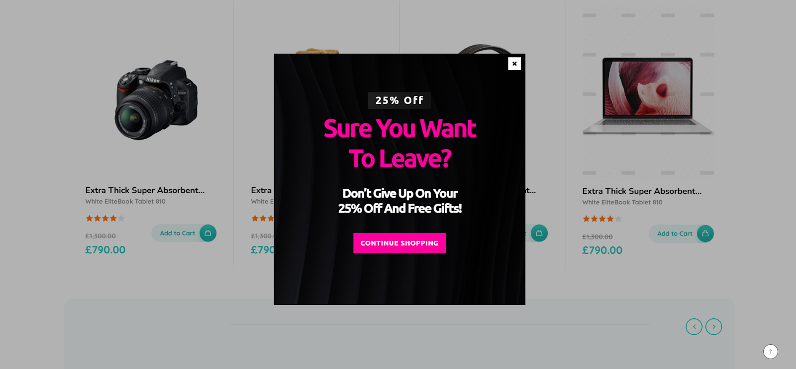
This is the result of our work:
Make sure to check other tips to get the most out of your Popups with Depicter: