Shopify Email Capture & Lead Generation

Shopify Email Capture & Lead Generation

If you’re running a Shopify store in 2026, you already know traffic is expensive. Whether it’s Meta ads, Google ads, influencers, or SEO, getting visitors isn’t easy anymore.

But here’s the real question:

Are you capturing those visitors before they leave?

Because if you’re not actively working on Shopify email capture, you’re basically paying for traffic that disappears forever.

This guide breaks down how to approach Shopify lead generation, how to increase opt-in rates, and how to turn casual visitors into long-term revenue through email.

Why Email Is Still the Highest ROI Channel for Shopify

Email marketing remains one of the highest ROI channels in e-commerce. Unlike paid ads, your email list is an owned asset. You don’t lose it when CPMs go up. You don’t compete in an auction every time you want to talk to your customers.

For Shopify stores, building an email list means:

  • Higher lifetime value
  • Lower dependency on ads
  • Better product launches
  • More predictable revenue

When you think about build email list Shopify strategies, it’s not just about a newsletter box. It’s about building a long-term communication channel.

A lot of stores focus on conversion first and email second. But in reality, Shopify email capture often happens before the purchase, and that’s what allows you to recover visitors who weren’t ready to buy.

Modern Shopify stores rely on behavioral onsite strategies rather than static forms buried in the footer.

Why Most Shopify Stores Fail at Email Capture

Let’s be honest. Most Shopify stores do one of these:

  • A tiny footer signup form
  • A generic 10% discount popup
  • A form that shows instantly to everyone
  • No segmentation at all

And then they wonder why their Shopify newsletter signup optimization isn’t working.

The truth is, static forms don’t convert well. Generic popups feel spammy. And showing the same message to every visitor ignores context.

Average opt-in rates for e-commerce hover around 2–5%. But that number can go higher when you use smarter strategies like:

  • Exit intent targeting
  • Scroll-based timing
  • Cart-based triggers
  • Personalized offers

Advanced tools allow you to trigger offers based on behavior, timing, and page context instead of showing the same popup to everyone.

Understanding Email Capture Psychology

If you want better Shopify lead generation strategies, you need to understand psychology first.

The Value Exchange

People don’t give their email for no reason. You’re asking for access to their inbox. That’s personal.

So the offer must feel worth it:

  • Discount
  • Free shipping
  • Early access
  • Exclusive content
  • Product recommendation quiz

Timing Matters

If a popup appears the second someone lands on your homepage, it feels aggressive. But if it appears after they scroll 60% of a product page? That’s contextual.

This is where Shopify exit intent popup strategies shine. They wait until the visitor signals they’re leaving.

Micro-Commitments

Two-step opt-ins often convert better than single-step forms. For example:
“Want 10% off?”
Yes → then ask for email.

Behavior-based triggers and dynamic targeting help align offers with actual user intent instead of guessing.

Core Email Capture Methods for Shopify

There isn’t just one way to handle Shopify email capture. The highest-performing stores combine multiple approaches.

Exit-Intent Popups

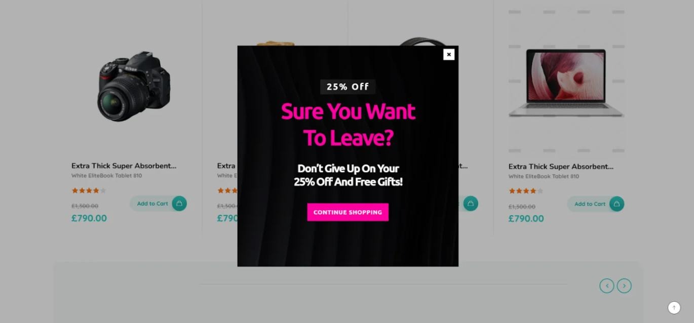
Exit intent is one of the most powerful tools for reduce cart abandonment with email Shopify strategies.

When a user moves toward closing the tab or navigating away, a popup appears with a last-chance offer.

Best practices:

  • Keep it simple
  • One clear CTA
  • No overwhelming design
  • Offer something meaningful

You can trigger exit-intent campaigns on product pages, cart pages, or even collection pages. Some stores only show them when cart value exceeds a certain threshold.

Depicter Shopify popup builder can be configured to trigger exit-intent popups based on page type, cart value, or device. 

You could use it to display a discount for cart abandoners or offer a lead magnet for blog visitors.

Timed and Scroll-Based Popups

Sometimes, exit intent isn’t enough.

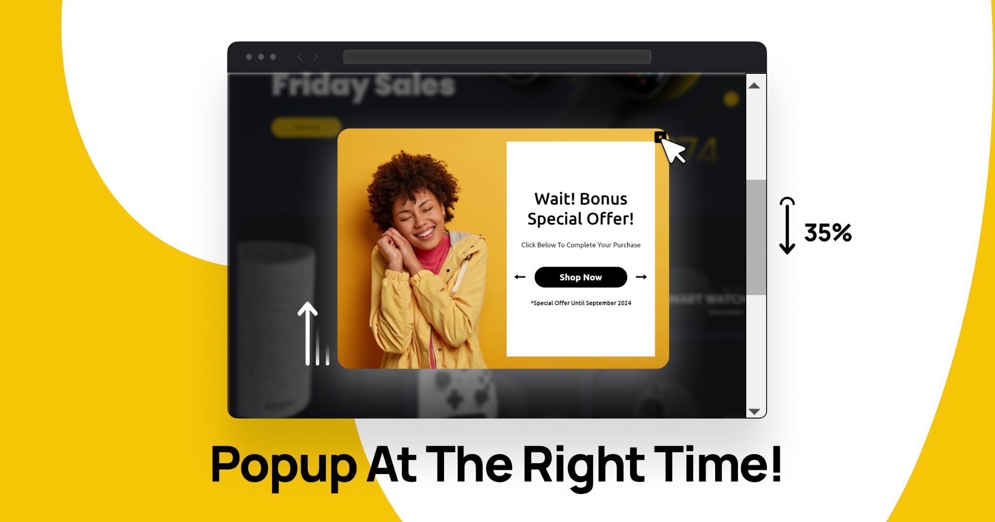
Timed popups appear after someone spends, say, 20 – 40 seconds on a page. Scroll-based triggers activate when a visitor scrolls a certain percentage.

These strategies improve Shopify popup for email performance because they feel more natural.

Instead of interrupting immediately, you wait until the visitor is engaged.

With tools that support scroll triggers and time delays, you can tailor campaigns differently for homepage visitors versus product page visitors. Depicter allows you to configure time-based or scroll-based triggers and adjust them by device or page type.

Sticky Announcement Bars for Email Capture

Not everyone likes popups.

Sticky bars offer a less intrusive method for Shopify onsite lead capture. They sit at the top or bottom of the screen and stay visible as users scroll.

Common strategies:

  • “Free shipping on first order, Join our list”
  • “Get early access to our next drop”
  • Countdown-driven urgency

The Shopify announcement bar can work well for email marketing when you want constant visibility without heavy interruption.

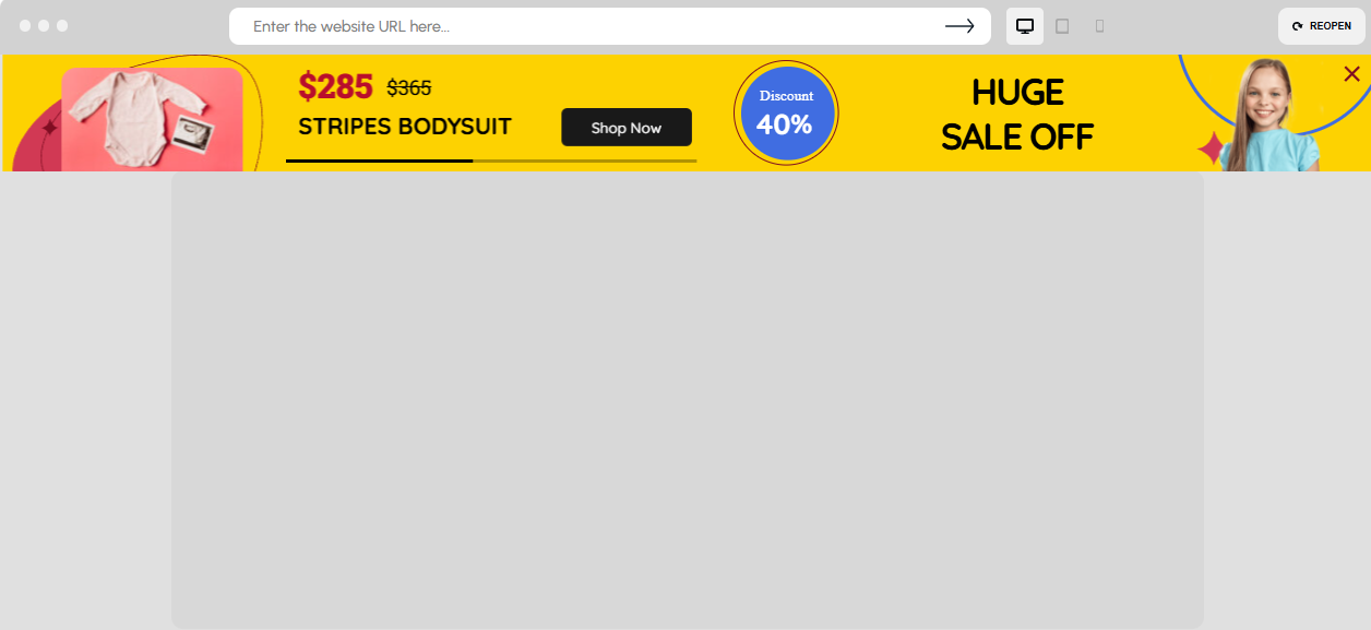
Depicter can be used to create sticky announcement bars with countdown timers and CTA buttons. You could display them sitewide or limit them to specific campaigns like seasonal sales.

Advanced Email Capture Strategies for Shopify

Once you’ve mastered the basics, you can move into more advanced territory.

Dynamic Product-Based Offers

Imagine combining dynamic product recommendations with email capture.

Instead of generic text:
“Join our list.”

You show:
“Get 10% off this exact collection.”

Or display a slider of trending products inside the popup.

This aligns email capture with real buying intent.

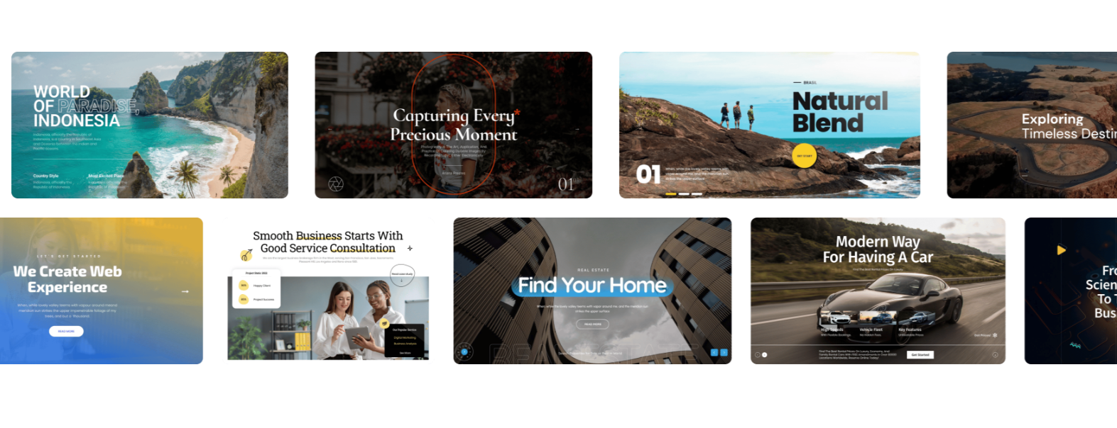
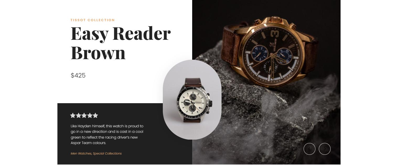
Depicter Shopify Slider supports dynamic product feeds that update automatically. You could display best sellers or category-specific products inside your campaigns.

Multi-Step Capture Flows

Two-step flows sometimes outperform single-step forms.

Example:
Step 1: “Want early access to Black Friday deals?”
Step 2: Email field

This approach works well for growing your email list in Shopify because it reduces friction.

Depicter allows you to create multi-step flows with conditional branching. You might design a sequence where different answers lead to different email segments.

Common Email Capture Mistakes on Shopify

Many stores hurt their own Shopify lead generation without realizing it.

Common mistakes:

  • Showing popups immediately
  • No frequency cap
  • Same offer everywhere
  • No mobile optimization
  • Too many overlapping apps

Another big one? Relying only on discounts. That trains customers to wait for deals.

Using proper targeting rules and frequency controls helps reduce annoyance and increase opt-in rate. Depicter includes targeting logic and display controls that can limit how often a campaign appears to the same visitor.

The Problem With Using Multiple Shopify Apps

Many Shopify stores stack:

  • One popup app
  • One announcement bar app
  • One slider app
  • One survey app

This leads to:

  • Script overload
  • Slower loading times
  • Design inconsistency
  • Harder campaign management

When you search for best Shopify apps for lead generation, you’ll find dozens. But stacking five tools creates complexity.

Instead of managing separate systems, some stores move toward a centralized conversion layer that handles multiple campaign types from one interface.

A Unified Approach to Shopify Email Capture

Instead of thinking in terms of “popup app” or “quiz app,” it’s more effective to think in terms of a unified onsite marketing system.

That system should allow you to create:

  • Popups
  • Sticky bars
  • Sliders
  • Surveys
  • Slide-Ins 
  • And more

Depicter for Shopify can function as a centralized visual builder where you manage popups, notification bars, sliders, and surveys from one place to run your campaigns. You could use it to coordinate email capture campaigns without stacking multiple separate apps.

Who Should Focus on Advanced Email Capture?

If you’re:

  • Running paid ads
  • Launching new products
  • Preparing seasonal campaigns
  • Struggling with low opt-in rates
  • Scaling email marketing

Then, improving your Shopify email capture strategy can dramatically increase revenue without increasing traffic.

Especially for stores investing heavily in ads, capturing emails before users leave can lower acquisition costs over time.

Conclusion 

Traffic without capture is a wasted opportunity.

If you want sustainable growth, you need:

  • Smart timing
  • Behavioral targeting
  • Segmentation
  • Unified campaign control

Shopify lead generation is not about throwing a random popup on your homepage. It’s about building a structured, contextual, and performance-driven email capture system.

When done right, email becomes your most stable revenue channel, not just a support tactic.

And Today, stores that win won’t be the ones with the most traffic. They’ll be the ones who capture it intelligently.

Where to Place Testimonials on a Website for Maximum Trust

Where to Place Testimonials on a Website for Maximum Trust

Testimonials are one of the most familiar trust signals on the web, yet their impact depends heavily on where they appear. Even strong testimonials can lose effectiveness if they’re hidden, poorly timed, or disconnected from user intent.

That’s why questions like where to place testimonials on a website come up so often. It’s not just about having positive feedback, but about showing it at the right moment, when visitors are actually paying attention and looking for reassurance.

This article explores how thoughtful testimonial placement on website pages can strengthen credibility, reduce hesitation, and support user decision-making across a website. Rather than focusing on tools or tactics to sell, the goal here is to explain why placement matters and how testimonials can be used responsibly and effectively.

Why Testimonial Placement Matters

Testimonials work because they provide social proof. They show that real people have interacted with a product or service and found value in it. However, users don’t consume websites in a linear way. They scan pages, skim sections, and jump between areas based on what they’re trying to achieve.

Placement matters because testimonials are most effective when they appear at moments of uncertainty, reinforce claims already being made, answer unspoken objections, and feel relevant to the surrounding content.

When testimonials are placed randomly or grouped into a single isolated page, they often fail to influence decisions. Strategic placement ensures testimonials support the user journey rather than interrupt it.

For a more detailed overview of how testimonials function and why they build credibility, this guide on testimonials on websites provides useful foundational context.

Homepage Testimonial Placement

The homepage is often a visitor’s first interaction with a brand. At this stage, users are usually asking basic questions such as whether the website is credible, whether others trust the brand, and whether they’re in the right place.

Testimonials on the homepage should focus on reassurance rather than detail. Their purpose is to support first impressions, not explain every feature or outcome.

Effective homepage placements commonly include testimonials positioned just below the hero section, where they reinforce the main value proposition, or mid-page sections that support claims related to reliability, results, or customer satisfaction. Testimonials can also work well near transition points, encouraging users to continue exploring the site.

Best practices for homepage testimonials include keeping them concise, focusing on trust and outcomes, avoiding excessive specificity, and prioritizing clarity over quantity. The homepage is about confidence, not depth.

Landing Pages and Product Pages

Landing pages and product pages are designed for decision-making. Users often arrive with clear intent, such as evaluating an offer or considering a specific solution. In these contexts, testimonials play a more direct role in reducing hesitation.
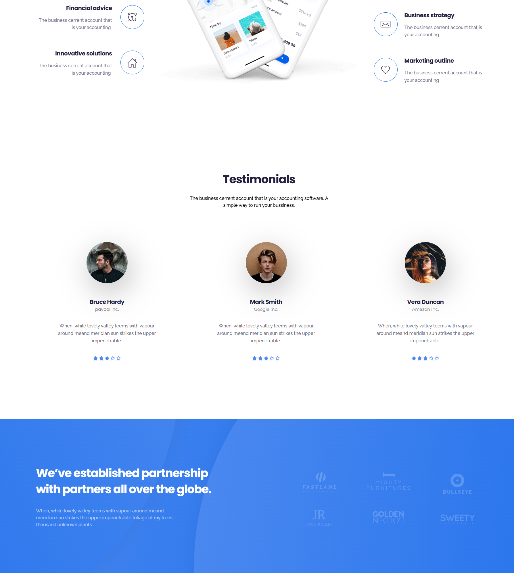
On landing pages, testimonials can reinforce a single promise, validate claims, and provide reassurance immediately before a call to action. They are commonly placed below key benefit sections or near signup and pricing areas.

On product pages, testimonials are most effective when they reference real usage and practical outcomes. Instead of grouping all testimonials at the bottom of the page, placing them alongside relevant features or explanations helps users connect claims with real experiences.

In both cases, relevance matters more than volume. A small number of well-matched testimonials is often more persuasive than a long list of generic quotes.

Visual vs. Text Testimonials

Testimonial format plays an important role in placement decisions. Text and visual testimonials serve different purposes and should be positioned accordingly.

Text testimonials are flexible and easy to scan. They work well when supporting written claims, appearing within informational sections, or reinforcing specific points on a page. They are especially effective in blog content, feature explanations, and comparison sections. Short paragraphs and clear attribution improve both readability and credibility.

Visual testimonials, such as those with photos or videos, tend to draw more attention and require more space. Because of this, placement becomes even more important. Visual testimonials are best used when emotional connection matters or when a testimonial tells a clear story.

They are typically most effective in dedicated sections on landing pages or between major content blocks where they don’t compete with dense text. Overusing visual testimonials can overwhelm users, so they should be placed intentionally and sparingly.

Common Testimonial Placement Mistakes

Many websites weaken the impact of testimonials through avoidable placement mistakes. One common issue is hiding testimonials on a single page that users may never visit. Another is placing testimonials too late in the journey, after users have already made up their minds.

Using testimonials that are irrelevant to the page’s audience or purpose can also reduce trust. Similarly, overloading one section with too many testimonials can dilute their impact and make them feel repetitive.

Testimonials should not interrupt critical content or break the flow of important explanations. When they feel intrusive rather than supportive, they lose credibility.

Matching Testimonials to User Intent

Effective testimonial placement starts with understanding user intent. Different pages serve different goals, and testimonials should align with those goals.

On educational pages, testimonials should reinforce credibility without pushing decisions. For the comparison pages, testimonials that mention alternatives or differentiation are often more helpful. And for conversion-focused pages, reassurance and outcome-focused testimonials tend to be most effective.

When testimonials reflect what users are already thinking or questioning, they feel helpful rather than promotional.

Key Takeaways

There is no single universal rule for testimonial placement. When people talk about finding the best places for testimonials on websites, they’re usually looking for guidance rather than a fixed formula. The most effective placements are guided by user behavior and intent rather than rigid templates.

Testimonials should be placed where users feel uncertainty, matched carefully to the purpose of each page, and used selectively rather than excessively. Isolating testimonials from decision points or overloading sections can reduce their effectiveness.

When treated as supportive content rather than decorative elements, testimonials quietly reinforce trust by sharing real experiences at the moments when users need reassurance most.

Image Slider Best Practices for Speed and User Experience

Image Slider Best Practices for Speed and User Experience

Image sliders have become a familiar element in modern web design. From homepage hero sections to product showcases and portfolios, they offer a visually engaging way to present multiple pieces of content within a limited space. Despite their popularity, sliders are also one of the most debated UI components due to concerns around performance, accessibility, and user engagement, which is why following image slider best practice is essential for achieving a balance between visual appeal and usability.

Understanding the fundamentals of What is an Image Slider helps designers and site owners make informed decisions about when and how sliders should be used effectively.

The truth lies somewhere in between. Image sliders are neither inherently good nor bad. When implemented with intention and technical care, they can enhance storytelling and visual appeal. 

When implemented poorly, they can harm usability, slow down pages, and frustrate users. Understanding best practices is essential for making sliders work effectively rather than against your website’s goals.

Why Image Sliders Remain Popular

Image sliders continue to be widely used because they solve a common design challenge: how to present multiple highlights without overwhelming the layout. They allow designers to rotate content, emphasize visuals, and introduce motion to otherwise static pages.

Common reasons websites use sliders include:

  • Showcasing multiple products or services
  • Highlighting featured blog posts or announcements
  • Creating visual storytelling sequences
  • Adding movement to hero sections

However, popularity alone does not guarantee effectiveness. Over time, UX research has raised valid concerns about how users interact with sliders, especially when they are overloaded or poorly optimized. The key takeaway is not to abandon sliders entirely, but to use them correctly.

Common Image Slider Mistakes

Many issues associated with sliders stem from predictable implementation mistakes. Avoiding these pitfalls significantly improves usability and performance.

Too Many Slides

One of the most common errors is including too many slides. Users rarely view more than the first one or two slides, especially on homepages. Excessive slides dilute attention and reduce content recall.

Best practice: Limit sliders to 3–5 slides maximum.

Autoplay Without Controls

Autoplay sliders that lack pause, navigation arrows, or swipe controls can feel intrusive. Users should never feel forced to consume moving content.

Best practice: Always provide clear controls and the ability to pause or navigate manually.

Heavy or Unoptimized Images

Large image files dramatically increase load time, especially on mobile networks. This negatively impacts both user experience and SEO.

Best practice: Optimize images for size, format, and resolution before uploading.

Poor Text Readability

Text placed directly on images often suffers from low contrast or cluttered backgrounds, making it hard to read.

Best practice: Use overlays, contrast-aware colors, and readable font sizes.

Using Sliders for Critical Content

Sliders are not ideal for conveying essential information such as core value propositions or legal notices. Content hidden behind slides risks being missed entirely.

Best practice: Reserve sliders for supporting or exploratory content, not critical messaging.

Performance and Speed Best Practices

Image slider performance is one of the strongest arguments against sliders but it doesn’t have to be. With modern techniques, sliders can be lightweight and fast.

Optimize Image Sizes

Always serve appropriately sized images. Avoid uploading full-resolution photos when smaller dimensions are sufficient.

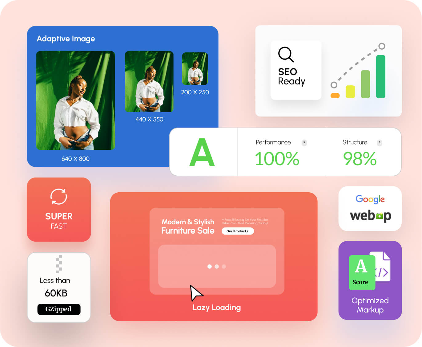
  • Use modern formats like WebP when possible
  • Compress images without noticeable quality loss
  • Serve different sizes for different screen resolutions

Use Lazy Loading

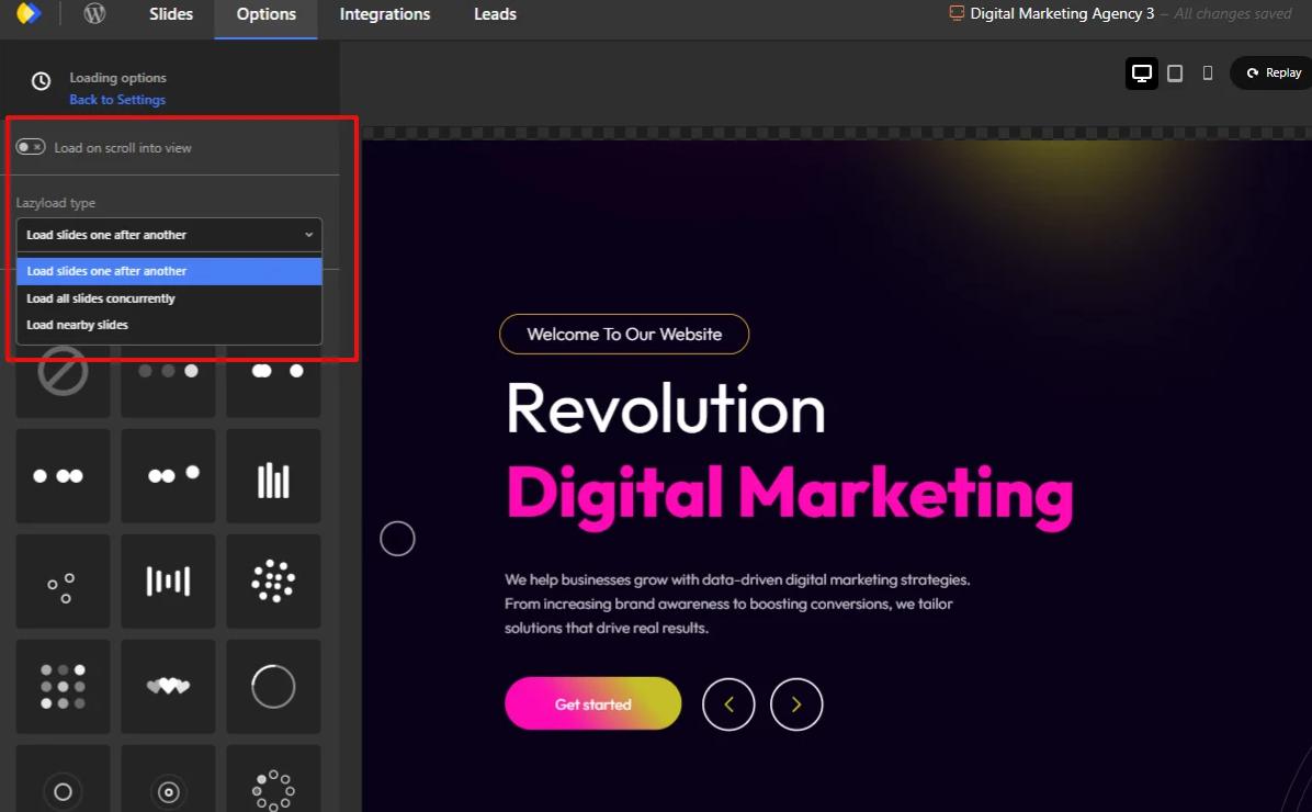
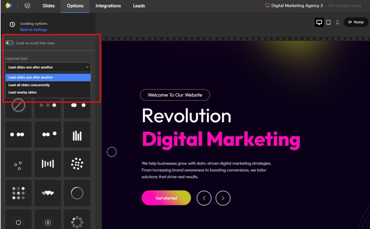
Lazy loading ensures images load only when they are needed, rather than all at once. Modern image sliders typically include this capability as a built-in feature and also provide additional loading-related options, such as deferred asset loading and optimized rendering behavior, to help improve overall page performance.

  • Load the first slide immediately
  • Defer loading off-screen slides
  • Reduce initial page weight

Avoid Excessive Animations

Complex transitions and layered animations require more processing power and JavaScript execution.

  • Prefer simple fades or slides
  • Avoid stacked animation effects
  • Keep transitions subtle and purposeful

Mobile User Experience Considerations

Mobile users often make up the majority of website traffic, making image slider usability for mobile users essential.

Swipe-Friendly Navigation

Sliders should feel natural on touch devices.

  • Support horizontal swipe gestures
  • Ensure smooth, responsive movement
  • Avoid reliance on hover interactions

Touch-Friendly Controls

Navigation elements must be large enough to tap comfortably.

  • Use adequately sized arrows and buttons
  • Avoid tiny pagination dots
  • Leave sufficient spacing between controls

Readable Text on Small Screens

What works on desktop often fails on mobile.

  • Increase font sizes for mobile breakpoints
  • Shorten text content
  • Ensure adequate line spacing

Avoid Precision-Based UI Elements

Small arrows or dots demand precise tapping, which frustrates users.

  • Favor clear buttons
  • Reduce visual clutter
  • Keep interaction simple

Accessibility Best Practices for Image Sliders

Accessibility is frequently overlooked in slider design, yet motion and interaction can pose real barriers for some users.

Keyboard Navigation

Users relying on keyboards must be able to navigate sliders.

  • Support tab navigation
  • Allow arrow key interaction
  • Ensure focus indicators are visible

Pause or Stop Autoplay

Motion can be distracting or harmful to some users.

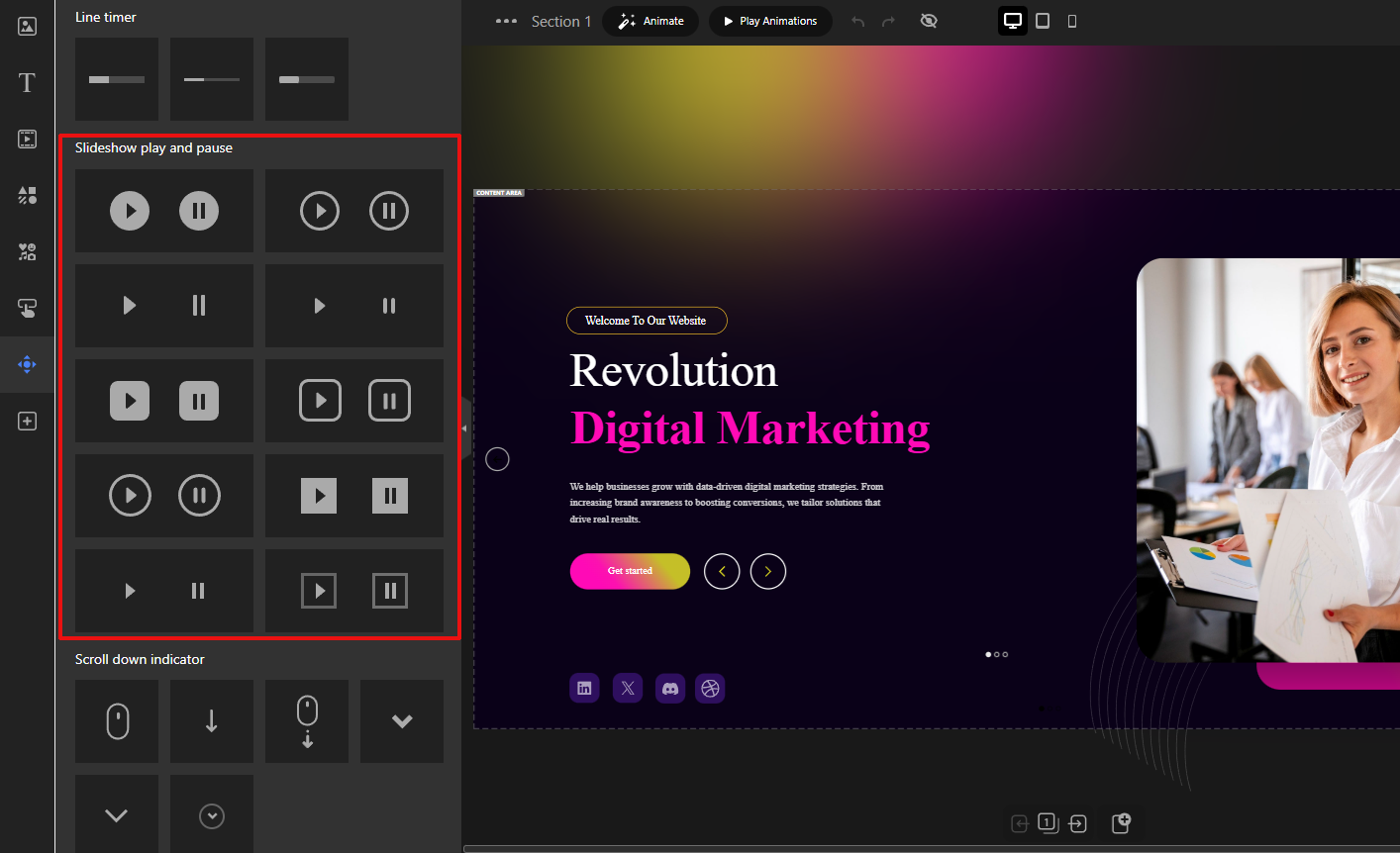
  • Provide a visible pause control
  • Respect reduced-motion preferences
  • Avoid mandatory autoplay

ARIA Roles (High Level)

Assistive technologies rely on semantic structure.

  • Use appropriate ARIA roles for sliders
  • Label navigation controls clearly
  • Ensure screen readers can interpret slide changes

Avoid Motion Overload

Too much movement can overwhelm users.

  • Limit animation frequency
  • Avoid rapid transitions
  • Keep motion predictable

When to Use (and When Not to Use) Image Sliders

Intentional usage is what separates effective sliders from ineffective ones.

When Image Sliders Make Sense

  • Visual storytelling and galleries
  • Showcasing multiple related items
  • Highlighting featured but non-critical content
  • Portfolios, inspiration sections, and campaigns

When to Avoid Image Sliders

  • When a single message is most important
  • For time-sensitive or critical information
  • When content must be immediately visible
  • On pages where performance is the top priority

Sliders should support the message, not compete with it.

Intentional Design Is What Makes Sliders Work

The debate around sliders often misses the core issue: design intent. Sliders fail not because they exist, but because they are frequently overloaded, under-optimized, or misused.

A well-designed image slider loads quickly, respects user control, works seamlessly on mobile, remains accessible to all users, and enhances rather than hides content.

Final Thought

Image sliders are not a shortcut to better design but they can be effective when used with care. By focusing on performance, accessibility, and intentional usage, you can avoid common pitfalls and create a smoother, more engaging user experience that respects both users and devices.

Website Carousel Examples, Use Cases, and Best Practices

Website Carousel Examples, Use Cases, and Best Practices

Website carousels have been debated for years. Some designers see them as powerful visual storytelling tools, while others criticize them for poor usability when implemented incorrectly. The truth sits in the middle. A website carousel can either enhance user experience or quietly damage conversions, depending on how and why it is used.

This guide focuses on website carousel examples, practical use cases, and proven best practices. Instead of re-defining the concept, we will look at when carousels actually work, how successful sites use them, and what mistakes to avoid. If you want a foundational explanation first, you can start with this detailed overview of what is a website carousel.

Why Website Carousel Examples Matter More Than Theory

Definitions explain what a carousel is, but examples show how it behaves in real environments. Many carousel problems do not come from the component itself, but from unclear goals, poor content hierarchy, or performance issues.

Looking at real-world scenarios helps answer important questions. Should this content rotate or stay static? How many slides are too many? Does this carousel support the main goal of the page?

For designers and marketers, examples bridge the gap between theory and execution. For WordPress users, they provide a blueprint that can be adapted without reinventing the wheel.
Common Types of Website Carousels and When to Use Them

Not all carousels serve the same purpose. Understanding the type of carousel you are using is the first step toward using it correctly.

Homepage Hero Carousels

Hero carousels are typically placed at the top of a homepage and are designed to communicate high-level messages.

They work best for seasonal campaigns, multiple high-priority announcements, or brand storytelling for first-time visitors. They often fail when they try to communicate too many ideas at once or when auto-play hides important content before users can read it.

A hero carousel should never replace a clear primary message. If your homepage has one main goal, a static hero section is often more effective.

Product Carousels for eCommerce

Product carousels are common on online stores, especially WooCommerce websites.

They work well for featured products, new arrivals, and related or upsell items on product pages. These carousels support exploration without forcing users to leave the page, and they usually perform better because users actively interact with them.

Testimonial and Review Carousels

Testimonial carousels help display social proof without overwhelming the layout.

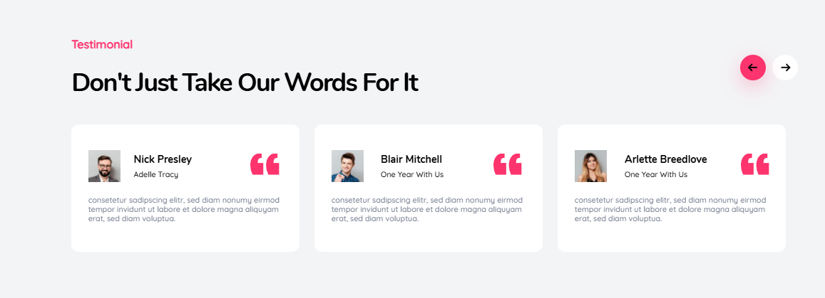
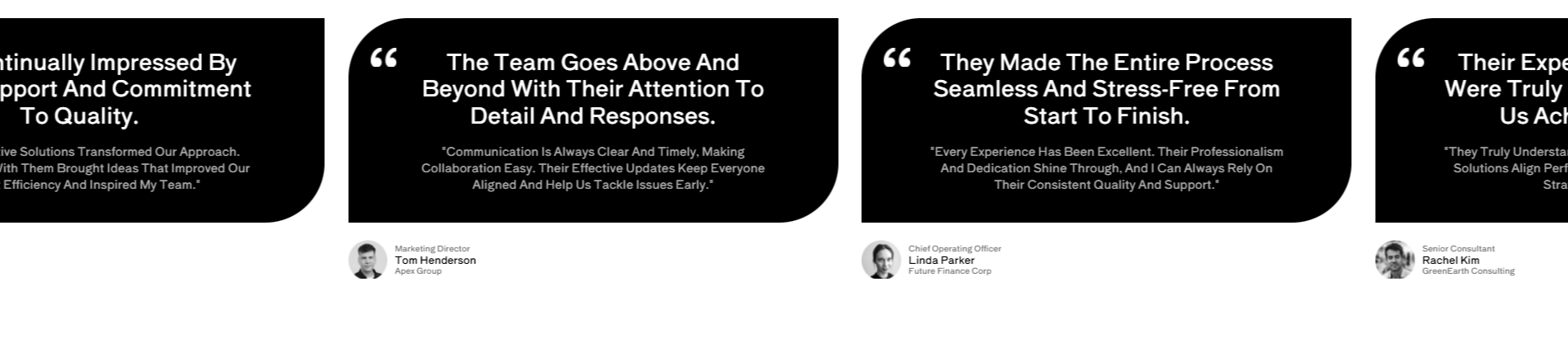
They are especially effective on SaaS landing pages, service websites, and pricing or checkout pages. Rotating testimonials keep the page visually clean while reinforcing trust, as long as the content remains short and readable.

Content and Blog Post Carousels

Content carousels highlight blog posts, tutorials, or resources.

They are useful for showcasing popular posts, category highlights, or editorial picks. On content-heavy websites, they help guide users toward valuable pages without cluttering the layout.

Website Carousel Examples Based on Real Scenarios

Instead of listing specific brands, the following examples focus on scenarios you can apply to your own website.

SaaS Homepage Feature Carousel

The goal of this carousel is to introduce multiple core features without overwhelming new visitors. It usually contains three to four slides, each focused on a single benefit.

Best practices include keeping the main headline static outside the carousel, using clear manual navigation, and avoiding aggressive auto-play. This keeps the core value proposition visible while allowing users to explore details at their own pace.

Online Store Featured Products Carousel

This carousel promotes high-margin or seasonal products. Multiple products are visible at once, usually between three and five, with clear images, pricing, and direct calls to action.
When implemented correctly, this type of carousel supports conversions instead of distracting from them.

Agency or Portfolio Carousel

Portfolio carousels showcase case studies or projects through visual previews and short descriptions. They work best when all slides follow a consistent layout and link to full case studies.

Users expect to browse visually in this context, which makes carousels feel natural rather than intrusive.

Website Carousel Best Practices That Actually Work

Carousels often fail because they ignore how users interact with content. Following proven UX principles makes a significant difference.

Limiting the number of slides is one of the most important rules. In most cases, three to five slides is enough. Adding more usually leads to lower engagement.

Each slide should have one clear call to action. Multiple competing actions reduce clarity and conversion rates. Clear, specific CTAs consistently outperform vague ones.

Auto-play should be avoided whenever possible. If it is used, transitions must be slow, controls must be visible, and users should always be able to pause the movement. Manual control almost always performs better.

Visual consistency is also critical. Similar image ratios, predictable text placement, and consistent navigation reduce cognitive load and make the carousel easier to understand.

Accessibility Considerations for Website Carousels

Accessibility is not optional. Poorly implemented carousels can create serious barriers for users.

An accessible carousel should support keyboard navigation, show visible focus states, and provide controls to pause or stop moving content. Proper ARIA labels help screen readers interpret slide changes correctly.

Designing for accessibility improves usability for all users, not just those relying on assistive technologies.

Performance and SEO Impact of Carousels

Carousels themselves are not harmful to SEO. Performance issues are.

Common problems include oversized images, excessive JavaScript, and animations that block rendering. These issues can negatively affect Core Web Vitals, especially Largest Contentful Paint.

Best practices include compressing images, lazy loading non-visible slides, and keeping animations lightweight. When optimized correctly, carousels can coexist with strong performance and healthy search visibility.

Common Website Carousel Mistakes to Avoid

Many carousel issues appear repeatedly across websites.

Using carousels to hide important content is one of the most common mistakes. Adding slides without a clear goal is another. Removing navigation controls for aesthetic reasons often hurts usability, and assuming users will wait for slides to rotate leads to missed messages.

If content matters, it should be visible immediately or easy to access.

When You Should Not Use a Website Carousel

There are situations where a carousel is simply the wrong solution.

Conversion-focused landing pages with one primary call to action often perform better with static layouts. Legal or informational pages also benefit from clarity over motion. Pages with already fragile performance should avoid adding heavy interactive elements.

In these cases, simplicity usually wins.

Building Flexible Carousels in WordPress With Depicter

Depicter is a flexible and user-friendly tool for creating carousels in WordPress without complex development. It allows you to build responsive and visually appealing carousels for different content types, including images, products, and dynamic data.

With its modern visual editor, Depicter gives you full control over design, layout, and performance while keeping everything optimized and accessible across devices.

To get familiar with how it works, watch this video.

How to Create a Carousel From Scratch with Depicter

Final Thoughts on Using Website Carousels Strategically

Website carousels are not good or bad by default. They are design tools that require intention.

When used with clear goals, limited content, and strong usability principles, carousels can improve content discovery, support storytelling, and enhance visual hierarchy. When misused, they quietly reduce engagement and conversions.

For a deeper understanding of the fundamentals behind this component, you can revisit the complete guide on what a website carousel is.

Used strategically, carousels can still earn their place in modern web design.

How to Promote Your Website For Free

How to Promote Your Website For Free

Creating a website is only the beginning. The real challenge is getting people to actually visit it. The good news is that you don’t need a budget to get noticed, website promotion free strategies can truly make a difference when used consistently. With the right approach, you can boost visibility, attract organic traffic, and grow your audience without paying for ads.

In this guide, you’ll discover more than twenty effective methods on how to promote website for free and build long-term traffic results.

Depicter Popup Builder 

Before we dive into the methods, it’s worth mentioning a tool that can support your promotional efforts: Depicter.

Depicter is built to simplify marketing tasks for website owners. It helps you create visuals, banners, popups, lead-generation elements, and custom forms, all without needing design skills. You can personalize messages for visitors, highlight offers, and craft content that captures attention and boosts engagement.

Because many of the free promotion techniques rely heavily on visual content and user interaction, Depicter can play a powerful supporting role throughout your strategy.

20+ Free Ways to Promote Your Website

1. Improve Your SEO

Search engine optimization helps your site show up when users search for relevant topics. Focus on keywords, write strong titles and descriptions, and make sure your website structure is easy for search engines to understand.

2. Start a Blog

Publishing helpful articles on your site consistently brings long-term traffic. Every new post is a new opportunity to be found through search engines.
Use Depicter to design visual elements that make your posts stand out, such as a website slider, Hero Section, Carousels, and more.

3. Diversify Your Content

Don’t rely only on text. Create videos, infographics, checklists, or short guides. Different people prefer different content types.

4. Build an Email List

Encourage visitors to subscribe to your newsletter. Sending useful updates brings people back to your site.
Depicter lets you build attractive sign-up forms or popups that fit your brand to grow your email list.

5. Create a Lead Magnet

Offer value for free a guide, a template, a discount, or a tool, in exchange for an email. This increases your list and brings repeat visitors.

6. Use Social Media Actively

Choose platforms where your audience spends time. Share useful posts, visuals, stories, or short tips regularly.

7. Repurpose Your Content

Turn a blog post into multiple social-media posts, an infographic, or a short video. This saves time and increases reach.

8. Engage in Online Communities

Join forums, groups, and communities related to your topic. Answer questions, help people, and participate naturally. Over time, users will check out your website.

9. Guest Post on Other Websites

Write valuable articles for other blogs in your niche. This introduces you to new audiences and establishes your credibility.

10. Collaborate With Micro-Influencers

You don’t need big influencers. Smaller creators with engaged audiences can help spread your content in exchange for mutual benefits.

11. Host Webinars or Live Sessions

Live sessions, tutorials, or Q&A events attract interested people and give you a chance to direct viewers to your website. Depicter can help you in this area by creating an interactive survey to collect feedback from your users.

12. Add Your Website to Free Directories

If you have a business or service, add your website to local directories or industry-specific lists. This can bring steady referral traffic.

13. Improve Your Website’s Performance

A fast, mobile-friendly site keeps visitors longer and encourages them to explore more pages.

14. Add Social Sharing Buttons

Make it simple for visitors to share your pages on social media. More shares mean more traffic naturally.

15. Create Evergreen Content

Write about topics that stay relevant for years. These pieces continue attracting visitors long after the day you publish them.

16. Leave Helpful Comments on Industry Blogs

Thoughtful comments, not spam, can spark curiosity and send readers to your site.

17. Build Backlinks Through Partnerships

Collaborate with others, exchange guest posts, or provide quotes or insights. Quality backlinks boost your authority.

18. Add Your Site to Your Email Signature

Simple but effective. Every email you send becomes a small promotional opportunity.

19. Participate in Q&A Platforms

Answering questions on popular Q&A communities helps build authority. People naturally click on your profile and discover your website.

20. Use Strong Visual Content

Infographics, diagrams, charts, and branded images attract more attention and get shared often.

You can also rely on Depicter to create sliders, carousels, hero sections, and flexible visual combinations that help your website stand out at first glance. By mixing dynamic layouts with strong visual storytelling, it becomes easier to highlight key messages and guide visitors toward important content.

21. Offer Free Tools or Templates

If your niche allows it, create simple tools or ready-to-use templates. These often get shared widely and bring recurring visitors.

22. Update Your Old Content

Refresh outdated posts occasionally. Add new data, visuals, or examples. Up-to-date content performs better in search engines.

23. Improve Internal Linking

Connect your articles and pages together. This helps visitors discover more content and strengthens your site structure.

24. Encourage Reviews or Testimonials

If you offer services or products, invite your customers to share their experiences. Social proof builds trust and attracts new visitors.

25. Do Cross-Promotion With Other Creators

Partner with someone in your niche to exchange mentions, co-create content, or feature each other. Both audiences benefit.

Conclusion

Promoting a website for free is entirely possible and even powerful when done with consistency. With smart use of content, visuals, community engagement, SEO, and cross-platform activity, you can slowly and steadily grow your traffic.
Depicter makes this process easier by giving you the ability to create marketing materials, visuals, and conversion-focused elements quickly and professionally.
Choose a few methods, stay patient, and build your presence step by step.

Best WordPress Christmas and New Year Deals 2025-26 (1)

Best WordPress Christmas and New Year Deals 2025-26

Best WordPress Christmas and New Year Deals 2025 - 2026

The holiday season is the perfect time to upgrade your WordPress website and prepare for a successful year ahead. In this post, we have curated the Best WordPress Christmas and New Year Deals 2026 to help you access powerful tools with exclusive holiday discounts.

Whether you are launching a new site or improving an existing one, these limited-time Christmas and New Year offers on plugins, themes, and hosting services allow you to enhance your website without stretching your budget.

Explore our handpicked Best WordPress Christmas and New Year Deals 2026 and take advantage of these festive savings before they end.

Have a product you would like us to feature? Fill out the form below and share your deal with us.

Have a product that should be included in our list? Don’t wait. Fill out the form below and share your details with us so we can feature your deal and help more users find it.

Featured Deals

Depicter Builder - 2 (1) - Copy

Depicter

Featured
Depicter is the #1 AI-powered builder for creating engaging Popups, Interactive Sliders, Feedback Surveys, High-impact Notification Bars, Stunning Carousels, and Eye-catching Hero Sections, trusted by more than 100,000+ happy users on their daily usage! Boost engagement and sales with powerful Popups (email subscriptions, exit intent offers, promotions, cart abandonment reminders, campaigns) and Notification Bars. Build stunning WordPress sliders, carousels, hero sections, and slideshows, from video and image sliders to WooCommerce product showcases, testimonials, galleries, and more.
Coupon code: Auto-applied Save 70%
Validity: 20 Dec 2025 to 01 Jan 2026
Get the Deal
01_phlox-39-2025-300.__large_preview

Phlox Pro

Featured
Phlox is the best Elementor multipurpose theme, trusted by over 100,000 active users and packed with more than 300 complete Elementor demos. Lightweight, modern, and fully customizable, Phlox powers every kind of website from blogs and portfolios to business sites, agencies, and online stores. With 49,000+ sales on ThemeForest and years of proven performance, it remains one of the most popular WordPress themes ever built.


Coupon code: Auto-applied Save 30%
Validity: 20 Dec 2025 to 01 Jan 2026
Get the Deal
master-purple-original

Master Slider

Featured
Master Slider is a free SEO friendly, responsive image and video slider, trusted by over 90,000 active users and 31,500 ThemeForest sales. With smooth, hardware-accelerated transitions and true touch swipe navigation, it offers a premium, lightweight, and intuitive experience that works perfectly with any theme.


Coupon code: Auto-applied Save 30%
Validity: 20 Dec 2025 to 01 Jan 2026
Get the Deal

Plugins

depicter 720_380

Depicter

Featured
Depicter is the #1 AI-powered builder for creating engaging Popups, Interactive Sliders, Feedback Surveys, High-impact Notification Bars, Stunning Carousels, and Eye-catching Hero Sections, trusted by more than 100,000+ happy users on their daily usage! Boost engagement and sales with powerful Popups (email subscriptions, exit intent offers, promotions, cart abandonment reminders, campaigns) and Notification Bars. Build stunning WordPress sliders, carousels, hero sections, and slideshows, from video and image sliders to WooCommerce product showcases, testimonials, galleries, and more.
Coupon code: Auto-applied Save 70%
Validity: 20 Dec 2025 to 01 Jan 2026
Get the Deal
master-purple-original

Master Slider

Featured
Master Slider is a free SEO friendly, responsive image and video slider, trusted by over 90,000 active users and 31,500 ThemeForest sales. With smooth, hardware-accelerated transitions and true touch swipe navigation, it offers a premium, lightweight, and intuitive experience that works perfectly with any theme.


Coupon code: Auto-applied Save 30%
Validity: 20 Dec 2025 to 01 Jan 2026
Get the Deal
Screenshot 2025-12-18 11.09.48

ElementsKit

Featured
Celebrate the holidays with up to 55% off on ElementsKit, the most complete solution for Elementor. Join millions of users who extend their sites with 90+ widgets, 20+ modules, and 1000+ ready sections. Create beautiful headers, footers, and multi level mega menus with ease, and enrich pages with parallax, particles, and animation effects. This holiday season, unlock advanced and modern design features inside a simple visual builder at the best price of the year.


Coupon code: Auto-applied Save 55%
Validity: 22 Dec 2025 to 12 Jan 2026
Get the Deal
Screenshot 2025-12-18 11.12.46

GutenKit

Featured
Make Gutenberg feel like a true visual builder this holiday season with GutenKit. Enjoy 50% off on all premium plans and build beautiful websites faster with 65+ blocks, 20+ modules, 900+ designs, and flexible patterns. Add powerful features like responsive breakpoints, query loop builder, mega menu builder, and 3D parallax effects to any page. This limited holiday offer is the perfect chance to upgrade your WordPress workflow before the season ends.


Coupon code: Auto-applied Save 50%
Validity: 22 Dec 2025 to 12 Jan 2026
Get the Deal
Screenshot 2025-12-22 16.29.17

CTX Feed Pro

Featured
CTX Feed Pro – Product Feed Manager for WooCommerce is your all-in-one solution to create and manage unlimited product feeds for any marketing or affiliate channel. Whether you want to showcase your products on ChatGPT, Google Shopping, Facebook, TikTok, or any of the 130+ supported platforms, CTX Feed Pro makes it effortless. It doesn’t matter if your store has 10 products or 100,000; CTX Feed handles them all smoothly. With 100+ ready-made templates, you can generate feeds in multiple formats (CSV, TXT, XML, and more) and even set up dynamic pricing, real-time sync, and automated updates.
Coupon code: HOLIDAY25 Save 60%
Validity: 05 Dec 2025 to 05 Jan 2026
Get the Deal
Screenshot 2025-12-18 11.14.39

MetForm

Featured
Build any form in minutes with MetForm, trusted by over 600,000 WordPress users. From contact and feedback to subscription and survey forms, packed with ready-made templates, multi-step forms, conditional logic, and smooth integrations. The drag-and-drop visual builder makes form creation effortless. Enjoy up to 50% off this holiday season and upgrade your website with smarter, faster forms. Grab MetForm now and make your site more interactive and user-friendly before this limited-time offer ends.


Coupon code: Auto-applied Save 50%
Validity: 22 Dec 2025 to 12 Jan 2026
Get the Deal
Screenshot 2025-12-18 11.17.52

GetGenie

Featured
Enjoy 45% off on GetGenie AI during the holiday offer and transform the way you create content in WordPress. GetGenie blends AI copywriting with SEO intelligence, helping you write, optimize, and rank with ease. Use 37+ templates along with SEO topic mapping, NLP keyword suggestions, SERP competitor insights, on page optimization, and content scoring. Generate full blogs in one click, chat through GenieChat, and compare content with competitors right inside WordPress or the SaaS dashboard. Act fast before this limited offer ends and let GetGenie elevate your next content win.
Coupon code: Auto-applied Save 45%
Validity: 22 Dec 2025 to 12 Jan 2026
Get the Deal

WordPress Themes

01_phlox-39-2025-300.__large_preview

Phlox Pro

Featured
Phlox is the best Elementor multipurpose theme, trusted by over 100,000 active users and packed with more than 300 complete Elementor demos. Lightweight, modern, and fully customizable, Phlox powers every kind of website from blogs and portfolios to business sites, agencies, and online stores. With 49,000+ sales on ThemeForest and years of proven performance, it remains one of the most popular WordPress themes ever built.


Coupon code: Auto-applied Save 30%
Validity: 20 Dec 2025 to 01 Jan 2026
Get the Deal
Best Email Subject Lines That Actually Work (1)

Best Email Subject Lines That Actually Work

Crafting a strong subject line is one of the simplest ways to capture attention fast, whether you are sending an email or showing a message on your website. With Depicter, these same subject line styles can power your WordPress Popup, slide-ins, and notification bars to boost engagement and clicks. In fact, there are so many things that you can do with Depciter:

A clear and compelling subject line sets the tone, builds curiosity, and tells people why they should stop and read. In this guide, you’ll learn the key elements of effective subject lines plus a big list of examples you can use or adapt.

What Makes a Good Subject Line

Here are the basics you should keep in mind:

  • Make it short and clear, so it’s fully visible on mobile.
  • Personalize when you can to make the email feel direct and relevant.
  • Show real value instead of vague promises.
  • Use urgency carefully when there is a real reason to act quickly.
  • Avoid clickbait because it damages trust and hurts long-term results.
  • Test your ideas because every audience responds differently.

Popular Subject Line Styles (With Examples)

Below you’ll find common categories of high-performing subject lines along with ready-to-use examples for each one.

1. FOMO and Scarcity

These work when something is presented as a limited-time offer or is expiring soon.

  • Only a few spots left
  • Final call to join
  • Last chance before it closes
  • Your access expires today
  • Almost gone, grab yours now

2. Curiosity and Mystery

These spark interest by teasing what’s inside.

  • You’ll want to see this
  • Something new just dropped
  • We have a surprise for you
  • Can you guess what changed
  • The story behind our latest update

3. Humor and Lighthearted Tone

Friendly, fun lines that make your email stand out.

  • Your inbox called, it misses us
  • Oops, we fixed something
  • A small joke to brighten your day
  • This email contains zero stress
  • Warning: this tip is addictive

4. Ego Appeal and Feeling Special

These make readers feel important or valued.

  • A special invite just for you
  • You’re on our priority list
  • For our top members only
  • You earned this
  • You deserve something better

5. Value and Benefit Driven

These say clearly what the reader will gain.

  • A simple way to improve your results
  • Your new shortcut to better productivity
  • Boost your conversions with this
  • A free guide you’ll actually use
  • Save hours this week with one small change

6. Pain Point Focused

These connect directly to a challenge your audience has.

  • Struggling with low engagement
  • Tired of slow results
  • Here is how to fix your workflow issues
  • What to do when sales stall
  • A solution for your biggest bottleneck

7. Personalized and Targeted

These feel tailored to one person or company.

  • Sarah, here’s a quick idea for you
  • A tip for your next project
  • Your custom recommendations
  • A smarter plan for your team
  • For your company: a better approach

8. Urgent and Time Sensitive

Useful for limited offers or deadlines.

  • Ends tonight, act now
  • 24 hours left to save
  • Don’t miss this round
  • Time is almost up
  • Last day for 50 percent off

9. Simple and Straightforward

Clear, direct subjects that say exactly what the email contains.

  • Your report is ready
  • Can we schedule a quick call
  • Important update inside
  • Your monthly summary
  • Here is the file you requested

10. Follow Up and Check In

Perfect for sequences and conversation threads.

  • Just checking in
  • Any updates on this
  • Wanted to follow up
  • A quick question
  • Still interested

11. Internal Communication

Designed for teams and employees.

  • Team update, please read
  • Reminder for this week
  • Your feedback matters
  • New project details inside
  • Quick announcement for everyone

12. Welcome Emails

Warm, friendly subject lines for new subscribers. This can be used with a welcome Popup, too.

  • Welcome, here’s what to expect
  • Thanks for joining us
  • Your first steps inside
  • Great to have you with us
  • Start here, your resources are ready

Common Mistakes to Avoid

  • Making the subject too long
  • Not matching the message inside
  • Overusing urgency
  • Using clickbait wording
  • Ignoring mobile readers

When writing subject lines, a few common mistakes can quietly hurt your open rates. Long subjects often get cut off on mobile, and mismatched messaging creates disappointment that reduces trust over time. Using too much urgency makes your emails feel pushy, while clickbait wording might earn a quick open but damages credibility in the long run. It also helps to remember that most readers check email on their phones, so clarity and brevity matter more than ever. For example, instead of writing something vague and exaggerated like “You won’t believe what just happened to your account today!”, a clear, mobile-friendly line such as “Important update to your account settings” performs far better because it’s honest, relevant, and easy to read.

Final Thoughts

When writing subject lines, a few common mistakes can quietly reduce your results. Long subjects often get cut off on mobile, and mismatched messaging leads to confusion that slowly hurts trust.

Overusing urgency can make your emails feel pushy, while clickbait wording might earn a quick open but damages credibility over time. It’s also important to remember that most people read emails on their phones, so short, clear lines work best.

Depicter, an AI-powered plugin for WordPress, helps you test variations inside popups, slide-ins, and notification bars, making it easier to avoid these pitfalls. For example, instead of something vague like “You won’t believe what we found”, a simple line such as “Quick update you should see” keeps things relevant and mobile-friendly while staying honest.

Black Friday Is the Moment to Power Up Your WordPress Site

Black Friday Is the Moment to Power Up Your WordPress Site

The secret to maximizing your budget this year is simple. Now is the absolute best time to buy powerful annual software solutions, including your favorite WordPress tools. This particular time of year is designed not only to save you money today, but also to ensure savings for the future. So you probably don’t want to miss the Best WordPress Black Friday deals 2025.

The Smartest Time to Buy WordPress is Right Now

This is more than a one-time discount. By purchasing your annual license today, you are timing your future perfectly.

Here is the ultimate benefit: When your renewal date arrives 12 months from now, it will fall exactly during the next Black Friday sale. You won’t just get a deep discount this year, you will automatically renew next year at the next biggest Black Friday price!

It’s the ultimate double-win. Maximum savings now, and guaranteed maximum savings again when you renew.

Why Black Friday Is the Perfect Time to Invest in WordPress Tools

Every year, software and SaaS companies roll out their biggest, most generous discounts during Black Friday. It’s the one time when professionals and beginners alike can upgrade their entire toolkit without stretching their budget.

This isn’t just about flashy numbers; it’s about opportunity. Many developers bundle in extra perks like premium templates, extended licenses, or bonus features, making this the ultimate time to buy the tools that truly level up your WordPress experience.

The Hidden Advantage of Timing Your Renewals Right

Smart budgeting isn’t just about cutting costs; it’s about planning ahead. By aligning your software renewals with major discount periods like Black Friday, you keep your yearly expenses predictable and optimized.

No more surprise renewals in the off-season or paying full price when you least expect it. Instead, every renewal becomes a chance to save again.

Worry-Free Renewal Strategy

Set your business up for long-term efficiency by organizing your key tools, hosting, security plugins, builders, and SEO software to renew around the same time each year.

When Black Friday rolls around, you’ll already be perfectly positioned to take advantage of the biggest savings without any stress.

Claim Your Ultimate Deal Now!

This Black Friday offer is strictly time-limited. Don’t miss this opportunity to fuel your growth and future-proof your budget for two years straight. Check out the Best WordPress Black Friday deals 2025.

Top WordPress Themes Featuring Depicter

Top WordPress Themes Featuring Depicter

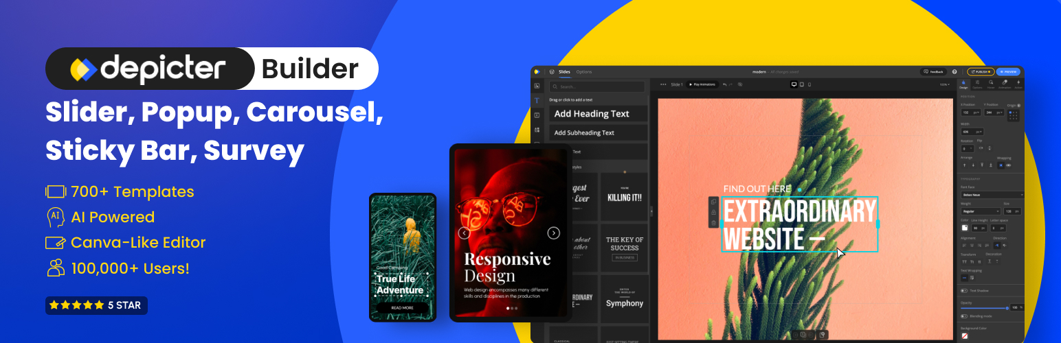
Depicter is the best WordPress AI-powered visual content builder and marketing tool that lets users create engaging Popups, Interactive Sliders, Feedback Surveys, High-impact Notification Bars, Stunning Carousels, and Eye-catching Hero Sections, without any coding. Beyond traditional sliders, it enables the creation of interactive hero sections, engaging popups, announcement bars, surveys, and much more, all within an intuitive Canva-like interface.

After several years of strong presence in the WordPress community, Depicter has become a well-recognized name, known for its reliability, versatility, and performance. Its growing user base and extensive customization options make it a perfect fit for theme developers who want to enrich their demos with dynamic, visually engaging elements that truly stand out.

In this post, we’ll showcase some of the top WordPress names that have beautifully integrated Depicter into their themes, demonstrating how it helps transform static layouts into immersive, conversion-focused experiences.

Top Teams That Are Using Depicter in Their Themes

1. Averta

Averta is a digital agency recognized for creating exceptional WordPress products that blend creativity, performance, and usability. With over 13 years of experience in web design and development, 3 products, and 240,000 active users, Averta has established a trusted name in the WordPress ecosystem through its products: Phlox Theme, Master Slider, and Depicter

Themes with Depicter:

Phlox

Phlox is a modern, lightweight, and fully customizable WordPress theme with over 49,000 sales on ThemeForest. It has consistently been featured in ThemeForest’s Weekly Popular Themes list since 2013. Designed to suit almost any type of website, including blogs, portfolios, business sites, agencies, news & magazines, restaurants, travel, photography, and WooCommerce stores, Phlox offers impressive flexibility and design quality.

Some great examples of how Depicter integrates beautifully with Phlox can be seen in demos like Dark Agency, Modern Corporate, and Green Business.

2. GoodLayers

GoodLayers is a dedicated team of experts specializing in premium WordPress theme development. They create comprehensive, unique, and visually stunning themes that combine high quality with exceptional value.

Themes with Depicter:

Some great examples of GoodLayers themes that integrate seamlessly with Depicter include Cozme, Zeomart, and Zurf.

Benefits of Using Depicter in WordPress Themes

  • Perfectly Matches Your Theme’s Design: Depicter allows developers to easily tweak every visual detail to ensure a perfect fit and a seamless user experience with the theme’s unique look.
  • Tons of Visual Tools and Flexibility: You gain access to a massive toolbox of components, supporting virtually any creative idea, from striking sliders to subtle overlay effects.
  • Super Easy for Your Customers: The tool is incredibly user-friendly and template-rich, letting non-technical users quickly customize demo content without needing to touch any code.
  • Built for Speed and SEO: Depicter’s lightweight structure and efficient loading keep your theme fast, stable, and highly optimized for search engines.
  • A Complete Visual Content Builder: Functioning as an all-in-one powerhouse, Depicter allows users to create sliders, hero sections, popups, surveys, and more within a single integrated tool.
  • Handles All Your Dynamic Content: Depicter fully supports dynamic sliders for posts, products, and reviews, making it an ideal fit for every kind of WordPress theme and data source.

Want to Include Depicter in Your Theme?

If you’re a theme developer and want to feature Depicter in your demos or theme package, we’d love to collaborate.

Conclusion

Depicter consistently proves its value as one of the most innovative and developer-friendly tools in the WordPress world. Its huge flexibility, visual strength, and simple integration make it the obvious choice for theme developers.

From hero sections and sliders to popups, surveys, and notification bars, Depicter adds engagement to any WordPress theme. The examples we’ve shown prove how smoothly Depicter can blend into any design style, helping you build demos that instantly inspire confidence and creativity.

If you’re ready to give your next theme a competitive edge that users will immediately notice and appreciate, integrating Depicter is absolutely the right next step.

FAQs

Q1: Can I integrate Depicter into my WordPress theme demos?

Yes, you certainly can! Theme developers are welcome to include Depicter in their demos. Our team is here to offer collaboration options and guidance to ensure the process is completely smooth.

Q2: Will using Depicter slow down my theme?

Not at all. Depicter is fully optimized for speed and performance. We ensure that even your most visually rich demos remain fast, lightweight, and great for SEO.

Q3: Is Depicter compatible with page builders like Elementor or Gutenberg?

Absolutely. Depicter works perfectly with Elementor, Gutenberg, and most other popular WordPress page builders, making it incredibly easy to integrate into any developer’s existing workflow.

Q4: What kinds of elements can I create with Depicter?

Depicter is a complete tool! You can build sliders, hero sections, popups, sticky bars, surveys, carousels, and even dynamic content sliders for posts, products, ACF fields, and much more, all in one place.