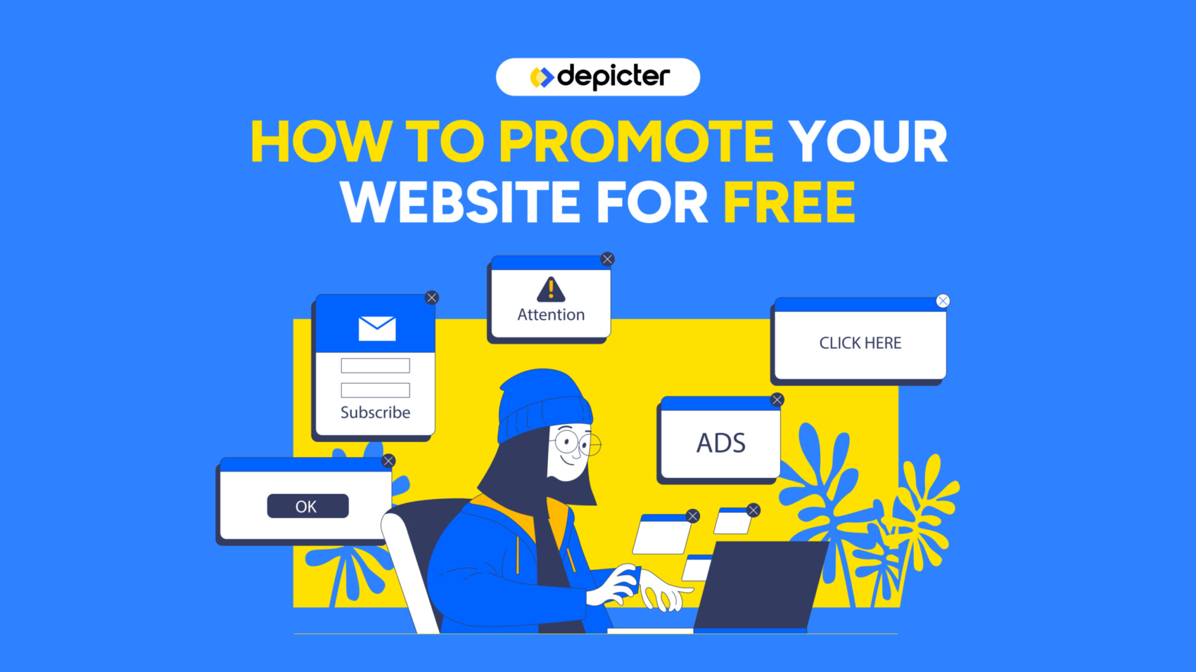
If you’re running a Shopify store in 2026, you already know traffic is expensive. Whether it’s Meta ads, Google ads, influencers, or SEO, getting visitors isn’t easy anymore.
But here’s the real question:
Are you capturing those visitors before they leave?
Because if you’re not actively working on Shopify email capture, you’re basically paying for traffic that disappears forever.
This guide breaks down how to approach Shopify lead generation, how to increase opt-in rates, and how to turn casual visitors into long-term revenue through email.
Why Email Is Still the Highest ROI Channel for Shopify
Email marketing remains one of the highest ROI channels in e-commerce. Unlike paid ads, your email list is an owned asset. You don’t lose it when CPMs go up. You don’t compete in an auction every time you want to talk to your customers.
For Shopify stores, building an email list means:
- Higher lifetime value
- Lower dependency on ads
- Better product launches
- More predictable revenue
When you think about build email list Shopify strategies, it’s not just about a newsletter box. It’s about building a long-term communication channel.
A lot of stores focus on conversion first and email second. But in reality, Shopify email capture often happens before the purchase, and that’s what allows you to recover visitors who weren’t ready to buy.
Modern Shopify stores rely on behavioral onsite strategies rather than static forms buried in the footer.
Why Most Shopify Stores Fail at Email Capture
Let’s be honest. Most Shopify stores do one of these:
- A tiny footer signup form
- A generic 10% discount popup
- A form that shows instantly to everyone
- No segmentation at all
And then they wonder why their Shopify newsletter signup optimization isn’t working.
The truth is, static forms don’t convert well. Generic popups feel spammy. And showing the same message to every visitor ignores context.
Average opt-in rates for e-commerce hover around 2–5%. But that number can go higher when you use smarter strategies like:
- Exit intent targeting
- Scroll-based timing
- Cart-based triggers
- Personalized offers
Advanced tools allow you to trigger offers based on behavior, timing, and page context instead of showing the same popup to everyone.
Understanding Email Capture Psychology
If you want better Shopify lead generation strategies, you need to understand psychology first.
The Value Exchange
People don’t give their email for no reason. You’re asking for access to their inbox. That’s personal.
So the offer must feel worth it:
- Discount
- Free shipping
- Early access
- Exclusive content
- Product recommendation quiz
Timing Matters
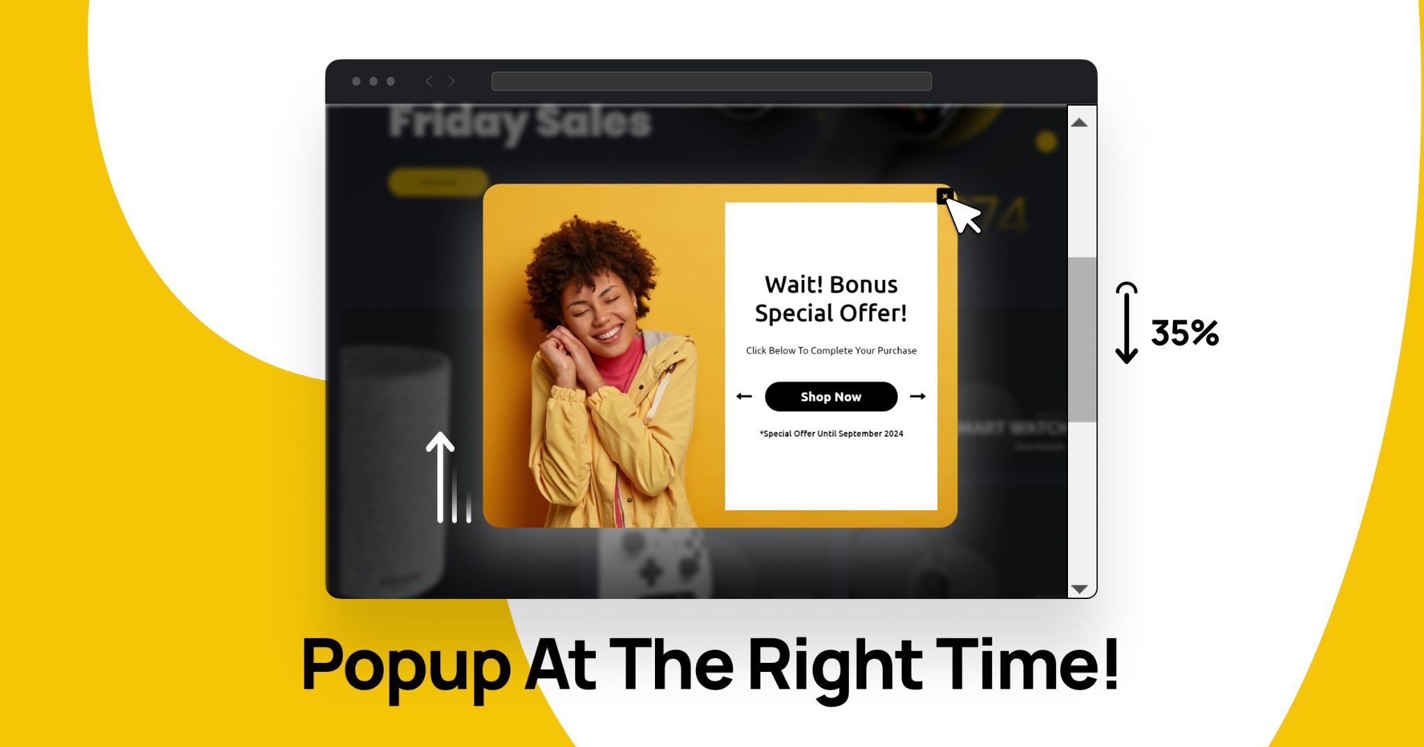
If a popup appears the second someone lands on your homepage, it feels aggressive. But if it appears after they scroll 60% of a product page? That’s contextual.
This is where Shopify exit intent popup strategies shine. They wait until the visitor signals they’re leaving.
Micro-Commitments
Two-step opt-ins often convert better than single-step forms. For example:
“Want 10% off?”
Yes → then ask for email.
Behavior-based triggers and dynamic targeting help align offers with actual user intent instead of guessing.
Core Email Capture Methods for Shopify
There isn’t just one way to handle Shopify email capture. The highest-performing stores combine multiple approaches.
Exit-Intent Popups
Exit intent is one of the most powerful tools for reduce cart abandonment with email Shopify strategies.
When a user moves toward closing the tab or navigating away, a popup appears with a last-chance offer.
Best practices:
- Keep it simple
- One clear CTA
- No overwhelming design
- Offer something meaningful
You can trigger exit-intent campaigns on product pages, cart pages, or even collection pages. Some stores only show them when cart value exceeds a certain threshold.
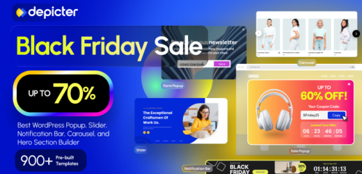
Depicter Shopify popup builder can be configured to trigger exit-intent popups based on page type, cart value, or device.
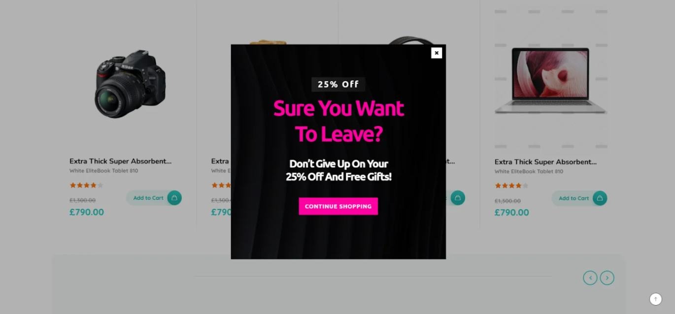
You could use it to display a discount for cart abandoners or offer a lead magnet for blog visitors.
Timed and Scroll-Based Popups
Sometimes, exit intent isn’t enough.
Timed popups appear after someone spends, say, 20 – 40 seconds on a page. Scroll-based triggers activate when a visitor scrolls a certain percentage.
These strategies improve Shopify popup for email performance because they feel more natural.
Instead of interrupting immediately, you wait until the visitor is engaged.
With tools that support scroll triggers and time delays, you can tailor campaigns differently for homepage visitors versus product page visitors. Depicter allows you to configure time-based or scroll-based triggers and adjust them by device or page type.
Sticky Announcement Bars for Email Capture
Not everyone likes popups.
Sticky bars offer a less intrusive method for Shopify onsite lead capture. They sit at the top or bottom of the screen and stay visible as users scroll.
Common strategies:
- “Free shipping on first order, Join our list”
- “Get early access to our next drop”
- Countdown-driven urgency
The Shopify announcement bar can work well for email marketing when you want constant visibility without heavy interruption.
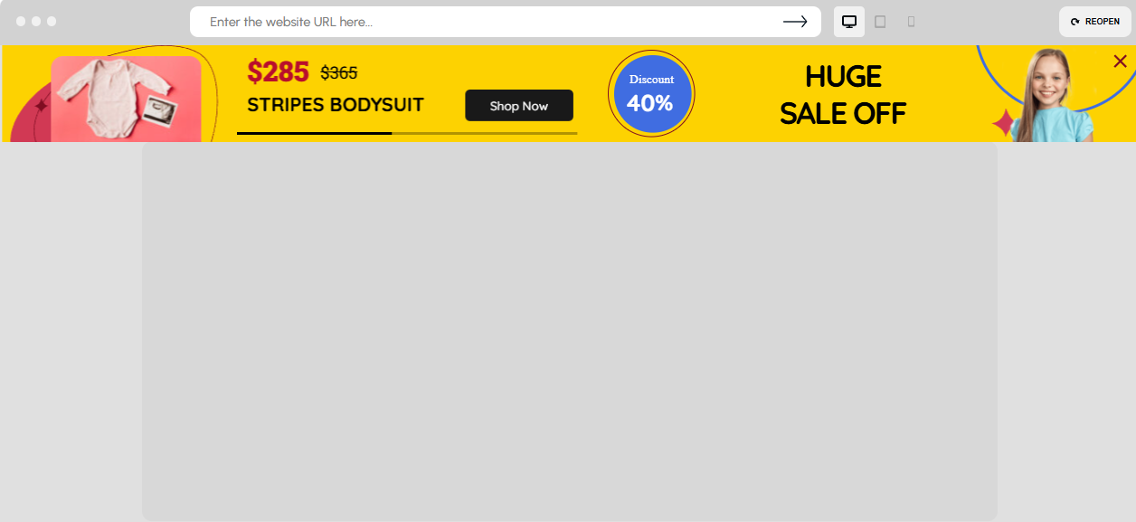
Depicter can be used to create sticky announcement bars with countdown timers and CTA buttons. You could display them sitewide or limit them to specific campaigns like seasonal sales.
Advanced Email Capture Strategies for Shopify
Once you’ve mastered the basics, you can move into more advanced territory.
Dynamic Product-Based Offers
Imagine combining dynamic product recommendations with email capture.
Instead of generic text:
“Join our list.”
You show:
“Get 10% off this exact collection.”
Or display a slider of trending products inside the popup.
This aligns email capture with real buying intent.
Depicter Shopify Slider supports dynamic product feeds that update automatically. You could display best sellers or category-specific products inside your campaigns.
Multi-Step Capture Flows
Two-step flows sometimes outperform single-step forms.
Example:
Step 1: “Want early access to Black Friday deals?”
Step 2: Email field
This approach works well for growing your email list in Shopify because it reduces friction.
Depicter allows you to create multi-step flows with conditional branching. You might design a sequence where different answers lead to different email segments.
Common Email Capture Mistakes on Shopify
Many stores hurt their own Shopify lead generation without realizing it.
Common mistakes:
- Showing popups immediately
- No frequency cap
- Same offer everywhere
- No mobile optimization
- Too many overlapping apps
Another big one? Relying only on discounts. That trains customers to wait for deals.
Using proper targeting rules and frequency controls helps reduce annoyance and increase opt-in rate. Depicter includes targeting logic and display controls that can limit how often a campaign appears to the same visitor.
The Problem With Using Multiple Shopify Apps
Many Shopify stores stack:
- One popup app
- One announcement bar app
- One slider app
- One survey app
This leads to:
- Script overload
- Slower loading times
- Design inconsistency
- Harder campaign management
When you search for best Shopify apps for lead generation, you’ll find dozens. But stacking five tools creates complexity.
Instead of managing separate systems, some stores move toward a centralized conversion layer that handles multiple campaign types from one interface.
A Unified Approach to Shopify Email Capture
Instead of thinking in terms of “popup app” or “quiz app,” it’s more effective to think in terms of a unified onsite marketing system.
That system should allow you to create:
- Popups
- Sticky bars
- Sliders
- Surveys
- Slide-Ins
- And more
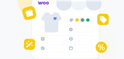
Depicter for Shopify can function as a centralized visual builder where you manage popups, notification bars, sliders, and surveys from one place to run your campaigns. You could use it to coordinate email capture campaigns without stacking multiple separate apps.
Who Should Focus on Advanced Email Capture?
If you’re:
- Running paid ads
- Launching new products
- Preparing seasonal campaigns
- Struggling with low opt-in rates
- Scaling email marketing
Then, improving your Shopify email capture strategy can dramatically increase revenue without increasing traffic.
Especially for stores investing heavily in ads, capturing emails before users leave can lower acquisition costs over time.
Conclusion
Traffic without capture is a wasted opportunity.
If you want sustainable growth, you need:
- Smart timing
- Behavioral targeting
- Segmentation
- Unified campaign control
Shopify lead generation is not about throwing a random popup on your homepage. It’s about building a structured, contextual, and performance-driven email capture system.
When done right, email becomes your most stable revenue channel, not just a support tactic.
And Today, stores that win won’t be the ones with the most traffic. They’ll be the ones who capture it intelligently.