Image sliders have become a familiar element in modern web design. From homepage hero sections to product showcases and portfolios, they offer a visually engaging way to present multiple pieces of content within a limited space. Despite their popularity, sliders are also one of the most debated UI components due to concerns around performance, accessibility, and user engagement, which is why following image slider best practice is essential for achieving a balance between visual appeal and usability.
Understanding the fundamentals of What is an Image Slider helps designers and site owners make informed decisions about when and how sliders should be used effectively.
The truth lies somewhere in between. Image sliders are neither inherently good nor bad. When implemented with intention and technical care, they can enhance storytelling and visual appeal.
When implemented poorly, they can harm usability, slow down pages, and frustrate users. Understanding best practices is essential for making sliders work effectively rather than against your website’s goals.
Why Image Sliders Remain Popular
Image sliders continue to be widely used because they solve a common design challenge: how to present multiple highlights without overwhelming the layout. They allow designers to rotate content, emphasize visuals, and introduce motion to otherwise static pages.

Common reasons websites use sliders include:
- Showcasing multiple products or services
- Highlighting featured blog posts or announcements
- Creating visual storytelling sequences
- Adding movement to hero sections
However, popularity alone does not guarantee effectiveness. Over time, UX research has raised valid concerns about how users interact with sliders, especially when they are overloaded or poorly optimized. The key takeaway is not to abandon sliders entirely, but to use them correctly.
Common Image Slider Mistakes
Many issues associated with sliders stem from predictable implementation mistakes. Avoiding these pitfalls significantly improves usability and performance.
Too Many Slides
One of the most common errors is including too many slides. Users rarely view more than the first one or two slides, especially on homepages. Excessive slides dilute attention and reduce content recall.
Best practice: Limit sliders to 3–5 slides maximum.
Autoplay Without Controls
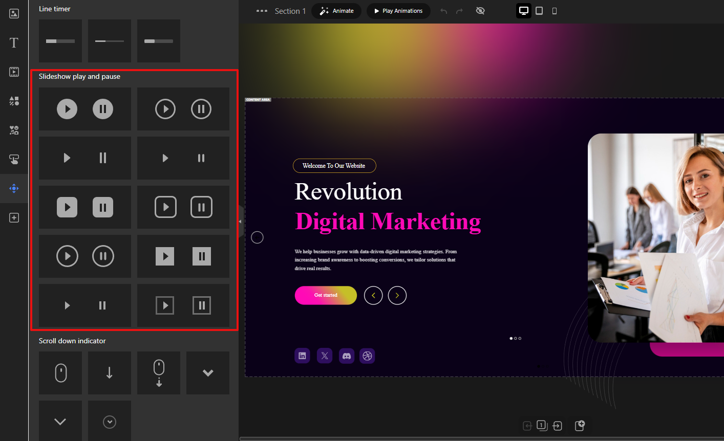
Autoplay sliders that lack pause, navigation arrows, or swipe controls can feel intrusive. Users should never feel forced to consume moving content.
Best practice: Always provide clear controls and the ability to pause or navigate manually.
Heavy or Unoptimized Images
Large image files dramatically increase load time, especially on mobile networks. This negatively impacts both user experience and SEO.
Best practice: Optimize images for size, format, and resolution before uploading.
Poor Text Readability
Text placed directly on images often suffers from low contrast or cluttered backgrounds, making it hard to read.
Best practice: Use overlays, contrast-aware colors, and readable font sizes.
Using Sliders for Critical Content
Sliders are not ideal for conveying essential information such as core value propositions or legal notices. Content hidden behind slides risks being missed entirely.
Best practice: Reserve sliders for supporting or exploratory content, not critical messaging.
Performance and Speed Best Practices
Image slider performance is one of the strongest arguments against sliders but it doesn’t have to be. With modern techniques, sliders can be lightweight and fast.
Optimize Image Sizes
Always serve appropriately sized images. Avoid uploading full-resolution photos when smaller dimensions are sufficient.
- Use modern formats like WebP when possible
- Compress images without noticeable quality loss
- Serve different sizes for different screen resolutions
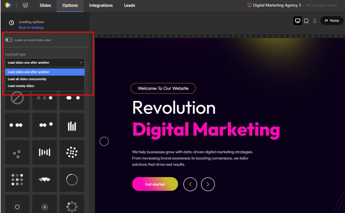
Use Lazy Loading
Lazy loading ensures images load only when they are needed, rather than all at once. Modern image sliders typically include this capability as a built-in feature and also provide additional loading-related options, such as deferred asset loading and optimized rendering behavior, to help improve overall page performance.
- Load the first slide immediately
- Defer loading off-screen slides
- Reduce initial page weight
Avoid Excessive Animations
Complex transitions and layered animations require more processing power and JavaScript execution.
- Prefer simple fades or slides
- Avoid stacked animation effects
- Keep transitions subtle and purposeful
Mobile User Experience Considerations
Mobile users often make up the majority of website traffic, making image slider usability for mobile users essential.
Swipe-Friendly Navigation
Sliders should feel natural on touch devices.
- Support horizontal swipe gestures
- Ensure smooth, responsive movement
- Avoid reliance on hover interactions
Touch-Friendly Controls
Navigation elements must be large enough to tap comfortably.
- Use adequately sized arrows and buttons
- Avoid tiny pagination dots
- Leave sufficient spacing between controls
Readable Text on Small Screens
What works on desktop often fails on mobile.
- Increase font sizes for mobile breakpoints
- Shorten text content
- Ensure adequate line spacing
Avoid Precision-Based UI Elements
Small arrows or dots demand precise tapping, which frustrates users.
- Favor clear buttons
- Reduce visual clutter
- Keep interaction simple
Accessibility Best Practices for Image Sliders
Accessibility is frequently overlooked in slider design, yet motion and interaction can pose real barriers for some users.
Keyboard Navigation
Users relying on keyboards must be able to navigate sliders.
- Support tab navigation
- Allow arrow key interaction
- Ensure focus indicators are visible
Pause or Stop Autoplay
Motion can be distracting or harmful to some users.
- Provide a visible pause control
- Respect reduced-motion preferences
- Avoid mandatory autoplay
ARIA Roles (High Level)
Assistive technologies rely on semantic structure.
- Use appropriate ARIA roles for sliders
- Label navigation controls clearly
- Ensure screen readers can interpret slide changes
Avoid Motion Overload
Too much movement can overwhelm users.
- Limit animation frequency
- Avoid rapid transitions
- Keep motion predictable
When to Use (and When Not to Use) Image Sliders
Intentional usage is what separates effective sliders from ineffective ones.
When Image Sliders Make Sense
- Visual storytelling and galleries
- Showcasing multiple related items
- Highlighting featured but non-critical content
- Portfolios, inspiration sections, and campaigns
When to Avoid Image Sliders
- When a single message is most important
- For time-sensitive or critical information
- When content must be immediately visible
- On pages where performance is the top priority
Sliders should support the message, not compete with it.
Intentional Design Is What Makes Sliders Work
The debate around sliders often misses the core issue: design intent. Sliders fail not because they exist, but because they are frequently overloaded, under-optimized, or misused.
A well-designed image slider loads quickly, respects user control, works seamlessly on mobile, remains accessible to all users, and enhances rather than hides content.
Final Thought
Image sliders are not a shortcut to better design but they can be effective when used with care. By focusing on performance, accessibility, and intentional usage, you can avoid common pitfalls and create a smoother, more engaging user experience that respects both users and devices.
Leave Comment