Want to know what a website carousel is? Ever seen those swipeable sections on websites that show off cool pictures or info?
Those are called website carousels, kind of like a digital picture frame that keeps things fresh.
They’re a great way to grab attention and pack a lot of info into a small space.
In this guide, we’ll walk you through everything you need to know about website carousels—step by step.
First, we’ll explain what carousels are and why they’re such a valuable tool for modern websites. Then, we’ll clear up the difference between carousels and sliders (don’t worry—it’s a subtle distinction).
Along the way, we’ll show you real-world examples to spark your creativity. And to top it off, we’ll share practical tips for designing high-impact carousels and walk you through how to build your own (yes, it’s easier than you might think!).
So let’s get started—and take your website to the next level.
Learn How to Create a Website Carousel From Scratch
In this video, you’ll learn how to create a website carousel from scratch using Depicter.
What is a Website Carousel?
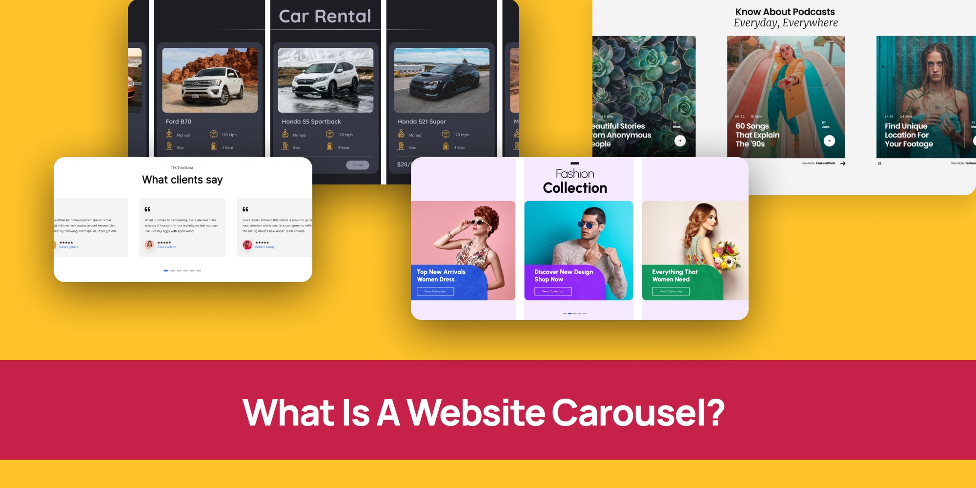
Ever scrolled through a website and seen those cool, swiping images or videos?
Those are called website carousels, also known as carousel sliders. Think of them like multiple digital picture frames that show off different stuff all at once.
There are two main types:
- Automatic Carousels: These are like those fancy automatic photo booths at the mall. They change pictures on their own, showing you different things at a set speed.
- Manual Carousels: These are like flipping through a photo album. You use arrows on the side to control which picture you see.
Website designers love carousels because they’re like superheroes with two superpowers:
- Space Savers: They can showcase a bunch of cool stuff, like your favorite bands’ new albums or the top games to download, without taking up tons of space on the website.
- Attention Grabbers: They keep you hooked! Those swiping pictures are way more interesting than just plain text, right? This makes you more likely to stay on the website and check out what they have to offer.
So now you know what carousels are on a website, and you probably already know what a slider is on a website, but you can’t quite see the difference.
That’s alright, we’ll break it down for you.
Website Carousel vs. Slider: What’s the Difference

You hear the terms “carousel” and “slider” thrown around when talking about websites. They both sound similar, right?
Well, you’re not wrong! Both carousels and sliders are like slideshows that show off images, videos, or other content on your website. You can often control them manually with arrows, or they can change automatically.
Here’s the small catch:
- Carousels: Imagine a merry-go-round for images. A carousel shows you several slides at once, like a little preview window.
- Sliders: Think of a single photo frame. Sliders only show you one slide at a time, and you click arrows (or don’t, depending on the slider) to see the next one.
So, In the grand scheme of things, both carousels and sliders achieve the same goal – showcasing content. But the way they do it can be slightly different.
Don’t worry, though, no matter which you choose, they can be great tools to boost your website’s performance if used well!
Website Carousel Examples
Looking for carousel examples to spark ideas for your next website design? Let’s explore a few possibilities.
Imagine a clothing store’s homepage. A carousel could elegantly showcase their latest fashion collections, with each slide featuring a different outfit and a clear call-to-action like “Shop Now!”
But carousels aren’t limited to product images. For example, an architect could use one to highlight completed projects—displaying each building one at a time in a clean, professional layout.
Depicter Comes With Many Website Carousel Templates!
Let’s take a look at some website carousel templates to inspire you in your website design.
Grocery Carousel
Imagine a grocery store website using a carousel to display their weekly specials. Mouthwatering photos of fresh fruits, vegetables, and delicious treats would grab your attention right away!
Fashion Trends Carousel
A clothing store could use a carousel to highlight the latest trends. They could show off trendy outfits or new arrivals, making it easy for you to discover the hottest styles.
Brands Carousel
Companies often use carousels to display logos of their trusted partners or collaborators. This builds trust with visitors and shows the strength of their brand network.
Company Testimonial Carousel
Testimonials are a great way to showcase positive feedback from satisfied customers. A carousel can display these testimonials, one at a time, letting visitors see what others are saying.
Podcast Box Carousel
Podcasters can use carousels to feature their latest episodes. Eye-catching graphics and short descriptions can entice visitors to tune in and listen.
Clean Testimonial Carousel
Similar to testimonials, carousels can be used to display positive quotes or reviews from happy clients. This adds social proof and builds trust with potential customers.
Web Page Carousel Examples: In Action
You’ve seen some web page templates above that you could use in your website.
Let’s take a look at some Real Websites using carousels on their webpages to inspire you in your design.
Silkool Tomiko
Imagine planning a trip to Tomioka City! The official tourist information website, Silkool Tomiko, might use a carousel to showcase stunning photos of the city’s must-see attractions. Each slide could feature a different landmark, like a beautiful temple or a serene garden, tempting you to explore further!
MAENI
Maeni, a manufacturing company, wants to show off the cool things they make. Their website might have a unique carousel where the items seem to move based on a slider bar. As you adjust the slider, the carousel animates, giving you a 360-degree view of their products in a fun and interactive way!
Arte
Feeling indecisive about what to watch? Arte, a popular TV channel, might use a carousel to highlight their latest documentaries, films, and other programs. Each slide could display a captivating image and a short description of the show, making it easy to discover something new and interesting to tune into.
Gravis
Looking for the latest iPhone or MacBook? Gravis, an online Apple product store, might use a carousel to showcase their hottest deals. Imagine swiping through images of sleek Apple devices, each with a clear “Buy Now” button, making it a breeze to grab the gadget you desire.
Apple
Apple’s official website might use a carousel on their Mac page to convince you they’re the best place to buy a Mac computer. Each slide could highlight unique features of Macs, like their stunning displays or powerful performance, making a compelling case for why you should choose Apple.
Ikea
Ikea isn’t just about furniture! Their website might have a carousel featuring articles with tips on how to treat yourself right, every day. Imagine swiping through ideas for a relaxing bath, a cozy reading nook, or a delicious home-cooked meal, inspiring you to create a little everyday oasis in your own home.
Quick Tips: Website Carousel Best Practices
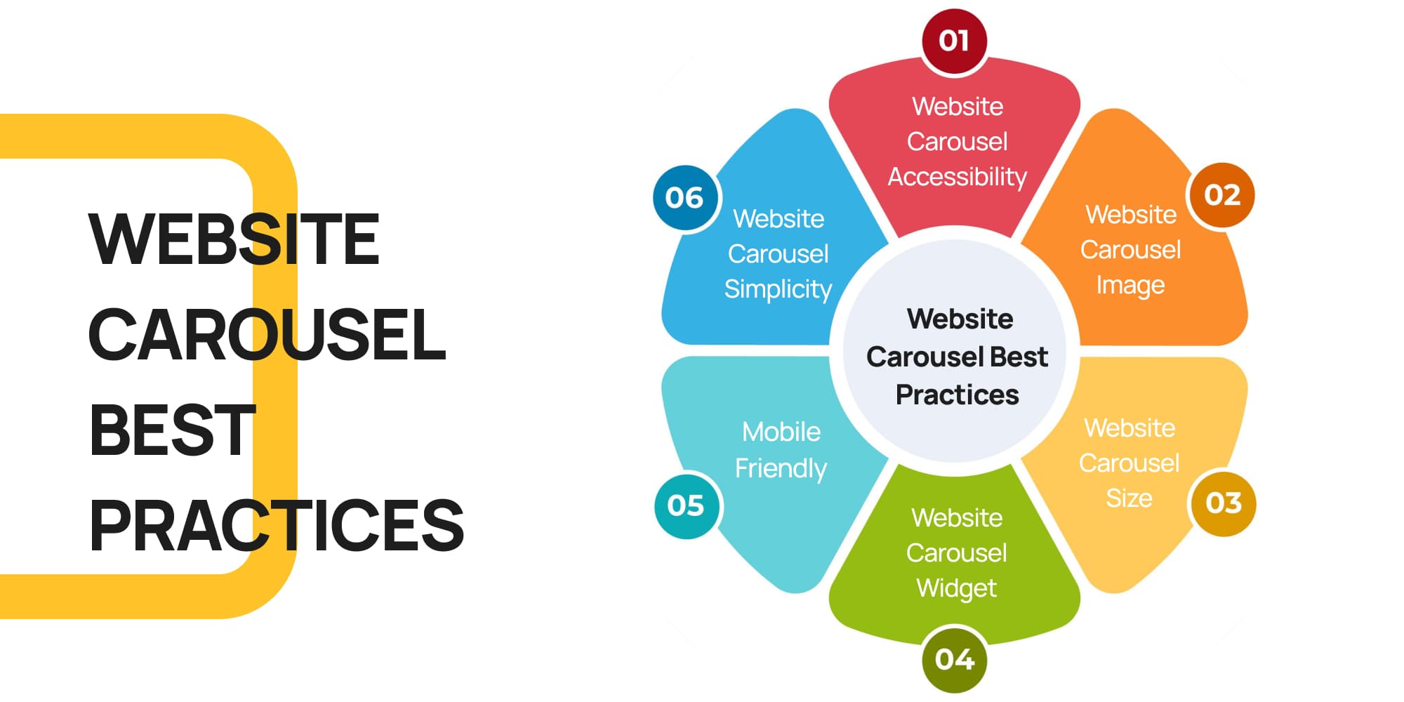
Here are some handy tips to make sure your website carousel is both beautiful and easy to use for everyone.
Imagine you’re designing a storefront window – you want it to be attractive and grab people’s attention, but also clear and easy to understand.
The same goes for your website carousel! Here’s how to achieve that:
1. Website Carousel Accessibility
Imagine someone is visiting your website for the first time. Is it clear what each slide is about, and how to navigate the carousel? Here’s what you can do:
- Clear Structure: Build the carousel like a well-organized box, with each slide having a clear purpose. This helps everyone understand what’s there.
- User Control: Let people navigate the carousel at their own pace. This means including buttons to move forward and backward, and the ability to pause any animations.
- Easy to See: Make sure the colors and text are easy to read against the background, just like a well-lit shop window!
2. Website Carousel Image
People are drawn to visuals, so use high-quality images that are relevant to your message. Think of them as eye-catching headlines for each slide.
3. Website Carousel Size
Don’t make your carousel too big or too small. It should be a comfortable size that fits well on your webpage and doesn’t overwhelm visitors.
4. Website Carousel Widget
Many website builders, like WordPress, have plugins that make creating carousels a breeze. We recommend Depicter, a user-friendly website carousel WordPress plugin that lets you customize your carousel with ease.
5. Mobile Friendly
Remember, many people browse websites on their phones. Make sure your carousel looks good and works smoothly on all devices, not just computers.
6. Website Carousel Simplicity
Avoid cramming too much text or information onto each slide. People won’t have time to read a whole paragraph, so focus on a clear message and a strong image.
Website Carousel Tutorial: Easy as Pie!

Imagine you want to add a cool carousel to your website, but the idea of coding feels a bit overwhelming. That’s exactly where website carousel plugins come in handy!
These plugins act like user-friendly tools that let you build carousels without needing any programming skills.
If you’re using WordPress, one popular choice is the Depicter plugin. Think of it as a complete carousel-building kit!
Depicter simplifies the process by offering ready-made carousel templates, drag-and-drop functionality, and plenty of customization options.
This means you can easily add your own images and text, and pick a design that fits your website’s style perfectly.
Best of all, in the next section of this guide, we’ll walk you through each step to create and add a carousel to your site—no stress involved!
Step 1: Installing and activating the Depicter Plugin
Before anything else, once your website is ready, in WordPress dashboard, head to plugins and click on “Add New Plugin“, then search for “Depicter“.
Once you find it, click on “Install Now“, and once installed, click “Activate“.

Step 2: Creating your Carousel
In this step you have two options; you can either choose one of the pre-made website carousel template and edit it, or you can create your carousel from scratch.
In this tutorial we’ll explain both.
a) Creating a Carousel Using a Pre-Made Carousel Template:
First, open the Depicter dashboard and either select the Carousel category or simply type “carousel” into the search bar.
Next, browse through the available templates. If you find one that suits your needs, go ahead and import it.
Finally, customize the carousel to fit your style—and just like that, you’re all set!
b) Creating a Carousel From Scratch
In the WordPress dashboard, head to Depicter. There are lots of pre-made carousel templates as you saw in the previous section.
But if you have something special in your mind, you can start creating your own carousel from scratch and we’ll help you with that.
So head to “CREATE A BLANK” on the left and choose “Carousel“.
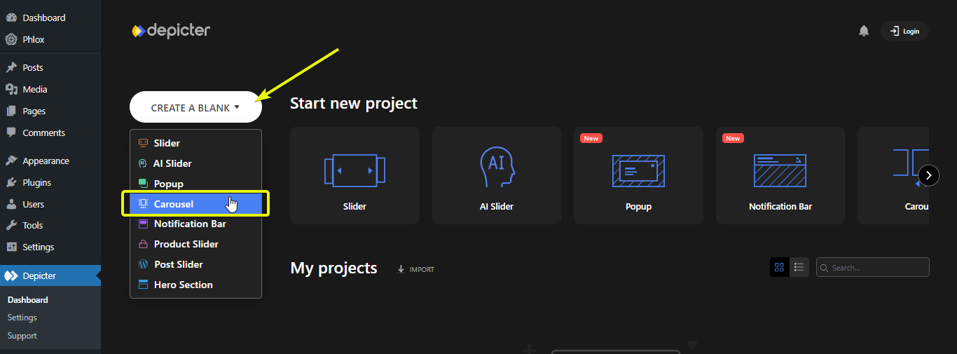
Choose a name, and adjust the width and height of your carousel and start designing.
Once you’re done designing, publish your carousel so you can add it to your website.
Step 3: Adding the Carousel to your WordPress Website
Adding a carousel to your website is simple. First, locate the homepage—or any page where you want the carousel to appear—either through the “Pages” section or by navigating directly to that page.
Once you’ve found it, click Edit with Elementor to begin customizing.

Once you’re inside the Elementor editor, start by creating a section and adding the Depicter widget to it. Then, select the carousel you previously created.
When everything looks good, click Update—and just like that, you’re all set!
Easy as pie!
And that’s it, only in three steps, you’ve learned how to create and add a carousel to your web page using the best widget possible; Depicter!
Conclusion: Level Up Your Website with Website Carousels!
So, there you have it! By now, you’ve learned everything you need to know about website carousels. We’ve covered what they are, explained how they can boost your website, and even cleared up the mystery behind “carousel vs. slider.”
We also explored some inspiring website carousel examples to spark your creativity. From showcasing your latest fashion collection to featuring glowing client testimonials, carousels offer a versatile way to grab attention and pack a punch.
Remember, using website carousel templates and user-friendly plugins like Depicter makes creating stunning carousels a breeze, even if you’re not a coding pro.
Here are some key takeaways to keep in mind:
- Website carousel best practices: Keep it clear, accessible, and mobile-friendly. Use high-quality images and focus on a strong message for each slide.
- Website carousel size: Choose a comfortable size that fits your website’s layout.
- Website carousel widget: Explore website builder plugins like Depicter to create and customize carousels with ease.
With a little planning and the right tools, you can easily add website carousels to your website and take your user experience to the next level. Now that you’re armed with this knowledge, get ready to create eye-catching carousels that will leave a lasting impression on your visitors!
FAQs
What exactly is a website carousel?
A website carousel is a dynamic slideshow feature on websites that displays multiple images, videos, or content in a rotating or swipeable format. It’s like a digital picture frame that keeps your site fresh and engaging.
How is a carousel different from a slider?
While both show content slides, a carousel typically displays several slides at once (like a mini preview), whereas a slider shows one slide at a time. Both can auto-rotate or be manually controlled.
Why should I use a carousel on my website?
Carousels save space by showcasing multiple pieces of content in one area, and they grab visitors’ attention, keeping them engaged longer. They’re great for highlighting products, testimonials, or featured articles.
Can I use carousel for things other than images?
Absolutely! Carousels can display videos, text, testimonials, logos, or even interactive content like podcast episodes.
Do I need to know coding to create a website carousel?
No coding required! Plugins like Depicter for WordPress let you create and customize carousels easily with drag-and-drop tools and ready-made templates.
Is website carousel mobile-friendly?
Yes, good carousel plugins and designs are responsive, meaning they look great and work smoothly on all devices, including smartphones and tablets.

Leave Comment