Have you ever been browsing a website and suddenly a new window appears on top of the page? That’s a popup, also called a modal popup!
Popups are like little boxes that websites can use to show you something extra. They can be a bit surprising, but they’re actually quite common and useful.
So why do websites use these popups? Well, there are a few reasons. Imagine you own a store and you want to tell your customers about a special sale.
A popup is a great way to grab their attention and let them know about the deals you have going on. You can use popups to collect email addresses to stay in touch with your customers and send them updates.
In short, website creators use popups to share important information and connect with their visitors in a more personal way.
This article is your one-stop shop for learning all about popups!
We’ll break down what they are, why websites use them, and explore a special kind of popup called a modal popup.
We’ll even cover some tricks to make sure popups on your website are helpful, not annoying, and show you how to add them without needing to be a computer whiz using a popup builder!
So, What Is A Popup?
Ever browsing a website and suddenly a new box pops up? It might dim the background a bit and show a message or ask you to do something, like join an email list or grab a free download.
This attention-grabbing box is called a popup. In the world of websites, If a popup blurs the background, then it is more formally called a modal popup.
What Are Other Names For Popups?
You might hear different names for those little windows that pop up on websites. They can be called modal popups, lightboxes, or even something fancy like magnific popups. But don’t worry, they all mean the same thing, with slight differences.
These popups are like special windows that open on top of the website you’re on. They often appear when you scroll down the page, click a button, or even just enter the website.
In modal popups, the background of the website usually gets a little blurry, and the popup window won’t close until you do something with it, like click “OK” to close it.
This is different from the old-fashioned popups you might be used to. Those would open up on a website and just stay there, even if you clicked on something else.
You could end up with a whole bunch of them open at once, making it hard to see the website itself. No wonder people got annoyed with those, and that’s why popup blockers were invented!
We won’t be talking about those annoying popups here. We’re focusing on the helpful kind, the modal popups that make your website experience smoother, not more frustrating.
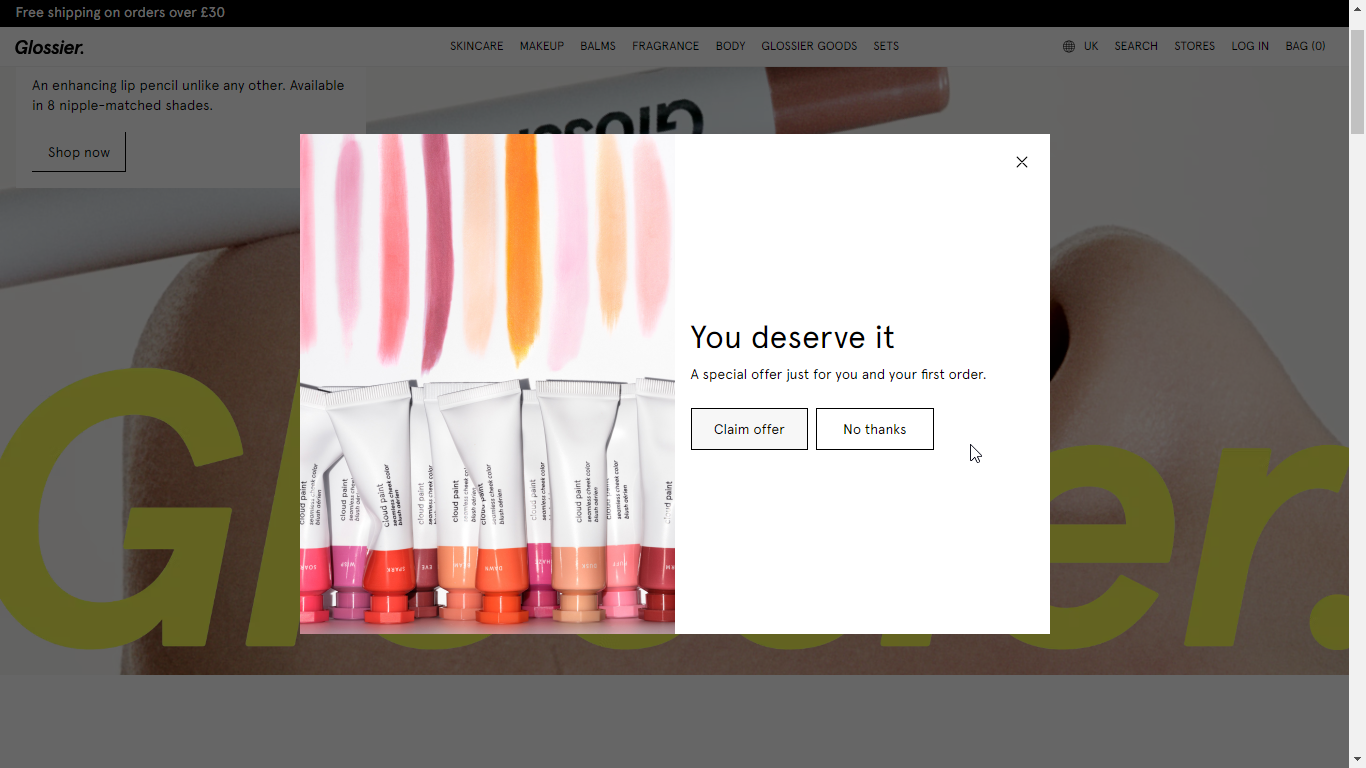
Here’s an example of a modal popup by Glossier:
Popup or Pop Up or Pop-Up?: Don’t Worry About The Spelling!
You might have seen these spellings for those surprise windows on websites: popup, pop up, and pop-up. Don’t worry, they all basically mean the same thing!
- “Pop up” describes something that appears suddenly, like a jack-in-the-box.
- “Pop-up” (written with a hyphen) is commonly used to talk about website popups specifically.
- “Popup” (all one word) is actually the most popular way people write it, even though it’s not technically the most correct.
No matter how you spell it, we’ll be using “popup” throughout this article for simplicity.
Popups for Websites; Yes or No?
Absolutely yes! Popups are a great way to focus a visitor’s attention. Remember those windows we talked about earlier that appear on websites?
Modal popups are a specific kind that dims the background and won’t disappear until you take action, like clicking a button.
And a quick side note: You might see popups written as “popup,” “pop-up,” or even “pop up.” All three are used, though “popup” is the most common. We’ll stick with “popup” throughout this article for simplicity.
Let’s see why they can be helpful for your website!
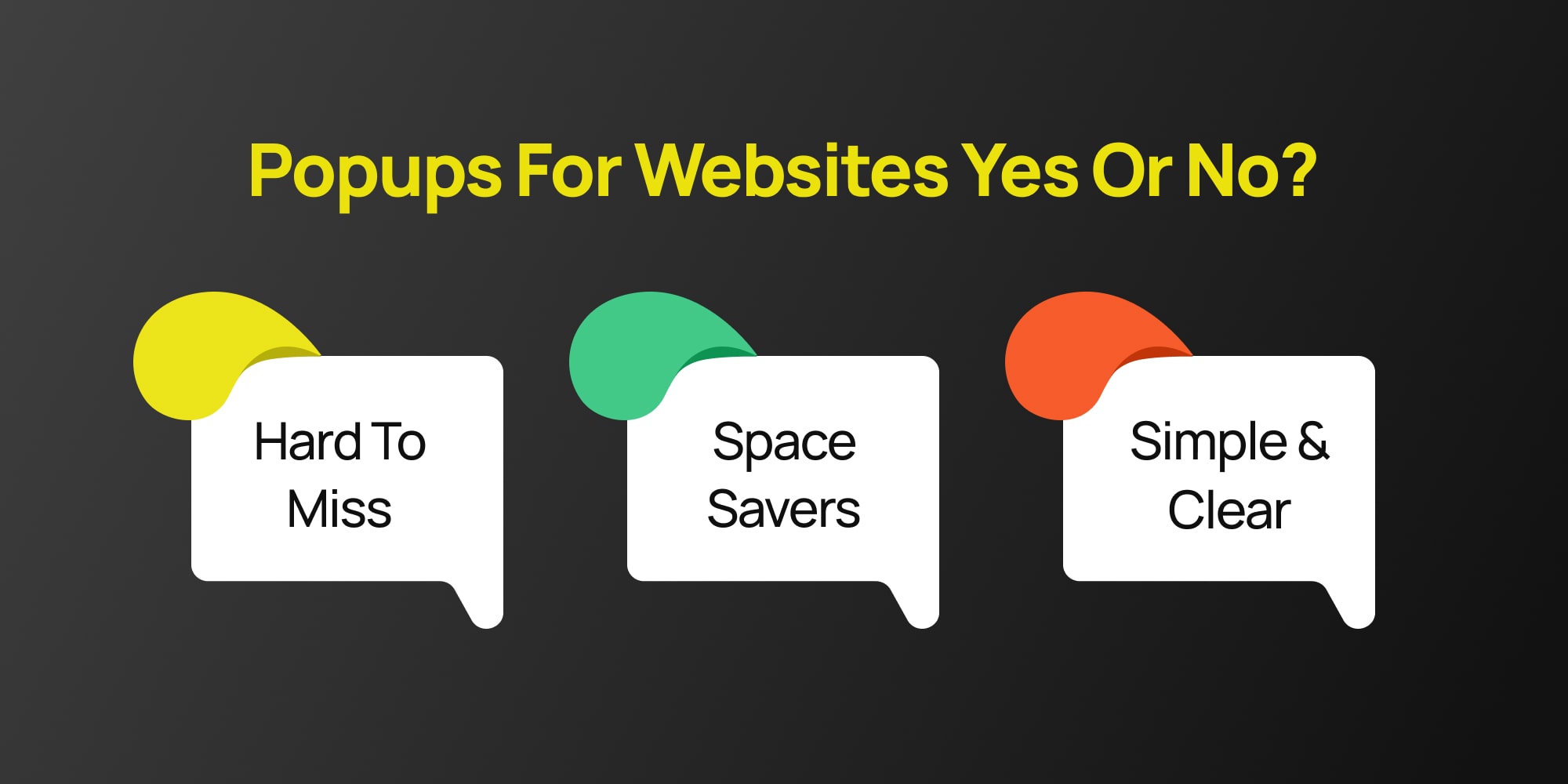
Simple and Clear
Popups keep things easy. Everything stays on the same screen, so visitors don’t get lost or confused about what they were doing before.
Hard to Miss
Since Popups appear right where you’re browsing, you can be sure people will see them. Unlike popups in new windows, which users might close by accident, modals grab attention.
Space Savers
Need to show a picture or video? Modals can act like a lightbox, displaying it clearly without cluttering up the main page.
But modal popups are more than just pretty faces! They can help you with all sorts of things, like:
Growing your email list
Offer a discount or bonus content in exchange for someone’s email address.
Sharing important updates
Need to let people know about a website update or a new product? A modal Popups is a great way to spread the word.
Showcasing special offers
Have a sale coming up? Use a Popups to highlight it and drive traffic to your product pages.
Basically anything! Popups are flexible and can be used for all sorts of things, from reminding people about an event to collecting feedback.
When Do Popups Pop Up? (Popup Use Cases)
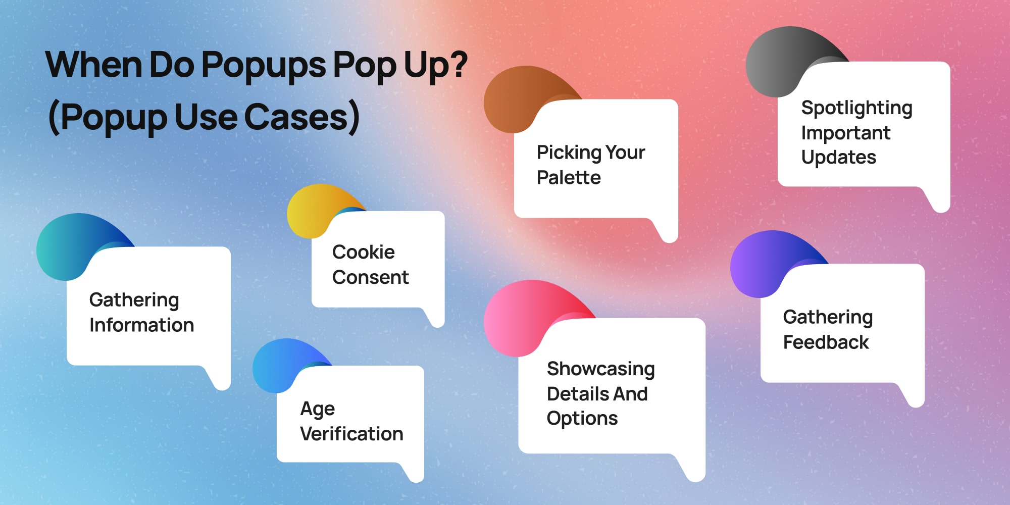
Popups can appear on websites for a variety of reasons, acting like little messengers with specific goals. Here are some of the most common times you might encounter them:
Gathering Information
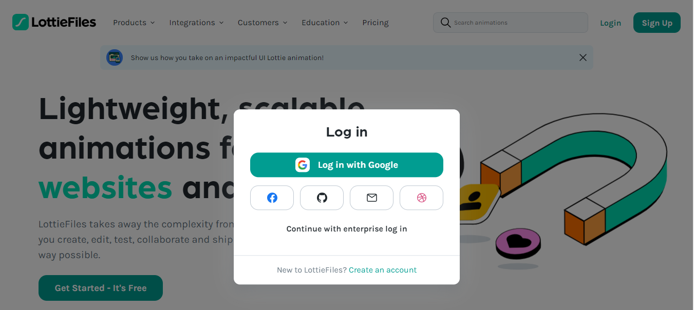
Popups can act like friendly digital assistants, helping websites collect information (usually using forms) from visitors.
This might involve signing up for a newsletter with your email address to receive updates and promotions, or entering your phone number to receive a special discount offer.
Cookie Consent

You’ll also sometimes see popups specifically asking for your consent to store cookies on your device. These cookies help websites remember your preferences and browsing history, and can be used to personalize your experience.
Spotlighting Important Updates

Imagine a website just launched a fantastic new feature, or maybe they’re having a huge sale. Popups can be a quick and effective way to grab your attention and ensure you don’t miss out on these exciting developments.
Showcasing Details and Options
Let’s say you’re browsing a clothing store’s website and spot a cool jacket. A popup might appear when you click on the image, revealing a more detailed description, different color options, or even a short video showcasing the jacket in action.
Gathering Feedback
Websites can also use popups to understand their visitors better. Imagine a small popup appearing as you’re about to leave a site, asking a quick question like “Did you find what you were looking for today?” Your answer can help the website improve and provide a better experience for future visitors.
Age Verification
Some websites might use popups to verify your age before allowing you to access certain content. This is especially common for websites that sell age-restricted products like alcohol or gambling services.
Making Your Popups Pop (and Not Flop!): Popup Best Practices!
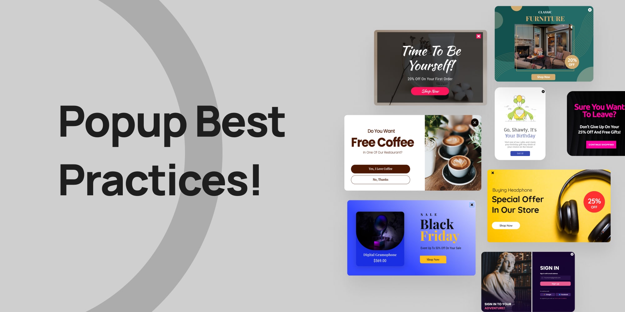
Now that you know the basics, let’s talk about making your popups helpful and interesting for visitors, instead of annoying. Here are some tricks:
- Headlines that Grab Attention: Start with a clear and catchy headline. What’s in it for the visitor? Use words like “Free,” “Sale,” or “Discount” to get their eyes on the prize.
- Pick the Right Format: There are different types of popups, some more in-your-face than others. Big, full-screen popups are okay for things like age checks, but not great for selling products. Choose a format that fits your message.
- Timing is Key: Don’t scare visitors away with a popup right when they land on your site. Instead, wait a few seconds before showing it, especially if they seem interested in browsing.
- Match Your Website: Make your popups look like they belong on your site. Use the same colors, fonts, and overall style as your website so it feels like a natural part of the experience.
- Keep it Relevant: Tailor your popups to what visitors are looking at. For example, a popup on a travel page could offer a discount on flights, while a popup on a clothing store might offer styling tips.
- Less is More: Keep your popups short and sweet. Aim for no more than two things for visitors to fill out, like their email address.
- Don’t Go Overboard: Popups are helpful tools, but don’t bombard visitors with them. Space them out and use them strategically.
- Easy Escape: Always include a clear and easy-to-find “Close” button so visitors can get rid of the popup if they’re not interested.
- Mobile Friendly: Make sure your popups work well and look good on all devices, especially phones and tablets.
- A Picture is Worth a Thousand Words: If it helps, add an image to your popup to make it more visually appealing.
- Be Friendly! Use a conversational tone and even a little humor to make your popups more inviting. This will help visitors feel less annoyed by them.
Adding Popups to Your WordPress Site with a Popup Builder (No Coding Required!)
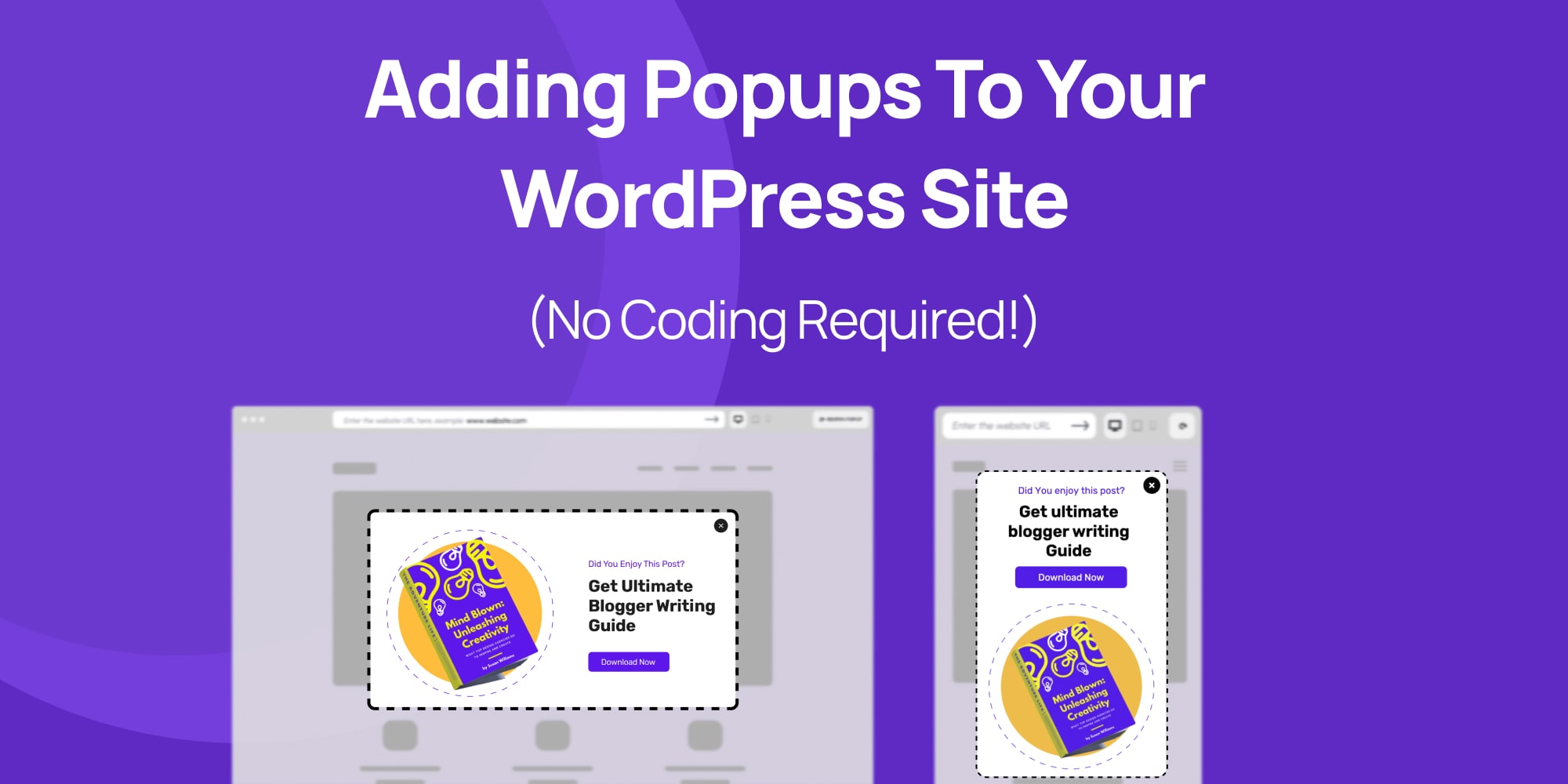
Ready to add those attention-grabbing popups to your WordPress website? Great! In this section, we’ll show you how to do it step-by-step, without needing any coding knowledge using only a popup builder.
We’ll be using WordPress popup builder called Depicter to design these popups. It’s a great tool because it lets you create beautiful popups easily, even if you’re not a tech expert.
1. Installing and Activating the Popup Builder (Depicter)
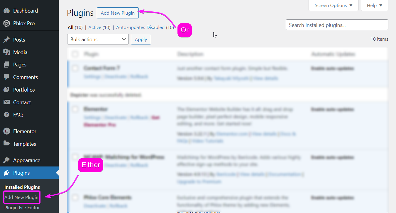
To install the Depicter plugin, go to plugins in your WordPress dashboard, click on “Add New Plugin” and Search for Depicter.
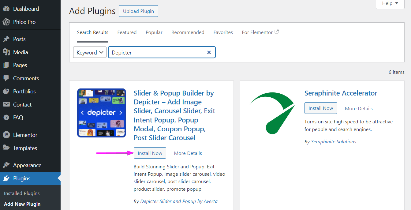
Once you find it, install and activate it and you’re good to go.
2. Importing A Popup Template
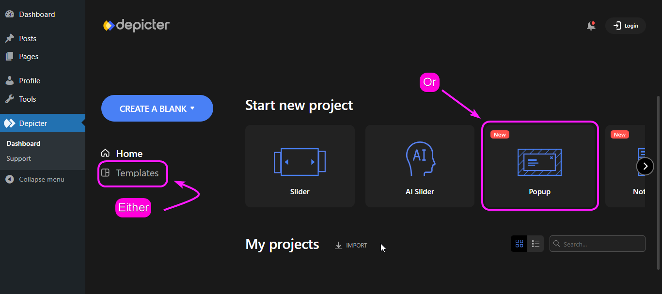
Remember that you can always start your creation from scratch in Depicter, to do that you can start with “Create A Blank” and choose “Popup” in this case.
However, to make things easy for you, we’re starting with a ready-made popup template.
To choose a template, either go to “templates” and choose the “Popup” category, or simply choose a the “Popup” category in “Home” and import a popup template.
3. Configuring the Popup Options
Depicter isn’t like other tools you might find for building popups. It lets you set everything up in a super simple way, and popups are no different! This section will be your guide to customizing popups in Depicter.
In this section, we’ll walk you through the key things you can adjust to create the perfect popups for your website.
Remember, we’ll focus on the most important settings to get you started.
Options: General
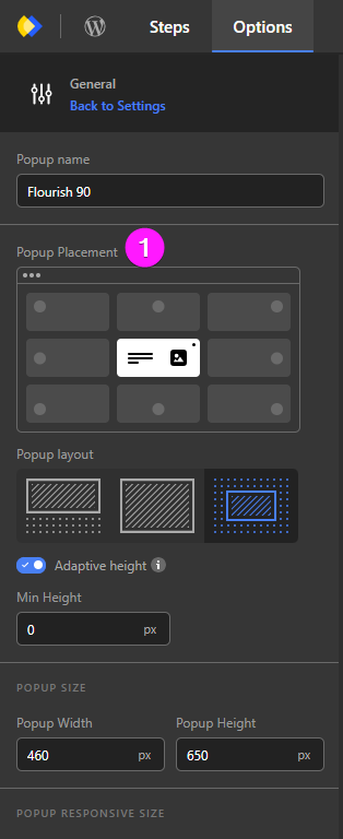
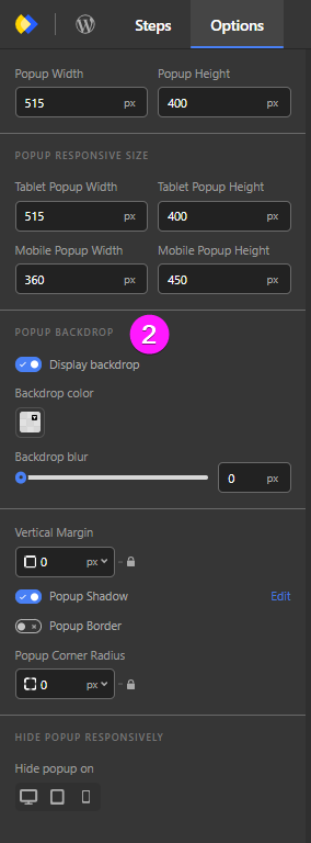
In the “general” options of Depicter popups, there are two things that you need to pay attention to:
- Popup Placement: This lets you choose exactly where on your webpage the popup will appear!
- Popup Backdrop: Here, you can control the look of the background behind the popup. You can change its color and adjust how blurry it is.
- Backdrop Color: In backdrop color, you can set the backdrop color of your modal popup to match your website.
- Backdrop Blur: This option controls the blur effect of the background in your modal popup.
Options: Behavior

By adjusting the behavior of your popup in options you can set thing like:
- How it closes: either by the ESC button or by clicking outside.
- The other settings are for sliders or when your popups has slides.
Options: Open and Close Animation
By adjusting the Open and Close Animation of your popup in options you will be setting:
- The motion of your popup when it appears on the page.
- The motion of your popup when it closes (either by the ESC button or clicking outside the popup).
- The direction of your popup movement.
- And finally the animation timing.
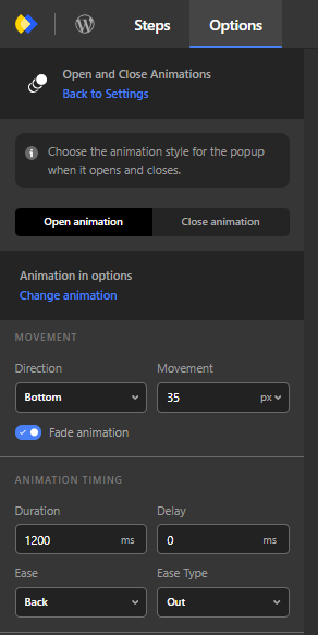
Display Rules
When you want to publish your popup, Depicter will ask you to manage your popup visibility:
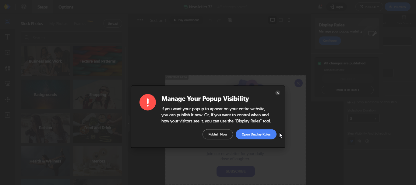
Now when you open the Display rules, you will notice four sections that you can configure for the most accurate popup display on your website.
Those rules are:
- Display Conditions
- Visibility Scheduling
- Triggers
- After Close
Let’s check out each one of these settings to see what they do:
1. Display Conditions

In the Display Conditions, you can control where your popup will appear on the website; In a WordPress Page, Custom Post Type, Woo-Commerce, based on the Audience, etc.
2. Visibility Scheduling

Maybe you have a sale, or you designed your popup for a specific occasion, you can schedule when it would appear on your website in the Visibility Scheduling in Depicter.
3. Triggers

In the Triggers settings in Depicter, you can set what triggers the popup to appear on your website; Whether it’s a click, a hover, a time spent on page, etc.
4. After Close
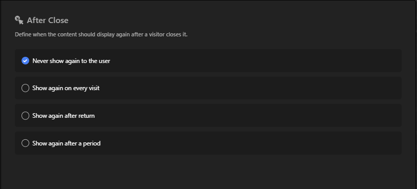
In the After Close settings of Depicter popups, you can set when the content would display again after a visitor closes it.
4. Publishing Your Popup
Once you’re done redesigning and configuring the popup setting, you would want your popup to appear on the website right?
All you have to do is click Publish!. And you’re done.
Popups are not like sliders that must be added to a specific page on your website. Where they appear, depends on how you configure them in the popup setting.
Showcasing Popups on Your Website
Ever wondered how popups would look on your website? Depicter can help!
It’s easy:
- Visit Depicter.com
- Click “Templates”
- Pick a template you like in the Popup category
- Click on the template
- Enter your website address
Now you can see how that popup template would look on your own website!
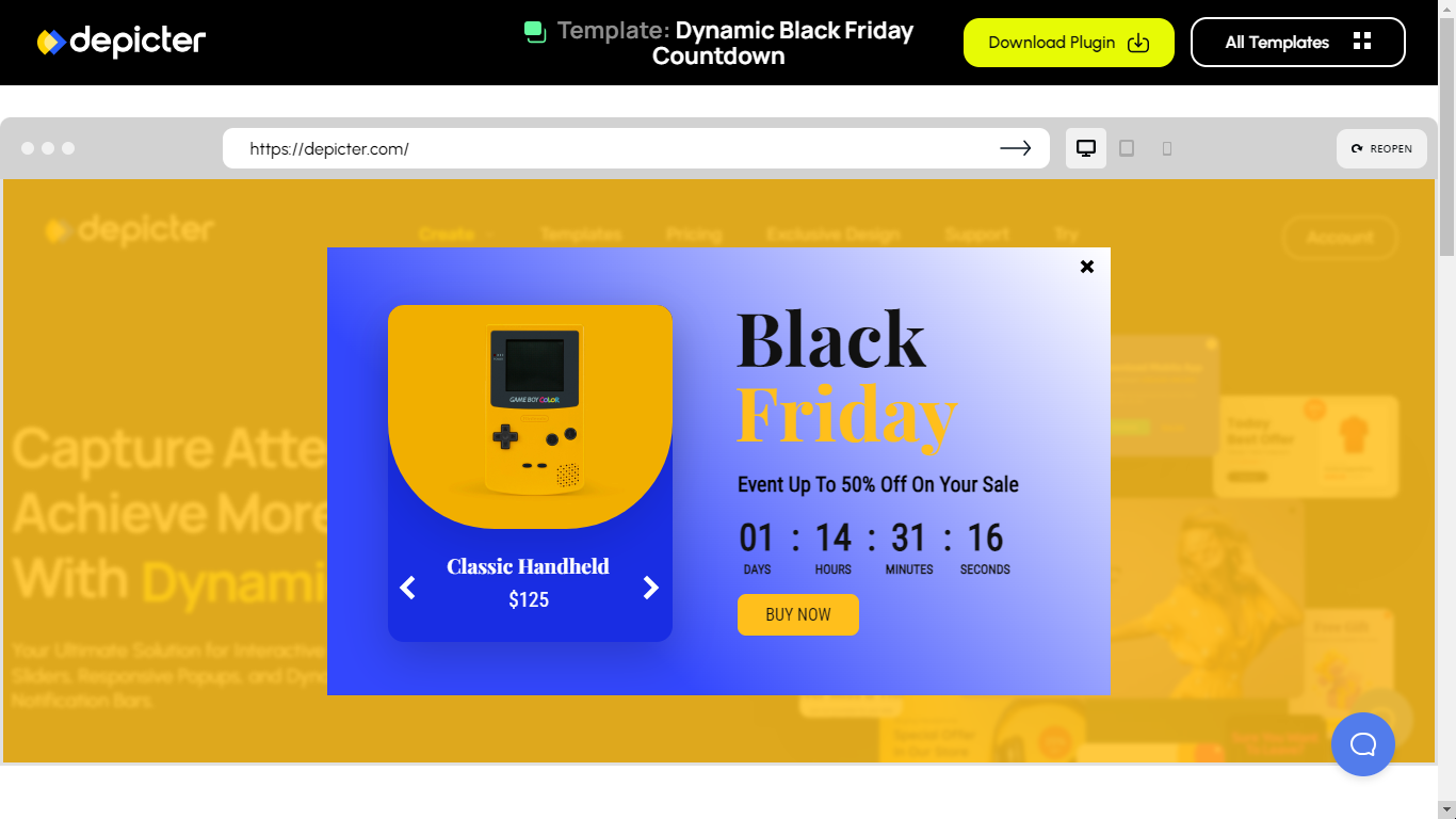
(In this example, you see how the template looks on Depicter’s website, but you can do the same for yours!)
Best WordPress Popup Templates You Need to See
Want to make a cool pop-up for your website? Check out Depicter’s pre-designed pop-ups to spark your ideas!
Conclusion
In conclusion, popups can be a valuable tool for website creators. When used strategically, they can help you capture attention, collect information, and boost conversions.
By following the best practices outlined above, you can create popups that are informative and engaging, rather than intrusive and annoying.
So the next time you’re building a website, don’t be afraid to experiment with popups and see how they can help you achieve your goals.
Leave Comment