WordPress Slider is a common design element on WordPress websites. It showcase multiple images, videos, or even snippets of text in a rotating format.
But here’s the thing: while sliders can be visually appealing, their effectiveness depends on how they’re designed and used.
Well-crafted sliders can be a powerful tool for grabbing your visitors’ attention and keeping them engaged.
They allow you to display a variety of content – from eye-catching product photos to special promotions – right on your homepage.
This can be a great way to highlight important information and encourage visitors to explore different parts of your website.
In WordPress, there are tools that make creating well-designed sliders much easier than it usually is; These are WordPress slider plugins.
In this article, we’ll tackle picking the perfect WordPress slider plugin for your site. We’ll even introduce you to a great free option called Depicter!
Next, we’ll answer a burning question: Are sliders even good for websites?
Finally, we’ll dive into the fun part: crafting beautiful WordPress sliders! We’ll share 7 key design tips to make your sliders shine and leave a lasting impression on your visitors.
So, buckle up and get ready to create stunning sliders that will take your website to the next level!
Picking the Perfect WordPress Slider Plugin for Your Site

Not all slider plugins are created equal! The best one for you depends on what you need it to do.
So how do you choose a good WordPress slider?
when choosing the best WordPress slider plugin, consider how easy it is to use, how fast it loads, and whether it looks good on all devices.
Tired of Slow Sliders? Watch How Depicter Makes Yours Fly! (Watch Now)
If you choose a WordPress slider plugin with these features, it will be much easier to apply the design tips that we’ll cover in this article.
We recommend that you check out Depicter, a free WordPress slider plugin that’s easy to use, keeps your site fast, and works perfectly on any device.
Plus, it comes with beautiful pre-designed WordPress slider templates to save you time creating sliders.
Are Sliders Good for Websites?

Ever wonder if those swiping image displays you see on websites actually work? (You’re not alone! The question of “are website sliders effective” or “are sliders good for websites” comes up a lot.)
WordPress Sliders can be a powerful tool for website design, but their effectiveness hinges on careful design and implementation.
When done well, sliders can capture visitor attention, hold their interest, and serve a variety of purposes.
They can be used to showcase a portfolio of products or services, highlight special offers or promotions, or deliver key pieces of information in a visually compelling way.
Sliders can also be space-savers, allowing you to display a wealth of content without overwhelming visitors with a cluttered layout.
However, poorly designed sliders can Slow down your website loading speed. They might also be confusing or difficult to navigate.
If not done right, they can go unnoticed by visitors altogether (banner blindness).
So, the answer is: it depends! If you take the time to design and use sliders effectively, they can be a valuable asset to your website. But if you’re not careful, they can actually hurt your user experience.
If you’re reading this article, it means that you really want to do it right, and we’re here to help!.
This guide breaks down 7 key WordPress slider design tips to take your sliders from drab to fab, all while keeping them speedy and user-friendly.
Follow these simple steps, and you’ll be whipping up WordPress sliders that wow your visitors and make your website even more awesome.
Stop Scrolling, Start Sliding! Learn how to create stunning website sliders with Depicter in this quick video!
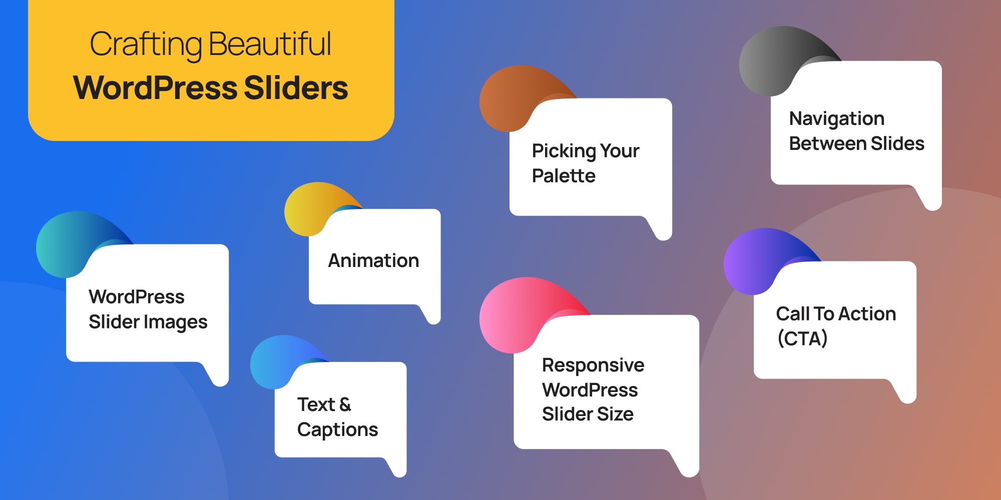
Crafting Beautiful WordPress Sliders (7 Tips)
WordPress Sliders can be like the welcome mat of your website – a first impression that grabs attention and invites visitors in. But just like a cluttered entryway, a poorly designed WordPress slider can confuse or turn people away.
The good news? With a few simple tips, you can transform your slider into a visual gem that keeps visitors engaged.
P.S. – It is a good idea to design your pages with sliders with WordPress staging. Push the final, well-tested version to your live site.
Let’s dive into some design tricks to make your slider shine!
1. WordPress Slider Images
Great pictures are what make a WordPress slider stand out. Use high-quality images or eye-catching videos that connect with your website’s content and the people you want to reach.
Depicter’s got tons of free photos, videos, and all sorts of vectors and shapes! You can use them to build your slider without spending any money.
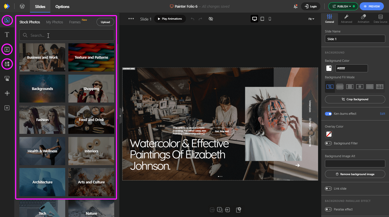
But to keep things running smoothly for your visitors, there’s a secret weapon: image optimization for sliders. Here’s what that means:
- Sharp Shots & Big Enough for the Job: This means using high quality images that are clear and crisp, not blurry or pixelated.
- Going JPG or PNG: Most of the time, you’ll want to use JPG images for your slider. They’re smaller in size which helps your website load faster. PNGs are a good choice for pictures with sharp edges or areas of clear text, but they can be bigger than JPGs.
- Keeping a Consistent Look: Decide if you want your slider to use photos or illustrations, and stick with that style throughout. This creates a more polished and professional look.
- Speedy Images: Big pictures can slow down your website. Use tools to compress your images without turning them blurry. This will help your slider load faster and keep visitors happy.
2. Text & Captions for Your Slider
Now that you’ve got stunning visuals, let’s add some text to make your slider even more informative and engaging.
Adding text to Depicter is super easy! On the left side, just drag and drop “headings,” “subheadings,” or regular text right onto your slider.
Want it even faster? Pick one of Depicter’s pre-made text styles on the left.
Don’t worry, you can always change your text later on the right side of the screen.
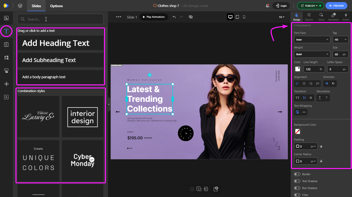
Here are some tips to keep your text clear and impactful:
- Short & Sweet: People are busy, so keep your slider text concise and to the point. Highlight the key message you want visitors to remember.
- Easy on the Eyes: Choose clear, easy-to-read fonts that complement your website’s overall design. Avoid fancy fonts that might be hard to decipher.
- Putting it in the Right Spot: Where you place your text matters. Make sure it doesn’t cover important parts of your images and is positioned for optimal readability on all devices.
3. Animation
A touch of movement can bring your slider to life, but too much can make visitors dizzy!
With Depicter, you can make anything on your slides move! You can change how it moves, how fast it goes, and anything else you want.

One neat thing about Depicter is that you can even animate text. This means you can make letters, words, and whole lines appear in a cool way.
All you have to do is with your text selected, go to animation on the right sidebar, and choose the text reveal or the text animation option.
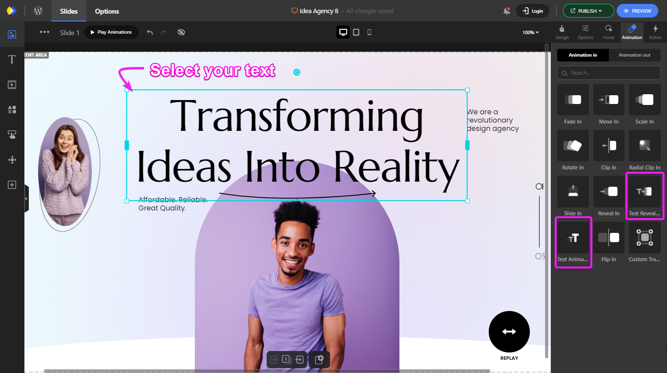
Here’s how to add animations that enhance your slider without going overboard:
- Matching the Mood: Choose animation styles that fit the overall design of your website. Playful slides might use bouncy animations, while a professional slider might benefit from smoother fades or slides.
- Finding the Sweet Spot: Animations should grab attention, but not become the main attraction. Avoid overwhelming visitors with flashy movements or too many animations happening at once. Keep it simple and tasteful.
- Just the Right Speed: Set the animation speed and duration to a comfortable pace. Animations that are too slow can feel boring, while those that are too fast might be hard to follow.
4. Picking Your Palette
Colors can really set the mood on your website, and your slider is no exception! Here’s how to choose colors that make your slider shine:
- Matching the Vibe: Make sure the colors in your slider complement the overall color scheme of your website. This creates a sense of unity and professionalism.
- Easy on the Eyes: Use contrasting colors for your text and background. This makes sure your text is clear and easy to read, especially on top of images.
- Finding Inspiration: Feeling stuck on color choices? Don’t worry! There are lots of free color palette generators online that can give you some great ideas. Just search for “color palette generator” and explore the options!
5. WordPress Slider Size Responsiveness
Nowadays, people browse websites on all sorts of devices, from phones to tablets to big computer screens.
Depicter works well on phones, tablets, and computers.
When you choose a template from Depicter’s various templates, you can pick the device icon at the top to see how it looks on different devices.
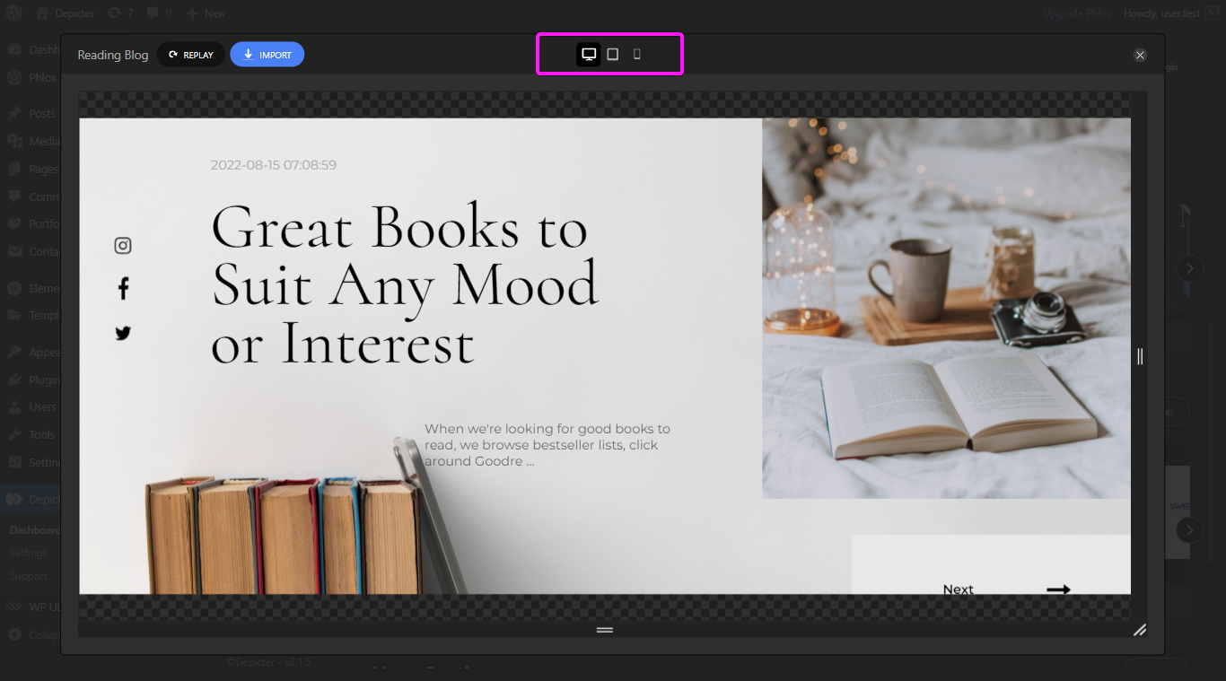
To keep your slider looking great no matter how someone visits your site, you need to make it responsive. Here’s what that means:
- Looking Good Everywhere: Make sure your slider adjusts automatically to fit the size of the screen someone is using. This way, it won’t appear squished on a phone or weirdly stretched out on a big desktop monitor.
- Picture Perfect on Every Device: Images and text might need to resize to fit different screens. This might mean using a slightly smaller WordPress Slider image size on phones or adjusting the text size to make sure it’s still easy to read.
6. Call to Action (CTA):
Great sliders don’t just grab attention, they encourage visitors to take action!
As we said before, Depicter has plenty of beautiful predesigned templates with practical and attractive call to actions.
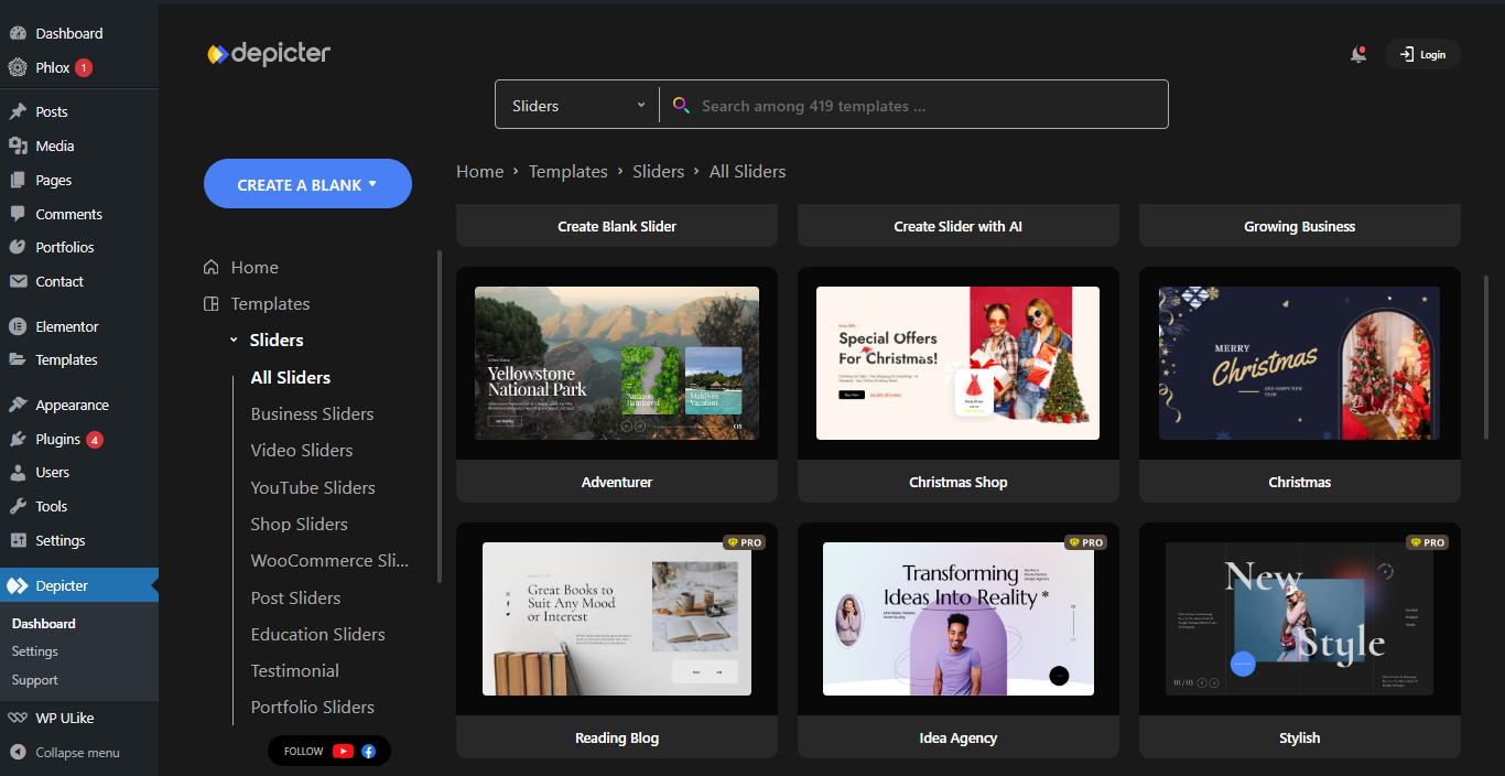
Here’s how to use CTAs (calls to action) to turn slider views into clicks and conversions:
- Click This!: Include a clear and easy-to-understand button within your slider. This button should tell people exactly what you want them to do, like “Shop Now,” “Learn More,” or “Sign Up Today.”
- Matching the Message: The text on your CTA button should be directly related to the content in your slider. For example, if your slider shows off a new product line, your CTA might be “Shop New Arrivals.”
- Putting it in the Spotlight: Where you place your CTA button matters! Position it somewhere that stands out and is easy to click on. This could be near the bottom of the slider or directly over the image.
7. Navigation Between Slides
People shouldn’t have to hunt for ways to move through your slider.
Depicter has made designing a clear and user-friendly navigation easier than ever.
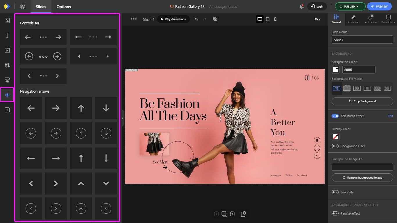
Not only you can choose between plenty of the navigation controls available, from navigation arrows, navigation bullets, circle timers, and so on;
The right sidebar also has an “Options” section where you can customize the slider’s navigation. You can choose things like whether the slider automatically repeats (loops), plays on its own, pauses, etc.
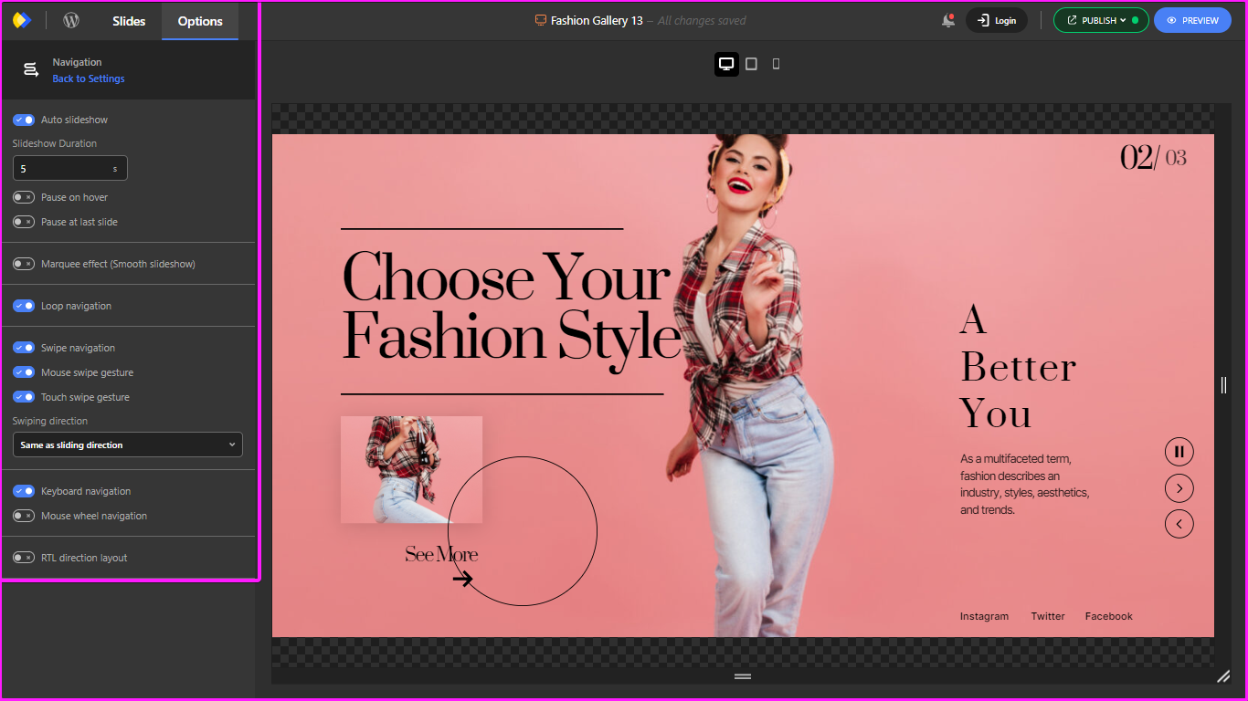
Here’s how to make navigation clear and user-friendly:
- Easy-Peasy Controls: Use clear and simple navigation controls, like arrows or dots, that show visitors how to switch between slides. These controls should be easy to understand at a glance.
- Touchscreen Friendly: Lots of people browse websites on their phones and tablets. Make sure your navigation controls are big enough and easy to tap on a touchscreen.
Final Word
Sliders, when done right, can be a powerful tool to grab your visitors’ attention and keep them engaged.
They can showcase products, highlight promotions, or deliver key information in a visually compelling way.
But remember, effective sliders depend on careful design and implementation.
This guide has equipped you with 7 key design tips to transform your sliders from bland to brilliant.
From choosing the right images and colors to creating clear navigation, these tips will help you craft sliders that inform, engage, and convert your visitors.
Don’t forget the power of a great slider plugin!
We highly recommend Depicter, a free WordPress slider plugin that’s easy to use, keeps your site fast, and works perfectly on any device. Plus, it comes with beautiful pre-designed templates to save you time and effort.
With the design tips in this article and the power of Depicter, you can create stunning sliders that will leave a lasting impression on your visitors.
Leave Comment