black friday sale for woocommerce stores
You’ve probably seen websites where you’re able to switch between two images or videos, revealing a dramatic change or a before and after comparison? Those are called a Before-After Slider!
A before-after slider can be a game-changer for your website, whether you’re showcasing product transformations, comparing design concepts, or simply adding an interactive element.
If you’re wondering how to create a before and after slider? / how to add before and after slider to website? / how to make before and after photo slider? This article is for you.
In this easy-to-follow tutorial, we’ll guide you through the process of creating your own Before After Slider.
We’ll cover everything from choosing the right tools to customizing the slider’s appearance and functionality.
By the end, you’ll have a stunning slider that will wow your visitors and make your website stand out.
An Amazing Collection of Before and After Templates
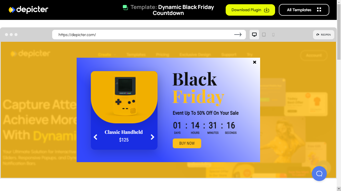
In this video, we’ll show you how to design interactive before-after sliders with Depicter to compare images easily.

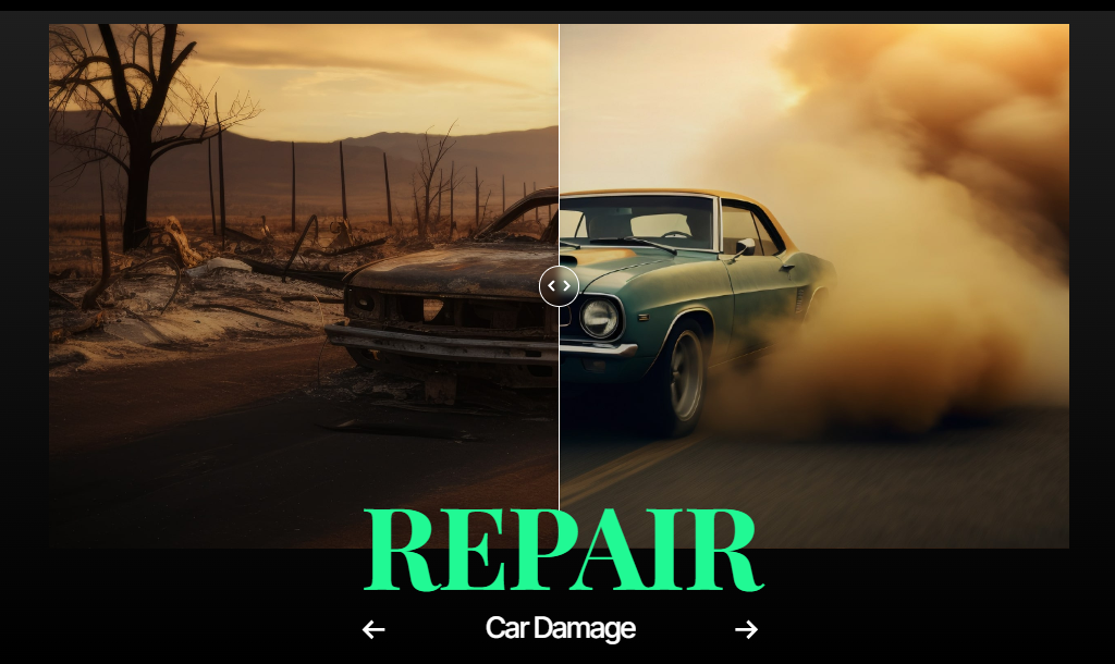
A before after slider lets you show two images side by side so visitors can easily compare them. It’s especially popular for showing changes or improvements, like a room makeover or a product upgrade.
The cool part? Visitors can control the slider themselves, moving it to see the “before” and “after” images, which makes the experience more interactive and fun.
People love being able to see these comparisons. For viewers, it’s not just interesting, it also helps them make decisions.
For example, if you’re showing a product’s transformation or comparing two different items, the slider can help customers decide if they want to buy.
Being able to see how something looks before and after modifications is a huge factor in convincing people about the quality of your service or product.
These sliders work on various platforms, including WordPress, and they’re versatile. You can use them for different purposes, whether you’re comparing photos, showing off project results, or demonstrating a product’s features.
No matter what kind of website you have, a before after slider adds a dynamic way to engage your audience and boost customer trust.

Using a before after slider on your WordPress site can make a big difference. It helps you show visitors the changes or improvements in your work, which can really grab their attention.
Here are a few key benefits:
Using a before-after slider on WordPress is an easy and effective way to show your visitors the value of your products or services.
Before-after sliders are useful when you need to show a clear comparison between two images. They work great in many different fields and can be used for all kinds of projects.
Here are some common situations where you’ll see them:
In each of these cases, before-after sliders make it easy to present changes in a clear and engaging way.
By letting visitors control the slider themselves, they get a more interactive experience that helps them see the full effect of the transformation.
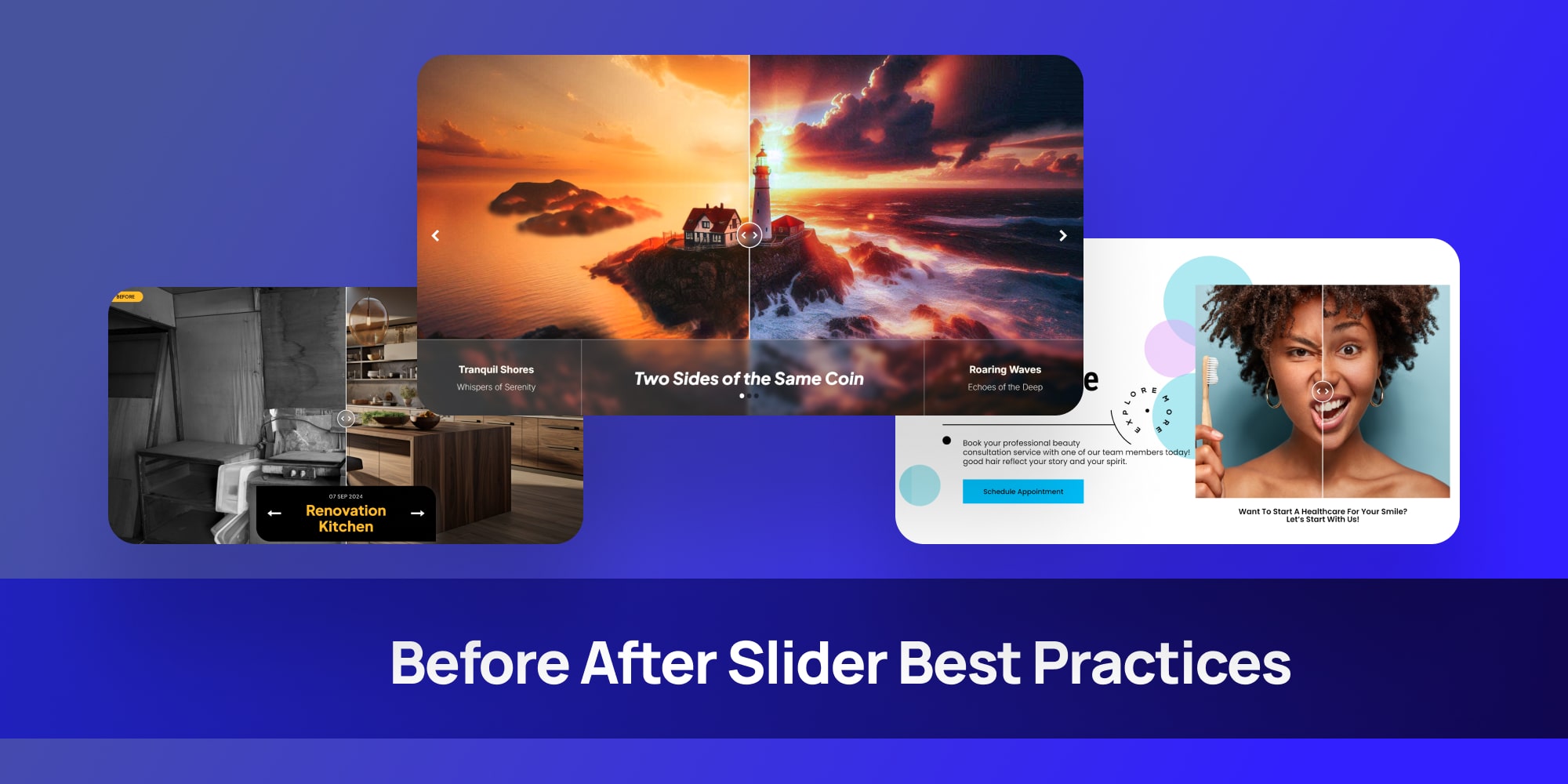
Using a before-after slider can make your website more engaging, but to get the best results, there are a few things you should keep in mind.
Here are some tips to help you create an effective and easy-to-use slider:
By following these simple best practices, your before-after slider will not only look great but also be effective in showing the value of your work or product.
Creating a before-after slider on WordPress is easier than you might think. Although I have to say the cool thing about Depicter is that you have two options:
In this tutorial we’ll explore both starting from creating before after slider using a ready-made template.
Design a Before and After Image Slider Video
Creating a before and after Slider using a template is easy, Just follow these simple steps:
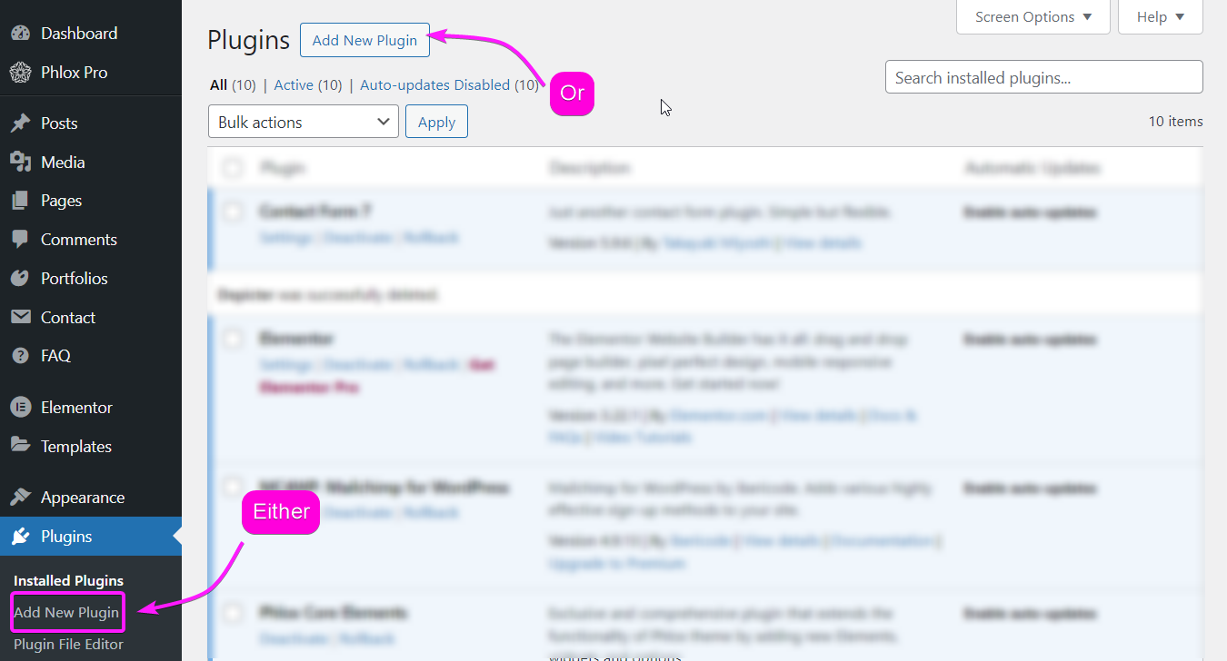
To install the Depicter plugin, go to plugins in your WordPress dashboard, click on “Add New Plugin” and Search for Depicter.
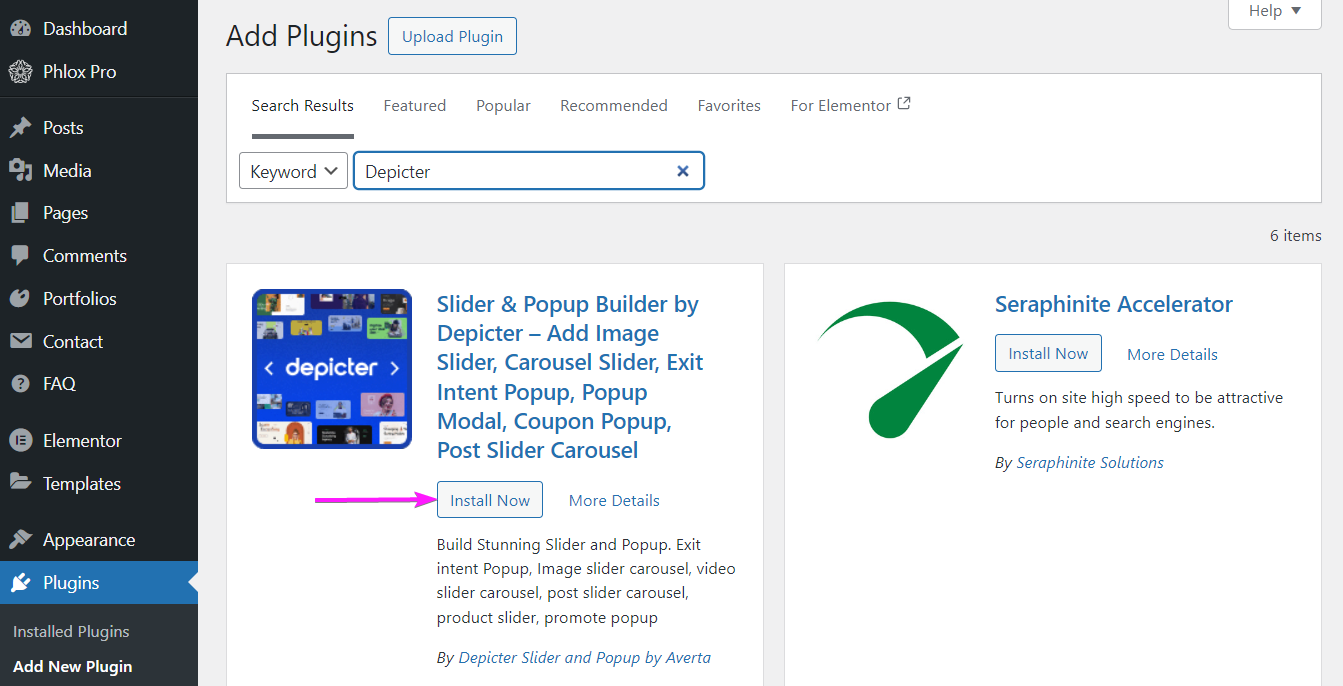
Once you find it, install and activate it and you’re good to go.
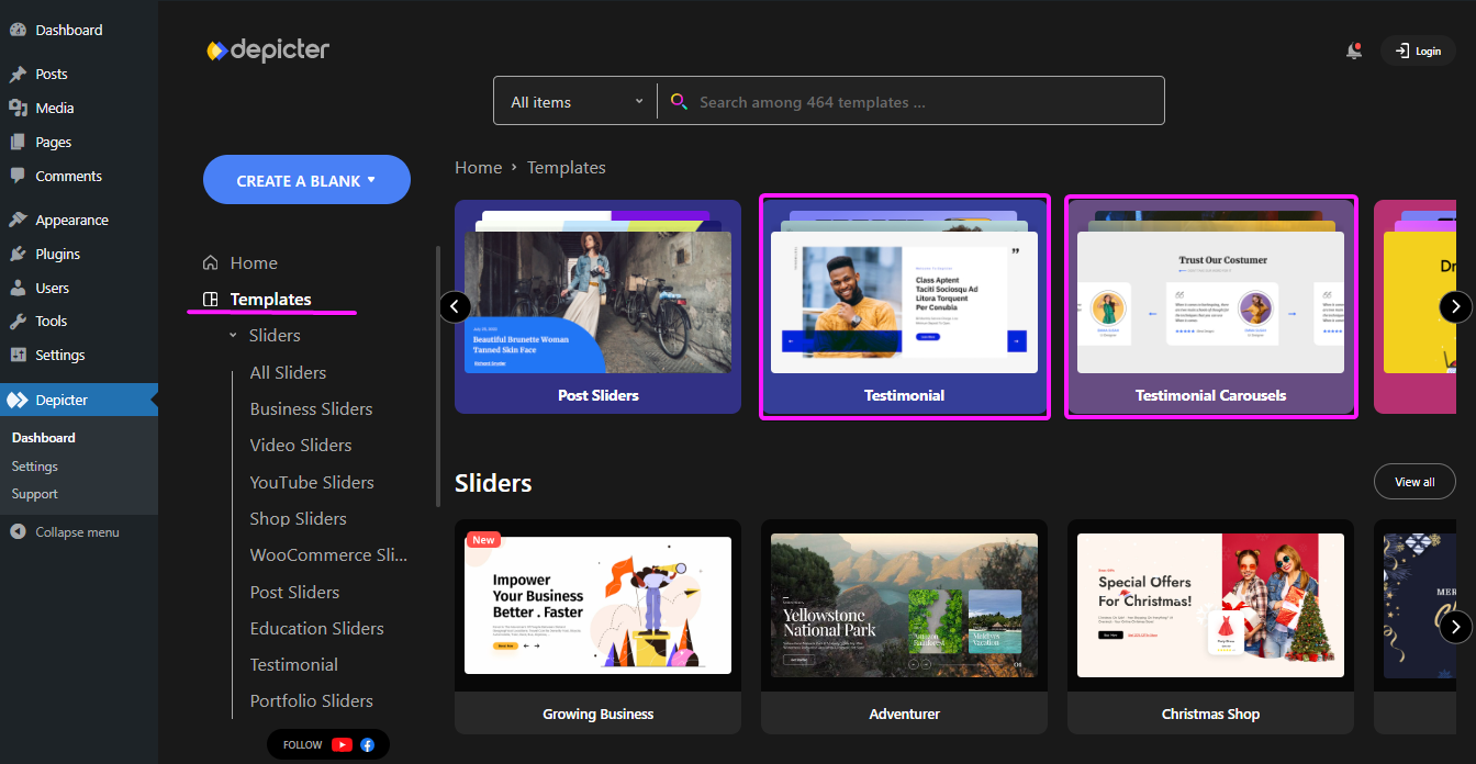
In the Depicter dashboard, head to templates then search “before after” in the search bar; That way you can see Depicter’s numerous before after WordPress ready-made templates.
Find a template and import it.
Once you’ve imported the template, you can customize everything to match your needs.
Now that you’ve made some changes, hit Preview to see how your slider looks. Nice, right? If you’re happy with it, you’re good to go!
Hit publish!
With Depicter, even when you’re creating a slider from scratch, you wouldn’t bee needing any coding skills. Just follow these simple steps:
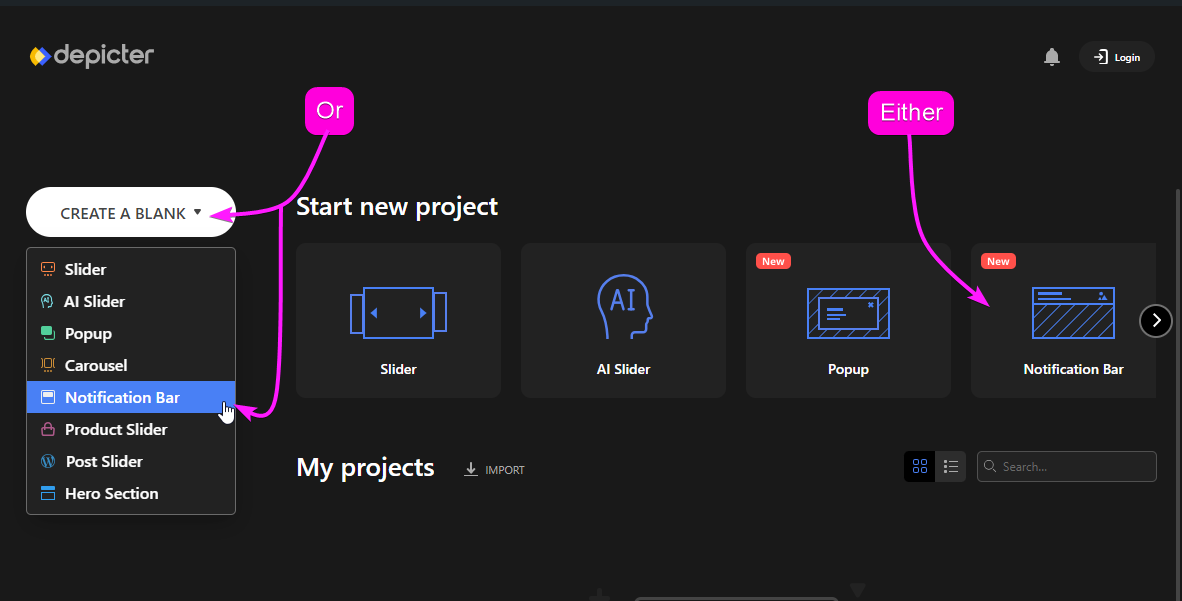
Want to start from scratch instead of using a template? No problem! Head back to the Depicter dashboard and click Create a Blank. Then, choose the Hero Section to get started.
Now, feel free to add other elements like text, icons, or anything else you want. Customize them to fit your style.
With the before-after slider selected, you can enable some cool effects in the options menu:
Play around with the other settings, like changing the controls color to match your design. The best part? You can see all your changes live as you make them.
Once you’re happy with everything, click Preview to see the final result. Once you’re happy with it, hit publish and you’re good to go.
To wrap things up, adding a before-after slider to your WordPress website can really make a difference by grabbing attention and showing off what you do.
Whether you’re showing changes, comparing looks, or just adding something fun, a good before after slider makes your site more interesting and helps people trust your work.
With a tool like Depicter, making these sliders is super easy, even if you don’t know how to code.
After reading this tutorial, you now know how to create amazing sliders that will impress your visitors and make your website stand out. Give it a try and see how it makes your site better!
If you’re looking for Optinmonster altenative, you’re definitely not alone. Many users have turned to OptinMonster alternatives that are more user-friendly, budget-friendly, or even free.
Fortunately, there are plenty of options to explore. To make your search easier, I’ve compiled a list of the most popular and reliable OptinMonster alternatives. Take a look at the options below to find the right fit for your business.
12 WordPress Popup Templates You NEED to See!
So, why are potential and current OptinMonster users seeking alternatives?
For those considering OptinMonster, some common concerns include the lack of a free trial, the high cost, and the need for paid integrations.
OptinMonster doesn’t offer a free trial, and its pricing plans range from $20 to $100 per month. This can be a significant expense for many businesses, prompting OptinMonster to run continuous discount offers to attract users.
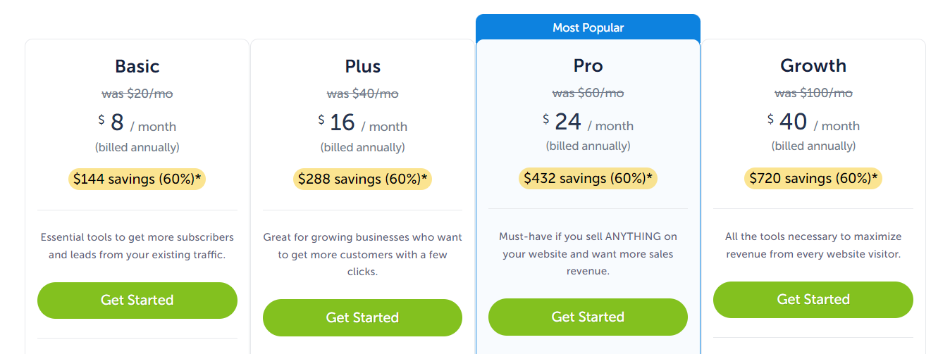
Additionally, integrating with popular apps like Klaviyo, HubSpot, and Google Analytics requires the Pro plan, which starts at $60 per month. If you’re on the basic plan, these crucial integrations aren’t available.
Existing users also have their reasons for seeking alternatives, with the most common being the high costs and concerns over security vulnerabilities.
Upgrading to higher-tier plans may seem like a solution, but many users find they’re paying more for just a few additional features.
For instance, advanced features like exit popups and UTM tracking are only available in the Pro plan, while spin-to-win popups require the Growth plan at $100 per month.
Security is another concern. Not long ago, a significant security flaw was discovered in OptinMonster that potentially exposed sensitive information from over a million websites. Although this issue has been resolved, it has led some users to explore other options.
If these issues resonate with you, it might be time to consider an alternative to OptinMonster.
Design a WordPress Popup From Scratch with Blazing Animations!
Depicter is a powerful, flexible, and user-friendly OptinMonster alternative plugin, offering many advanced features for free.
Whether you’re looking to create engaging popups, schedule them for specific events, or trigger them based on user actions, this Optinmoster alternative plugin provides the tools you need to boost conversions and engage your audience effectively.
Depicter offers very competitive pricing, making it an excellent value for those looking to enhance their website’s conversion rates.
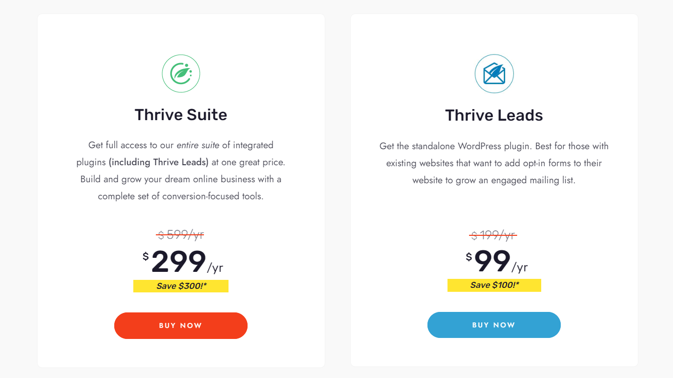
If you need an OptinMonster alternative, Thrive Leads is a great choice. It’s perfect for WordPress users who want to improve lead generation with customizable forms.
Thrive Leads offers various popup options, like lightbox popups and sticky bars. It’s simple to use, with drag-and-drop design and A/B testing to see what works best.
With flexible pricing options, Thrive Leads can fit your needs. Here’s a quick look at its key features.
Pros:
Cons:
Pricing Options:
How to Create a WordPress Notification Bar From Scratch!
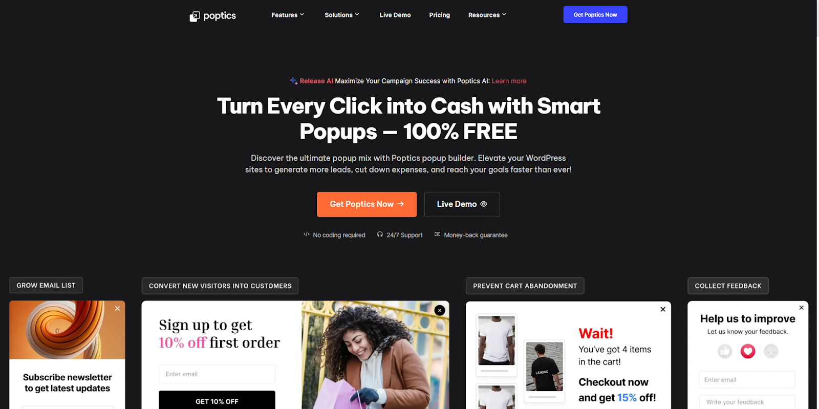
Poptics is an AI-powered WordPress popup builder that helps you grow sales, collect leads, and promote offers without slowing down your site. It includes ready-made templates, smart triggers, and WooCommerce tools to reach the right visitors at the right time. If you want a simple setup and strong conversion results, Poptics is a solid choice.
With its user-friendly interface, powerful targeting options, and a library of customizable templates, Poptics Popup Builder offers the best solution for creating compelling pop-ups.
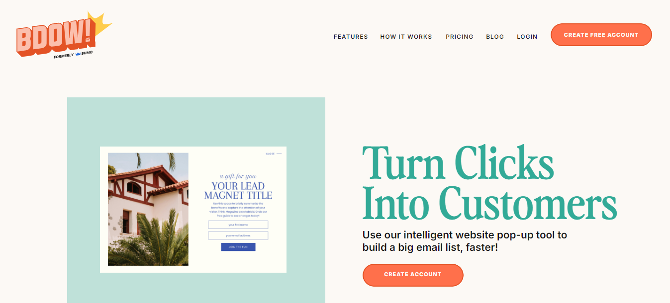
BDOW (formerly known as Sumo) is a solid OptinMonster alternative, particularly if you’re interested in integrating basic popups with other marketing features like email campaigns.
Available as both a WordPress plugin and for other website platforms, BDOW offers a range of tools to help grow your email list and engage visitors.
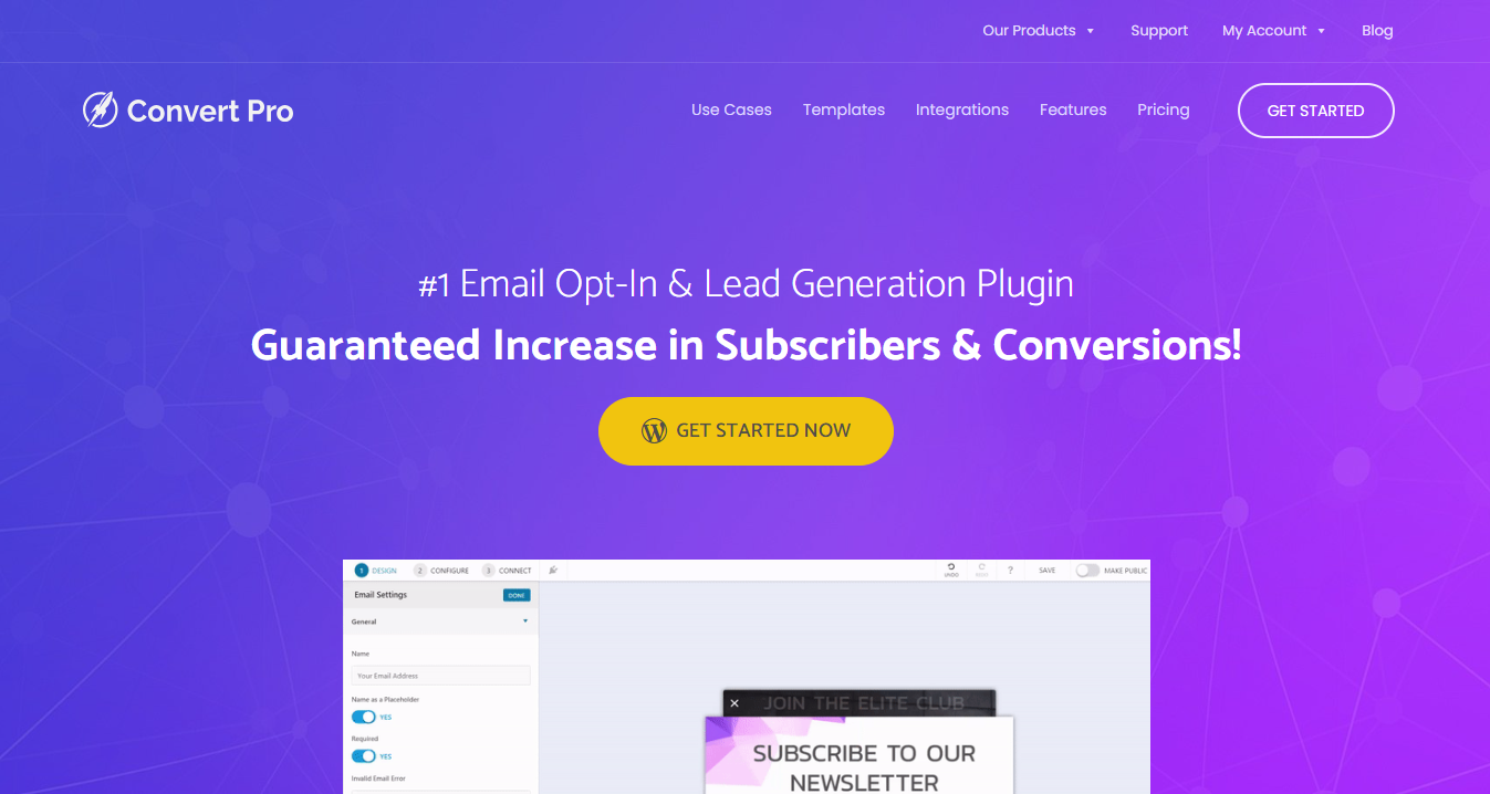
Convert Pro is another strong OptinMonster alternative, designed to help you create high-converting popups and opt-in forms with ease.
With its intuitive drag-and-drop editor and a range of ready-to-use templates, Convert Pro makes it simple to design and deploy effective marketing campaigns.
Convert Pro offers great features at a reasonable price, making it an excellent choice for boosting your website’s conversions and growing your email list.
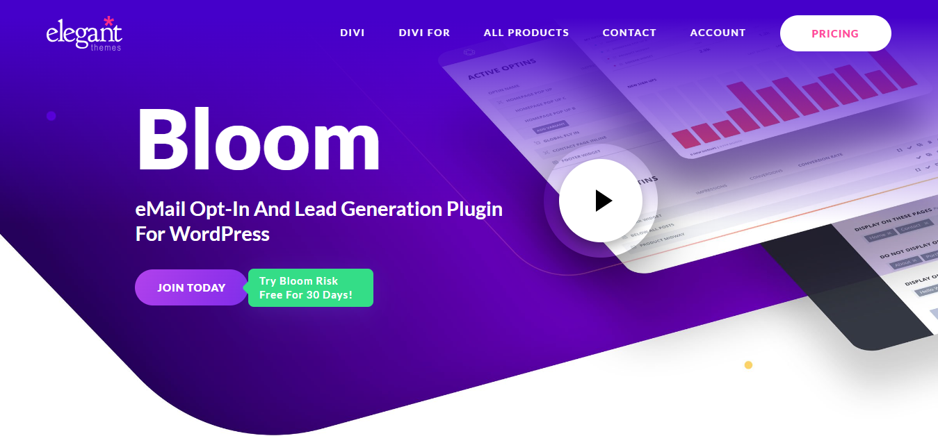
If you’re using Divi, this Optinmonster alternative is for you. Bloom by Elegant Themes is a straightforward tool for creating email opt-in popups to help grow your email list.
While it doesn’t offer advanced features like a visual drag-and-drop builder or exit-intent popups, it’s still a solid option for basic needs.
If you’re already using other Elegant Themes products like Divi, Bloom can be a valuable addition to your toolkit.
Bloom’s simplicity and integration with Elegant Themes make it a good choice for users who are already invested in the Elegant Themes ecosystem (eg. Divi)
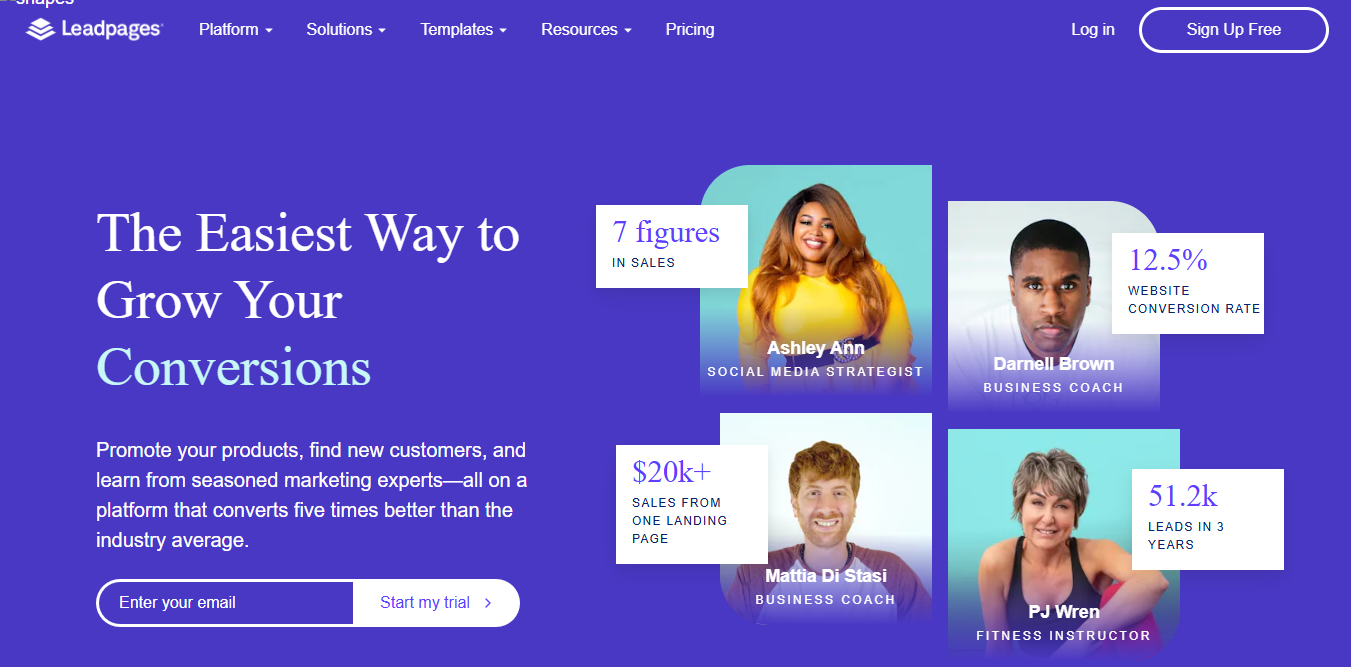
Leadpages is a another platform that offers a range of tools to help you grow your online presence and capture leads.
With its drag-and-drop interface, you can easily create landing pages, pop-ups, and alert bars without needing any coding skills.
This makes it an excellent choice for beginners and those who want to quickly set up effective lead-generation campaigns.
Leadpages offers a free 14-day trial for both plans, allowing you to test out its features before committing.
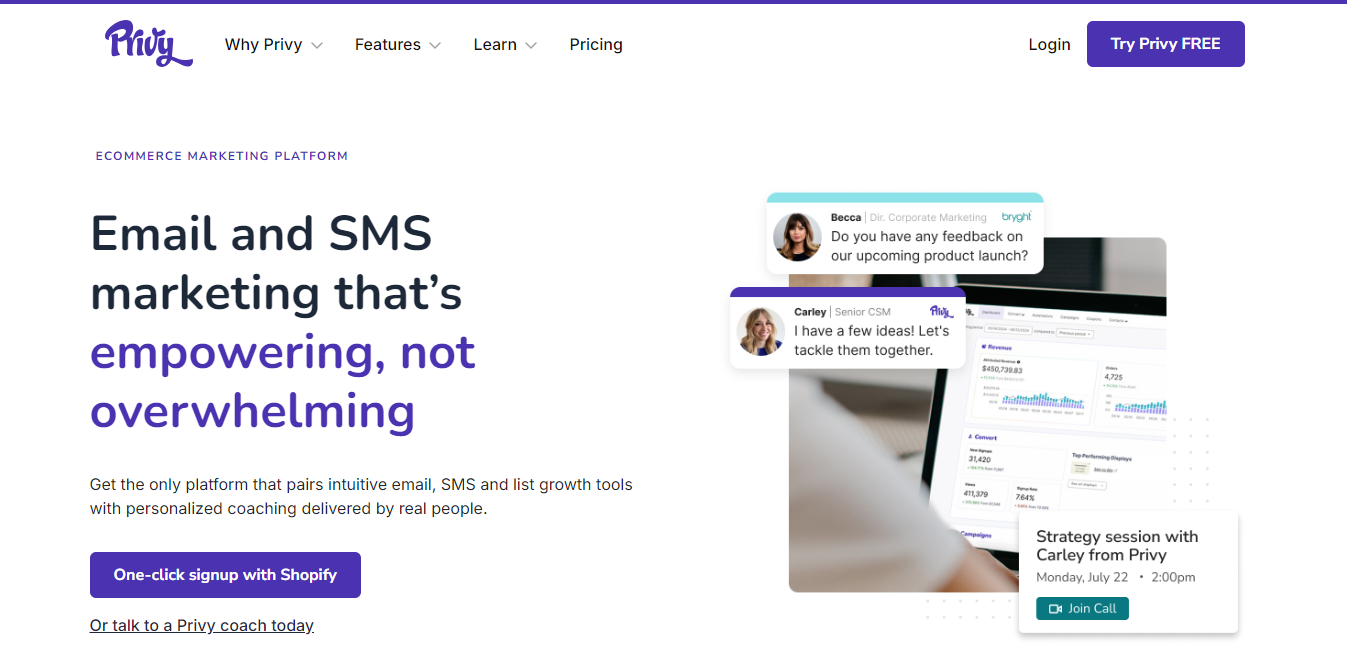
Privy is a comprehensive alternative to OptinMonster, combining lead generation with built-in marketing tools.
With Privy, you can capture leads, send them directly to an integrated email app, and nurture them through email and SMS campaigns.
While it may have fewer lead generation features compared to some other tools, Privy’s all-in-one approach makes it a strong option for businesses looking to streamline their marketing efforts.
Privy is a cost-effective OptinMonster alternative, offering both lead generation and marketing features for the price of one. It’s a great choice for businesses on a budget that want an all-in-one solution.
When looking for an OptinMonster alternative, it’s important to focus on the features that matter most to your business. Here are some key factors to consider:
A user-friendly interface is crucial, especially if you’re not a tech expert. Look for plugins with drag-and-drop editors and simple setup processes, so you can start creating popups, notification bars, and forms quickly without needing extensive technical knowledge.
Your website is unique, and your lead generation tools should be too. Choose an alternative that allows you to customize popups, forms, and notifications to match your brand’s style.
This includes options for setting triggers, controlling where and when popups appear, and personalizing messages based on visitor behavior.
Seamless integration with your existing tools is a must. Whether you’re using an email marketing service, CRM, or analytics tool, your OptinMonster alternative should connect smoothly with these platforms.
This ensures that your lead generation efforts are well-coordinated and that you can easily manage your contacts and track your results.
Cost is often a deciding factor, especially if you’re looking for a free OptinMonster alternative. While some plugins offer basic features for free, others provide more advanced options at competitive prices.
Compare pricing plans to find an option that fits your budget without compromising on essential features.
Security is a top priority for any website. While OptinMonster is generally safe, it’s important to ensure that any alternative you choose also offers robust security measures.
Check for regular updates, secure coding practices, and features that protect your site and data from potential threats.
By focusing on these criteria, you can find an OptinMonster alternative that not only meets your needs but also enhances your ability to generate leads and grow your business.
Below is a table comparing the key criteria for each OptinMonster alternative you chose for your article: Depicter, Thrive Leads, BDOW (formerly Sumo), Convert Pro, Bloom by Elegant Themes, Leadpages, and Privy.
| Criteria | Depicter | Thrive Leads | BDOW (Formerly Sumo) | Convert Pro | Bloom by Elegant Themes | Leadpages | Privy |
|---|---|---|---|---|---|---|---|
| Drag-and-Drop Builder | Yes | Yes | No | Yes | No | Yes | No |
| Notification Bars | Yes | Yes | Yes | Yes | No | Yes | Yes |
| A/B Testing | No | Yes | Yes | Yes | No | Yes | No |
| Exit-Intent Popups | Yes | Yes | No | Yes | No | Yes | No |
| Advanced Triggers | Yes | Yes | Yes | Yes | No | Yes | Yes |
| Number of Pre-Built Templates | 420+ | 220+ | 60+ | +60 | 100+ | 250+ | 60+ |
| Other Platform Support | No | No | Yes | Yes | No | Yes | Yes |
| Free Plan Available | Yes | No | Yes | No | No | No | Yes |
| Pricing (Paid Plans Starting From) | $30/year | $99/year | $49/month | $89/year | $89/year | $37/month | $75/month |
| All-in-One Marketing Tools | No | No | No | No | No | No | Yes |
| 24/7 Support | Yes | Yes | No | No | No | No | No |
Finding the right OptinMonster alternative can make a big difference in growing your business and capturing more leads. Whether you’re looking for something more affordable, easier to use, or packed with features, the options listed here offer great choices for different needs and budgets.
Think about what’s most important to you—whether it’s ease of use, customization, integration with other tools, cost, or security. By focusing on these key areas, you’ll be able to pick a tool that fits your website perfectly and helps you reach your goals.
Explore these alternatives and choose the one that best suits your needs to boost your lead generation efforts and grow your business.
Below is a table comparing the key criteria for each OptinMonster alternative you chose for your article: Depicter, Thrive Leads, BDOW (formerly Sumo), Convert Pro, Bloom by Elegant Themes, Leadpages, and Privy.
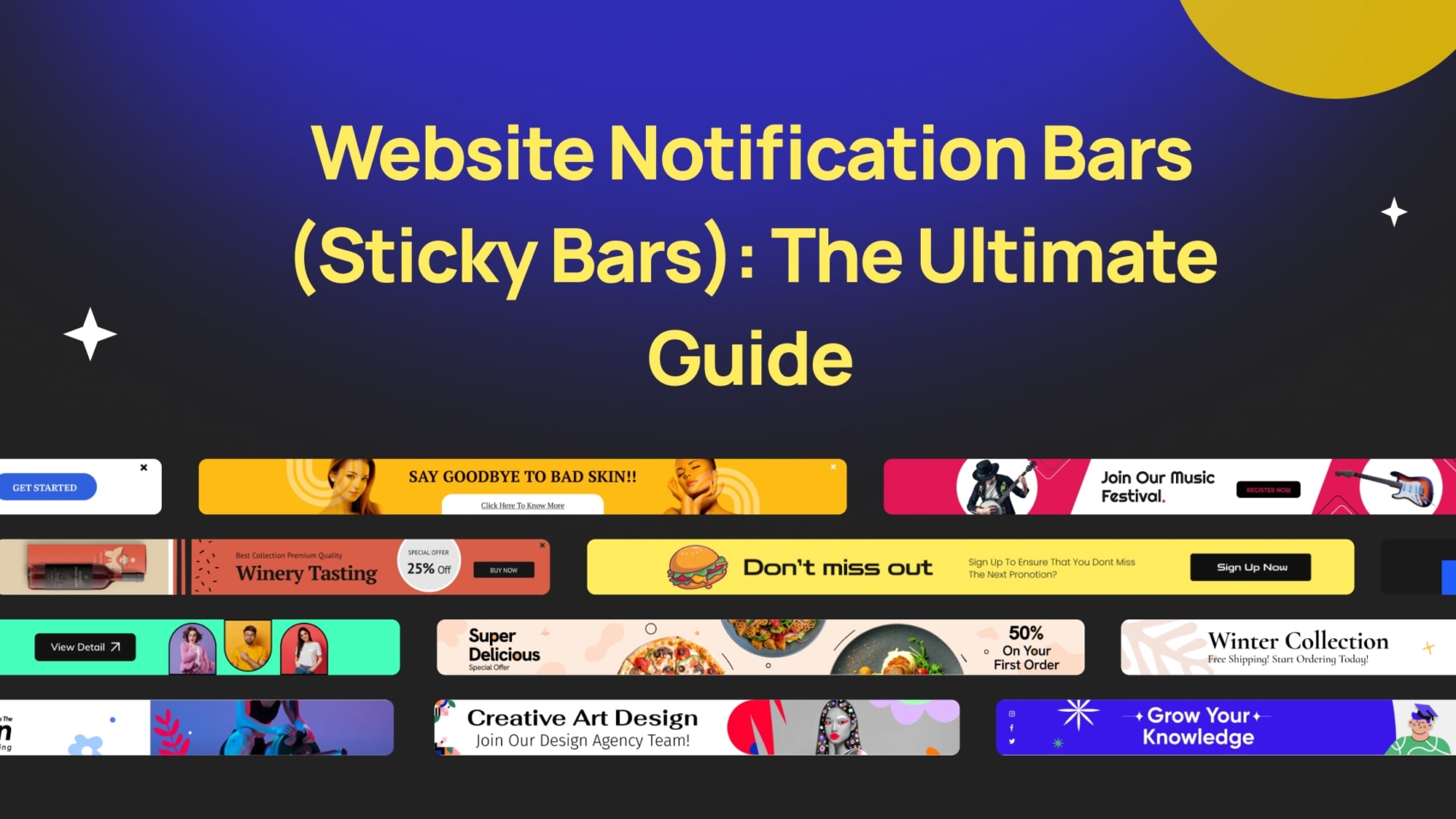
Have you noticed those little bars at the top or bottom of websites? Those are website notification bars.
Imagine you’re browsing the web and see a small bar appear at the top( or bottom) of the screen. This is a website notification bar, also sometimes called a sticky bar or a website notification banner. It’s a handy tool websites use to grab your attention and share important information.
This guide will be your one-stop shop for everything about notification bars! We’ll answer questions like:
By the end of this guide, you’ll be a notification bar pro, ready to create your own or understand how they work when you encounter them on other websites.
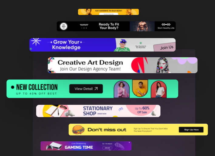
Have you ever visited a website and seen a small bar appear at the top or bottom of the screen? That’s a website notification bar, also known as a sticky bar or an announcement bar.
These bars are a popular way for websites to grab your attention and share important information.

Think of them like mini billboards on a website. You can use them for a variety of purposes, such as:
Whether it’s directing traffic to a specific section of your website, conducting surveys, or providing real-time alerts, the possibilities are vast.
Here’s what makes website notification bars different from pop-up ads:
Here are some key things to keep in mind when using website notification bars:
There are many ways to create website notification bars. Some website builders have them built-in, or you can use a WordPress notification bar plugin for easy creation. There are even free website notification bar generators available online.
Let’s dive into some real-world examples of website notification bars (sticky bars) and explore how they’re used to engage visitors:
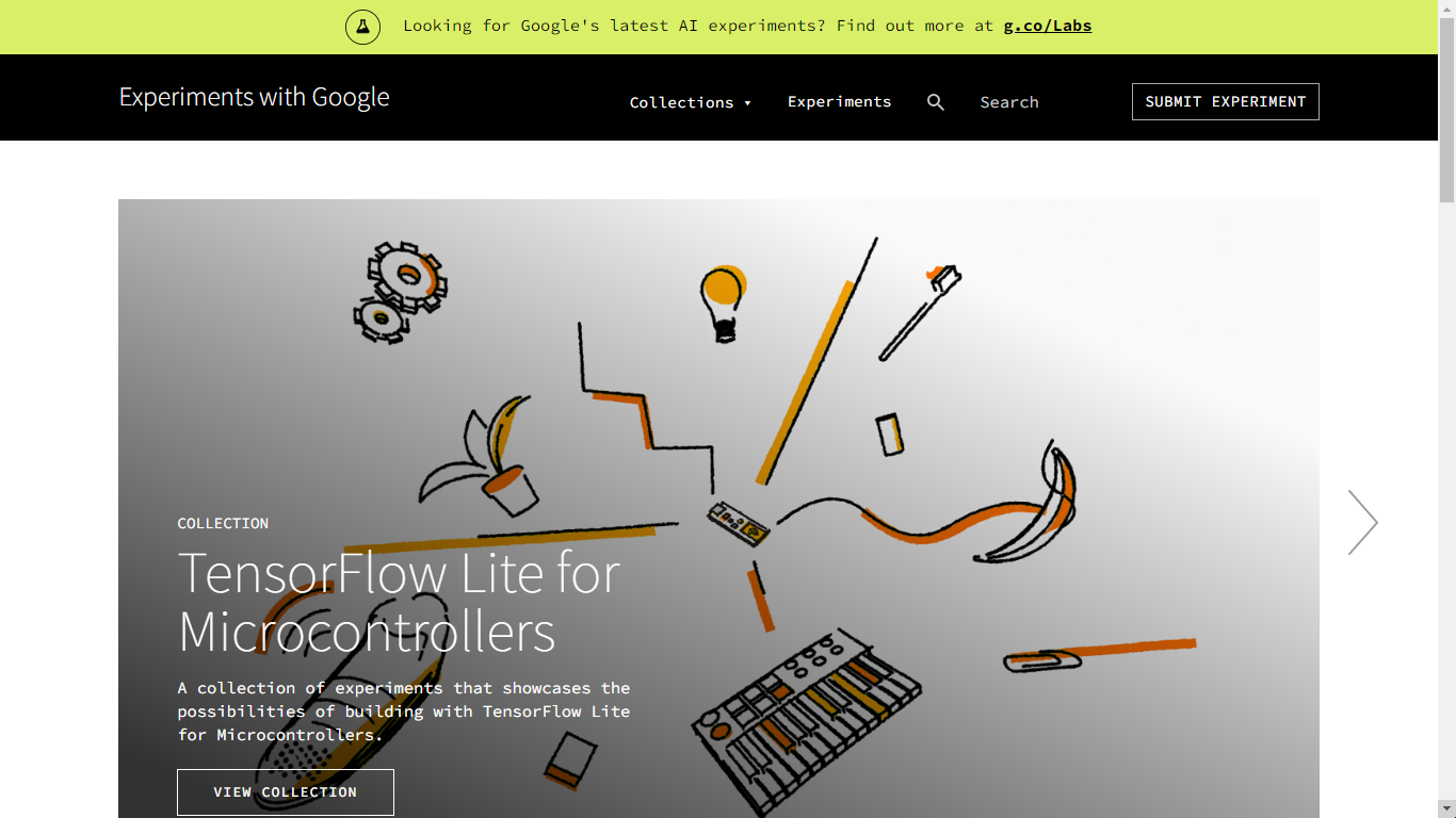
This notification bar from Google cleverly taps into curiosity.
It uses a question to pique visitors’ interest and then directs them to a specific landing page (g.co/labs) for more information.
This is a great example of how notification bars can be used to promote new features or initiatives.
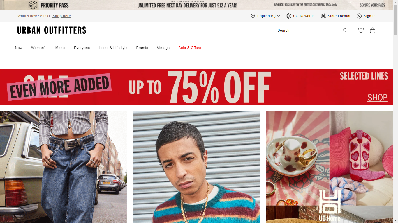
This notification bar from Urban Outfitters focuses on a clear benefit for shoppers: free next-day delivery.
It includes a specific price point (12 euros) and a timeframe (a year) to make the offer even more enticing. This is a classic example of using notification bars to drive sales and encourage subscriptions.
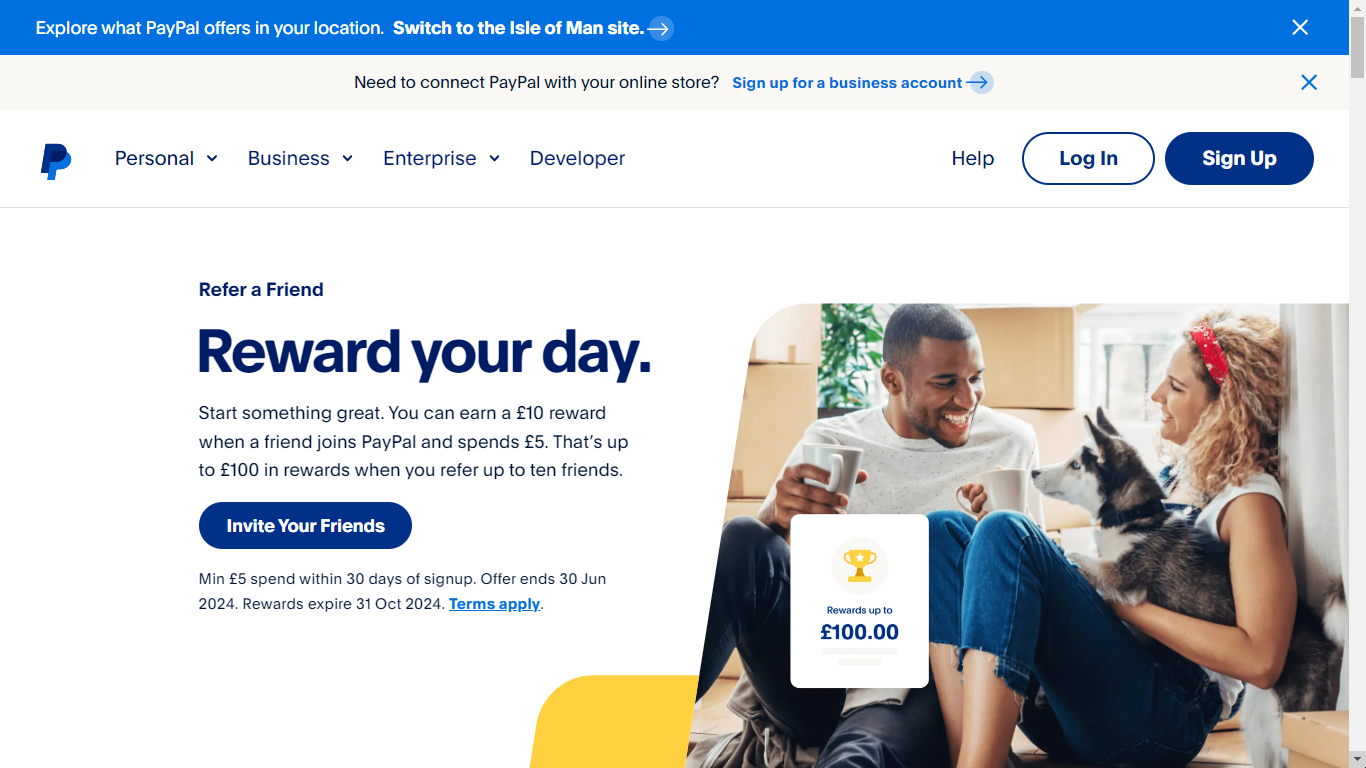
PayPal uses a double dose of notification bars here. The first one targets users based on their location, encouraging them to switch to a specific regional site for potentially more relevant offerings.
The second bar focuses on business users, prompting them to sign up for a business account if they want to connect PayPal to their online store.
This demonstrates how notification bars can be customized to target different visitor segments.
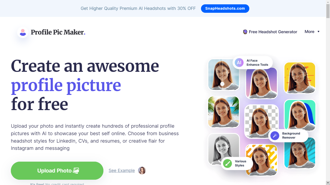
This notification bar from Profile Pic Maker uses a combination of elements to grab attention:
This example shows how notification bars can be used to promote premium features or upgrades.
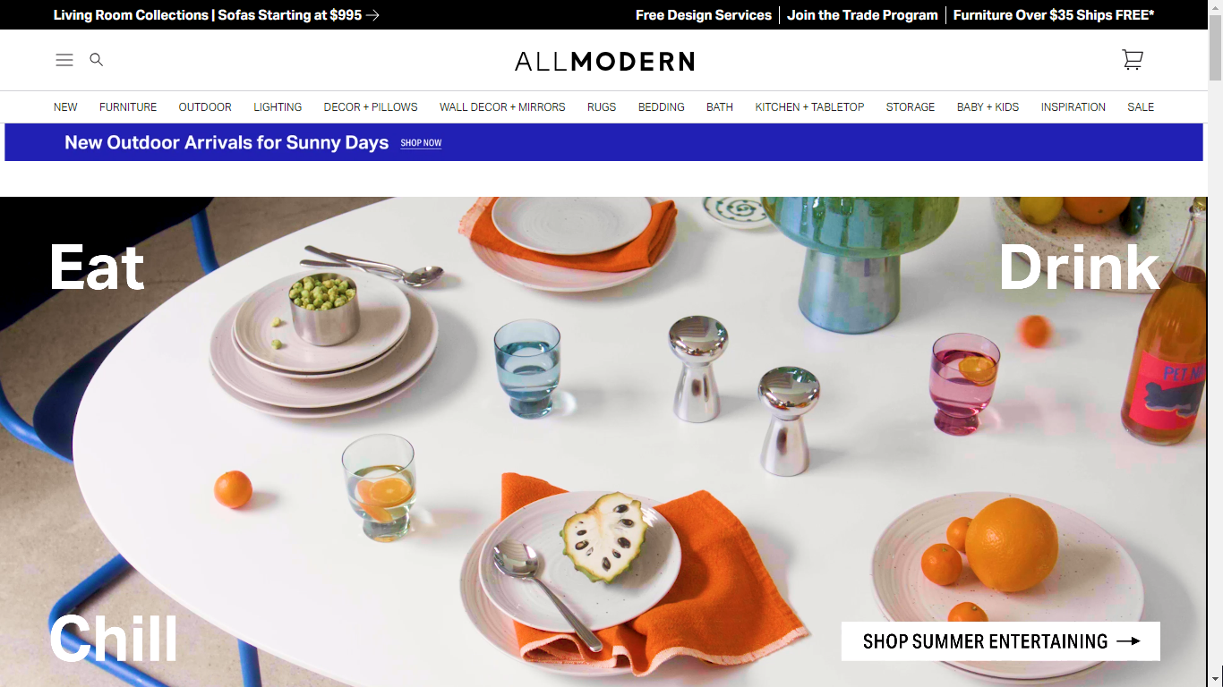
This notification bar from All Modern is packed with information, showcasing several offerings at once. It highlights product categories (living room collection, sofas), price points (starting at $995), and additional services (free design service, free shipping).
While this approach can be informative, it’s important to strike a balance to avoid overwhelming visitors. Consider A/B testing different notification bar formats to see what resonates best with your audience.
So, you’ve seen the power of website notification bars (also known as sticky bars or website notification banners) and want to leverage them on your own WordPress website. These handy tools are a great way to grab attention and promote important messages to your visitors.
The good news is, creating a notification bar for your WordPress site is easier than you might think if you use the right tools! There are several methods at your disposal:
We’ll explore each of these methods in detail throughout this guide, so you can choose the approach that best suits your comfort level and website needs.
In this section, we’ll walk you through creating a notification bar (sticky bar) for your WordPress website using Depicter, a popular WordPress notification bar plugin.
Depicter offers a user-friendly interface and a variety of features to customize your bar’s appearance and functionality.
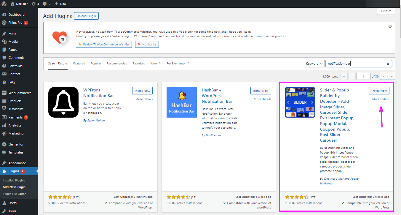
In WordPress Dashboard, head to plugins, then add new.
Then search for “Notification Bar” or “Depicter” in the search bar. You will see Depicter in the top results.
Install and activate to plugin to get started.
In Depicter dashboard, look for Notification bar, to see the templates. Or you can click on “Create A Blank” to start creating one from scratch.
In this tutorial, we’ll guide you through the easiest way possible; Using a ready-made template.
Browse through the templates, preview them, and choose one to your liking.
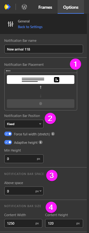
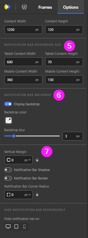
Once you import your template, you can customize it to your liking. Let’s go ahead and see what you can control in your notification banner.
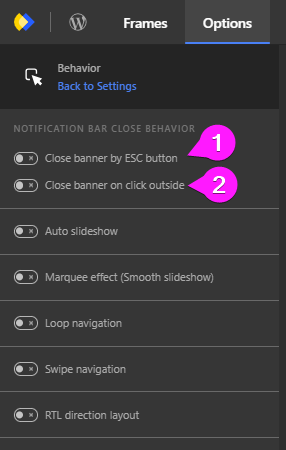
Once you’re done customizing the overall appearance of your website notification bar or sticky bar, it’s time to configure some option of your notification banner.
Right when you want to publish your notification banner, you’ll be asked to configure the “display rules.”
In this section, we’ll get to know these rules and how to configure them better.
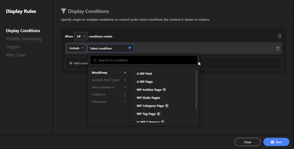
In display conditions, you can specify under which circumstances your notification banner is displayed to your visitors.
You are able to specify everything from WordPress pages, custom post types, products, type of device, country and more!
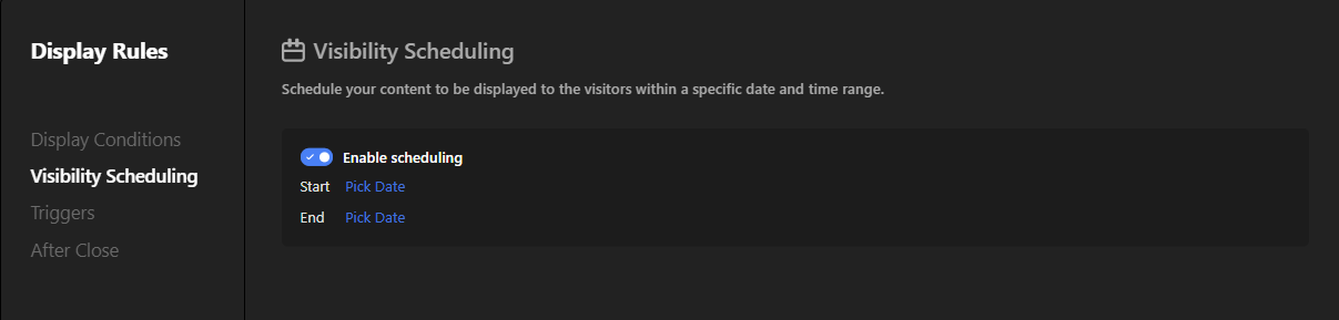
As the name suggests, you’re able to schedule when your notification bar to be visible to your website visitors.
Let’s say you run an online flower shop and you have a limited time only free delivery for your service. So what you do is you create a notification banner, and you schedule it for that limited time only.
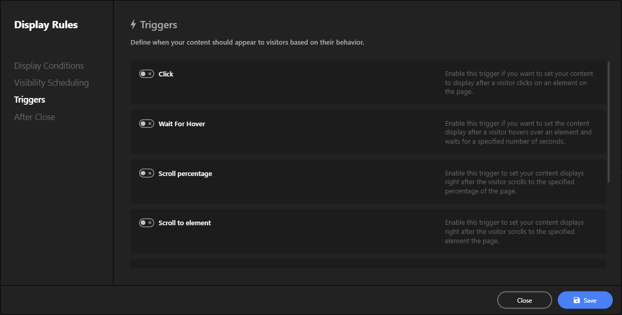
In triggers, you can set your notification bar to appear based on the visitor’s behavior:
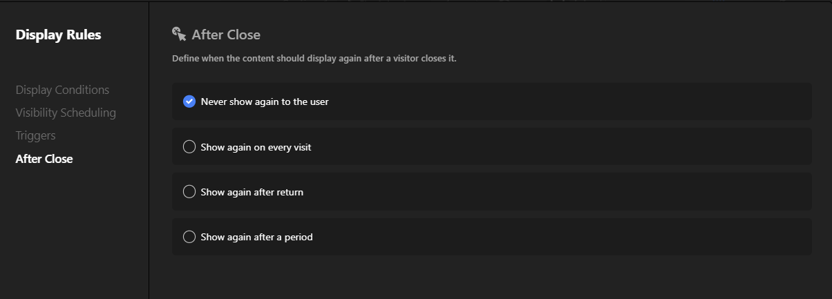
And last but not least, you can even define what happens after a user closes the notification bar; Do you want it to appear again after they visit your website, or do you want it to appear every time they visit your website?
Your Website, Your Choice!
Building a sticky bar on scroll is very similar to creating a regular notification bar. In fact, they’re almost the same thing! The only difference is in a few small settings.
In the last section, you created a notification bar and explored its settings. Now, get ready to turn any notification bar into a sticky bar on scroll that follows you as you scroll down the page – all with just a few clicks!
The first thing you need to do is removing the backdrop so that you don’t have to close the notification bar in order to be able to hand around in the website!
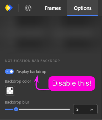
To do that go to Option -> General, and disable the backdrop!
Now the next step is, configuring the position setting.
In Options -> General you’ll see multiple positions; Fixed, Sticky and Static.
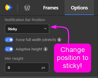
Now, to make a sticky bar on scroll you need to set the position to sticky!
Now the last thing that you can do, is remove the close button and you’re done, you have a sticky bar on scroll.
In conclusion, website notification bars are a simple yet powerful tool to enhance your website’s communication and engagement with visitors.
Whether you’re announcing exciting news, sharing important updates, or encouraging visitors to take action, these bars can be a subtle and effective way to convey your message without disrupting the user experience.
Creating your own notification bar is straightforward with various tools and plugins available, especially if you’re using a platform like WordPress.
By following the steps outlined in this guide, you can customize notification bars to fit your website’s style and functionality, ensuring they serve your specific needs.
Remember to keep your message concise, include a clear call to action, and make sure your notification bar matches your brand’s look and feel.
With these tips and the right tools, you’ll be able to leverage notification bars to effectively communicate with your website visitors. Happy creating!
A notification bar is a small bar that appears at the top or bottom of a website to share important information or announcements. It’s also known as a sticky bar or a website notification banner.
Notification bars typically appear as slim bars across the top or bottom of the screen. They often contain concise messages and a call-to-action. You can see various website notification bar examples, like those from Google or PayPal, to understand their appearance and use.
Yes, you can create a sticky bar on scroll, which stays visible as users scroll down the page. This can be done using WordPress plugins or by setting the position to “sticky” in your notification bar’s settings.
A WordPress notification bar plugin is a tool that allows you to easily create, customize, and manage notification bars on your WordPress website without needing to code.
A website notification bar generator allows you to design a bar online, providing limited customization options. Once designed, you can copy the generated code and embed it into your website.
Sticky bars, like notification bars, stay fixed on the screen as users scroll. Examples include persistent call-to-action bars on e-commerce sites or promotional bars on content-heavy websites.
To make a notification bar sticky:
– Go to the bar’s settings.
– Set the position to “sticky” instead of “fixed” or “static.”
– Ensure the bar remains visible as users scroll.
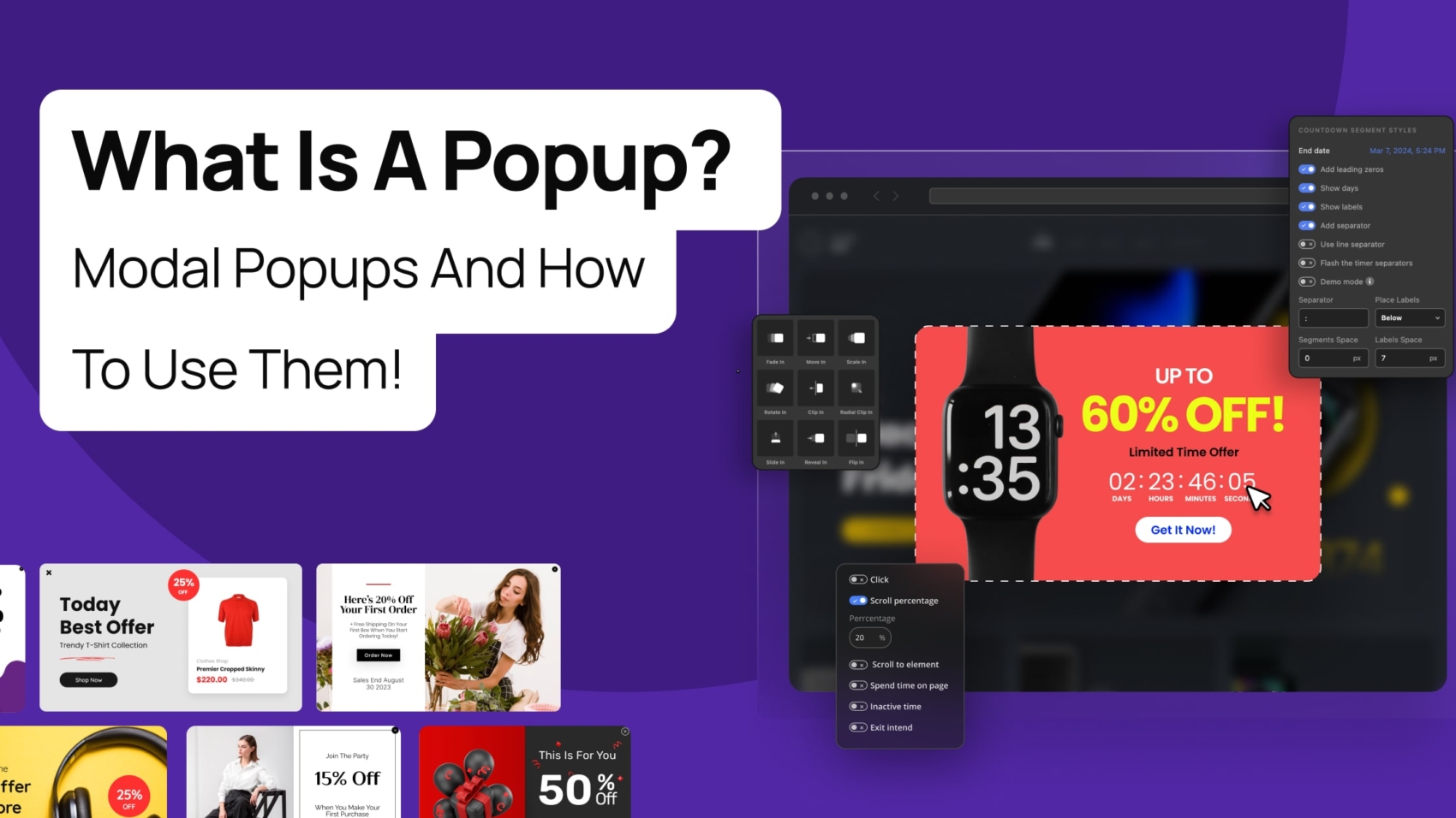
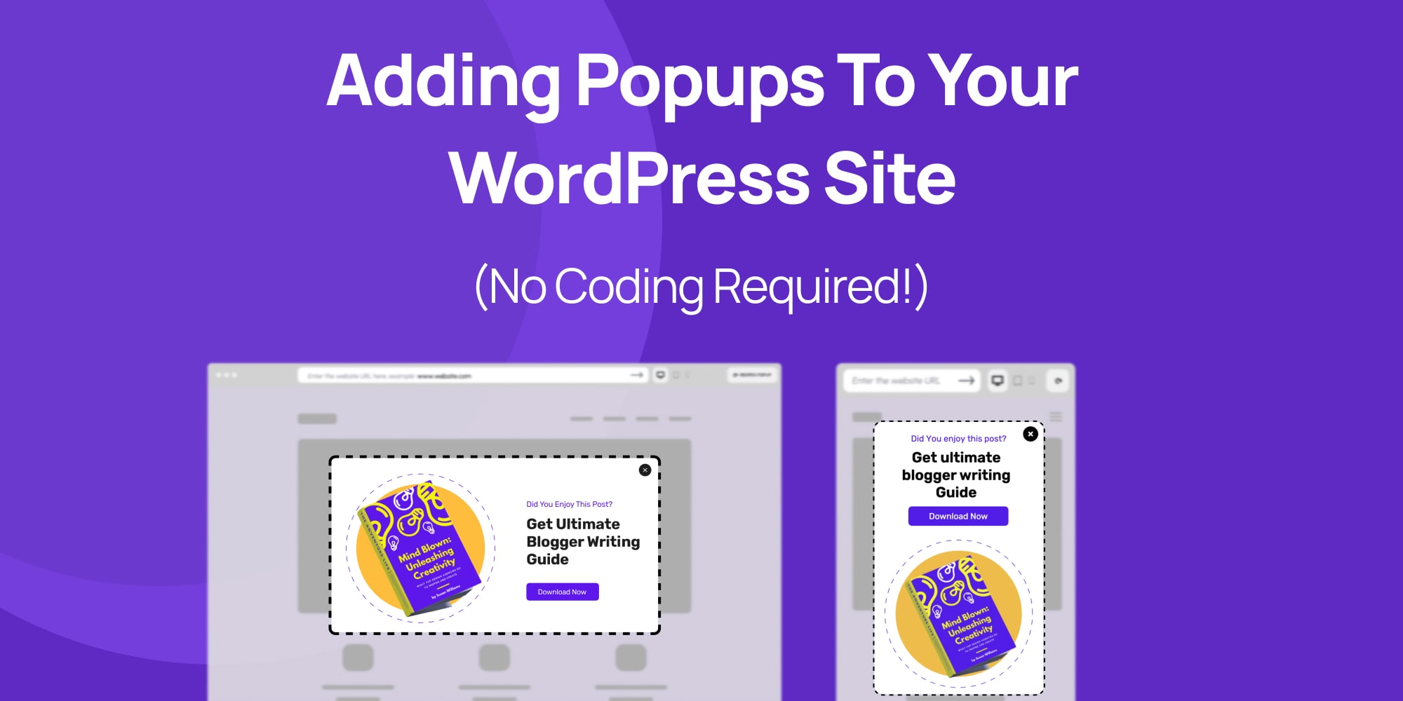
Have you ever been browsing a website and suddenly a new window appears on top of the page? That’s a popup, also called a modal popup!
Popups are like little boxes that websites can use to show you something extra. They can be a bit surprising, but they’re actually quite common and useful.
So why do websites use these popups? Well, there are a few reasons. Imagine you own a store and you want to tell your customers about a special sale.
A popup is a great way to grab their attention and let them know about the deals you have going on. You can use popups to collect email addresses to stay in touch with your customers and send them updates.
In short, website creators use popups to share important information and connect with their visitors in a more personal way.
This article is your one-stop shop for learning all about popups!
We’ll break down what they are, why websites use them, and explore a special kind of popup called a modal popup.
We’ll even cover some tricks to make sure popups on your website are helpful, not annoying, and show you how to add them without needing to be a computer whiz using a popup builder!
Ever browsing a website and suddenly a new box pops up? It might dim the background a bit and show a message or ask you to do something, like join an email list or grab a free download.
This attention-grabbing box is called a popup. In the world of websites, If a popup blurs the background, then it is more formally called a modal popup.
You might hear different names for those little windows that pop up on websites. They can be called modal popups, lightboxes, or even something fancy like magnific popups. But don’t worry, they all mean the same thing, with slight differences.
These popups are like special windows that open on top of the website you’re on. They often appear when you scroll down the page, click a button, or even just enter the website.
In modal popups, the background of the website usually gets a little blurry, and the popup window won’t close until you do something with it, like click “OK” to close it.
This is different from the old-fashioned popups you might be used to. Those would open up on a website and just stay there, even if you clicked on something else.
You could end up with a whole bunch of them open at once, making it hard to see the website itself. No wonder people got annoyed with those, and that’s why popup blockers were invented!
We won’t be talking about those annoying popups here. We’re focusing on the helpful kind, the modal popups that make your website experience smoother, not more frustrating.
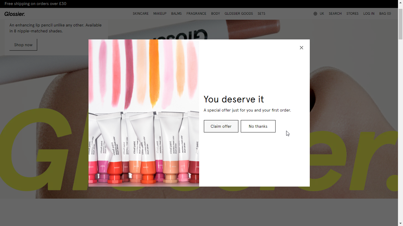
Here’s an example of a modal popup by Glossier:
You might have seen these spellings for those surprise windows on websites: popup, pop up, and pop-up. Don’t worry, they all basically mean the same thing!
No matter how you spell it, we’ll be using “popup” throughout this article for simplicity.
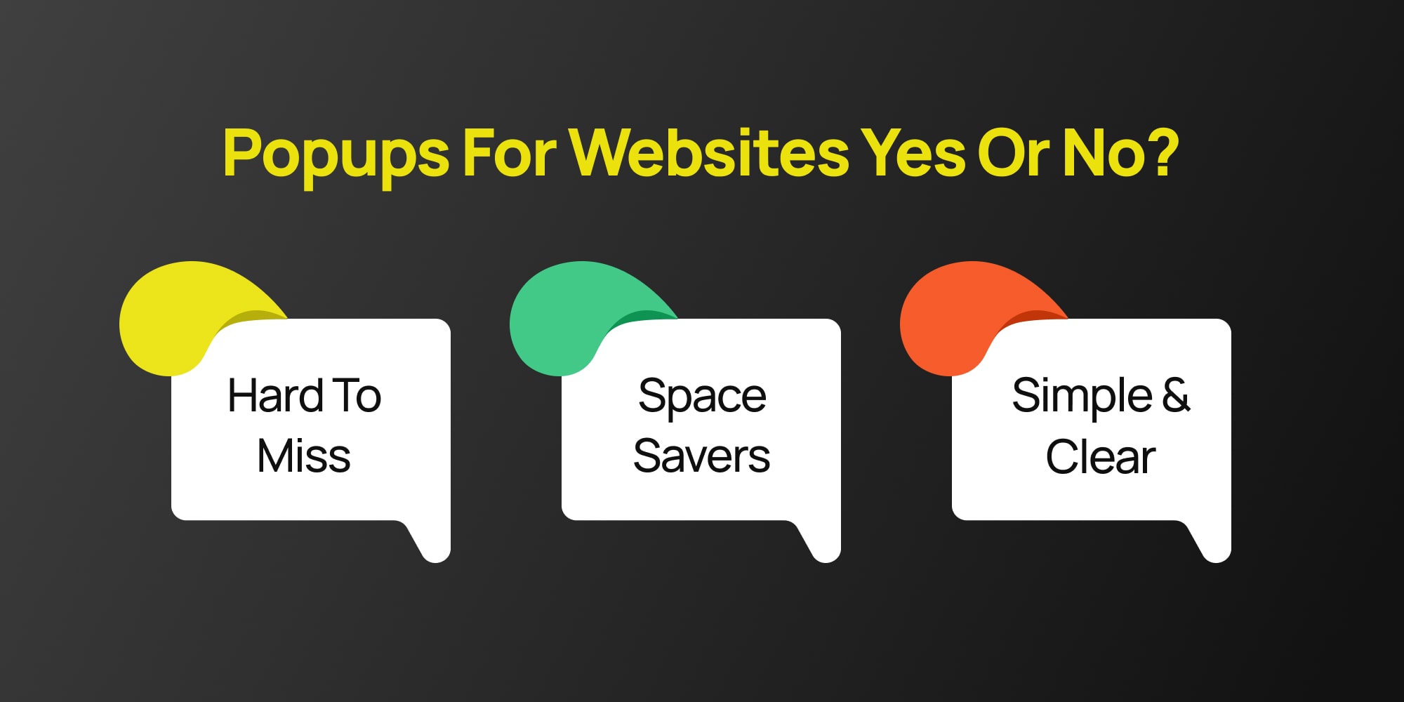
Absolutely yes! Popups are a great way to focus a visitor’s attention. Remember those windows we talked about earlier that appear on websites?
Modal popups are a specific kind that dims the background and won’t disappear until you take action, like clicking a button.
And a quick side note: You might see popups written as “popup,” “pop-up,” or even “pop up.” All three are used, though “popup” is the most common. We’ll stick with “popup” throughout this article for simplicity.
Let’s see why they can be helpful for your website!
Popups keep things easy. Everything stays on the same screen, so visitors don’t get lost or confused about what they were doing before.
Since Popups appear right where you’re browsing, you can be sure people will see them. Unlike popups in new windows, which users might close by accident, modals grab attention.
Need to show a picture or video? Modals can act like a lightbox, displaying it clearly without cluttering up the main page.
But modal popups are more than just pretty faces! They can help you with all sorts of things, like:
Offer a discount or bonus content in exchange for someone’s email address.
Need to let people know about a website update or a new product? A modal Popups is a great way to spread the word.
Have a sale coming up? Use a Popups to highlight it and drive traffic to your product pages.
Basically anything! Popups are flexible and can be used for all sorts of things, from reminding people about an event to collecting feedback.
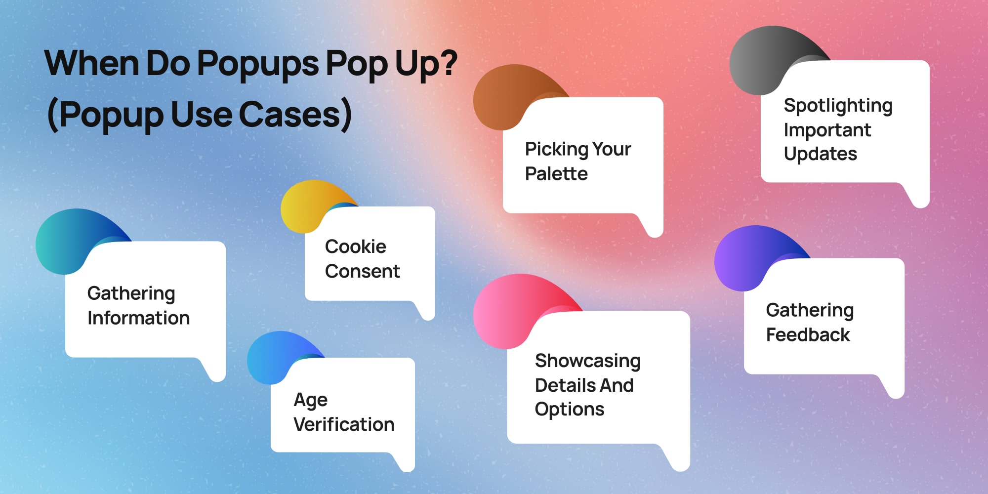
Popups can appear on websites for a variety of reasons, acting like little messengers with specific goals. Here are some of the most common times you might encounter them:
Popups can act like friendly digital assistants, helping websites collect information (usually using forms) from visitors.
This might involve signing up for a newsletter with your email address to receive updates and promotions, or entering your phone number to receive a special discount offer.

You’ll also sometimes see popups specifically asking for your consent to store cookies on your device. These cookies help websites remember your preferences and browsing history, and can be used to personalize your experience.

Imagine a website just launched a fantastic new feature, or maybe they’re having a huge sale. Popups can be a quick and effective way to grab your attention and ensure you don’t miss out on these exciting developments.
Let’s say you’re browsing a clothing store’s website and spot a cool jacket. A popup might appear when you click on the image, revealing a more detailed description, different color options, or even a short video showcasing the jacket in action.
Websites can also use popups to understand their visitors better. Imagine a small popup appearing as you’re about to leave a site, asking a quick question like “Did you find what you were looking for today?” Your answer can help the website improve and provide a better experience for future visitors.
Some websites might use popups to verify your age before allowing you to access certain content. This is especially common for websites that sell age-restricted products like alcohol or gambling services.

Now that you know the basics, let’s talk about making your popups helpful and interesting for visitors, instead of annoying. Here are some tricks:
Ready to add those attention-grabbing popups to your WordPress website? Great! In this section, we’ll show you how to do it step-by-step, without needing any coding knowledge using only a popup builder.
We’ll be using WordPress popup builder called Depicter to design these popups. It’s a great tool because it lets you create beautiful popups easily, even if you’re not a tech expert.
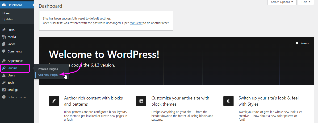
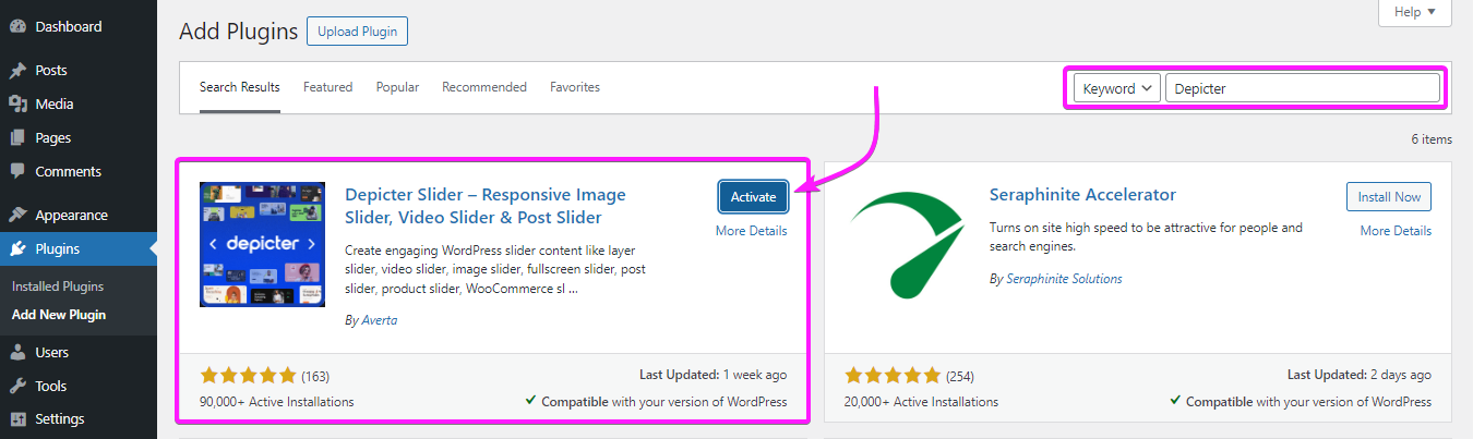
To install the Depicter plugin, go to plugins in your WordPress dashboard, click on “Add New Plugin” and Search for Depicter.
Once you find it, install and activate it and you’re good to go.
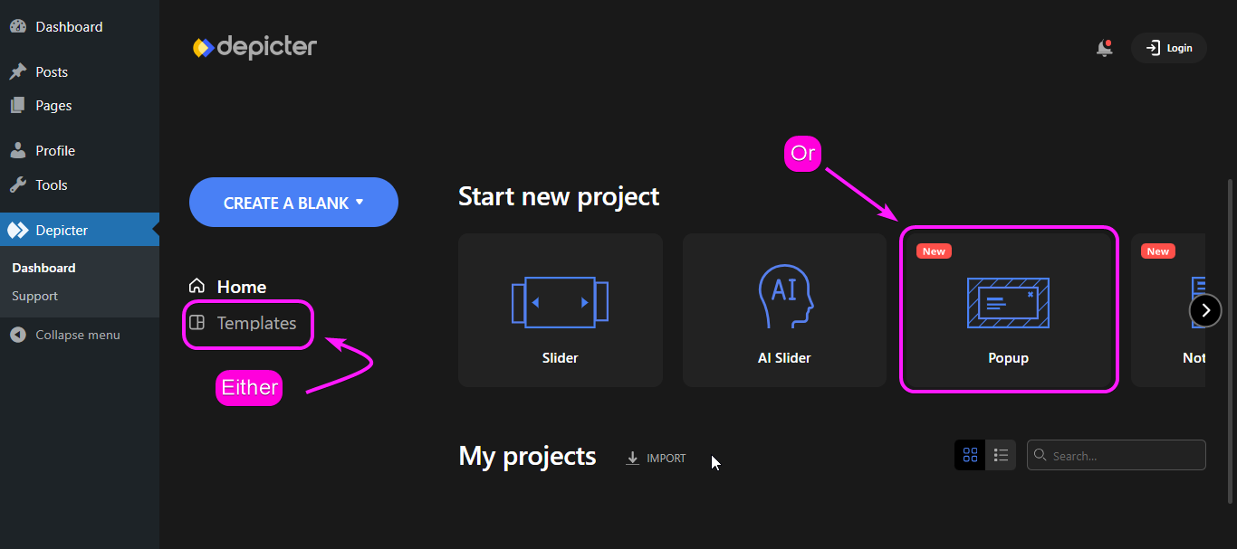
Remember that you can always start your creation from scratch in Depicter, to do that you can start with “Create A Blank” and choose “Popup” in this case.
However, to make things easy for you, we’re starting with a ready-made popup template.
To choose a template, either go to “templates” and choose the “Popup” category, or simply choose a the “Popup” category in “Home” and import a popup template.
Depicter isn’t like other tools you might find for building popups. It lets you set everything up in a super simple way, and popups are no different! This section will be your guide to customizing popups in Depicter.
In this section, we’ll walk you through the key things you can adjust to create the perfect popups for your website.
Remember, we’ll focus on the most important settings to get you started.
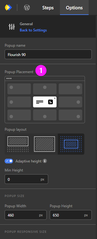
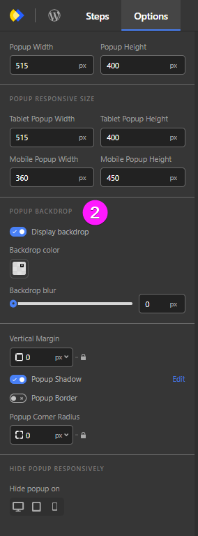
In the “general” options of Depicter popups, there are two things that you need to pay attention to:

By adjusting the behavior of your popup in options you can set thing like:
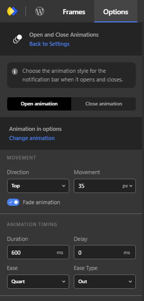
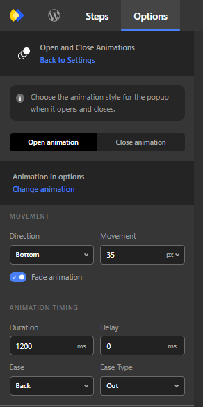
By adjusting the Open and Close Animation of your popup in options you will be setting:
When you want to publish your popup, Depicter will ask you to manage your popup visibility:
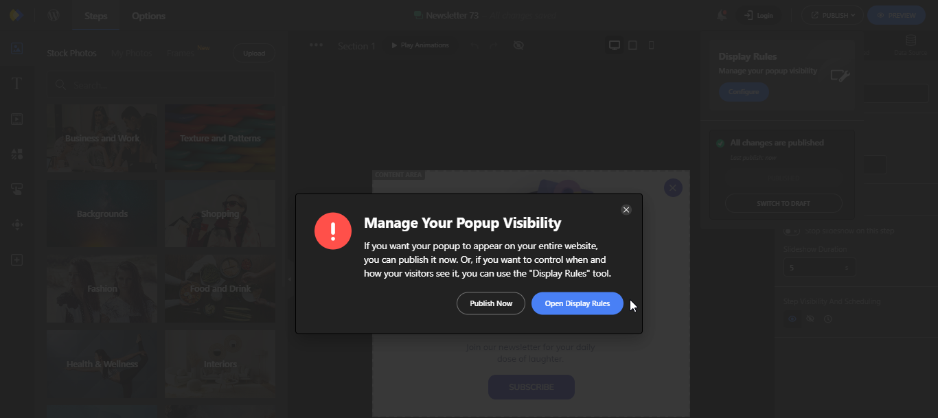
Now when you open the Display rules, you will notice four sections that you can configure for the most accurate popup display on your website.
Those rules are:
Let’s check out each one of these settings to see what they do:

In the Display Conditions, you can control where your popup will appear on the website; In a WordPress Page, Custom Post Type, Woo-Commerce, based on the Audience, etc.

Maybe you have a sale, or you designed your popup for a specific occasion, you can schedule when it would appear on your website in the Visibility Scheduling in Depicter.

In the Triggers settings in Depicter, you can set what triggers the popup to appear on your website; Whether it’s a click, a hover, a time spent on page, etc.
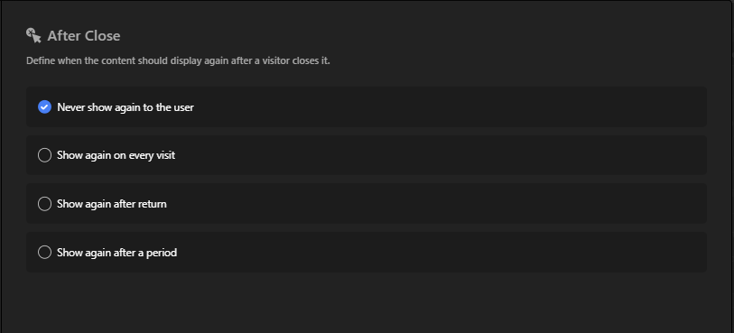
In the After Close settings of Depicter popups, you can set when the content would display again after a visitor closes it.
Once you’re done redesigning and configuring the popup setting, you would want your popup to appear on the website right?
All you have to do is click Publish!. And you’re done.
Popups are not like sliders that must be added to a specific page on your website. Where they appear, depends on how you configure them in the popup setting.
Ever wondered how popups would look on your website? Depicter can help!
It’s easy:
Now you can see how that popup template would look on your own website!
(In this example, you see how the template looks on Depicter’s website, but you can do the same for yours!)
Want to make a cool pop-up for your website? Check out Depicter’s pre-designed pop-ups to spark your ideas!
In conclusion, popups can be a valuable tool for website creators. When used strategically, they can help you capture attention, collect information, and boost conversions.
By following the best practices outlined above, you can create popups that are informative and engaging, rather than intrusive and annoying.
So the next time you’re building a website, don’t be afraid to experiment with popups and see how they can help you achieve your goals.
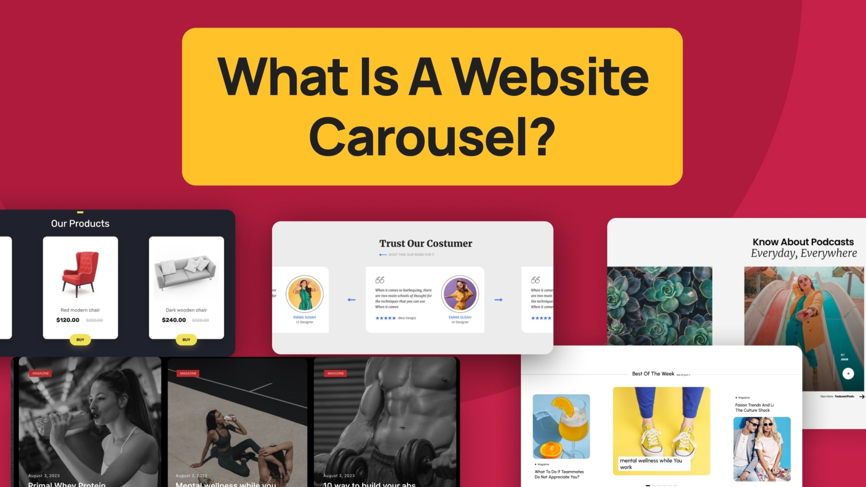
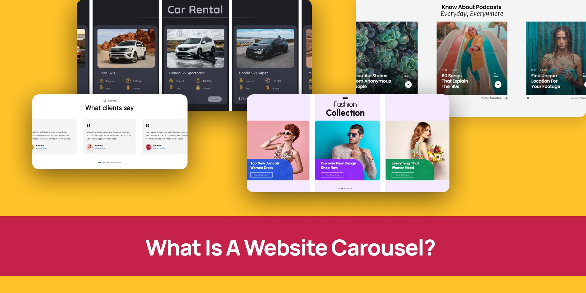
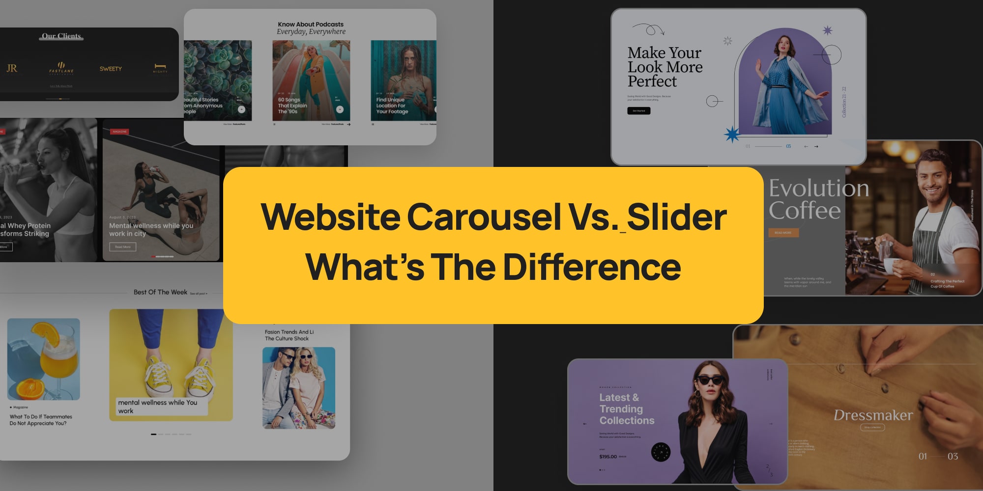
Want to know what a website carousel is? Ever seen those swipeable sections on websites that show off cool pictures or info?
Those are called website carousels, kind of like a digital picture frame that keeps things fresh.
They’re a great way to grab attention and pack a lot of info into a small space.
In this guide, we’ll walk you through everything you need to know about website carousels—step by step.
First, we’ll explain what carousels are and why they’re such a valuable tool for modern websites. Then, we’ll clear up the difference between carousels and sliders (don’t worry—it’s a subtle distinction).
Along the way, we’ll show you real-world examples to spark your creativity. And to top it off, we’ll share practical tips for designing high-impact carousels and walk you through how to build your own (yes, it’s easier than you might think!).
So let’s get started—and take your website to the next level.
Ever scrolled through a website and seen those cool, swiping images or videos?
Those are called website carousels, also known as carousel sliders. Think of them like multiple digital picture frames that show off different stuff all at once.
There are two main types:
Website designers love carousels because they’re like superheroes with two superpowers:
So now you know what carousels are on a website, and you probably already know what a slider is on a website, but you can’t quite see the difference.
That’s alright, we’ll break it down for you.
You hear the terms “carousel” and “slider” thrown around when talking about websites. They both sound similar, right?
Well, you’re not wrong! Both carousels and sliders are like slideshows that show off images, videos, or other content on your website. You can often control them manually with arrows, or they can change automatically.
Here’s the small catch:
So, In the grand scheme of things, both carousels and sliders achieve the same goal – showcasing content. But the way they do it can be slightly different.
Don’t worry, though, no matter which you choose, they can be great tools to boost your website’s performance if used well!
Looking for carousel examples to spark ideas for your next website design? Let’s explore a few possibilities.
Imagine a clothing store’s homepage. A carousel could elegantly showcase their latest fashion collections, with each slide featuring a different outfit and a clear call-to-action like “Shop Now!”
But carousels aren’t limited to product images. For example, an architect could use one to highlight completed projects—displaying each building one at a time in a clean, professional layout.
Let’s take a look at some website carousel templates to inspire you in your website design.
Imagine a grocery store website using a carousel to display their weekly specials. Mouthwatering photos of fresh fruits, vegetables, and delicious treats would grab your attention right away!
A clothing store could use a carousel to highlight the latest trends. They could show off trendy outfits or new arrivals, making it easy for you to discover the hottest styles.
Companies often use carousels to display logos of their trusted partners or collaborators. This builds trust with visitors and shows the strength of their brand network.
Testimonials are a great way to showcase positive feedback from satisfied customers. A carousel can display these testimonials, one at a time, letting visitors see what others are saying.
Podcasters can use carousels to feature their latest episodes. Eye-catching graphics and short descriptions can entice visitors to tune in and listen.
Similar to testimonials, carousels can be used to display positive quotes or reviews from happy clients. This adds social proof and builds trust with potential customers.
You’ve seen some web page templates above that you could use in your website.
Let’s take a look at some Real Websites using carousels on their webpages to inspire you in your design.
Imagine planning a trip to Tomioka City! The official tourist information website, Silkool Tomiko, might use a carousel to showcase stunning photos of the city’s must-see attractions. Each slide could feature a different landmark, like a beautiful temple or a serene garden, tempting you to explore further!
Maeni, a manufacturing company, wants to show off the cool things they make. Their website might have a unique carousel where the items seem to move based on a slider bar. As you adjust the slider, the carousel animates, giving you a 360-degree view of their products in a fun and interactive way!
Feeling indecisive about what to watch? Arte, a popular TV channel, might use a carousel to highlight their latest documentaries, films, and other programs. Each slide could display a captivating image and a short description of the show, making it easy to discover something new and interesting to tune into.
Looking for the latest iPhone or MacBook? Gravis, an online Apple product store, might use a carousel to showcase their hottest deals. Imagine swiping through images of sleek Apple devices, each with a clear “Buy Now” button, making it a breeze to grab the gadget you desire.
Apple’s official website might use a carousel on their Mac page to convince you they’re the best place to buy a Mac computer. Each slide could highlight unique features of Macs, like their stunning displays or powerful performance, making a compelling case for why you should choose Apple.
Ikea isn’t just about furniture! Their website might have a carousel featuring articles with tips on how to treat yourself right, every day. Imagine swiping through ideas for a relaxing bath, a cozy reading nook, or a delicious home-cooked meal, inspiring you to create a little everyday oasis in your own home.
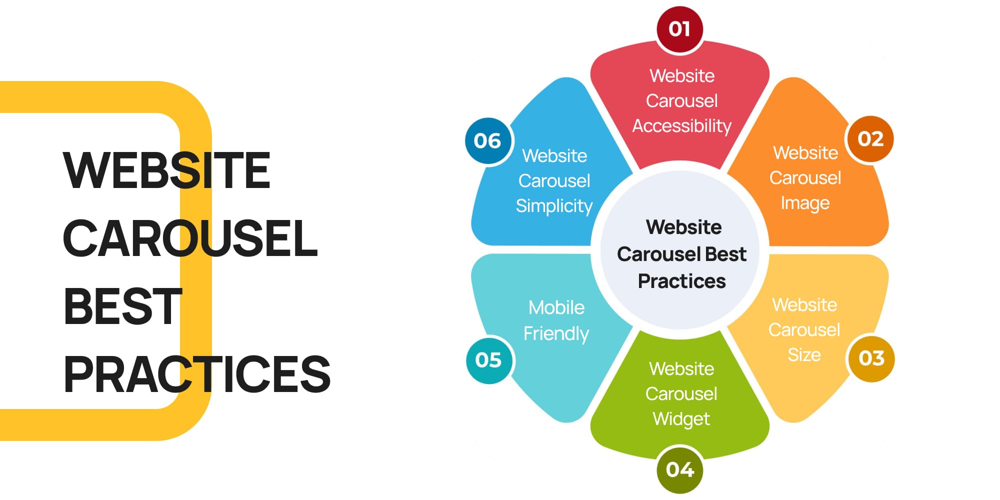
Here are some handy tips to make sure your website carousel is both beautiful and easy to use for everyone.
Imagine you’re designing a storefront window – you want it to be attractive and grab people’s attention, but also clear and easy to understand.
The same goes for your website carousel! Here’s how to achieve that:
Imagine someone is visiting your website for the first time. Is it clear what each slide is about, and how to navigate the carousel? Here’s what you can do:
People are drawn to visuals, so use high-quality images that are relevant to your message. Think of them as eye-catching headlines for each slide.
Don’t make your carousel too big or too small. It should be a comfortable size that fits well on your webpage and doesn’t overwhelm visitors.
Many website builders, like WordPress, have plugins that make creating carousels a breeze. We recommend Depicter, a user-friendly website carousel WordPress plugin that lets you customize your carousel with ease.
Remember, many people browse websites on their phones. Make sure your carousel looks good and works smoothly on all devices, not just computers.
Avoid cramming too much text or information onto each slide. People won’t have time to read a whole paragraph, so focus on a clear message and a strong image.
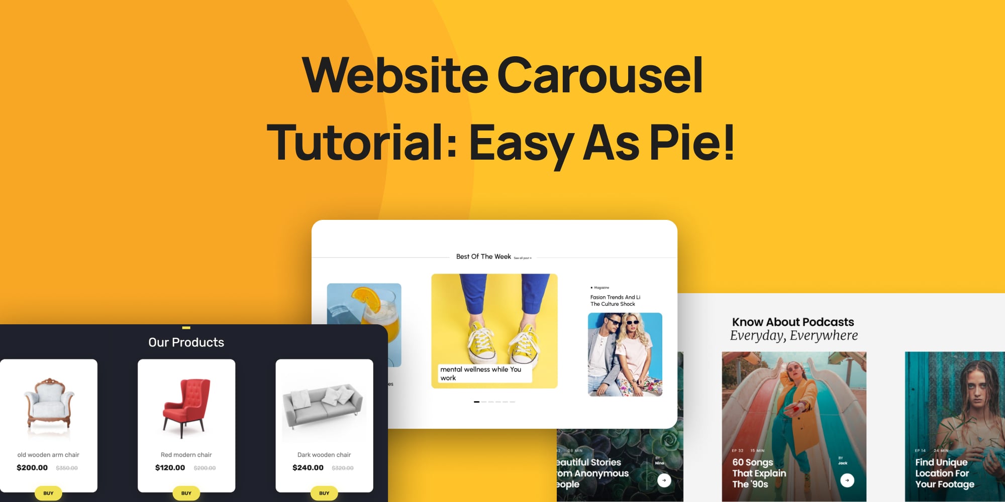
Imagine you want to add a cool carousel to your website, but the idea of coding feels a bit overwhelming. That’s exactly where website carousel plugins come in handy!
These plugins act like user-friendly tools that let you build carousels without needing any programming skills.
If you’re using WordPress, one popular choice is the Depicter plugin. Think of it as a complete carousel-building kit!
Depicter simplifies the process by offering ready-made carousel templates, drag-and-drop functionality, and plenty of customization options.
This means you can easily add your own images and text, and pick a design that fits your website’s style perfectly.
Best of all, in the next section of this guide, we’ll walk you through each step to create and add a carousel to your site—no stress involved!
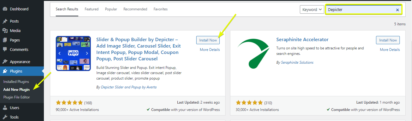
Before anything else, once your website is ready, in WordPress dashboard, head to plugins and click on “Add New Plugin“, then search for “Depicter“.
Once you find it, click on “Install Now“, and once installed, click “Activate“.
In this step you have two options; you can either choose one of the pre-made website carousel template and edit it, or you can create your carousel from scratch.
In this tutorial we’ll explain both.
First, open the Depicter dashboard and either select the Carousel category or simply type “carousel” into the search bar.
Next, browse through the available templates. If you find one that suits your needs, go ahead and import it.
Finally, customize the carousel to fit your style—and just like that, you’re all set!
In the WordPress dashboard, head to Depicter. There are lots of pre-made carousel templates as you saw in the previous section.
But if you have something special in your mind, you can start creating your own carousel from scratch and we’ll help you with that.
So head to “CREATE A BLANK” on the left and choose “Carousel“.
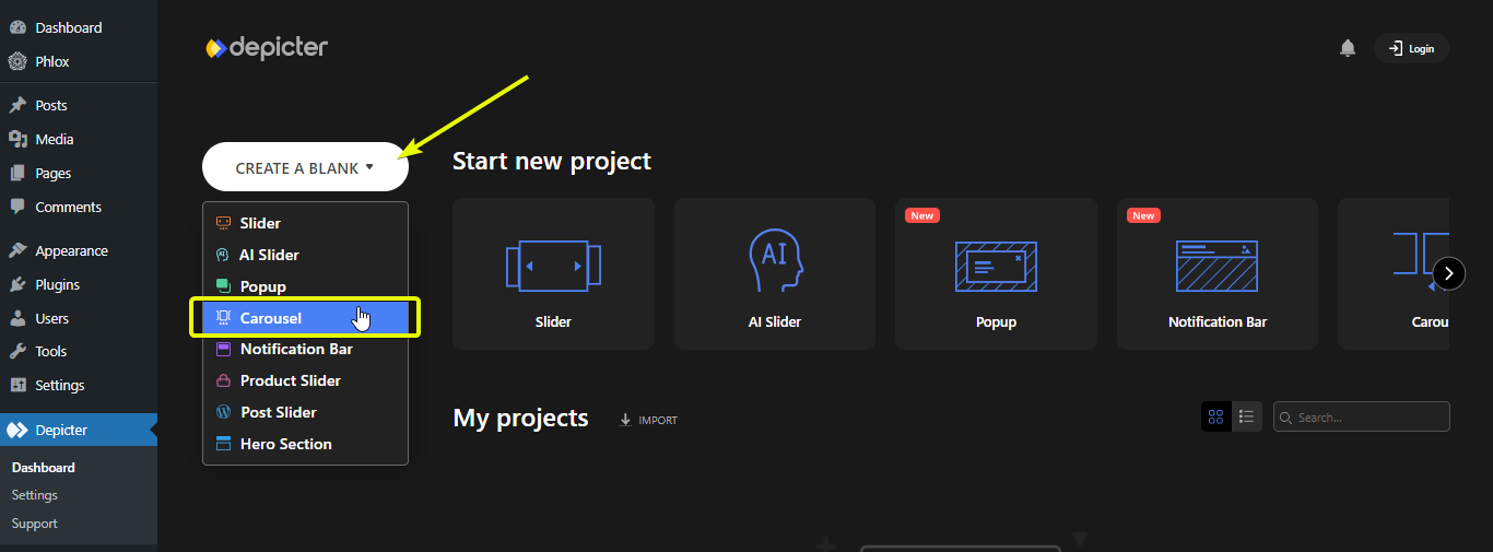
Choose a name, and adjust the width and height of your carousel and start designing.
Once you’re done designing, publish your carousel so you can add it to your website.
Adding a carousel to your website is simple. First, locate the homepage—or any page where you want the carousel to appear—either through the “Pages” section or by navigating directly to that page.
Once you’ve found it, click Edit with Elementor to begin customizing.
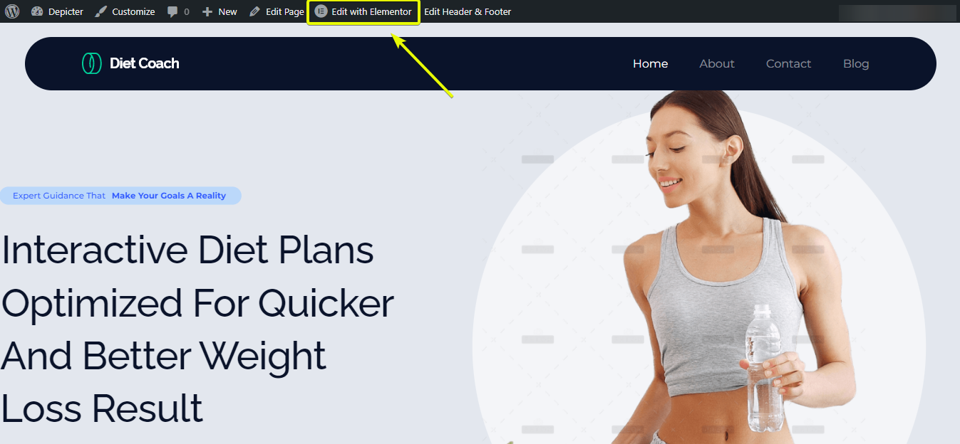
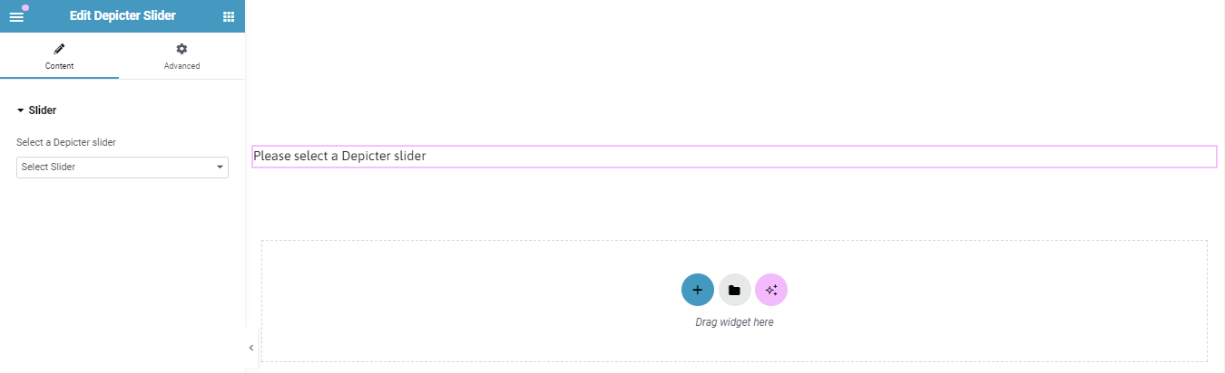
Once you’re inside the Elementor editor, start by creating a section and adding the Depicter widget to it. Then, select the carousel you previously created.
When everything looks good, click Update—and just like that, you’re all set!
Easy as pie!
And that’s it, only in three steps, you’ve learned how to create and add a carousel to your web page using the best widget possible; Depicter!
So, there you have it! By now, you’ve learned everything you need to know about website carousels. We’ve covered what they are, explained how they can boost your website, and even cleared up the mystery behind “carousel vs. slider.”
We also explored some inspiring website carousel examples to spark your creativity. From showcasing your latest fashion collection to featuring glowing client testimonials, carousels offer a versatile way to grab attention and pack a punch.
Remember, using website carousel templates and user-friendly plugins like Depicter makes creating stunning carousels a breeze, even if you’re not a coding pro.
Here are some key takeaways to keep in mind:
With a little planning and the right tools, you can easily add website carousels to your website and take your user experience to the next level. Now that you’re armed with this knowledge, get ready to create eye-catching carousels that will leave a lasting impression on your visitors!
A website carousel is a dynamic slideshow feature on websites that displays multiple images, videos, or content in a rotating or swipeable format. It’s like a digital picture frame that keeps your site fresh and engaging.
While both show content slides, a carousel typically displays several slides at once (like a mini preview), whereas a slider shows one slide at a time. Both can auto-rotate or be manually controlled.
Carousels save space by showcasing multiple pieces of content in one area, and they grab visitors’ attention, keeping them engaged longer. They’re great for highlighting products, testimonials, or featured articles.
Absolutely! Carousels can display videos, text, testimonials, logos, or even interactive content like podcast episodes.
No coding required! Plugins like Depicter for WordPress let you create and customize carousels easily with drag-and-drop tools and ready-made templates.
Yes, good carousel plugins and designs are responsive, meaning they look great and work smoothly on all devices, including smartphones and tablets.
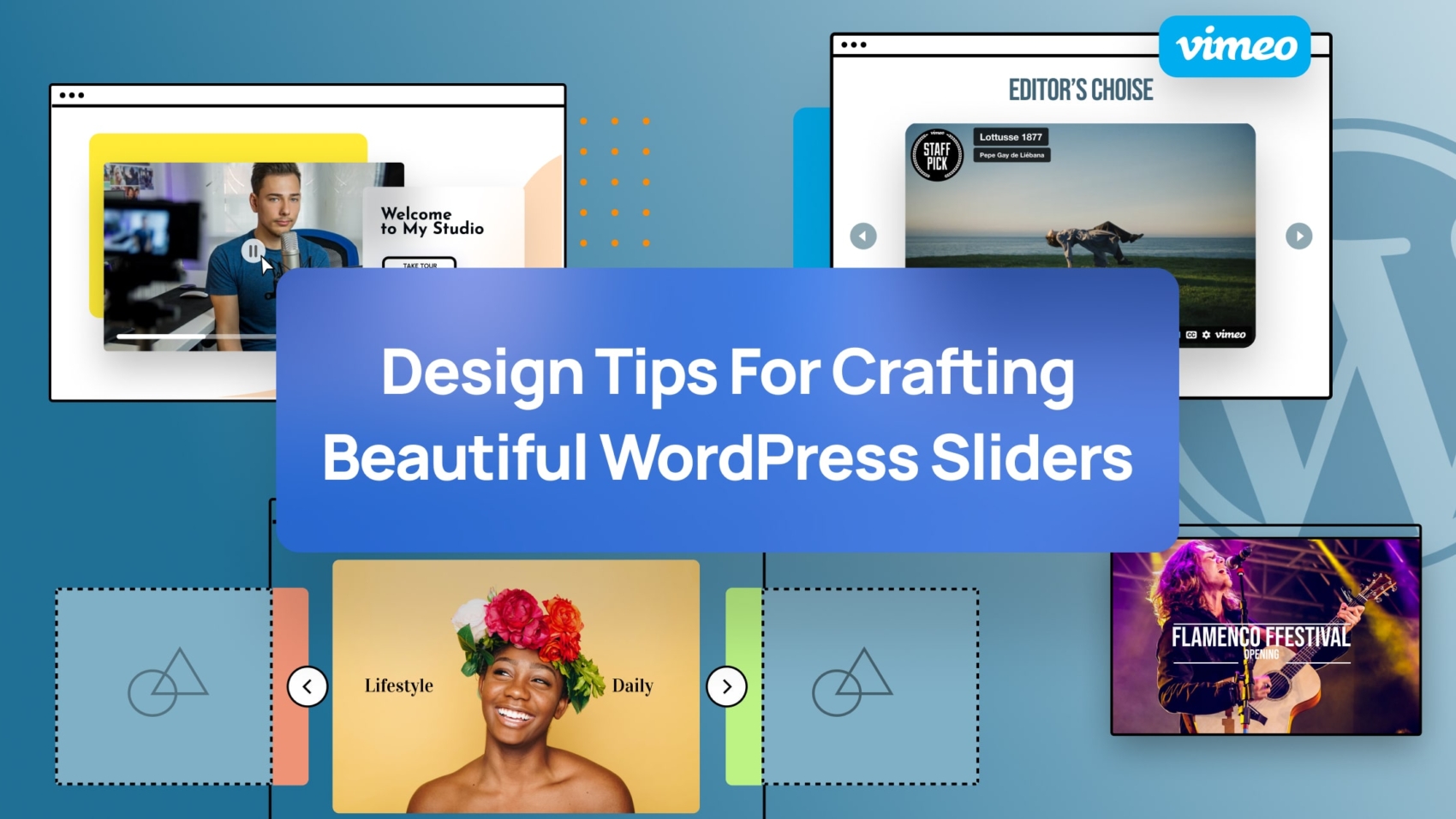
Learn how you can craft beautiful webpages using WordPress slider carefully while keeping up with your performance needs.

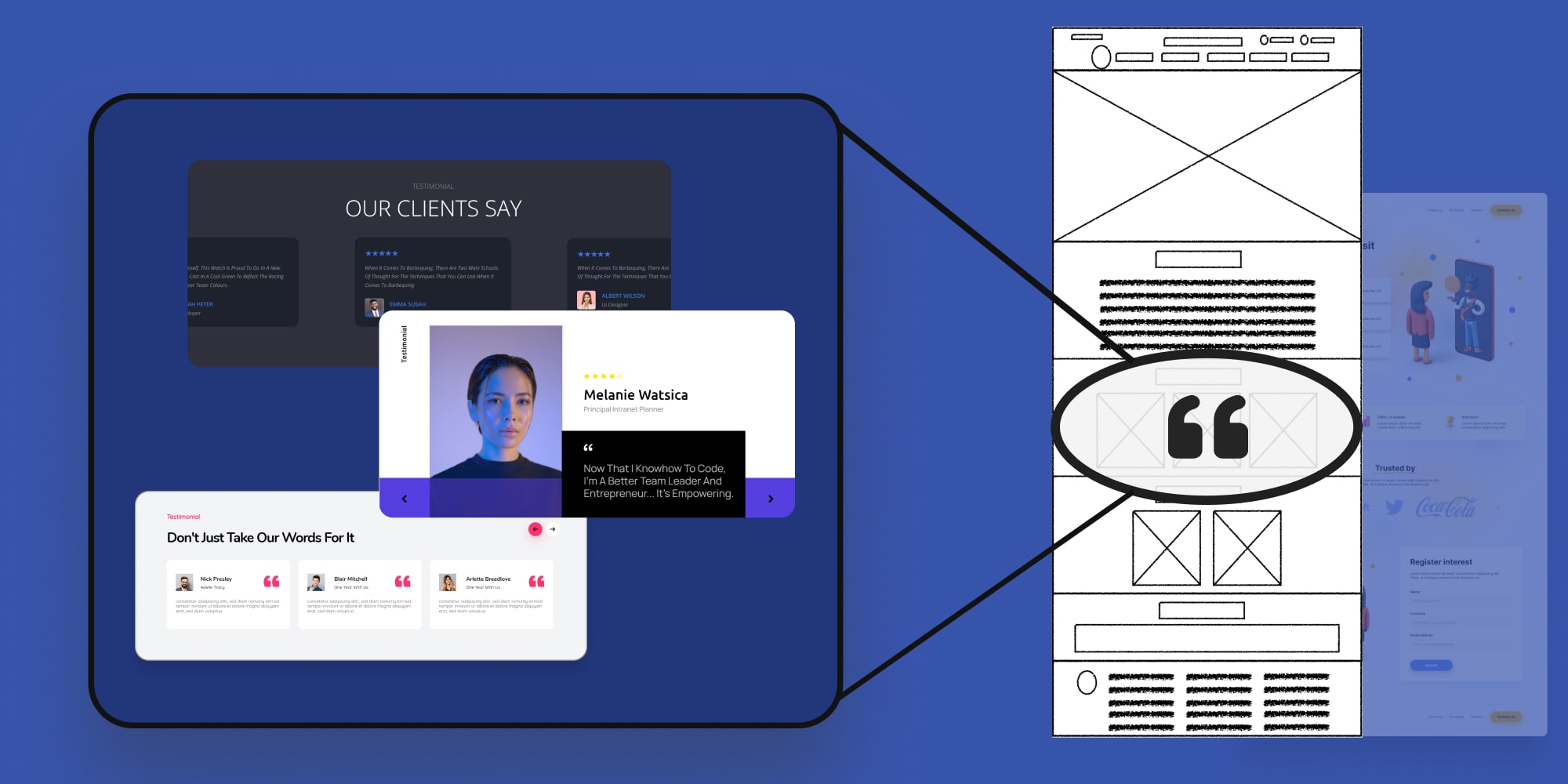
Have you ever wondered what are testimonials on website? Well you’ve come to the right place to find your answer.
Imagine you’re shopping online for a new fitness program. There are tons of options, all promising amazing results. But how do you know which one to trust? This is where website testimonials come in.
Customer testimonials are short snippets from real people sharing their positive experiences with a product or service.
Think of them like mini-recommendations from people who’ve been there, done that. furthermore they play a powerful role in convincing website visitors that your business is reliable and delivers on its promises.
This guide dives deep into website testimonials, exploring what they are, how they work, and finally answer your question “how to display testimonials on website” to turn happy customers into website heroes who convince others to join the fan club!
Get ready to learn about the types of testimonials, see real-world testimonials on website examples and discover how to leverage their power to boost your website’s credibility and conversions.
Craving a deeper dive into the world of creating compelling testimonials? This comprehensive video goes beyond the basics, offering a step-by-step guide on how to create powerful testimonials that resonate with your audience.

When it comes to hearing from your customers, there are two main ways: reviews and testimonials.
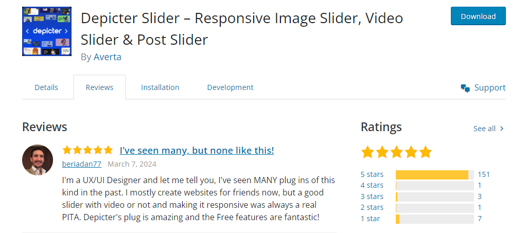
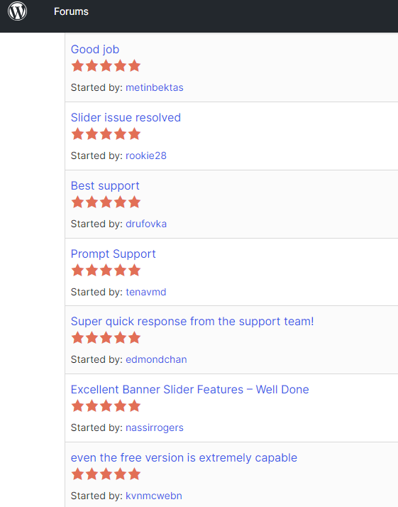
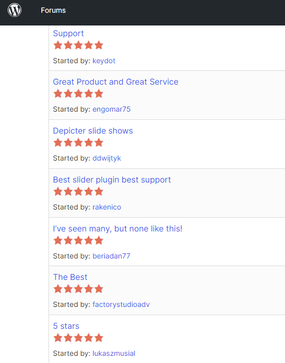
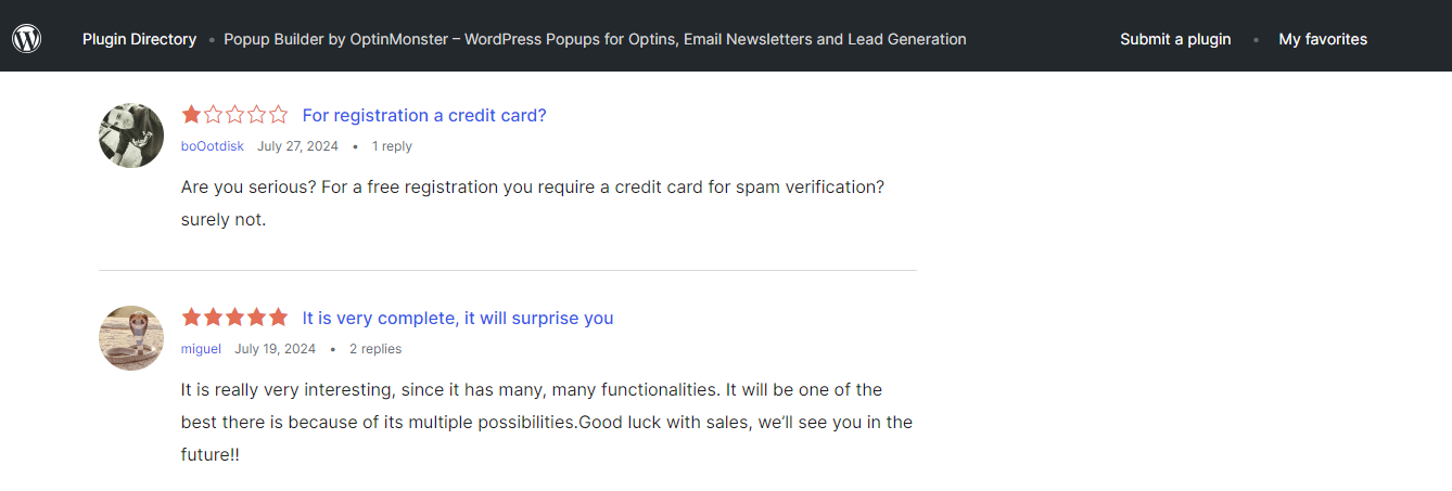
Notice how, in this example, a satisfied user has sung Depicter’s praises with a perfect 5-star rating. This unsolicited positive review speaks volumes about the plugin’s user-friendliness.
Reviews can be positive or negative, but both offer valuable insights to help you improve your business.
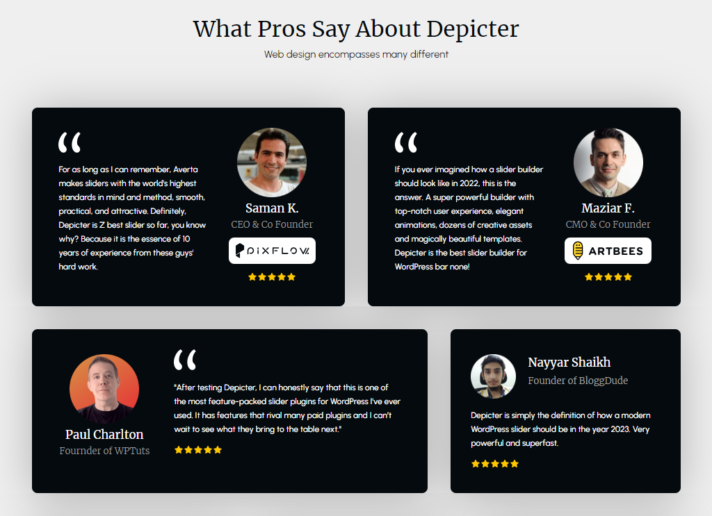
For reference, the testimonials above showcase what Depicter users have said about the plugin.
They focus on specific results the customer achieved and aim to give potential customers a real-life perspective of what it’s like to do business with you.
Testimonials are often used in marketing materials and displayed prominently on websites to build trust with potential customers.
In short, reviews are quick and factual, while testimonials are more personal and in-depth. Both play a valuable role in understanding your customers and building trust with potential ones.
Customer reviews are powerful tools, but there’s more than one way to showcase them! Let’s explore some popular types of testimonials and how they can benefit your brand.
Imagine a happy customer raving about your product on Facebook or Twitter. That’s the magic of social media testimonials! These authentic endorsements feel natural and show real people enjoying your product.
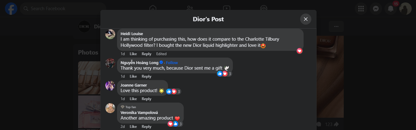
Example: various customers on Dior’s Forever Glow Star Filter Facebook post love the product and consequently offer to write their reviews – all on their own! This highlights the power of genuine product quality.
Imagine a respected professional in your field recommending your product. In fact industry insider testimonials combine the power of a regular review with the added weight of an expert’s opinion.
This is perfect for B2B companies, showing that well-known names trust your brand.

Example: Elementor WordPress website builder showcases a testimonial from a satisfied customer. While mentioning the person’s job title, the focus is on their positive experience, making it relatable to anyone who might need similar software.
This is a familiar format: a quote from a happy customer, their picture, and their name. It’s simple but undoubtedly effective!
Tip: Adding a customer photo builds trust. People connect better with real faces, making the testimonial more impactful.
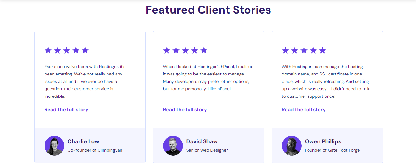
Example: Hostinger web hosting company includes testimonials with the customer’s picture and how long they’ve been using the service. This shows potential customers Hostinger’s long-term customer satisfaction.
Video testimonials on website take things to the next level! While they require more effort to produce, they can be incredibly effective.
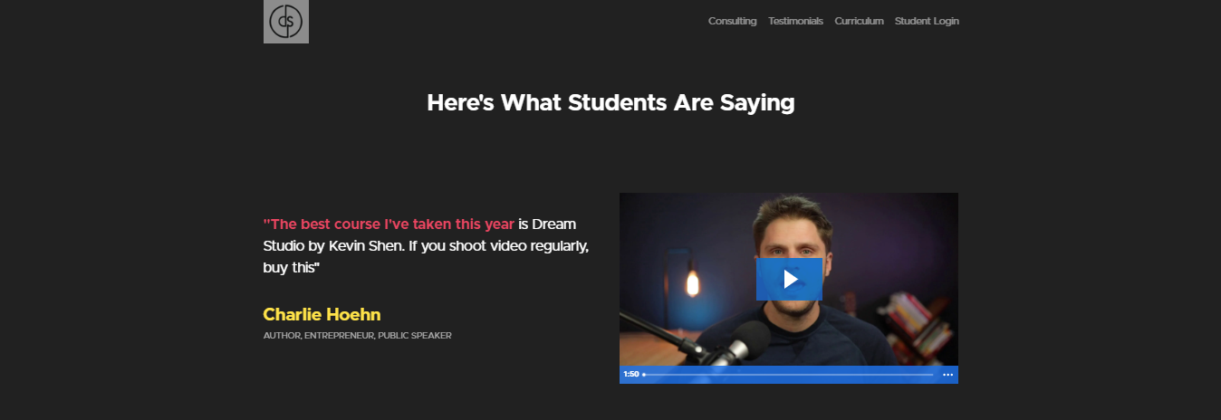
Example: Kevin’s Dream Studio course empowers students to design their ideal creative spaces. In order to highlight their achievements, he features video testimonials from satisfied students across his website.
Curious about video sliders? Read this article to find out all you need to know about them!
Why are videos great?
By using different testimonial formats, you can showcase the positive experiences of your customers and convince potential buyers that your brand is the right choice for them.
Don’t just toss testimonials on a random page – put them to work! You might ask yourself where to place testimonials on a website for maximum trust.
Here are key areas for strategic placement:
A clean and visually appealing presentation can elevate the impact of your testimonials. Here are some design tips:
While having a plethora of testimonials might seem ideal, quality trumps quantity. Focus on showcasing a curated selection of powerful and impactful testimonials that truly resonate with your target audience.
Up to this point in the article, you already know what a testimonial on a website is and how to make the best of it.
Now it’s time to learn how you can add a testimonial slider and testimonial carousel to your website that shows how amazing your customer thinks you are.
The best part? You don’t need coding skills to achieve this! In this guide, we’ll walk you through the easiest method possible: using the Depicter plugin for WordPress.
If you’re looking to work with an easy to use, testimonial WordPress plugin with various beautiful ready-made templates, Depicter is the right plugin for you.
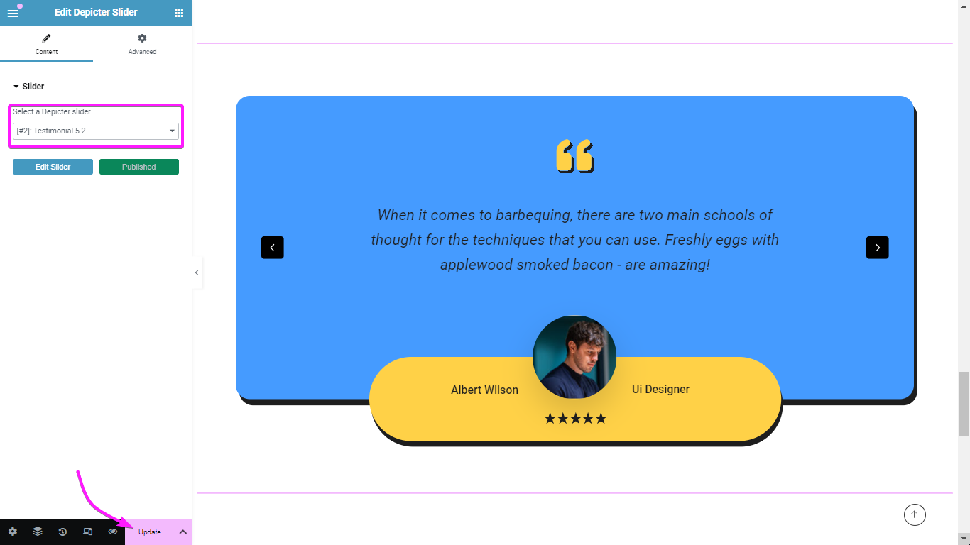
Once you decide where you want to put the testimonial slider on your website (in this example, to our homepage), the first thing you have to do is adding the Depicter Pugin to your WordPress.
Remember, you can always choose to create a slider (or carousel) from scratch, by choosing the “create a blank” option.
Choose a template and import it.
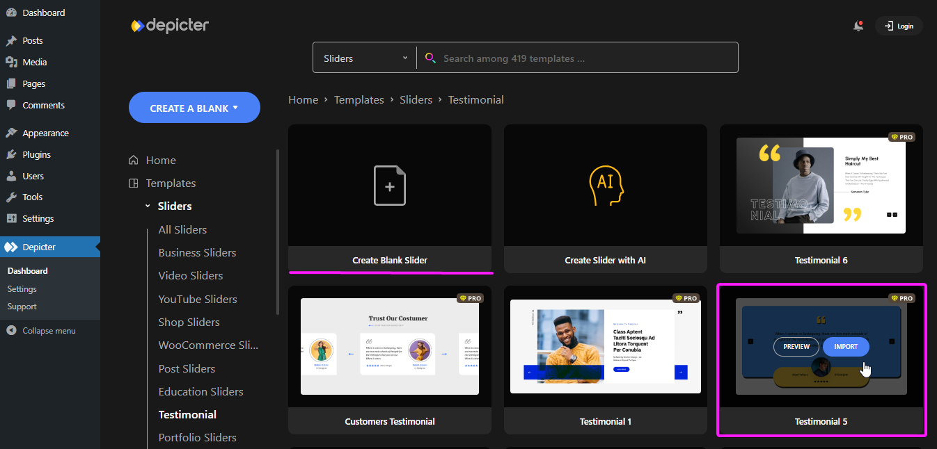
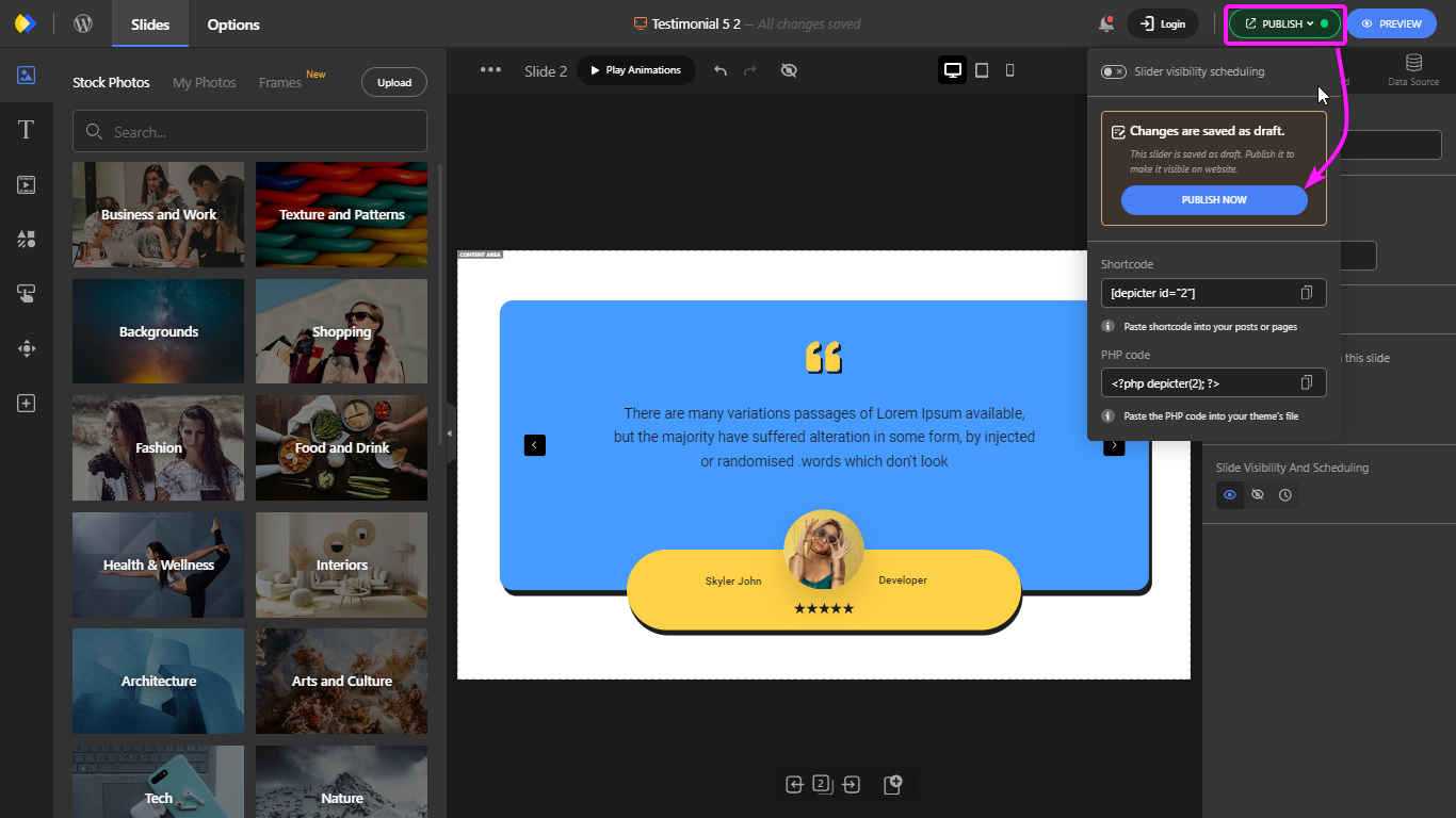
Once done with customization, hit publish and the slider is ready to show off wherever you want it to be.
Well, that’s pretty much it!. As you can see, adding a testimonial to your website can get very easy if you use the right tools at hand.

Remember, testimonials are all about showcasing the real-world impact of your product or service. By incorporating these key elements:
4. Including Visuals: Headshots and Logos for Added Credibility
A picture is worth a thousand words, and that holds true for testimonials too. Including headshots of your customers adds a human touch and builds trust. People connect better with faces!
For B2B testimonials, consider incorporating company logos alongside the customer’s information. This establishes credibility by showcasing partnerships with reputable brands.
5. The Power of Storytelling: Testimonials that Captivate
The best testimonials don’t just list benefits – they tell a story. Encourage your customers to share their journey: the challenges they faced, how your product or service helped them overcome those obstacles, and the positive impact it’s had on their business or life.
Storytelling creates an emotional connection with potential customers, making your testimonials more memorable and persuasive.
By following these tips and leveraging the ease of Depicter, you can transform customer raves into website magnets, boosting trust and conversions like never before!

Ever wondered how to add video slider in WordPress website? Adding a video slider to your WordPress website doesn’t require coding expertise.